
In one of my recent articles, The Evolution of the Hamburger icon we talked about the history of this commonly-used pattern, and about who’s using it and why.
In fact, there have been many recent discussions in UX circles that have raised the counter-intuitive nature of the hamburger icon and issues in several cases.
In this article, I thought we’d focus on three other very common 2014 UX patterns. Each one is so prevalent and humdrum that we may not even think twice when we employ them.
But perhaps we should.
If you’ve followed my articles, you’ll know that the effectiveness of a UX pattern depends on a great number of factors, and there is no scientific formula that will tell you that choice ‘x’ is totally right or wrong. You are the only one who that can really judge if it fits your needs of audience, and you’ll make the final call.
Nevertheless, if they aren’t questioned, even widely-discredited UX patterns often persist long after they should have become no more than historical footnotes.
The UX patterns that we’ll examine are:
Large Background Images
Text as Images
Mega Menus
In addition, I’ll give you some alternatives to these three (I believe) outdated design patterns in order to help you move on.
1. Large Background Images
In recent years, panoramic background images have become such a hot web design trend that they approach the realm of cliche. You don’t have to wander far to find dozens of creative examples which illustrate the technique beautifully. The Web is still full of captivating landing pages, big portfolios, and in some cases even traditional corporate websites use specialized full-screen background photos to dazzle users.

Although some images make a very impressive visual impact on a website, you’ll often need to consider alternatives to this practice, particularly for sites with an important mobile audience.
Even if the old saying “A picture is worth a thousand words” is true, and information conveyed through imagery is remembered much more readily than the written data, developers should pay attention to how and when apply this principle to web design.
A crucial factor that you cannot underestimate is that these gigantic, retina-ready backgrounds usually equate to gigantic, bandwidth-slaughtering file sizes. This, in turn, leads to huge impacts on load times, which feeds directly into user experience.
As these background images are very often about setting a visual tone or emotional mood, rather than communicating required information, they add a large amount of weight to a page for very little measurable user benefit.
Users whose screen is generally smaller than 1024px will absolutely not see the background image. Small screens simply don’t have the screen real estate to display content and background images. They essentially choke down thousands of pixels that they then throw away!
What’s the Alternative?
There are two alternatives that you could consider to use:
- Context-aware image sizing, whose goal is to “deliver optimized, contextual image sizes for responsive layouts that utilize dramatically different image sizes at different resolutions”
- Interchange that allows you to dynamically load content on a responsive site based on user’s browsers, so you can target small, medium and large images for the right use-cases.
To sum up
Large images have the potential to lose you customers/readers who would otherwise visit your site. Put yourself in your users’ low-res, slower shoes and imagine their experience with your website (especially viewing it on a mobile device).
Test your page load time and, finally, conclude adopting what is best for your audience.
Text as Images
I suspect many might be reading this thinking “Honestly, does anyone really still do that?”. You might be surprised.
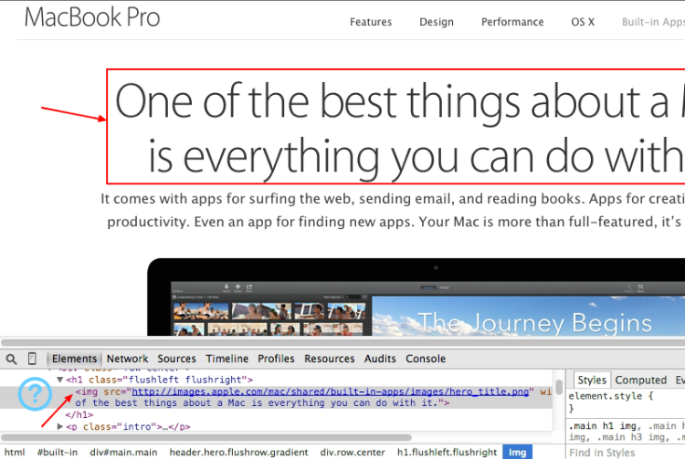
Apple.com has used the technique across the entire site for many years. You’ll still find image text used extensively thoughout their Mac Mini, MacBook Air and MacBook Pro pages. In fact, you’ll even find plenty of examples on their brand new iPhone 6 product pages.
Who said IR is dead?
Of course, there are many good reasons to avoid embedding text into images.
Image-based text can perform badly for users that resize their screens/images — a far more common behavior with today’s multi-sized devices than we might have expected 5 years ago.
Secondly, we know that text embedded in an image makes that text itself inaccessible by default to screen readers. There are workaround, but we’re adding brittle complexity to something that has worked flawlessly since the early 1990s.
Thirdly, images can often look terrible on retina unless you individually optimize each one. There’s much less inherent flexibility for updates and text edits, with even the smallest edit requiring the generation of brand new assets.
Last but not least, it’s hard for search engines to index and understand the content on the page when it’s all trapped in images. As smart as Google are, the crazy results you often get from image search confirms how much harder it is for computers to interpret imagery.
So, if you really need to employ an image with a text in your project, remember to always add a descriptive alt attribute to your images, unless they are used for purely decorative purposes. In addition, when using an image as a link, enter a description of where that link goes.
What’s the Alternative?
Image-based text is most often used when designers want more control over the way typography renders.
Instead of adopting the text-as-an-image method, you should think about the possibility to use web fonts. These are font files that we can apply to any text in the site, including text generated by a content management system (like WordPress).
Text is accessible for various devices and can be read and indexed by search engines. The Web is full of some really great free fonts suitable for your purposes. There are many different varieties of web fonts that you could take into account. The most well-known are:
It would be fascinating to know why Apple are unconvinced by this approach
Mega Menus
Several years ago, Craig Buckler wrote an article about the phenomenom of the mega drop-down menu, a trend which has become popular in web design.
Mega menus are often used on large-scale sites that have many potential destination pages for users to navigate to.
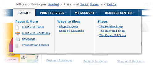
Rather than just using a one-directional dropdown, the mega menu opens up an expanded area that offers more options. While mega menus can make it easier for users to get deeper into the site with fewer clicks, this barrage of options can also potentially overwhelm some visitors.
What’s the Alternative?
Mega menus have a great potential and, rather than replacing them with other kind of menus, it could be worth spending time in improving their structure.
Some good practices you could employ to achieve this task are:
- Use indicators to show interactivity (plus, minus, down arrows).
- Use instantaneous transitions.
- Manage widths and alignments in the best way possible(for example add extra padding to allow users to not make mistakes).
- Don’t use unusual transitions or unexpected effects that could annoy users.
- Don’t overcrowd the menus and overwhelm the user with choices.
To sum up
First of all, it’s critiically important to test the navigational usability of your menus on touch-screen devices. A mega menu with well-designed interactions, well-structured information architecture, consistency, and a great user interface can benefit both the company and the user in so many ways.
However, you have to be sure that it doesn’t cause them additional frustration (for instance, accidental hover interactions) or hinder them by slowing their naviagation.
Conclusions
In this article you’ve discovered some alternatives to few commonly employed design patterns. Users care about how these elements impact and it should be your goal to make their interactions easy and pleasant with any reasonalbe device at any connection speed.
Focus on how to achieve the best experience possible and experiment until you find your proper solution.
Frequently Asked Questions (FAQs) about Outdated UX Patterns
What are some examples of outdated UX patterns?
Outdated UX patterns are design elements that were once popular but have since fallen out of favor due to changes in user behavior, technology, or design philosophy. Examples include skeuomorphism, which is a design principle that involves making items resemble their real-world counterparts. This was popular in the early days of digital design but is now considered outdated. Other examples include the hamburger menu, which is often criticized for hiding important navigation elements, and carousels, which can be confusing and frustrating for users.
Why is it important to avoid outdated UX patterns?
Outdated UX patterns can negatively impact the user experience. They can make a website or app feel dated, confusing, or difficult to navigate. This can lead to user frustration and may cause users to abandon the site or app. By avoiding outdated UX patterns and using modern, user-friendly design principles, you can create a better user experience and increase user engagement and satisfaction.
How can I identify outdated UX patterns?
Identifying outdated UX patterns involves staying up-to-date with current design trends and user behavior. This can be done by reading design blogs, attending design conferences, and conducting user testing. User feedback can be particularly valuable in identifying outdated or frustrating design elements. Additionally, if a design element feels clunky, confusing, or out of place, it may be an outdated UX pattern.
What should I replace outdated UX patterns with?
Outdated UX patterns should be replaced with modern, user-friendly design elements. This will depend on the specific pattern and the context in which it is used. For example, instead of using a hamburger menu, you might use a tab bar for navigation. Instead of using a carousel, you might use a single, static image or a grid of images. The key is to focus on simplicity, clarity, and user-friendliness.
Are there any tools or resources to help me avoid outdated UX patterns?
Yes, there are many tools and resources available to help you avoid outdated UX patterns. These include design blogs, online courses, design pattern libraries, and user testing tools. Additionally, getting feedback from other designers and users can be invaluable in identifying and avoiding outdated UX patterns.
Can outdated UX patterns ever be useful?
While generally it’s best to avoid outdated UX patterns, there may be certain situations where they can still be useful. For example, if you’re designing for a specific audience that is familiar with and prefers a certain pattern, it may be beneficial to use it. However, these situations are the exception rather than the rule.
How often should I update my UX patterns?
There’s no set rule for how often you should update your UX patterns. It largely depends on the feedback you’re getting from users and the latest design trends. However, it’s a good practice to regularly review and update your designs to ensure they’re providing the best possible user experience.
What are some current UX pattern trends?
Current UX pattern trends focus on simplicity, clarity, and user-friendliness. Some popular trends include minimalistic design, microinteractions, and personalized experiences. Additionally, with the rise of mobile devices, responsive and mobile-first design are increasingly important.
How can I stay up-to-date with current UX patterns?
Staying up-to-date with current UX patterns involves continuous learning and staying engaged with the design community. This can be done by reading design blogs, attending design conferences, taking online courses, and participating in design forums and social media groups.
What are some common mistakes to avoid when updating UX patterns?
Some common mistakes to avoid when updating UX patterns include making changes for the sake of change, not considering the context in which a pattern is used, and not getting user feedback. It’s important to make changes based on user needs and behavior, not just on what’s trendy. Additionally, any changes should be tested with users to ensure they improve the user experience.
 Annarita Tranfici
I have a Bachelor's degree in European languages, cultures, and literature from the University of Naples. I'm passionate about graphics and web design, and for several years I've been working on projects and designs for many companies. I'm a writer for the Audero User Group; my specialties are HTML, CSS, Web Design, and Adobe Photoshop.