Last week I walked you through four well-understood rules of psychology that you can use to really improve your website results. Today I have three more rules involving color, human attention spans and reactions to change that take things to another level.
Let’s get started!
Rule 1: Attention Spans are Shrinking Every Year

In a 2015 study, Microsoft surveyed 2,000 people and monitored the brain activity of 112 more people with electroencephalograms (EEGs). One of the highlights of the study is that our attention span has reduced; the average human now has an attention span of eight seconds, compared to an attention span of 12 seconds in 2000. We now have a shorter attention span than a goldfish (which has an attention span of nine seconds).
The fact that we are indeed becoming increasingly impatient, especially online, was further established by an Aberdeen study that found that a one second delay in website loading time will result in 40 percent of people abandoning a website and a 7 percent decrease in conversion.
Our desire to have instant gratification (which is constantly being bolstered by the seemingly instant availability of everything, thanks to technology!) has deep roots in psychology. Researchers conducted a study on students at four different universities, observed the brain activity of participants with an fMRI, and found that two areas of our brain compete for control over our behavior when we have to choose between short-term rewards and long-term goals.
The study found that parts of the brain that are heavily influenced by brain systems associated with emotion activate when we’re faced with the possibility of instant gratification, leaving us with little choice since we are not likely to logically consider our decisions. In short, we’re wired to want instant gratification, and, since it mainly has to do with our emotions, there’s little we can do about it.
How does this apply to your website design?
Principle: Use the ‘Goldfish Principle’ to Optimize Your Site for Impatient Users
No matter how beautiful and appealing your web design is, it is half useless if it doesn’t load fast. Cut out the extra, unnecessary features. Clean up your code to avoid a bloated design, and follow other design best practices for making a website faster.
Rule 2: Men and Women Perceive Color Differently
If, as a designer, your use of color is based on what you “like” best or what you “think” looks better, think again. There’s a lot to research on the psychology of color, and you can use the right colors to influence the actions your users take.
According to a 2006 study titled, “Impact of Color on Marketing,” people make up their minds within 90 seconds of interacting with people or products, and 62 to 90 percent of their assessment is influenced by colors alone. The study, that reviews literature on color psychology in the context of marketing, found that it is possible to use colors to increase or decrease appetite, reduce perception of waiting time, make customers more patient and enhance people’s mood.
In fact, color is so powerful that the color of the food we eat, as well as surrounding colors, has been observed to influence the palatability of food and the appetite of the eater.
Similar research published in 2010 found that color can influence the likability and familiarity people feel towards a brand – and that the right use of color can enhance purchase intent. The study analyzed 100 brands, involved 450 non-color blind participants, and compared brand personality (which is basically the impression people have about certain brands: Nike is “cool,” Apple is “exclusive,” etc.), likability and familiarity based on a number of factors.
Participants were randomly split into three groups; the first group was shown a brand name in Arial font with a middle gray color, the second group was shown a middle gray version of the brand’s logo, while the third group was shown a full-color version of the brand logo.
The study found that color affects brand personality and likability. Since the researchers found the colors red, blue and black to be most commonly used by the brands analyzed, they did further analysis and saw that these colors elicited certain feelings about the brands; the color red elicited excitement in users about a brand, the color blue made users feel a brand was more competent and the color black made users feel a brand was more sophisticated. This was irrespective of how the brand actually is.
That said, the decision to favor one color over another shouldn’t be simplistically made. Despite our natural tendency to react in certain way to some colors over others, available research shows that color preference can easily vary among people of different gender and culture. Below is a graphic showing the most favorite colors among men and women:
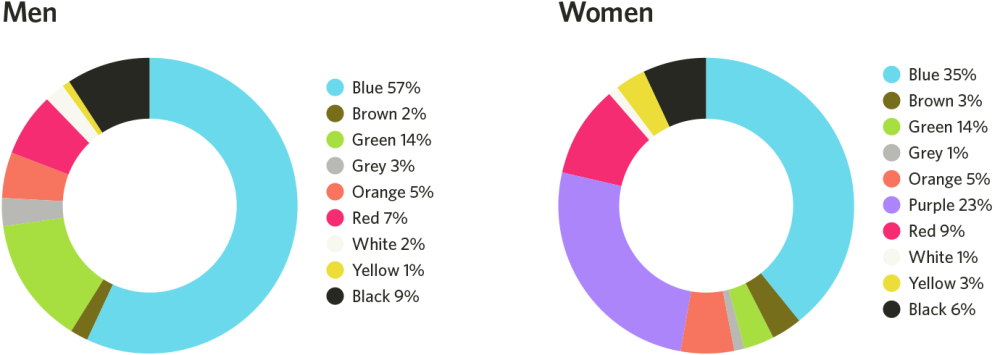
The following screenshot shows the least favorite colors between men and women:
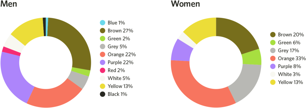
A few things are easily apparent:
- You might have to use different colors depending on whether your audience is predominantly male or female (for example, men generally dislike the color purple compared to women)
- There is an overlap between colors for both genders, so all hope is not lost if your design will be served to an audience of mixed male and female
- Men generally prefer bold colors while women prefer softer colors
How does this apply to your website design?
Principle: Vary Your Usage of Color Based on Your Audience and Goals
Vary your color use based on the audience of your design; it is especially important to avoid biases influenced by your own gender and experience as a designer. As a male designer, don’t assume that a female audience will love your design and use of color because you think it is beautiful.
Instead, understand the color preference of both genders, as well as people of different backgrounds, and let that influence your design choices. It is also important to understand the emotions different colors elicit and use colors accordingly.
The discussion about colors won’t be complete without addressing the concept of sensory adaptation, though.
Rule 3: Humans are More Sensitive to ‘Change’ Than ‘Color’
We just talked about color, but it is important to also discuss sensory adaptation to keep things in perspective. This is especially important when designing for conversions.
Many people have reported that changing the color of their sales button or CTA boosted their conversions, but do claims like this hold water? While colors do have their role, and we just observed the role different colors can play, based on gender and other factors, it is just as important to consider the concept of sensory adaptation.
In psychology, sensory adaptation refers to change in responsiveness to constant stimulus over time. In basic terms, we tend to gradually tune out stimuli we are repeatedly exposed to; that constant noise that you initially found irritating and couldn’t bear but gradually became used to.
This is also why:
- a warm bath initially feels hot but gradually feels normal
- you become unaware of your clothes and shoes not long after putting them on
- banner blindness allows users to ignore content they aren’t interested in
Sensory adaptation explains all these, and the same principle holds true in web design.
For example, the following screenshot shows an oft-cited case study on how a change in color button boosted conversions by 21 percent:
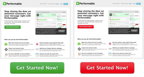
Now, that sounded like good advocacy for the color red, so the color red must be pretty good for getting people to click on a button, right? Not so fast. The study ignored other variables, such as the role sensory adaptation played in the decisions of users.
A careful look at the design shows that the most used color on the page is the color green; it’s a part of the color of the logo, it’s the main color used in the image, it’s used later in the copy and the fact that the sales page uses a white background makes the color green easily blend in. Naturally, since green is the most dominant color on the page, and going with the principles of sensory adaptation, the green button won’t stand out.
Users would have naturally adapted to seeing the color green, reducing the chances of them actually taking clicking the green button. The red color switches things up, however, and breaks the monotony the dominant green color has created. The color red is basically screaming “See me!” and thus makes users more likely to click on it.
Interestingly, to support the concept of sensory adaptation, another article claims that the orange button color is the best for conversions. Other articles have claimed blue, green, etc.
At the end of the day, it’s not so much about the button color but about the sensory adaptation principle. While red might indeed be a superior color for gaining attention and improving conversions, it all boils down to the overall color scheme of your design; perhaps the users have been conditioned to gradually “adapt” to the color green after seeing it a lot on your page, thus making it less effective.
How does this apply to your website design?
Principle: Use The Sensory Adaptation Theory to Boost Conversions
The principle of sensory adaptation applies not just to button color, but to design as a whole. If you want people to take certain actions, ensure you make the element that induces that action different from other elements on a page. Also, ensure that anything you want to catch the attention of users looks different in your design; monotonous design is a huge conversion killer.
 John Stevens
John Stevens is a psychologist, sales and marketing consultant and the founder and CEO of Hosting Facts (latest review ). He is also a partner in the Website Setup blogging project. When he is not digging into psychology research, he is tending his beards.