Recently, Matthew Magain caught up with Xavier Mathieu, the designer responsible for creating the new 99designs.com web site design.
Over a hard-fought game of foosball, Matthew quizzed Xavier on his design decisions, the challenges he faced in creating a new visual identity for a large design community, and his thoughts on the concept of “design contests.”
Disclosure: 99designs was founded by a team of former SitePointers. We still let them use our espresso machine every now and then.
SitePoint: Thanks for taking the time to talk to me Xavier. First up, tell our readers a bit about yourself and your experience as a designer.
Well, I’ve always been fairly creative. I was always building things as a kid — lamps, pen holders, that kind of thing … I had a real interest in industrial design. I also played with lots of Lego, which I really believe gave me lots of practice at being creative!
In terms of my education I attended LISAA, which is a private design school in Paris, France. Design school taught me how to develop a professional approach to graphic design, and all of our assignments were real-world examples, so making the leap from student life to the professional world wasn’t difficult.
I teamed up with a couple of friends from my college after graduating, and we freelanced for a few years in France before I moved to Australia. Those few years definitely gave me a broad range of experiences.
Outside of work I really enjoy outdoor sports. Rollerskating, cycling … recently I’ve taken up kite surfing, which I discovered since moving to Melbourne. I love it! Plus it keeps me fit.
SitePoint: What are the tools that you use when designing a web site?
Adobe Illustrator. That’s it. I love working with vectors because they’re crisp and clean, which reflects my own design style, I think. I’m fanatical about small details, and once you master it, Illustrator makes it easy to make small changes to show a client.
SitePoint: So what is 99designs, Xavier?
99designs is basically a large design community that competes for design projects. Anyone can start a contest to have something designed — be that a logo, a web site, a t-shirt, or something else –- and the designers compete for the prize.
SitePoint: The new site looks great. Do you have anything that you can share with us from the early stages when you were fleshing out concepts?
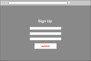
Yeah, I do actually. When I first started I had two main concepts that I was exploring. This is the grid layout for one of the ideas. I want to insist, however, that is the very first mockup that I did.
While it might not look that impressive, creating mockups like this — even if I discard them — is an essential part of the process I follow. I like to explore possible directions and get those ideas down, and then either use them, tweak them, or discard them.
I wanted to incorporate elements from the graphic design world, so one idea was to use the colour halftone effect that you see when you zoom in on a four-colour print job. The site is all about graphic design, which is why I wanted to draw inspiration from the traditional design world.
SitePoint: I definitely think you made the right choice. That’s a pretty radical colour scheme, too. What were your thinking at this stage?
I wanted to have really bright, fluoro colours on that mockup especially. But I didn’t like it — it doesn’t work here at all. In fact, I can’t remember why I chose those colours. They were probably just the first colours I thought of.
SitePoint: You knew beforehand that the logo for this site was going to be designed by the 99designs.com community. How did that shape your design?
It was the first time that I’d worked in that way — creating a visual identity, and then adding the logo afterwards. But the end result proves that it can work. It may not be ideal for every project, but it worked well in this case. The logo the team chose is quite flexible, so it could probably be used with a number of different styles.

SitePoint: How did you decide upon the colour scheme for the final design that was chosen?
I chose the orange to represent the creativity of the designers — orange is such a popular colour among designers. The purple is more representative of institutions — for the contest holders. These colours are two of the three colours that form a triad on the colour wheel (green is the third). They complement each other well, as one is warm and one is cool.
SitePoint: So the association with SitePoint didn’t influence your design decisions?
No, 99designs is a completely separate company, even though both of the brands use orange, and I guess there are similarities between the orange/blue and the orange/purple colour schemes. But the orange we used on 99designs.com is much redder — it’s quite red compared to the bright SitePoint orange.
Having said that, when the site launched last week and I read through the list of changes that had been made, I noticed that the orange had actually changed! The community feedback was that it was too bright! I think the exact wording was “A more muted shade of orange (for those of you that don’t wear sunglasses).” I still like the original orange better, but that’s okay.
SitePoint: I noticed a lot of the feedback that came in from the 99designs users related to the site’s features and the functionality. Was there much other feedback that influenced the design as well?
Yeah, there was quite a bit. It’s a bit weird, sometimes, watching your design get tweaked until you finally settle upon a compromise between your original vision and what the users want. But that’s often the case, and the 99designs guys are very much about listening to their users, so it’s important. The changes were all quite small anyway — the main layout and the general feel remained unchanged.
SitePoint: It’s quite a big move away from the original design, given that the site was originally part of SitePoint Contests.
Yeah, it is. We wanted to provide easy, friendly access to the information about what people can do on the site, especially for new visitors who need to understand very easily how to use the site.
Because 99designs.com is a new company, we wanted a new image, so this was certainly more of a “redesign” than a “realign.” But of course we also had to take into account the thousands of existing users who were going to need to change the way they interacted with the site once it was redesigned.
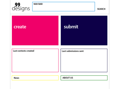
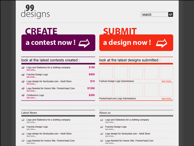
For the front page, the main aim was to provide a very clear entry point for the two kinds of people that come to the site: contest holders and designers. Before, the front page listed lots of options, but now you can only choose one of two options: launch a contest, or find a contest to compete in. And, as I mentioned, we now have a colour scheme that reflects those two options, and two nice big buttons for each type of visitor.

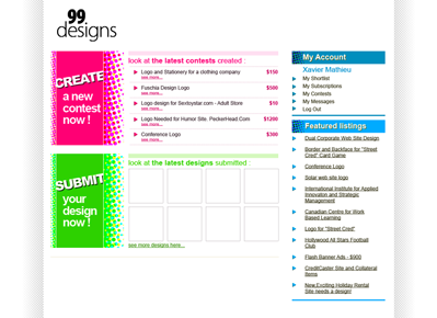
As you can see, under those buttons we chose to list popular contests and popular designs. The Popular Contests list is based on the number of entries a contest is receiving, and the amount of feedback that’s being provided by the contest holder. The Popular Designs list shows thumbnails of highly rated designs. I think it’s a very good way of showing that there’s a lot of activity on the site, and the result is very colourful too.
SitePoint: Even though the colour halftone effect didn’t make it into the final design, I see you still managed to include some elements from the print world in the design.
I really wanted to use some ideas and inspiration from traditional design. The icons use paper — the plane and the folder, for example — to reinforce the purpose of the site. And the layout uses lots of white, I guess like white paper, to really let the entries shine and give them a place, rather than having the entries compete with the site’s own colour scheme.

SitePoint: From exploring the site, it definitely feels less cluttered and cleaner than when it was part of SitePoint. But all of the functionality is still there, isn’t it?
That’s right — and more, actually. There are some new features for facilitating better discussion between the contest holder and the designer, and making it clear which entry is being discussed, which I quite like. It’s really useful in terms of the feedback that the designer gets.
SitePoint: My final question is about the nature of the site. Some professional designers are against the idea of design contests because they think of it as spec work. What are your thoughts on this?
It’s a good question, and it was actually a concern for me when I first started. When I first took a look through the site, I saw some designs that looked like clip art, or basically weren’t very good and were a bit amateurish. But as I browsed further and looked at more contests, I started to see that there were lots of high-quality designs being submitted as well.
My view is that if the prize is reasonable, then a site like 99designs.com is a great way to get people from all over the world working on projects and exchanging ideas. A lot of the discussion that happens is between designers who support and help each other. These designers are learning a lot from the feedback they get on their entries, and they’re building their portfolios and constantly improving.
What you’ll also find is that many of the more experienced freelancer designers end up getting ongoing work from the contests they win, so they’re using 99designs.com more for marketing purposes and lead generation than to simply win a prize. There are many designers in the community now who make their living from 99designs.com.
If it’s done properly, I think design contests are a good thing.
I do worry sometimes when I see contest holders offering a low prize for a logo, or not giving lots of feedback — it says to me that the client doesn’t understand the importance of building a visual identity. A logo is the foundation of a company, so to offer only $100 and expect that good designers will enter your contest is a bit misguided, I think.
That said, 99designs seems to be popular with lots of open source projects, not-for-profits and charities that don’t have big budgets for their branding. These are organisations that are never going to engage an expensive design studio to build their visual branding, so they represent quite a different market.
SitePoint: So you’re not worried about losing your job as a designer because of design contests, then?
Ha ha, no! I think there will always be a place for someone with excellent creative skills to work closely with clients. And many design projects simply aren’t suited to the design contest format. But I think that even for designers who work full-time, 99designs.com can be a fun way to practice your skills and discover new projects that are different from your day job, and if you happen to win, it’s a bonus!
SitePoint: Xavier, thanks for taking the time to talk to us.
No problem Matt, thank you!
Related links: 99designs.com
 Matthew Magain
Matthew Magain is a UX designer with over 15 years of experience creating exceptional digital experiences for companies such as IBM, Australia Post, and sitepoint.com. He is currently the Chief Doodler at Sketch Group, Co-founder of UX Mastery, and recently co-authored Everyday UX, an inspiring collection of interviews with some of the best UX Designers in the world. Matthew is also the creator of Charlie Weatherburn and the Flying Machine.