Startups are taking over the Internet. It’s like we have an idea for everything and a website to go with it. If you don’t believe me just spend 10 minutes on Product Hunt.
With all this competition around, how can you ensure that your startup’s website is a cut above the rest?
In this article, we’re going to delve into the three components of a killer startup website and what you can do to give yours’ the best chance of success.
Clear, intriguing messaging
This is the most important part of a startup website. About 90 percent of your time and effort should be spent on your messaging.*
*[footnote: Statistic totally made up and based on personal opinion]
As a designer myself a lot of entrepreneurs come to me, really excited, asking for these Apple-esque designs they’ve always dreamed of. Their thinking is that good design will naturally sell their product.
When it comes to writing the copy, it’s seen as an afterthought. Something to put into fill out the design.
It’s worth remembering that one of the main reasons Apple is so successful is because of its messaging.
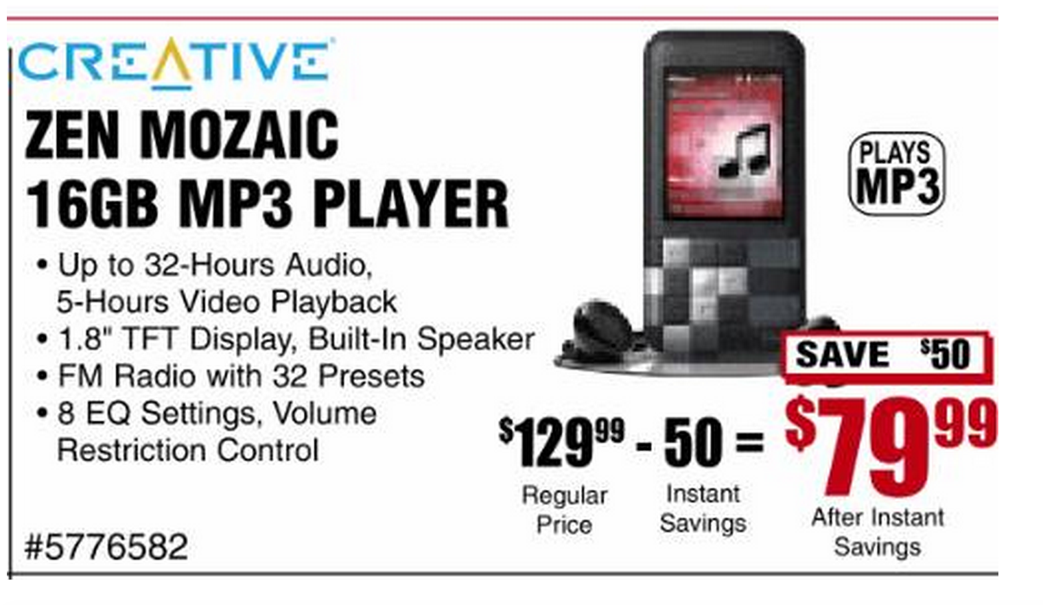
In ancient times, where all we saw is adverts like this:
Apple came up with this:
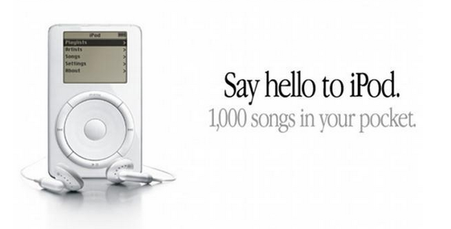
Of course Apple released the iPod way back in the Internet stone ages (circa 2001). Landing pages weren’t used to the extent they are today but the copy above would and did make a great headline for their core message.
What makes good messaging?
Good messaging should be clear and to the point.
But not necessarily obvious.
The best headlines are when you can find, what I like to call, the Cleverly-Obvious Sweet Spot. (Catchy, huh?)
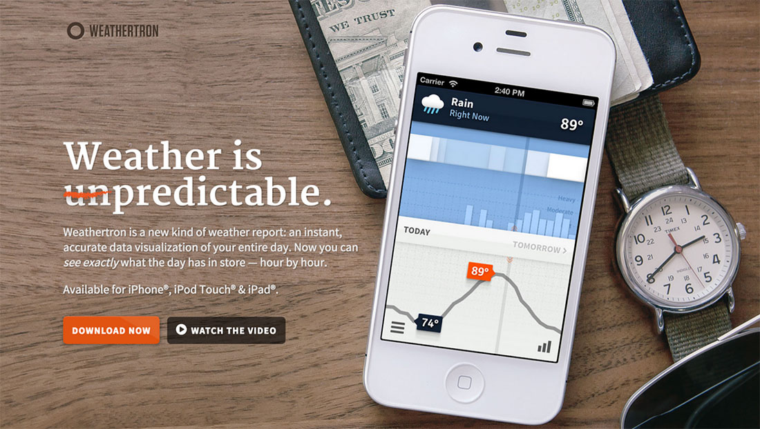
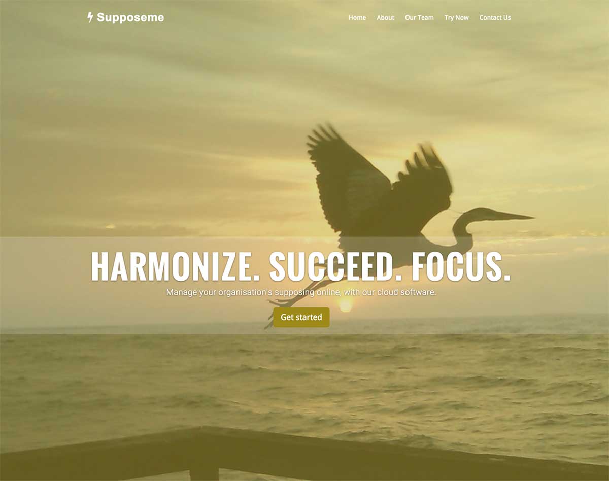
Weathertron’s headline gets across the idea of its app in a clever way, without compromising clarity.
This website uses generic words in a bid to “speak to everyone;” when, in fact, they are speaking to nobody.
Ok, confession time. The above screenshot isn’t an actual startup website. It’s taken from an amusing website that generates startup websites. I didn’t want to name and shame anybody here because that’s just not nice now, is it?
Let’s do another example. Take these three headlines, ranked in order of effectiveness:
We craft meaningful experiences. <— WTF does that mean?!
We make websites for startups. <— Ok, better. It says what you do and who you do it for but it’s not exactly clever or exciting.
We help startups raise their first 10k online in 3 months. <— Ooh I’m intrigued, and you’re definitely targeting me. Do tell me more!
Important note: Everybody wants something clever and catchy as their headline. But don’t force it. Chances are if you come up with something, you’ll be in the shower or hiking up a mountain (so make sure you have a pen—or a fantastic memory).
If you can’t come up with anything in the Cleverly-Obvious Sweet Spot just stick to obvious.
Good messaging doesn’t waste people’s time
You know your target audience. You’ve done the research so you know who they are, where they hang out online, what they buy and so on.
(You have done your research, right? If not, stop reading now and go learn about your customers.)
You know who your product is for. But do they know your product is for them?
The quicker you can communicate this, the better chance you have of funneling out all of the people you’re not targeting, leaving a pool ripe with those who are just itching to buy what you’re selling.
If I was your target audience you need to understand that I’m short on time. Help me to figure out if your product is for me or not.
And if it’s not, I’ll close the tab. But that’s ok, I was never going to be a customer anyway, I just realized it in five seconds rather than five minutes.
What’s the best way to know whether or not your headline is communicating your offering quickly enough? Test it.
You don’t have to do a ginormous test with all the bells and whistles.
Just show some neutral users, who are members of your target audience, your main, headline message and see how quickly they understand what you’re trying to tell (or sell) them.
Consider Video
When all the articles began popping up saying “Video is the future of the web,” I rolled my eyes.
I hate watching videos online.
In a tutorial, I do not have the time for a five-minute intro about what you’re going to teach me and the oh-so-darling thing that your kitty just did, I just want to know the keyboard shortcut for Duplicate Layer in Photoshop.
But when it comes to startup websites, I’ve changed my mind.
There are so many websites now claiming to have the next time-saving, money-making, get-rich-quick scheme, and I’m intrigued by all of them.
But like you, I’m busy. And a tad overloaded. I don’t want to spend my time ferrying my way through your website, trying to figure out what your product is and whether I want in.
That’s where a video comes in handy.
It doesn’t matter if it’s a simple screencast of you using your product and describing its benefits or a fancy pants video with Stephen Hawking doing the voiceover. Just let me click play, and watch your product in action. In other words, do the work for me (I’m kinda lazy).
Consider the design but know it’s not the be-all, end-all
As a designer I have to at least touch on the aesthetics of startup websites. Here are some tips that I’ve learned over the years that can really help boost both the visuals and user experience of your website.
Note: If you’re considering hiring somebody for your website I’d say you’d be better off investing your money into a kick-ass copywriter to get you off the ground and then approach a designer when you’ve had some interest (and some sales), and they can work with you to tweak it.
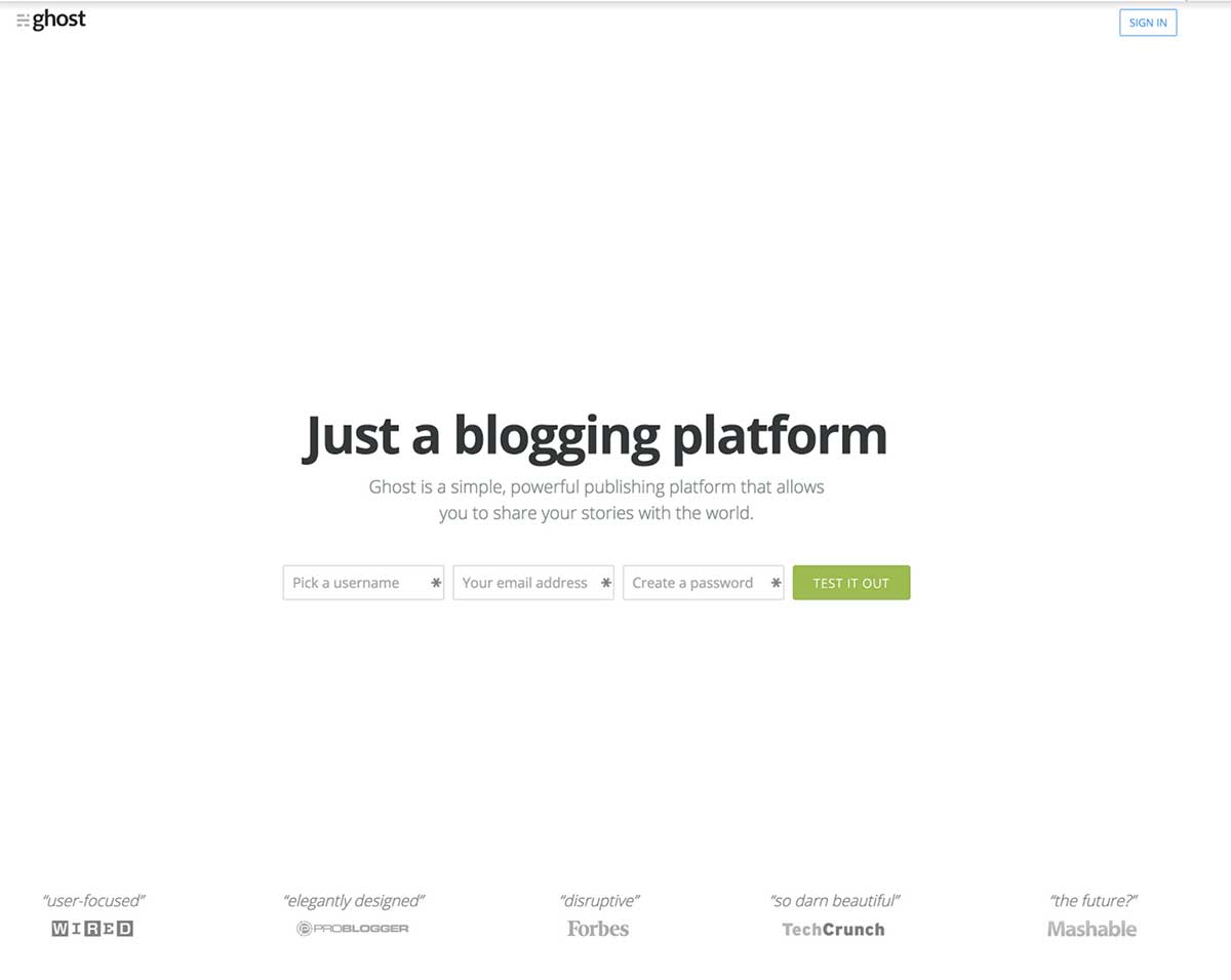
1. Under-design rather than over-design
If you struggle with design, or don’t have the budget to hire a professional designer, always remember it’s best to under-design than over-design. Nothing says class more than big, readable fonts on a white background. Really, it can be that simple, take Ghost for example:
2. Keep your navigation easily accessible and consider including a call-to-action (CTA) in it
Your navigation should be easily accessible, especially if you have long pages on your website. Whether it’s fixed at the top or pops back up when you begin scrolling is up to you. Just make sure people can access it when they need it. Bonus points if you include your CTA in there.
Here is a great email course outlining the fundamentals of great navigation.
3. Keep your colors simple and use a contrasting color for your main CTA (and nowhere else)
A lot of the principles for great landing pages also apply to startup websites. You need a primary CTA, but, unlike a landing page, you can also have CTAs that help the customer dive deeper into your product.
These secondary CTAs can be designed to fit the rest of your websites color schemes. With that being said though, your primary one (Start your free 30-day trial, Get in touch for a quote etc.) should be wrapped in a big, bold contrasting color because that is ultimately the driver behind getting the user to take the specific action you want them to.
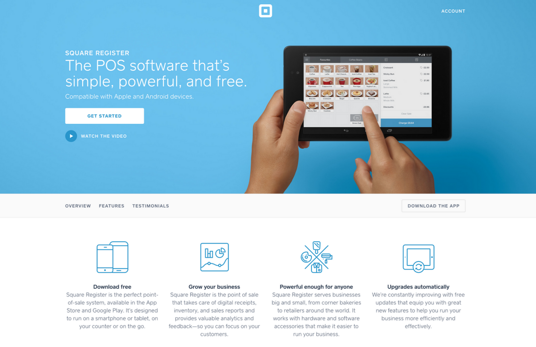
4. Steer clear of generic stock photos
Use images of your actual product. Many startup websites look the same. How many times have you seen this image (or similar) on a startup website?

A Mac on a desk doesn’t tell me much about your product. Show me your product! Square has a great example of this:
So who is doing it right?
Here are some startup websites that have either already converted me, or are seriously close.
Stripe
Stripe’s website is clear and targeted so you’re left without a doubt about what it offers and who it is for. Not only have they shown screenshots of what their product does, they’ve also sneaked in a bit of social proof by using examples of brands using their system.

Wake.io
Wake is a great example of minimal design done right. Everything on this page is useful. There is no fluff. Its navigation is simple with a clear CTA. And their video is pretty funny.
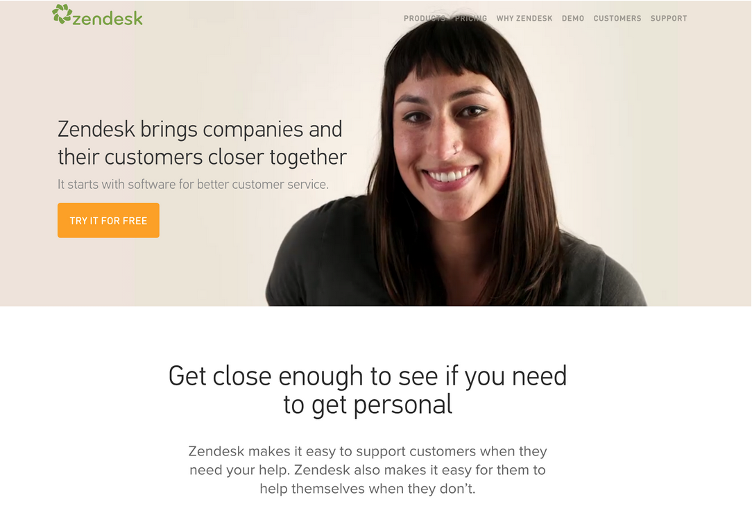
Zendesk
Zendesk’s entire website is meticulously thought through. There’s no long stretches of text that nobody is going to read. Every point is laid out in a clear and concise way. You’ll also notice the only time they use orange is when asking you to sign up.
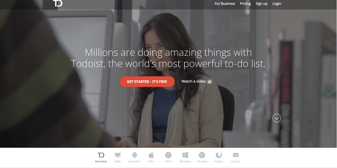
Todoist.com
A to-do list app is going to be particularly hard to sell as there are so many of them. Todoist’s headline instantly sets it as a cut above the rest. Including the supported browsers and devices is a great way to differentiate themselves from all the “iPhone only—Android coming soon” apps out there.
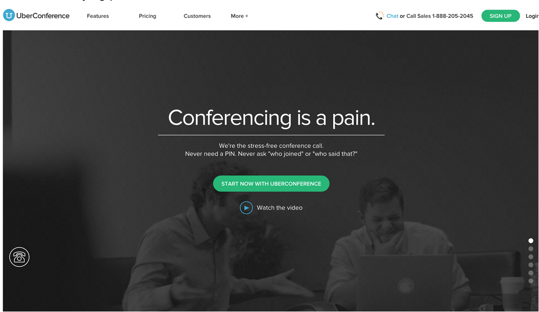
UberConference
UberConference instantly addresses multiple pain points for anybody having done an online conference call. This is a great way to get people intrigued by your product in the hope it can solve an annoying problem for them.
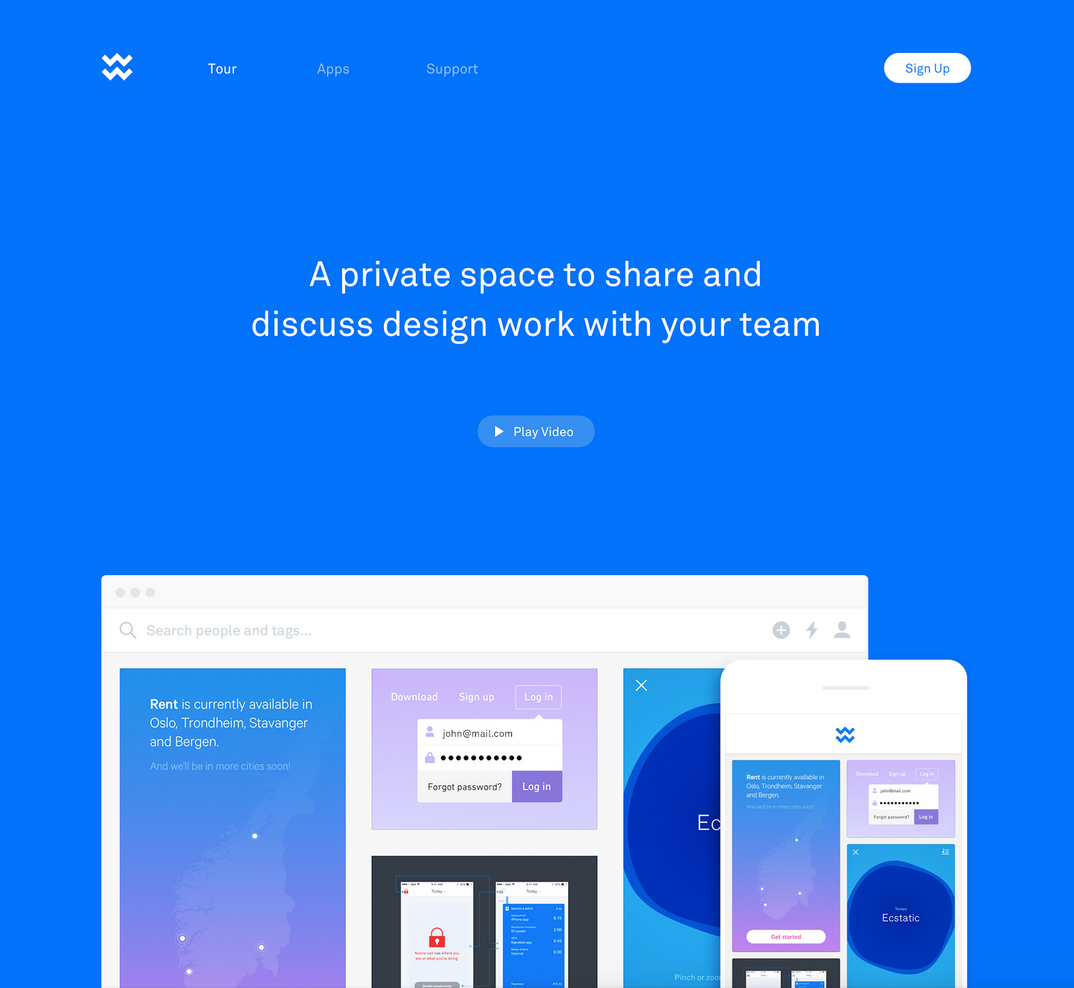
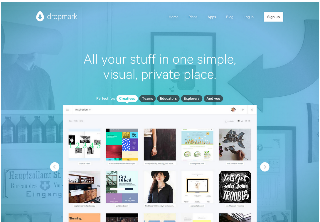
Dropmark
Dropmark’s website does a good job of targeting multiple audiences. By showing an example of how it can work with each group you eliminate the issue of creating for many and at the same time creating for none.
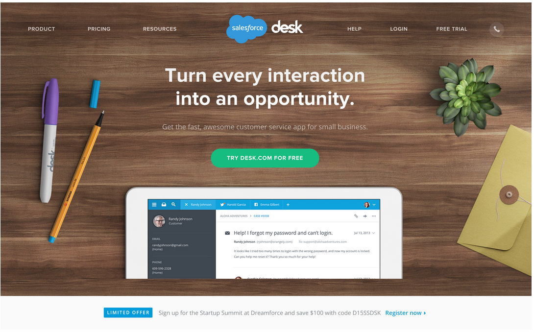
Salesforce Desk
Desk is another example of using a contrasting color for your main CTA. You’re left in no doubt as to where they want you to click. Note the text on the button says exactly what will happen when you click, rather than using the more generic “Get Started” or “Sign up now”.
Over to you: What do you think about the above tips? Do you have anything else to add. Let me know in the comments!
Frequently Asked Questions about Startup Websites
What are the key elements of a successful startup website?
A successful startup website should have a clear and concise value proposition, easy navigation, engaging content, and a strong call-to-action. It should also be mobile-friendly, have fast load times, and be optimized for search engines. Social proof, such as testimonials or case studies, can also enhance credibility. Lastly, it should reflect the brand’s personality and values, creating a memorable user experience.
How can I make my startup website stand out from the competition?
To make your startup website stand out, focus on creating a unique and engaging user experience. This can be achieved through innovative design, compelling content, and interactive elements. Also, ensure your website clearly communicates your unique selling proposition – what sets your startup apart from others in the market.
What should be the main focus of a startup website?
The main focus of a startup website should be to communicate the value of your product or service to your target audience. This includes explaining what your startup does, why it’s unique, and how it can solve your customers’ problems. It should also encourage visitors to take a specific action, such as signing up for a newsletter, requesting a demo, or making a purchase.
How important is the design of a startup website?
The design of a startup website is extremely important as it directly impacts user experience and perceptions of your brand. A well-designed website can enhance usability, increase engagement, and improve conversion rates. It should be visually appealing, easy to navigate, and consistent with your brand identity.
How can I optimize my startup website for search engines?
Search engine optimization (SEO) involves various strategies, including keyword research and optimization, creating high-quality content, improving website speed, and building backlinks. It’s also important to ensure your website is mobile-friendly, as this is a key ranking factor for search engines.
What role does content play in a startup website?
Content plays a crucial role in communicating your brand message, educating visitors about your product or service, and persuading them to take action. It also helps improve search engine rankings, driving more traffic to your website.
How can I measure the success of my startup website?
You can measure the success of your startup website using various metrics, such as traffic, bounce rate, conversion rate, and average time spent on the site. Tools like Google Analytics can provide valuable insights into user behavior and website performance.
How often should I update my startup website?
Regular updates are essential to keep your website relevant and engaging. This includes updating content, adding new features, improving design, and optimizing for SEO.
How can I improve the load time of my startup website?
Improving website load time can be achieved by optimizing images, enabling browser caching, reducing server response time, and minimizing HTTP requests.
What is the role of a call-to-action (CTA) in a startup website?
A call-to-action (CTA) is a prompt that encourages visitors to take a specific action. This could be signing up for a newsletter, downloading a whitepaper, or making a purchase. A well-crafted CTA can significantly improve conversion rates.
 Laura Elizabeth
Laura is a UI/UX designer who has a hankering for cross stitch and rockets. She also runs Design Academy which aims to help developers conquer their fear of design and feels most uncomfortable writing in the third person.