Create a Toggle Switch in React as a Reusable Component
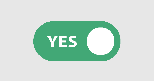
In this article, we’ll create an iOS-inspired toggle React component. This will be a small, self-contained component that you can reuse in future projects. As we go, we’ll also build a simple demo React app that uses our custom toggle switch component.
Although we could use third-party libraries for this, building the component from scratch allows us to better understand how our code works and allows us to customize our component completely.
The checkbox is traditionally used for collecting binary data, such as yes or no, true or false, enable or disable, on or off, etc. Although some modern interface designs avoid form fields when creating toggle switches, I’ll stick with them here due to their greater accessibility.
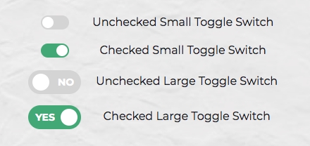
Here’s a screenshot of the component we’ll be building:
Key Takeaways
- Use Create React App to quickly set up a new React application and build a reusable iOS-inspired toggle switch component.
- Leverage SCSS for styling the toggle switch, ensuring it’s visually appealing and aligns with modern design standards.
- Implement the toggle switch as a controlled component in React, using props to manage its state and behavior dynamically.
- Enhance accessibility by making the toggle switch keyboard accessible and using appropriate ARIA attributes.
- Utilize PropTypes for type-checking within the component to ensure that the required data is passed and is of the correct type.
- Explore advanced theming and responsiveness by incorporating SCSS variables and media queries to adapt the toggle switch’s appearance on different devices.
Step 1 – Creating the React App
Let’s use Create React App to quickly get a toggle switch React component up and running. If you’re unfamiliar with Create React App, check out our getting started guide.
create-react-app toggleswitchOnce everything has been installed, change into the newly created directory and start the server with yarn start (or npm start if you prefer). This will start the development server at http://localhost:3000.
Next, create a ToggleSwitch directory in the src directory. This is where we will make our component:
mkdir src/ToggleSwitch
In this directory, make two files: ToggleSwitch.js and ToggleSwitch.scss:
touch ToggleSwitch.js ToggleSwitch.scssFinally, alter App.js as follows:
import React from 'react';
import ToggleSwitch from './ToggleSwitch/ToggleSwitch'

function App() {
  return (
    <ToggleSwitch />
  );
}

export default App;
Step 2 – The Markup
We can start by setting up a basic HTML checkbox input form element for our toggle React component with its necessary properties.
<input type="checkbox" name="name" id="id" />Then, add an enclosing <div> tag around it and a <label> tag right below the <input> tag to create a label saying, Toggle Me!
<div class="toggle-switch">
  <input type="checkbox" class="toggle-switch-checkbox" name="toggleSwitch" id="toggleSwitch" />
  <label class="toggle-switch-label" for="toggleSwitch">
    Toggle Me!
  </label>
</div>
Adding everything, you should get something like this:

We can also get rid of the label text and use the <label> tag itself to check or uncheck the checkbox input control. For that, add two <span> tags inside the <label> tag to construct the switch holder and the toggling switch:
<div class="toggle-switch">
  <input type="checkbox" class="toggle-switch-checkbox" name="toggleSwitch" id="toggleSwitch" />
  <label class="toggle-switch-label" for="toggleSwitch">
    <span class="toggle-switch-inner"></span>
    <span class="toggle-switch-switch"></span>
  </label>
</div>
Step 3 – Converting to a React Component
Now that we know what needs to go into the HTML, all we need to do is convert the HTML into a React component. Let’s start with a basic component here. We’ll make this a class component, and then we’ll convert it into hooks, as it’s easier for new developers to follow state than useState when building a React switch button.
Add the following to src/ToggleSwitch/ToggleSwitch.js file we created in the step 1.
import React, { Component } from "react";

class ToggleSwitch extends Component {
  render() {
    return (
      <div className="toggle-switch">
        <input
          type="checkbox"
          className="toggle-switch-checkbox"
          name="toggleSwitch"
          id="toggleSwitch"
        />
        <label className="toggle-switch-label" htmlFor="toggleSwitch">
          <span className="toggle-switch-inner" />
          <span className="toggle-switch-switch" />
        </label>
      </div>
    );
  }
}

export default ToggleSwitch;
At this point, it’s not possible to have multiple toggle switch sliders on the same view or page due to the repetition of ids. Although we could leverage React’s way of componentization here, we’ll be using props to dynamically populate the values:
import React, { Component } from 'react';

class ToggleSwitch extends Component {
  render() {
    return (
      <div className="toggle-switch">
        <input
          type="checkbox"
          className="toggle-switch-checkbox"
          name={this.props.Name}
          id={this.props.Name}
        />
        <label className="toggle-switch-label" htmlFor={this.props.Name}>
          <span className="toggle-switch-inner" />
          <span className="toggle-switch-switch" />
        </label>
      </div>
    );
  }
}

export default ToggleSwitch;
The this.props.Name will populate the values of id, name and for (note that it is htmlFor in React JS) dynamically, so that you can pass different values to the component and have multiple instances on the same page.
If you noticed, the <span> tag doesn’t have an ending </span> tag. Instead, it’s closed in the starting tag like <span />, which is completely fine in JSX.
You can test this component by updating the App.js with the below code.
function App() {
  return (
    <>
      <ToggleSwitch Name='newsletter' />
      <ToggleSwitch Name='daily' />
      <ToggleSwitch Name='weekly' />
      <ToggleSwitch Name='monthly' />
    </>
  );
}
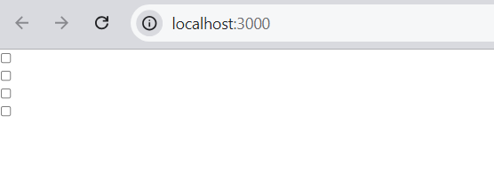
Inspect the output at http://localhost:3000/ (possibly using your browser’s dev tools) and ensure everything is working correctly.
Step 4 – Styling and SCSS
I recently wrote about styling React Components, where I compared the various ways this was possible. In that article, I concluded that SCSS is the best method, and that’s what we’ll use here.
For SCSS to work with Create React App, you’ll need to install the sass package.
Note: Previously, many developers used node-sass for this. But, node-sass library has now been deprecated and it is recommended to use sass or sass-embedded.
yarn add node-sassWe’ll also need to import the correct file into our component:
// ToggleSwitch.js

import React, { Component } from 'react';
import './ToggleSwitch.scss';
...
Now for the styling. This is a rough outline of what we’re after for the styling of our React switch button.
- By default, the switch is only 75px wide and vertically aligned in an inline-block so that it’s inline with the text and doesn’t cause layout problems.
- We’ll ensure the control is not selectable so that users can’t drag and drop it.
- We’ll be hiding the original checkbox input.
- Both the ::after and ::before pseudo-elements need to be styled and made into elements to get them into the DOM and style them.
- We’ll also add some CSS transitions for a cool animated effect.
And this is what that looks like in SCSS. Add the following to src/ToggleSwitch/ToggleSwitch.scss:
.toggle-switch {
  position: relative;
  width: 75px;
  display: inline-block;
  vertical-align: middle;
  -webkit-user-select: none;
  -moz-user-select: none;
  -ms-user-select: none;
  text-align: left;
  &-checkbox {
    display: none;
  }
  &-label {
    display: block;
    overflow: hidden;
    cursor: pointer;
    border: 0 solid #bbb;
    border-radius: 20px;
    margin: 0;
  }
  &-inner {
    display: block;
    width: 200%;
    margin-left: -100%;
    transition: margin 0.3s ease-in 0s;
    &:before,
    &:after {
      display: block;
      float: left;
      width: 50%;
      height: 34px;
      padding: 0;
      line-height: 34px;
      font-size: 14px;
      color: white;
      font-weight: bold;
      box-sizing: border-box;
    }
    &:before {
      content: "Yes";
      text-transform: uppercase;
      padding-left: 10px;
      background-color: #f90;
      color: #fff;
    }
  }
  &-disabled {
    background-color: #ddd;
    cursor: not-allowed;
    &:before {
      background-color: #ddd;
      cursor: not-allowed;
    }
  }
  &-inner:after {
    content: "No";
    text-transform: uppercase;
    padding-right: 10px;
    background-color: #bbb;
    color: #fff;
    text-align: right;
  }
  &-switch {
    display: block;
    width: 24px;
    margin: 5px;
    background: #fff;
    position: absolute;
    top: 0;
    bottom: 0;
    right: 40px;
    border: 0 solid #bbb;
    border-radius: 20px;
    transition: all 0.3s ease-in 0s;
  }
  &-checkbox:checked + &-label {
    .toggle-switch-inner {
      margin-left: 0;
    }
    .toggle-switch-switch {
      right: 0px;
    }
  }
}
Now, run the server again at http://localhost:3000/, and you’ll see four nicely styled toggle switches. Try toggling them; they should all work.

Also, take a while to go through the code above. If there’s anything you’re unsure about, you can consult the Sass documentation, or ask a question at the SitePoint Forums.
Dynamic Labels
Currently, the toggle options are hard coded:
.toggle-switch {
  ...
  &-inner {
    ...
    &:before {
      content: "Yes";
      ...
    }
  }
  ...
  &-inner:after {
    content: "No";
    ...
  }
  ...
}
To make the component more flexible, we can grab these dynamically from the control using HTML5 data-attributes:
&:before {
  content: attr(data-yes);
  ...
}
&-inner:after {
  content: attr(data-no);
  ...
}
We’ll hardcode the data attributes for testing but will make this more flexible in the final version:
// ToggleSwitch.js

class ToggleSwitch extends Component {
  render() {
    return (
      <div className="toggle-switch">
        ...
        <label className="toggle-switch-label" htmlFor={this.props.Name}>
          <span className="toggle-switch-inner" data-yes="Ja" data-no="Nein"/>
          <span className="toggle-switch-switch" />
        </label>
      </div>
    );
  }
}
If you run the application, you should see something like this:

Step 6 – Creating a Smaller Component Version
Also, using a smaller version of the switch component React without the text for smaller screens would be a great idea. So let’s add the styling for it with some minimal sizes and remove the text:
.toggle-switch {
  ...
  &.small-switch {
    width: 40px;
    .toggle-switch-inner {
      &:after,
      &:before {
        content: "";
        height: 20px;
        line-height: 20px;
      }
    }
    .toggle-switch-switch {
      width: 16px;
      right: 20px;
      margin: 2px;
    }
  }
}
With respect to responsiveness, we should be changing the complete size, so let’s use the CSS scale function. Here we’ve covered all the Bootstrap-based responsive widths of devices.
.toggle-switch {
  ...
  @media screen and (max-width: 991px) {
    transform: scale(0.9);
  }
  @media screen and (max-width: 767px) {
    transform: scale(0.825);
  }
  @media screen and (max-width: 575px) {
    transform: scale(0.75);
  }
}
You can test these changes out by adding the small-switch class to the parent <div> element in ToggleSwitch.js:
class ToggleSwitch extends Component {
  render() {
    return (
      <div className="toggle-switch small-switch">
        ...
      </div>
    );
  }
}
Head back to the dev server and test your changes. If you’d like to check what you have against the finished SCSS file, you can find that here.
Step 6 – Theming in SCSS
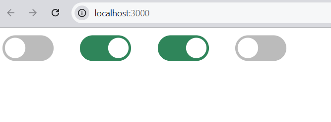
Since we can use variables in SCSS, it is easier to add support for multiple color themes. You can read more about this in “Sass Theming: The Never Ending Story”. We’ll use some color themes here and change all the raw colors to variables. The first three lines are a configurable set of colors, which helps us theme our little control:
// Colors
$label-colour: #bbb;
$disabled-colour: #ddd;
$toggle-colour: #2F855A;
$white: #fff;

// Styles
.toggle-switch {
  ...
  &-label {
    ...
    border: 0 solid $label-colour;
  }
  &-inner {
    ...
    &:before {
      ...
      background-color: $toggle-colour;
      color: $white;
    }
  }
  &-disabled {
    background-color: $disabled-colour;
    cursor: not-allowed;
    &:before {
      background-color: $disabled-colour;
      cursor: not-allowed;
    }
  }
  &-inner:after {
    ...
    background-color: $label-colour;
    color: $white;
  }
  &-switch {
    ...
    background: $white;
    border: 0 solid $label-colour;
  }
  ...
}
And that’s it with the styling. Now let’s add some interactivity.
Step 7 – Interactions and JavaScript
Please note that the following section only contains demo code to explain the concepts. You should not be updating your actual ToggleSwitch component in this section.
Our basic component will be a dumb component (or presentation component) whose state will be controlled by a parent component or container, such as a form. What do we mean by controlled? Well, let’s look at an uncontrolled version first:
import React from 'react';

const ToggleSwitch = () => (
  <div>
    <input
      type="checkbox"
      className="toggle-switch-checkbox"
    />
  </div>
);

export default ToggleSwitch;
When users interact with the above checkbox input, it will toggle between a checked and unchecked state of its own accord without us having to write any JavaScript. HTML input elements can manage their own internal state by updating the DOM directly.
However, in React, it’s recommended we use controlled components, as shown in the following example:
import React from 'react';

const ToggleSwitch = ({checked}) => (
  <div>
    <input
      type="checkbox"
      className="toggle-switch-checkbox"
      checked={checked}
    />
  </div>
);

export default ToggleSwitch;
Here, React is controlling the state of the checkbox input. All interactions with this input have to go through the virtual DOM. If you try to interact with the component as it is, nothing will happen, as we haven’t defined any JavaScript code that can change the value of the checked prop we’re passing in.
To fix this, we can pass in an onChange prop — a function to be called whenever the checkbox is clicked:
import React from 'react';

const ToggleSwitch = ({checked, onChange}) => (
  <div>
    <input
      type="checkbox"
      className="toggle-switch-checkbox"
      checked={checked}
      onChange={e => onChange(e.target.checked)}
    />
  </div>
);

export default ToggleSwitch;
Now, the checkbox input is interactive. Users can toggle the component “on” and “off” just like before. The only difference here is that the state is controlled by React, as opposed to the earlier uncontrolled version. This allows us to easily access the state of our component at any given time via JavaScript. We can also easily define the initial value when declaring the component.
Now, let’s look at how we can use this in the ToggleSwitch component. Below is a simplified class-based example:
import React, { Component } from 'react';

class Form extends Component {
  state = { checked : false }

  onChange = newValue => {
    this.setState({ checked: newValue });
  }

  render() {
    return (
      <ToggleSwitch id="toggleSwitch" checked={this.checked} onChange={this.onChange} />
    );
  }
}

export default Form;
Now let’s convert the class-based component into a functional component using hooks:
import React, { useState } from 'react';

export default function Form() {
  let [checked, setChecked] = useState(false);

  return (
    <ToggleSwitch id="toggleSwitch" checked={checked} onChange={setChecked} />
  )
}
As you can see, we drastically reduced the number of lines using functional components and the hooks creation method.
If React Hooks are new to you, “React Hooks: How to Get Started & Build Your Own”.
Step 8 – Finalizing the ToggleSwitch Component
Now, let’s get back to our ToggleSwitch component. We’ll need the following props:
- id (required): This is the ID that will be passed to the checkbox input control. Without it, the component won’t render.
- checked (required): This will hold the current state, which will be a boolean value.
- onChange (required): This function will be called when the input’s onChange event handler is triggered.
- name (optional): This will be the label text of the checkbox input, but we will generally not use it.
- small (optional): This boolean value renders the Toggle Switch in a small mode without rendering the text.
- optionLabels (optional): If you aren’t using the small version of the control, you might need to pass this to the Toggle Switch as an array of two values, which signify the text for True and False. An example would be Text={[“Yes”, “No”]}.
- disabled (optional): This will be directly passed to the <input type=”checkbox” />.
When the small version is not used, the following optionLabels text will be used as default:
// Set optionLabels for rendering.
ToggleSwitch.defaultProps = {
  optionLabels: ["Yes", "No"],
};
Since most of the props have to be set by the user, and we can’t use arbitrary values, it’s always better to stop rendering if the required props aren’t passed in. This can be done using a simple JavaScript if statement or a ternary operator using ? : or a short-circuited &&:
{this.props.id ? (
  <!-- display the control -->
) : null}
As our app grows, we can catch many bugs by type-checking. React has some built-in type-checking abilities. To run type checking on the props for a component, you can assign the special propTypes property. We can enforce the above list of props using React’s PropType library, a separate library that exports a range of validators that can be used to ensure the data you receive is valid.
You can install it like so:
yarn add prop-types
Then, import the PropTypes library using:
// ToggleSwitch.js
import PropTypes from "prop-types";
We’ll define the PropTypes in the following way:
ToggleSwitch.propTypes = {
  id: PropTypes.string.isRequired,
  checked: PropTypes.bool.isRequired,
  onChange: PropTypes.func.isRequired,
  name: PropTypes.string,
  optionLabels: PropTypes.array,
  small: PropTypes.bool,
  disabled: PropTypes.bool
};
By way of explanation:
- PropTypes.string.isRequired: This is a string value, and it’s required and mandatory.
- PropTypes.string: This is a string value, but it isn’t mandatory.
- PropTypes.func: This prop takes in a function as a value, but it isn’t mandatory.
- PropTypes.bool: This is a boolean value, but it isn’t mandatory.
- PropTypes.array: This is an array value, but it isn’t mandatory.
Now, we can carry on with the ToggleSwitch component. Replace the contents of src/ToggleSwitch/ToggleSwitch.js with the following:
import React from "react";
import PropTypes from "prop-types";
import './ToggleSwitch.scss';

/*
Toggle Switch Component
Note: id, checked and onChange are required for ToggleSwitch component to function.
The props name, small, disabled and optionLabels are optional.
Usage: <ToggleSwitch id="id" checked={value} onChange={checked => setValue(checked)}} />
*/

const ToggleSwitch = ({ id, name, checked, onChange, optionLabels, small, disabled }) => {

  return (
    <div className={"toggle-switch" + (small ? " small-switch" : "")}>
      <input
        type="checkbox"
        name={name}
        className="toggle-switch-checkbox"
        id={id}
        checked={checked}
        onChange={e => onChange(e.target.checked)}
        disabled={disabled}
        />
        {id ? (
          <label className="toggle-switch-label" htmlFor={id}>
            <span
              className={
                disabled
                  ? "toggle-switch-inner toggle-switch-disabled"
                  : "toggle-switch-inner"
              }
              data-yes={optionLabels[0]}
              data-no={optionLabels[1]}
            />
            <span
              className={
              disabled
                ? "toggle-switch-switch toggle-switch-disabled"
                : "toggle-switch-switch"
              }
            />
          </label>
        ) : null}
      </div>
    );
}

// Set optionLabels for rendering.
ToggleSwitch.defaultProps = {
  optionLabels: ["Yes", "No"],
};

ToggleSwitch.propTypes = {
  id: PropTypes.string.isRequired,
  checked: PropTypes.bool.isRequired,
  onChange: PropTypes.func.isRequired,
  name: PropTypes.string,
  optionLabels: PropTypes.array,
  small: PropTypes.bool,
  disabled: PropTypes.bool
};

export default ToggleSwitch;
Finally, to test the component, update the App.js with the below code:
import React, { useState } from 'react';
import ToggleSwitch from './ToggleSwitch/ToggleSwitch'

function App() {
  let [newsletter, setNewsletter] = useState(false);

  const onNewsletterChange = (checked) => {
    setNewsletter(checked);
  }

  return (
    <>
      <ToggleSwitch id="newsletter" checked={ newsletter } onChange={ onNewsletterChange } />
      <label htmlFor="newsletter">Subscribe to our Newsletter</label>
    </>
  );
}

export default App;
Now, when you head to http://localhost:3000/, you should see the working toggle.

Step 9 – Making the Component Keyboard Accessible
The final step is to make our component keyboard accessible. To do this, first, alter the label like below:
// ToggleSwitch.js

<label className="toggle-switch-label"
       htmlFor={id}
       tabIndex={ disabled ? -1 : 1 }
       onKeyDown={ e => handleKeyPress(e) }>
  ...
</label>
As you can see, we’ve added a tabIndex property, which we’re setting to 1 (focusable) or -1 (not focusable), depending on whether the component is currently disabled.
We’ve also declared a handleKeyPress function to deal with it receiving keyboard input:
function handleKeyPress(e){
  if (e.keyCode !== 32) return;

  e.preventDefault();
  onChange(!checked)
}
This checks if the key pressed is the space bar. If so, it prevents the browser’s default action (scroll the page in this case) and toggles the component’s state.
And that’s essentially all you need. The component is now keyboard accessible.
However, there’s a slight problem. If you click the ToggleSwitch component, you will get an outline of the entire component, which is probably not desired. To combat this, we can alter things slightly to make sure it receives an outline when it’s focused on the keyboard, but not when it’s clicked:
// ToggleSwitch.js
<span
  className={
    disabled
      ? "toggle-switch-inner toggle-switch-disabled"
      : "toggle-switch-inner"
  }
  data-yes={optionLabels[0]}
  data-no={optionLabels[1]}
  tabIndex={-1}
/>
<span
  className={
  disabled
    ? "toggle-switch-switch toggle-switch-disabled"
    : "toggle-switch-switch"
  }
  tabIndex={-1}
/>
Here, we’ve added a tabIndex property to both inner <span> elements to ensure they can’t receive focus.
Then, update the ToggleSwitch.scss file with the below code to apply a style to the ToggleSwitch’s inner <span> element when it’s focused on the keyboard but not when it’s clicked.
$focus-color: #ff0;

.toggle-switch {
  ...
  &-label {
    ...
    &:focus {
      outline: none;
      > span {
        box-shadow: 0 0 2px 5px $focus-color;
      }
    }
    > span:focus {
      outline: none;
    }
  }
  ...
}
You can read more about this technique here. It’s slightly hacky and should be dropped in favor of using :focus-visible, as soon as that gains wide enough browser support.
When you run the application, you should be able to toggle the component using the space bar.

A More Complete Example
To finish off, I’d like to demonstrate a more complete example of using the ToggleSwitch component in the following CodeSandbox.
This demo uses multiple ToggleSwitch components on the same page. The state of the last three toggles depends on the state of the first. That is, you need to accept marketing emails before you can refine your choice of which ones to receive.
Summary
In this article, I’ve shown how to create a reusable, iOS-inspired React toggle component using React. We looked at styling the component with SCSS, making it a controlled component, customizing it by passing it props, and making it keyboard accessible.
You can find the complete code for the React toggle component on our GitHub repo.
FAQs on How to Create a Toggle Switch in React as a Reusable Component
How Can I Customize the Appearance of My React Toggle Switch?
Customizing the appearance of your React toggle switch is quite straightforward. You can modify the CSS properties to suit your design needs. For instance, you can change the switch’s background color, border color, size, and shape. You can also add animations or transitions for a more interactive user experience. Remember to keep your changes consistent with your overall application design for a seamless user experience.
Can I Use the Switch Button React Component with Functional Components?
Yes, you can use the React toggle switch with functional components. The process is similar to using it with class components. You just need to import and use the switch component in your functional component. You can also use hooks like useState to manage the state of the switch.
How Can I Make My Switch Button React Component Accessible?
Accessibility is a crucial aspect of web development. To make your React toggle switch accessible, you can use ARIA (Accessible Rich Internet Applications) attributes. For instance, you can use the “aria-checked” attribute to indicate the state of the switch. You can also add keyboard support to allow users to toggle the switch using the keyboard.
How Can I Test My React Switch Component?
Testing is an essential part of the development process. You can use testing libraries like Jest and React Testing Library to test your react switch component. You can write tests to check if the switch toggles and renders correctly when clicked and handles props correctly.
Can I Use the React Toggle Switch with Redux?
Yes, you can use the React toggle switch with Redux. You can manage the state of the switch using Redux actions and reducers. This can be particularly useful if the state of the switch needs to be shared across multiple components or if it affects the global state of your application.
How Can I Add a Label to My React Toggle Switch?
Adding a label to your React toggle switch can improve its usability. You can add a label by wrapping the react switch component in a “label” element. You can also use the “htmlFor” attribute to associate the label with the switch.
How Can I Handle Errors in My React Toggle Switch Component?
Error handling is an important part of any component. In your React toggle switch component, you can use try-catch blocks to handle errors. You can also use error boundaries, a React feature that catches and handles errors in components.
Can I Use the React Toggle Switch in a Form?
Yes, you can use the React toggle switch in a form. You can handle the state of the switch in the form’s state. You can also handle the form submission and use the state of the switch to perform certain actions.
How Can I Animate My React Toggle Switch?
Animating your React toggle switch can enhance the user experience. You can use CSS transitions or animations to animate the switch, or you can use libraries like React Spring for more complex animations.
Can I Use the React Toggle Switch with TypeScript?
Yes, you can use the React toggle switch with TypeScript. You just need to define the props’ types and the switch’s state. This can help you catch errors during development and make your code more robust and maintainable.
How Can I Optimize the Performance of Switch Toggles?
You can optimize the performance of your React toggle switch by using React’s memo function to prevent unnecessary re-renders.
How Can I Handle State Management for Multiple Toggle Switches in a Single Form?
You can manage the state of multiple toggle switches in a single form by using an object to store each switch’s state. This allows you to easily update and access the state of each switch, making your form handling more efficient.
Praveen is a software and web developer, cloud computing consultant, full-stack developer, UX architect, a CEO, and even … a cook. You can find him at praveen.science.
I write clean, readable and modular code. I love learning new technologies that bring efficiencies and increased productivity to my workflow.


