Part I: Getting Started
- Chapter 1: What Is Machine Learning?
- Chapter 2: Introduction to R and RStudio
- Chapter 3: Managing Data
Chapter 1: What Is Machine Learning?
Welcome to the world of machine learning! You're about to embark upon an exciting adventure discovering how data scientists use algorithms to uncover knowledge hidden within the troves of data that businesses, organizations, and individuals generate every day.
If you're like us, you often find yourself in situations where you are facing a mountain of data that you're certain contains important insights, but you just don't know how to extract that needle of knowledge from the proverbial haystack. That's where machine learning can help. This book is dedicated to providing you with the knowledge and skills you need to harness the power of machine learning algorithms. You'll learn about the different types of problems that are well-suited for machine learning solutions and the different categories of machine learning techniques that are most appropriate for tackling different types of problems.
Most importantly, we're going to approach this complex, technical field with a practical mind-set. In this book, our purpose is not to dwell on the intricate mathematical details of these algorithms. Instead, we'll focus on how you can put those algorithms to work for you immediately. We'll also introduce you to the R programming language, which we believe is particularly well-suited to approaching machine learning problems from a practical standpoint. But don't worry about programming or R for now. We'll get to that in Chapter 2. For now, let's dive in and get a better understanding of how machine learning works.
By the end of this chapter, you will have learned the following:
- How machine learning allows the discovery of knowledge in data
- How unsupervised learning, supervised learning, and reinforcement learning techniques differ from each other
- How classification and regression problems differ from each other
- How to measure the effectiveness of machine learning algorithms
- How cross-validation improves the accuracy of machine learning models
DISCOVERING KNOWLEDGE IN DATA
Our goal in the world of machine learning is to use algorithms to discover knowledge in our datasets that we can then apply to help us make informed decisions about the future. That's true regardless of the specific subject-matter expertise where we're working, as machine learning has applications across a wide variety of fields. For example, here are some cases where machine learning commonly adds value:
- Segmenting customers and determining the marketing messages that will appeal to different customer groups
- Discovering anomalies in system and application logs that may be indicative of a cybersecurity incident
- Forecasting product sales based on market and environmental conditions
- Recommending the next movie that a customer might want to watch based on their past activity and the preferences of similar customers
- Setting prices for hotel rooms far in advance based on forecasted demand
Of course, those are just a few examples. Machine learning can bring value to almost every field where discovering previously unknown knowledge is useful—and we challenge you to think of a field where knowledge doesn't offer an advantage!
Introducing Algorithms
As we proceed throughout this book, you'll see us continually referring to machine learning techniques as algorithms. This is a term from the world of computer science that comes up again and again in the world of data science, so it's important that you understand it. While the term sounds technically complex, the concept of an algorithm is actually straightforward, and we'd venture to guess that you use some form of an algorithm almost every day.
An algorithm is, quite simply, a set of steps that you follow when carrying out a process. Most commonly, we use the term when we're referring to the steps that a computer follows when it is carrying out a computational task, but we can think of many things that we do each day as algorithms. For example, when we are walking the streets of a large city and we reach an intersection, we follow an algorithm for crossing the street. Figure 1.1 shows an example of how this process might work.
Of course, in the world of computer science, our algorithms are more complex and are implemented by writing software, but we can think of them in this same way. An algorithm is simply a series of precise observations, decisions, and instructions that tell the computer how to carry out an action. We design machine learning algorithms to discover knowledge in our data. As we progress through this book, you'll learn about many different types of machine learning algorithms and how they work to achieve this goal in very different ways.
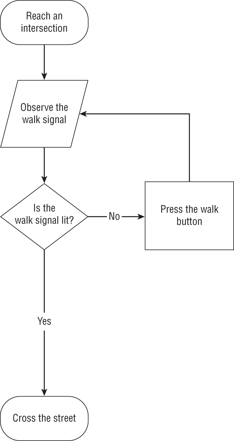
Figure 1.1 Algorithm for crossing the street
Artificial Intelligence, Machine Learning, and Deep Learning
We hear the terms artificial intelligence, machine learning, and deep learning being used almost interchangeably to describe any sort of technique where computers are working with data. Now that you're entering the world of data science, it's important to have a more precise understanding of these terms.
- Artificial intelligence (AI) includes any type of technique where we are attempting to get a computer system to imitate human behavior. As the name implies, we are trying to ask computer systems to artificially behave as if they were intelligent. Now, of course, it's not possible for a modern computer to function at the level of complex reasoning found in the human mind, but we can try to mimic some small portions of human behavior and judgment.
- Machine learning (ML) is a subset of artificial intelligence techniques that attempt to apply statistics to data problems in an effort to discover new knowledge by generalizing from examples. Or, in other terms, machine learning techniques are artificial intelligence techniques designed to learn.
- Deep learning is a further subdivision of machine learning that uses a set of complex techniques, known as neural networks, to discover knowledge in a particular way. It is a highly specialized subfield of machine learning that is most commonly used for image, video, and sound analysis.
Figure 1.2 shows the relationships between these fields. In this book, we focus on machine learning techniques. Specifically, we focus on the categories of machine learning that do not fit the definition of deep learning.
MACHINE LEARNING TECHNIQUES
The machine learning techniques that we discuss in this book fit into two major categories. Supervised learning algorithms learn patterns based on labeled examples of past data. Unsupervised learning algorithms seek to uncover patterns without the assistance of labeled data. Let's take a look at each of these techniques in more detail.
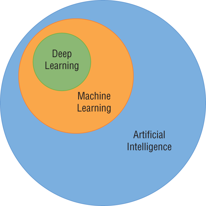
Figure 1.2 The relationship between artificial intelligence, machine learning, and deep learning
Supervised Learning
Supervised learning techniques are perhaps the most commonly used category of machine learning algorithms. The purpose of these techniques is to use an existing dataset to generate a model that then helps us make predictions about future, unlabeled data. More formally, we provide a supervised machine learning algorithm with a training dataset as input. The algorithm then uses that training data to develop a model as its output, as shown in Figure 1.3.
You can think of the model produced by a supervised machine learning algorithm as sort of a crystal ball—once we have it, we can use it to make predictions about our data. Figure 1.4 shows how this model functions. Once we have it, we can take any new data element that we encounter and use the model to make a prediction about that new element based on the knowledge it obtained from the training dataset.
The reason that we use the term supervised to describe these techniques is that we are using a training dataset to supervise the creation of our model. That training dataset contains labels that help us with our prediction task.
Let's reinforce that with a more concrete example. Consider a loan officer working at the car dealership shown in Figure 1.5. The salespeople at the dealership work with individual customers to sell them cars. The customers often don't have the necessary cash on hand to purchase a car outright, so they seek financing options. Our job is to match customers with the right loan product from three choices.
- Subprime loans have the most expensive interest rates and are offered to customers who are likely to miss payment deadlines or default on their loans.
- Top-shelf loans have the lowest interest rate and are offered to customers who are unlikely to miss payments and have an extremely high likelihood of repayment.
- Standard loans are offered to customers who fall in the middle of these two groups and have an interest rate that falls in between those two values.

Figure 1.3 Generic supervised learning model

Figure 1.4 Making predictions with a supervised learning model
We receive loan applications from salespeople and must make a decision on the spot. If we don't act quickly, the customer may leave the store, and the business will be lost to another dealership. If we offer a customer a higher risk loan than they would normally qualify for, we might lose their business to another dealership offering a lower interest rate. On the other hand, if we offer a customer a lower interest rate than they deserve, we might not profit on the transaction after they later default.
Our current method of doing business is to review the customer's credit report and make decisions about loan categories based on our years of experience in the role. We've “seen it all” and can rely upon our “gut instinct” to make these important business decisions. However, as budding data scientists, we now realize that there might be a better way to solve this problem using machine learning.
Our car dealership can use supervised machine learning to assist with this task. First, they need a training dataset containing information about their past customers and their loan repayment behavior. The more data they can include in the training dataset, the better. If they have several years of data, that would help develop a high-quality model.
The dataset might contain a variety of information about each customer, such as the customer's approximate age, credit score, home ownership status, and vehicle type. Each of these data points is known as a feature about the customer, and they will become the inputs to the machine learning model created by the algorithm. The dataset also needs to contain labels for each one of the customers in the training dataset. These labels are the values that we'd like to predict using our model. In this case, we have two labels: default and repaid. We label each customer in our training dataset with the appropriate label for their loan status. If they repaid their loan in full, they are given the “repaid” label, while those who failed to repay their loans are given the “default” label.

Figure 1.5 Using machine learning to classify car dealership customers
A small segment of the resulting dataset appears in Figure 1.6. Notice two things about this dataset. First, each row in the dataset corresponds to a single customer, and those customers are all past customers who have completed their loan terms. We know the outcomes of the loans made to each of these customers, providing us with the labels we need to train a supervised learning model. Second, each of the features included in the model are characteristics that are available to the loan officer at the time they are making a loan decision. That's crucial to creating a model that is effective for our given problem. If the model included a feature that specified whether a customer lost his or her job during the loan term, that would likely provide us with accurate results, but the loan officer would not be able to actually use that model because they would have no way of determining this feature for a customer at the time of a loan decision. How would they know if the customer is going to lose their job over the term of the loan that hasn't started yet?
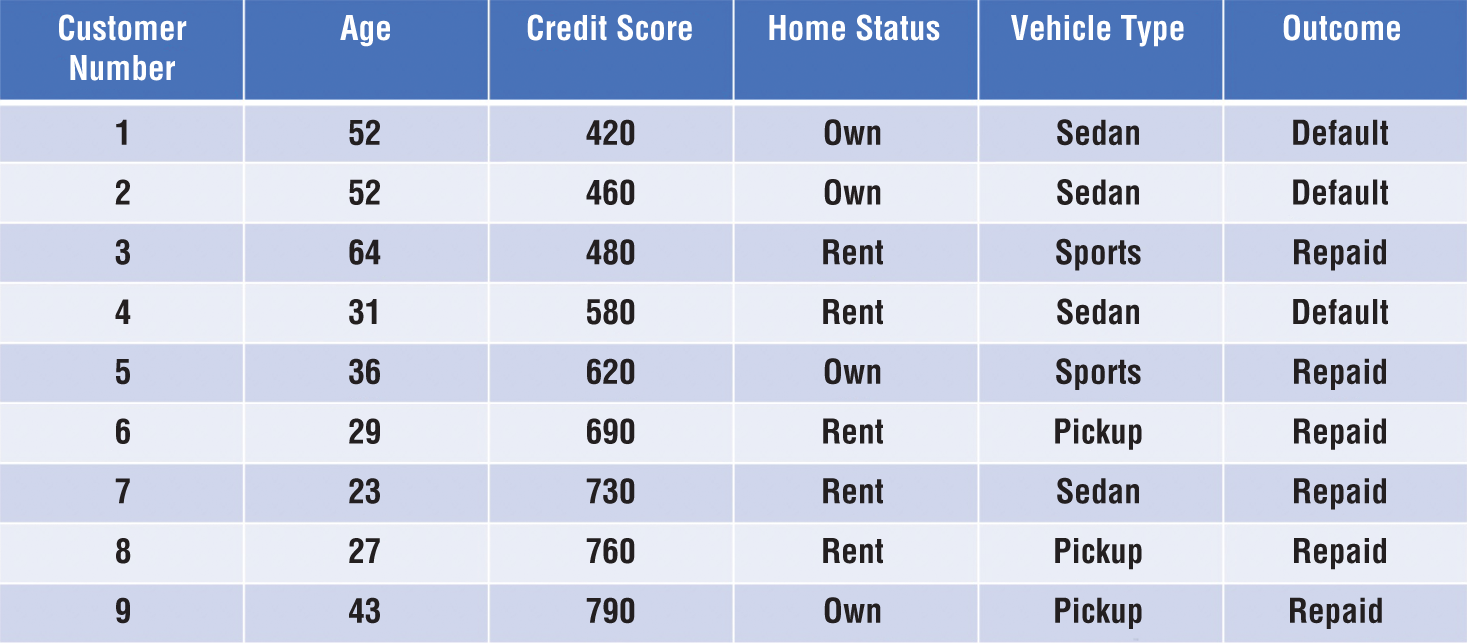
Figure 1.6 Dataset of past customer loan repayment behavior
If we use a machine learning algorithm to generate a model based on this data, it might pick up on a few characteristics of the dataset that may also be apparent to you upon casual inspection. First, most people with a credit score under 600 who have financed a car through us in the past defaulted on that loan. If we use that characteristic alone to make decisions, we'd likely be in good shape. However, if we look at the data carefully, we might realize that we could realize an even better fit by saying that anyone who has a credit score under 600 and purchased a sedan is likely to default. That type of knowledge, when generated by an algorithm, is a machine learning model!
The loan officer could then deploy this machine learning model by simply following these rules to make a prediction each time someone applies for a loan. If the next customer through the door has a credit score of 780 and is purchasing a sports car, as shown in Figure 1.7, they should be given a top-shelf loan because it is quite unlikely that they will default. If the customer has a credit score of 410 and is purchasing a sedan, we'd definitely want to slot them into a subprime loan. Customers who fall somewhere in between these extremes would be suited for a standard loan.
Now, this was a simplistic example. All of the customers in our example fit neatly into the categories we described. This won't happen in the real world, of course. Our machine learning algorithms will have imperfect data that doesn't have neat, clean divisions between groups. We'll have datasets with many more observations, and our algorithms will inevitably make mistakes. Perhaps the next high credit-scoring young person to walk into the dealership purchasing a sports car later loses their job and defaults on the loan. Our algorithm would make an incorrect prediction. We talk more about the types of errors made by algorithms later in this chapter.

Figure 1.7 Applying the machine learning model
Unsupervised Learning
Unsupervised learning techniques work quite differently. While supervised techniques train on labeled data, unsupervised techniques develop models based on unlabeled training datasets. This changes the nature of the datasets that they are able to tackle and the models that they produce. Instead of providing a method for assigning labels to input based on historical data, unsupervised techniques allow us to discover hidden patterns in our data.
One way to think of the difference between supervised and unsupervised algorithms is that supervised algorithms help us assign known labels to new observations while unsupervised algorithms help us discover new labels, or groupings, of the observations in our dataset.
For example, let's return to our car dealership and imagine that we're now working with our dataset of customers and want to develop a marketing campaign for our service department. We suspect that the customers in our database are similar to each other in ways that aren't as obvious as the types of cars that they buy and we'd like to discover what some of those groupings might be and use them to develop different marketing messages.
Unsupervised learning algorithms are well-suited to this type of open-ended discovery task. The car dealership problem that we described is more generally known as the market segmentation problem, and there is a wealth of unsupervised learning techniques designed to help with this type of analysis. We talk about how organizations use unsupervised clustering algorithms to perform market segmentation in Chapter 12.
Let's think of another example. Imagine that we manage a grocery store and are trying to figure out the optimal placement of products on the shelves. We know that customers often run into our store seeking to pick up some common staples, such as milk, bread, meat, and produce. Our goal is to design the store so that impulse purchases are near each other in the store. As seen in Figure 1.8, we want to place the cookies right next to the milk so someone who came into the store to purchase milk will see them and think “Those cookies would be delicious with a glass of this milk!”
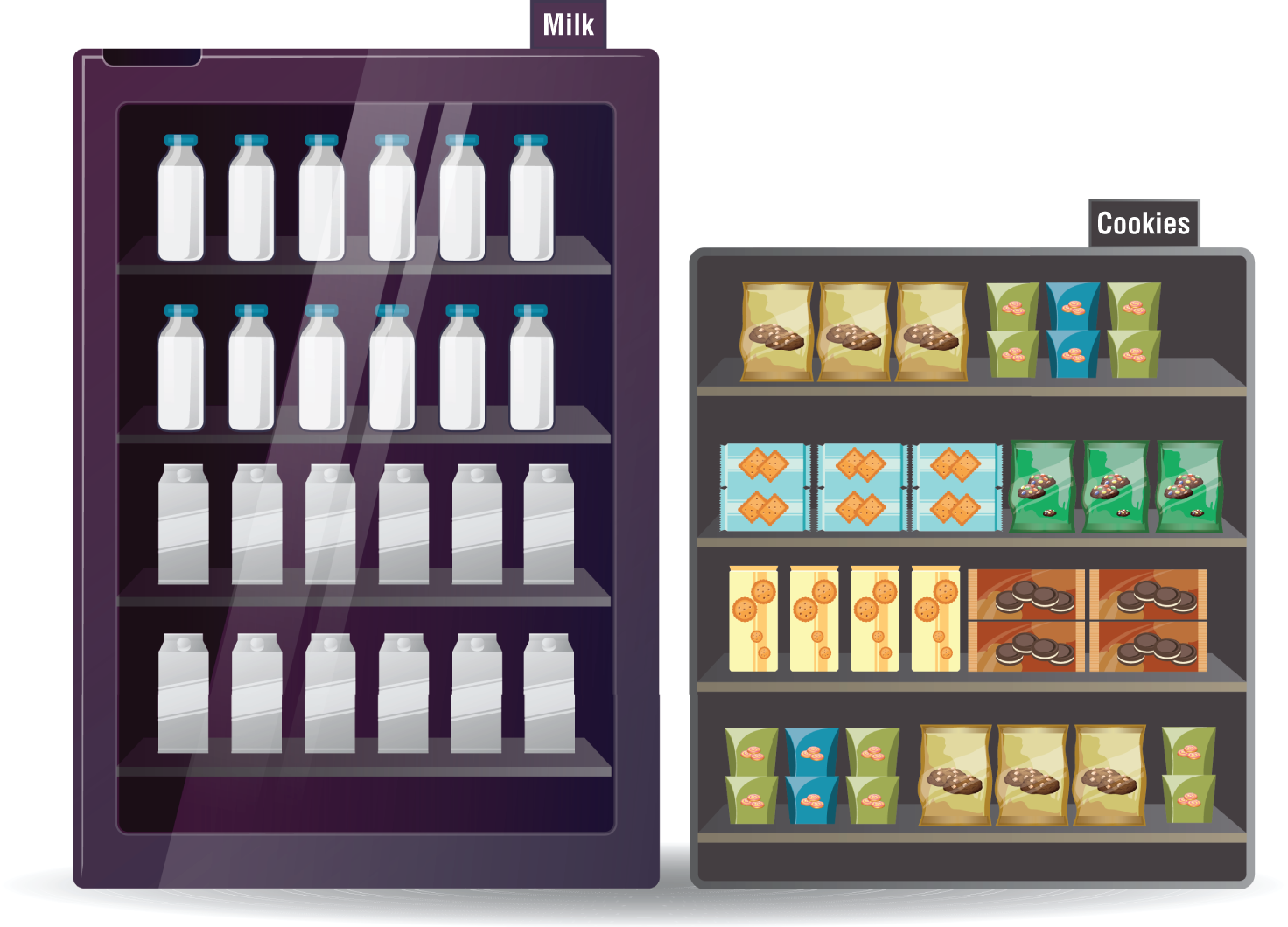
Figure 1.8 Strategically placing items in a grocery store based on unsupervised learning
The problem of determining which items customers frequently purchase together is also a well-known problem in machine learning known as the market basket problem. We talk about how data scientists use association rules approaches to tackle the market basket problem in Chapter 11.
Note
You may also hear about a third type of machine learning algorithm known as reinforcement learning. These algorithms seek to learn based on trial and error, similar to the way that a young child learns the rules of a home by being rewarded and punished. Reinforcement learning is an interesting technique but is beyond the scope of this book.
In the previous section, we described ways to group algorithms based on the types of data that they use for training. Algorithms that use labeled training datasets are known as supervised algorithms because their training is “supervised” by the labels while those that use unlabeled training datasets are known as unsupervised algorithms because they are free to learn whatever patterns they happen to discover, without “supervision.” Think of this categorization scheme as describing how machine learning algorithms learn.
We can also categorize our algorithms based on what they learn. In this book, we discuss three major types of knowledge that we can learn from our data. Classification techniques train models that allow us to predict membership in a category. Regression techniques allow us to predict a numeric result. Similarity learning techniques help us discover the ways that observations in our dataset resemble and differ from each other.
Classification Techniques
Classification techniques use supervised machine learning to help us predict a categorical response. That means that the output of our model is a non-numeric label or, more formally, a categorical variable. This simply means that the variable takes on discrete, non-numeric values, rather than numeric values. Here are some examples of categorical variables with some possible values they might take on:
- Educational degree obtained (none, bachelor's, master's, doctorate)
- Citizenship (United States, Ireland, Nigeria, China, Australia, South Korea)
- Blood type (A+, A-, B+, B-, AB+, AB-, O+, O-)
- Political party membership (Democrat, Republican, Independent)
- Customer status (current customer, past customer, noncustomer)
For example, earlier in this chapter, we discussed a problem where managers at a car dealership needed the ability to predict loan repayment. This is an example of a classification problem because we are trying to assign each customer to one of two categories: repaid or default.
We encounter all types of classification problems in the real world. We might try to determine which of three promotional offers would be most appealing to a potential customer. This is a classification problem where the categories are the three different offers.
Similarly, we might want to look at people attempting to log on to our computer systems and predict whether they are a legitimate user or a hacker seeking to violate the system's security policies. This is also a classification problem where we are trying to assign each login attempt to the category of “legitimate user” or “hacker.”
Regression Techniques
Regression techniques use supervised machine learning techniques to help us predict a continuous response. Simply put, this means that the output of our model is a numeric value. Instead of predicting membership in a discrete set of categories, we are predicting the value of a numeric variable.
For example, a financial advisor seeking new clients might want to screen possible clients based on their income. If the advisor has a list of potential customers that does not include income explicitly, they might use a dataset of past contacts with known incomes to train a regression model that predicts the income of future contacts. This model might look something like this:
![]()
If the financial advisor encounters a new potential client, they can then use this formula to predict the person's income based on their age and years of education. For each year of age, they would expect the person to have $1,000 in additional annual income. Similarly, their income would increase $3,000 for each year of education beyond high school.
Regression models are quite flexible. We can plug in any possible value of age or income and come up with a prediction for that person's income. Of course, if we didn't have good training data, our prediction might not be accurate. We also might find that the relationship between our variables isn't explained by a simple linear technique. For example, income likely increases with age, but only up until a certain point. More advanced regression techniques allow us to build more complex models that can take these factors into account. We discuss those in Chapter 4.
Similarity Learning Techniques
Similarity learning techniques use machine learning algorithms to help us identify common patterns in our data. We might not know exactly what we're trying to discover, so we allow the algorithm to explore the dataset looking for similarities that we might not have already predicted.
We've already mentioned two similarity learning techniques in this chapter. Association rules techniques, discussed more fully in Chapter 11, allow us to solve problems that are similar to the market basket problem—which items are commonly purchased together. Clustering techniques, discussed more fully in Chapter 12, allow us to group observations into clusters based on the similar characteristics they possess.
Association rules and clustering are both examples of unsupervised uses of similarity learning techniques. It's also possible to use similarity learning in a supervised manner. For example, nearest neighbor algorithms seek to assign labels to observations based on the labels of the most similar observations in the training dataset. We discuss those more in Chapter 6.
MODEL EVALUATION
Before beginning our discussion of specific machine learning algorithms, it's also helpful to have an idea in mind of how we will evaluate the effectiveness of our algorithms. We're going to cover this topic in much more detail throughout the book, so this is just to give you a feel for the concept. As we work through each machine learning technique, we'll discuss evaluating its performance against a dataset. We'll also have a more complete discussion of model performance evaluation in Chapter 9.
Until then, the important thing to realize is that some algorithms will work better than others on different problems. The nature of the dataset and the nature of the algorithm will dictate the appropriate technique.
In the world of supervised learning, we can evaluate the effectiveness of an algorithm based on the number and/or magnitude of errors that it makes. For classification problems, we often look at the percentage of times that the algorithm makes an incorrect categorical prediction, or the misclassification rate. Similarly, we can look at the percentage of predictions that were correct, known as the algorithm's accuracy. For regression problems, we often look at the difference between the values predicted by the algorithm and the actual values.
Note
It only makes sense to talk about this type of evaluation when we're referring to supervised learning techniques where there actually is a correct answer. In unsupervised learning, we are detecting patterns without any objective guide, so there is no set “right” or “wrong” answer to measure our performance against. Instead, the effectiveness of an unsupervised learning algorithm lies in the value of the insight that it provides us.
Classification Errors
Many classification problems seek to predict a binary value identifying whether an observation is a member of a class. We refer to cases where the observation is a member of the class as positive cases and cases where the observation is not a member of the class as negative cases.
For example, imagine we are developing a model designed to predict whether someone has a lactose intolerance, making it difficult for them to digest dairy products. Our model might include demographic, genetic, and environmental factors that are known or suspected to contribute to lactose intolerance. The model then makes predictions about whether individuals are lactose intolerant or not based on those attributes. Individuals predicted to be lactose intolerant are predicted positives, while those who are predicted to not be lactose intolerant (or, stated more simply, those who are predicted to be lactose tolerant) are predicted negatives. These predicted values come from our machine learning model.
There is also, however, a real-world truth. Regardless of what the model predicts, every individual person is either lactose intolerant or they are not. This real-world data determines whether the person is an actual positive or an actual negative. When the predicted value for an observation differs from the actual value for that same observation, an error occurs. There are two different types of error that may occur in a classification problem.
- False positive errors occur when the model labels an observation as predicted positive when it is, in reality, an actual negative. For example, if the model identifies someone as likely lactose intolerant while they are, in reality, lactose tolerant, this is a false positive error. False positive errors are also known as Type I errors.
- False negative errors occur when the model labels an observation as predicted negative when it is, in reality, an actual positive. In our lactose intolerance model, if the model predicts someone as lactose tolerant when they are, in reality, lactose intolerant, this is a false negative error. False negative errors are also known as Type II errors.
Similarly, we may label correctly predicted observations as true positives or true negatives, depending on their label. Figure 1.9 shows the types of errors in chart form.
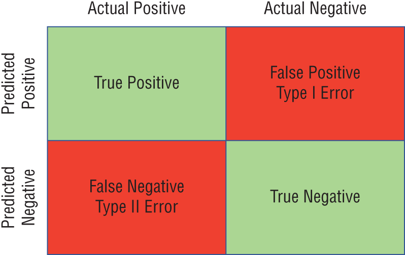
Figure 1.9 Error types
Of course the absolute numbers for false positive and false negative errors depend on the number of predictions that we make. Instead of using these magnitude-based measures, we measure the percentage of times that those errors occur. For example, the false positive rate (FPR) is the percentage of negative instances that were incorrectly identified as positive. We can compute this rate by dividing the number of false positives (FP) by the sum of the number of false positives and the number of true negatives (TN), or, as a formula:
![]()
Similarly, we can compute the false negative rate (FNR) as follows:
![]()
There is no clear-cut rule about whether one type of error is better or worse than the other. This determination depends greatly on the type of problem being solved.
For example, imagine that we're using a machine learning algorithm to classify a large list of prospective customers as either people who will purchase our product (positive cases) or people who will not purchase our product (negative cases). We only spend the money to send the mailing to prospects labeled by the algorithm as positive.
In the case of a false positive mailing, you send a brochure to a customer who does not buy your product. You've lost the money spent on printing and mailing the brochure. In the case of a false negative result, you do not send a mailing to a customer who would have responded. You've lost the opportunity to sell your product to a customer. Which of these is worse? It depends on the cost of the mailing, the potential profit per customer, and other factors.
On the other hand, consider the use of a machine learning model to screen patients for the likelihood of cancer and then refer those patients with positive results for additional, more invasive testing. In the case of a false negative result, a patient who potentially has cancer is not sent for additional screening, possibly leaving an active disease untreated. This is clearly a very bad result.
False positive results are not without harm, however. If a patient is falsely flagged as potentially cancerous, they are subjected to unnecessary testing that is potentially costly and painful, consuming resources that could have been used on another patient. They are also subject to emotional harm while they are waiting for the new test results.
The evaluation of machine learning problems is a tricky proposition, and it cannot be done in isolation from the problem domain. Data scientists, subject-matter experts, and, in some cases, ethicists, should work together to evaluate models in light of the benefits and costs of each error type.
Regression Errors
The errors that we might make in regression problems are quite different because the nature of our predictions is different. When we assign classification labels to instances, we can be either right or wrong with our prediction. When we label a noncancerous tumor as cancerous, that is clearly a mistake. However, in regression problems, we are predicting a numeric value.
Consider the income prediction problem that we discussed earlier in this chapter. If we have an individual with an actual income of $45,000 annually and our algorithm's prediction is on the nose at exactly $45,000, that's clearly a correct prediction. If the algorithm predicts an income of $0 or $10,000,000, almost everyone would consider those predictions objectively wrong. But what about predictions of $45,001, $45,500, $46,000, or $50,000? Are those all incorrect? Are some or all of them close enough?
It makes more sense for us to evaluate regression algorithms based on the magnitude of the error in their predictions. We determine this by measuring the distance between the predicted value and the actual value. For example, consider the dataset shown in Figure 1.10.
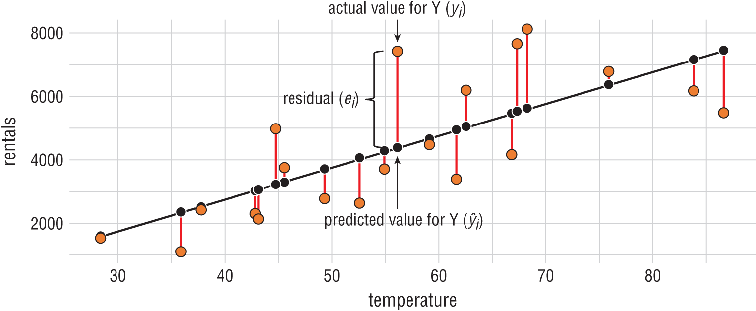
Figure 1.10 Residual error
In this dataset, we're trying to predict the number of bicycle rentals that occur each day based on the average temperature that day. Bicycle rentals appear on the y-axis while temperature appears on the x-axis. The black line is a regression line that says that we expect bicycle rentals to increase as temperature increases. That black line is our model, and the black dots are predictions at specific temperature values along that line.
The orange dots represent real data gathered during the bicycle rental company's operations. That's the “correct” data. The red lines between the predicted and actual values are the magnitude of the error, which we call the residual value. The longer the line, the worse the algorithm performed on that dataset.
We can't simply add the residuals together because some of them are negative values that would cancel out the positive values. Instead, we square each residual value and then add those squared residuals together to get a performance measure called the residual sum of squares.
We revisit the concept of residual error, as well as this specific bicycle rental dataset, in Chapter 4.
Types of Error
When we build a machine learning model for anything other than the most simplistic problems, the model will include some type of prediction error. This error comes in three different forms.
- Bias (in the world of machine learning) is the type of error that occurs due to our choice of a machine learning model. When the model type that we choose is unable to fit our dataset well, the resulting error is bias.
- Variance is the type of error that occurs when the dataset that we use to train our machine learning model is not representative of the entire universe of possible data.
- Irreducible error, or noise, occurs independently of the machine learning algorithm and training dataset that we use. It is error inherent in the problem that we are trying to solve.
When we are attempting to solve a specific machine learning problem, we cannot do much to address irreducible error, so we focus our efforts on the two remaining sources of error: bias and variance. Generally speaking, an algorithm that exhibits high variance will have low bias, while a low-variance algorithm will have higher bias, as shown in Figure 1.11. Bias and variance are intrinsic characteristics of our models and coexist. When we modify our models to improve one, it comes at the expense of the other. Our goal is to find an optimal balance between the two.
In cases where we have high bias and low variance, we describe the model as underfitting the data. Let's take a look at a few examples that might help illustrate this point. Figure 1.12 shows a few attempts to use a function of two variables to predict a third variable. The leftmost graph in Figure 1.12 shows a linear model that underfits the data. Our data points are distributed in a curved manner, but our choice of a straight line (a linear model) limits the ability of the model to fit our dataset. There is no way that you can draw a straight line that will fit this dataset well. Because of this, the majority of the error in our approach is due to our choice of model and our dataset exhibits high bias.
The middle graph in Figure 1.12 illustrates the problem of overfitting, which occurs when we have a model with low bias but high variance. In this case, our model fits the training dataset too well. It's the equivalent of studying for a specific test (the training dataset) rather than learning a generalized solution to the problem. It's highly likely that when this model is used on a different dataset, it will not work well. Instead of learning the underlying knowledge, we studied the answers to a past exam. When we faced a new exam, we didn't have the knowledge necessary to figure out the answers.
The balance that we seek is a model that optimizes both bias and variance, such as the one shown in the rightmost graph of Figure 1.12. This model matches the curved nature of the distribution but does not closely follow the specific data points in the training dataset. It aligns with the dataset much better than the underfit model but does not closely follow specific points in the training dataset as the overfit model does.
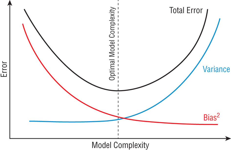
Figure 1.11 The bias/variance trade-off

Figure 1.12 Underfitting, overfitting, and optimal fit
Partitioning Datasets
When we evaluate a machine learning model, we can protect against variance errors by using validation techniques that expose the model to data other than the data used to create the model. The point of this approach is to address the overfitting problem. Look back at the overfit model in Figure 1.12. If we used the training dataset to evaluate this model, we would find that it performed extremely well because the model is highly tuned to perform well on that specific dataset. However, if we used a new dataset to evaluate the model, we'd likely find that it performs quite poorly.
We can explore this issue by using a test dataset to assess the performance of our model. The test dataset is set aside at the beginning of the model development process specifically for the purpose of model assessment. It is not used in the training process, so it is not possible for the model to overfit the test dataset. If we develop a generalizable model that does not overfit the training dataset, it will also perform well on the test dataset. On the other hand, if our model overfits the training dataset, it will not perform well on the test dataset.
We also sometimes need a separate dataset to assist with the model development process. These datasets, known as validation datasets, are used to help develop the model in an iterative process, adjusting the parameters of the model during each iteration until we find an approach that performs well on the validation dataset. While it may be tempting to use the test dataset as the validation dataset, this approach reintroduces the potential of overfitting the test dataset, so we should use a third dataset for this purpose.
Holdout Method
The most straightforward approach to test and validation datasets is the holdout method. In this approach, illustrated in Figure 1.13, we set aside portions of the original dataset for validation and testing purposes at the beginning of the model development process. We use the validation dataset to assist in model development and then use the test dataset to evaluate the performance of the final model.
Cross-Validation Methods
There are also a variety of more advanced methods for creating validation datasets that perform repeated sampling of the data during an iterative approach to model development. These approaches, known as cross-validation techniques, are particularly useful for smaller datasets where it is undesirable to reserve a portion of the dataset for validation purposes.
Figure 1.14 shows an example of cross-validation. In this approach, we still set aside a portion of the dataset for testing purposes, but we use a different portion of the training dataset for validation purposes during each iteration of model development.
If this sounds complicated now, don't worry about it. We discuss the holdout method and cross-validation in greater detail when we get to Chapter 9. For now, you should just have a passing familiarity with these techniques.
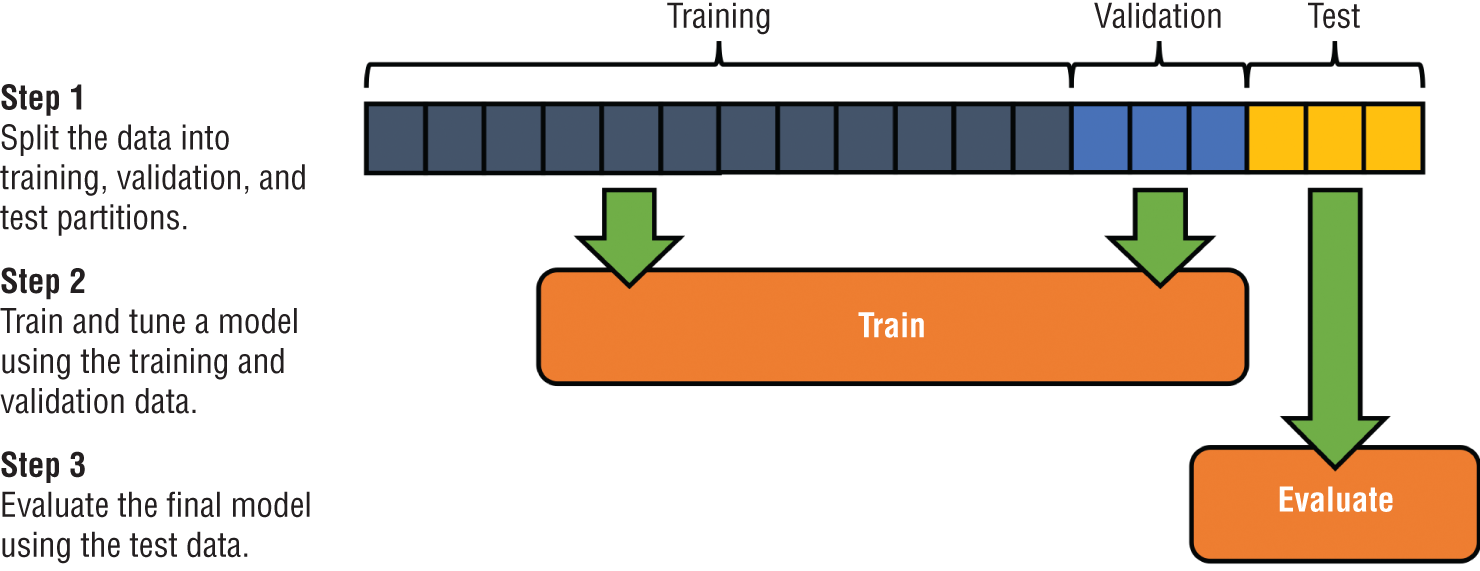
Figure 1.13 Holdout method
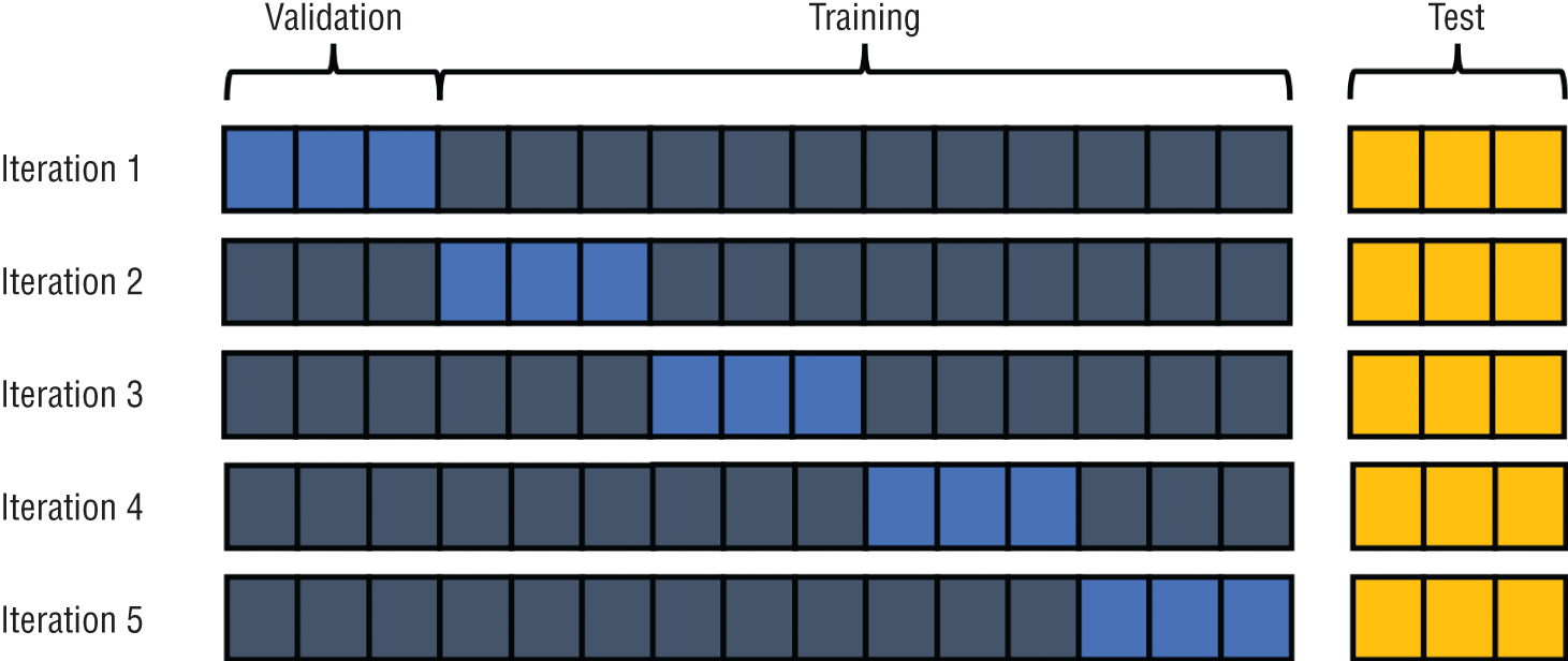
Figure 1.14 Cross-validation method
EXERCISES
- Consider each of the following machine learning problems. Would the problem be best approached as a classification problem or a regression problem? Provide a rationale for your answer.
- Predicting the number of fish caught on a commercial fishing voyage
- Identifying likely adopters of a new technology
- Using weather and population data to predict bicycle rental rates
- Predicting the best marketing campaign to send a specific person
- You developed a machine learning algorithm that assesses a patient's risk of heart attack (a positive event) based on a number of diagnostic criteria. How would you describe each of the following events?
- Your model identifies a patient as likely to suffer a heart attack, and the patient does suffer a heart attack.
- Your model identifies a patient as likely to suffer a heart attack, and the patient does not suffer a heart attack.
- Your model identifies a patient as not likely to suffer a heart attack, and the patient does not suffer a heart attack.
- Your model identifies a patient as not likely to suffer a heart attack, and the patient does suffer a heart attack.
Chapter 2:Introduction to R and RStudio
Machine learning sits at the intersection of the worlds of statistics and software development. Throughout this book, we focus extensively on the statistical techniques used to unlock the value hidden within data. In this chapter, we provide you with the computer science tools that you will need to implement these techniques. In this book, we've chosen to do this using the R programming language. This chapter introduces the fundamental concepts of the R language that you will use consistently throughout the remainder of the book.
By the end of this chapter, you will have learned the following:
- The role that the R programming language plays in the world of data science and analytics
- How the RStudio integrated development environment (IDE) facilitates coding in R
- How to use packages to redistribute and reuse R code
- How to write, save, and execute your own basic R script
- The purpose of different data types in R
WELCOME TO R
The R programming language began in 1992 as an effort to create a special-purpose language for use in statistical applications. More than two decades later, the language has evolved into one of the most popular languages used by statisticians, data scientists, and business analysts around the world.
R gained rapid traction as a popular language for several reasons. First, it is available to everyone as a free, open source language developed by a community of committed developers. This approach broke the mold of past approaches to analytic tools that relied upon proprietary, commercial software that was often out of the financial reach of many individuals and organizations.
R also continues to grow in popularity because of its adoption by the creators of machine learning methods. Almost any new machine learning technique created today quickly becomes available to R users in a redistributable package, offered as open source code on the Comprehensive R Archive Network (CRAN), a worldwide repository of popular R code. Figure 2.1 shows the growth of the number of packages available through CRAN over time. As you can see, the growth took off significantly over the past decade.
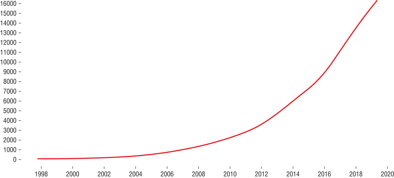
Figure 2.1 Growth of the number of CRAN packages over time
It's also important to know that R is an interpreted language, rather than a compiled language. In an interpreted language, the code that you write is stored in a document called a script, and this script is the code that is directly executed by the system processing the code. In a compiled language, the source code written by a developer runs through a specialized program called a compiler, which converts the source code into executable machine language.
The fact that R is an interpreted language also means that you can execute R commands directly and see an immediate result. For example, you could execute the following simple command to add 1 and 1:
Code snippet
> 1+1[1] 2When you do this, the R interpreter immediately responds with the result: 2.
R AND RSTUDIO COMPONENTS
Our working environment for this book consists of two major components: the R programming language and the RStudio integrated development environment (IDE). While R is an open source language, RStudio is a commercial product designed to make using R easier.
The R Language
The open source R language is available as a free download from the R Project website at https://www.r-project.org. As of the writing of this book, the current version of R is version 3.6.0, code-named “Planting of a Tree.” R is generally written to be backward compatible, so if you are using a later version of R, you should not experience any difficulties following along with the code in this book.
Note
The code names assigned to different releases of R are quite interesting! Past code names included “Great Truth,” “Roasted Marshmallows,” “Wooden Christmas-Tree,” and “You Stupid Darkness.” These are all references to the Peanuts comic strip by Charles Schultz.
If you haven't done so already, now would be a good time to install the most recent version of R on your computer. Simply visit the R Project home page, click the CRAN link, and choose the CRAN mirror closest to your location. You'll then see a CRAN site similar to the one shown in Figure 2.2. Choose the download link for your operating system and run the installer after the download completes.
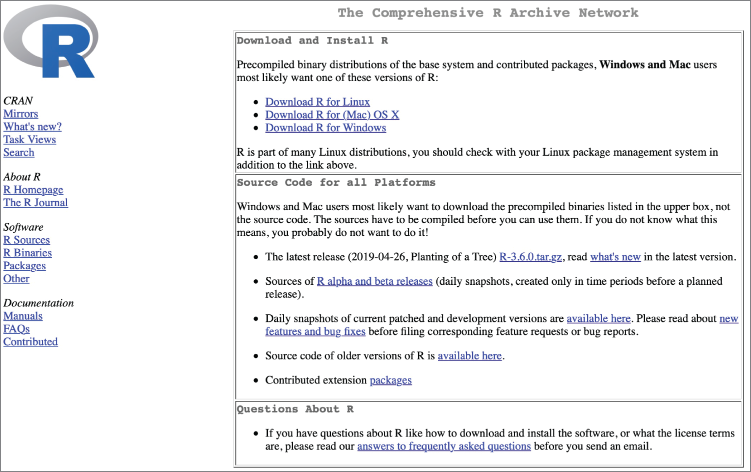
Figure 2.2 Comprehensive R Archive Network (CRAN) mirror site
RStudio
As an integrated development environment, RStudio offers a well-designed graphical interface to assist with your creation of R code. There's no reason that you couldn't simply open a text editor, write an R script, and then execute it directly using the open source R environment. But there's also no reason that you should do that! RStudio makes it much easier to manage your code, monitor its progress, and troubleshoot issues that might arise in your R scripts.
While R is an open source project, the RStudio IDE comes in different versions. There is an open source version of RStudio that is available for free, but RStudio also offers commercial versions of its products that come with enhanced support options and added features.
For the purposes of this book, the open source version of RStudio will be more than sufficient.
RStudio Desktop
RStudio Desktop is the most commonly used version of RStudio, especially for individual programmers. It's a software package that you download and install on your Windows, Mac, or Linux system that provides you access to a well-rounded R development environment. You can see an example of the RStudio IDE in action in Figure 2.3.
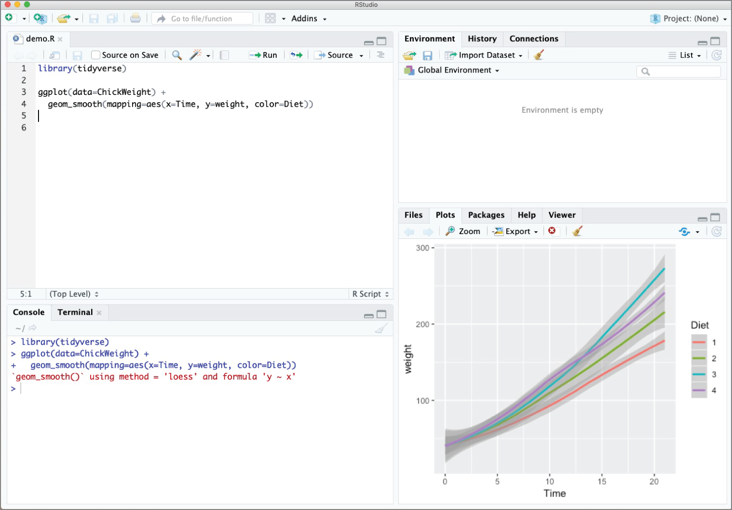
Figure 2.3 RStudio Desktop offers an IDE for Windows, Mac, and Linux systems.
If you haven't already installed RStudio Desktop on your computer, go ahead and do so now. You can download the most recent version at https://www.rstudio.com/products/rstudio/download/#download.
RStudio Server
RStudio also offers a server version of the RStudio IDE. This version is ideal for teams that work together on R code and want to maintain a centralized repository. When you use the server version of RStudio, you may access the IDE through a web browser. The server then presents a windowed view to you that appears similar to the desktop environment. You can see an example of the web-based IDE in Figure 2.4.
Using RStudio Server requires building a Linux server, either on-premises or in the cloud, and then installing the RStudio Server code on that server. If your organization already uses RStudio Server, you may use that as you follow along with the examples in this book.
Exploring the RStudio Environment
Let's take a quick tour of the RStudio Desktop environment and become oriented with the different windows that you see when you open RStudio.
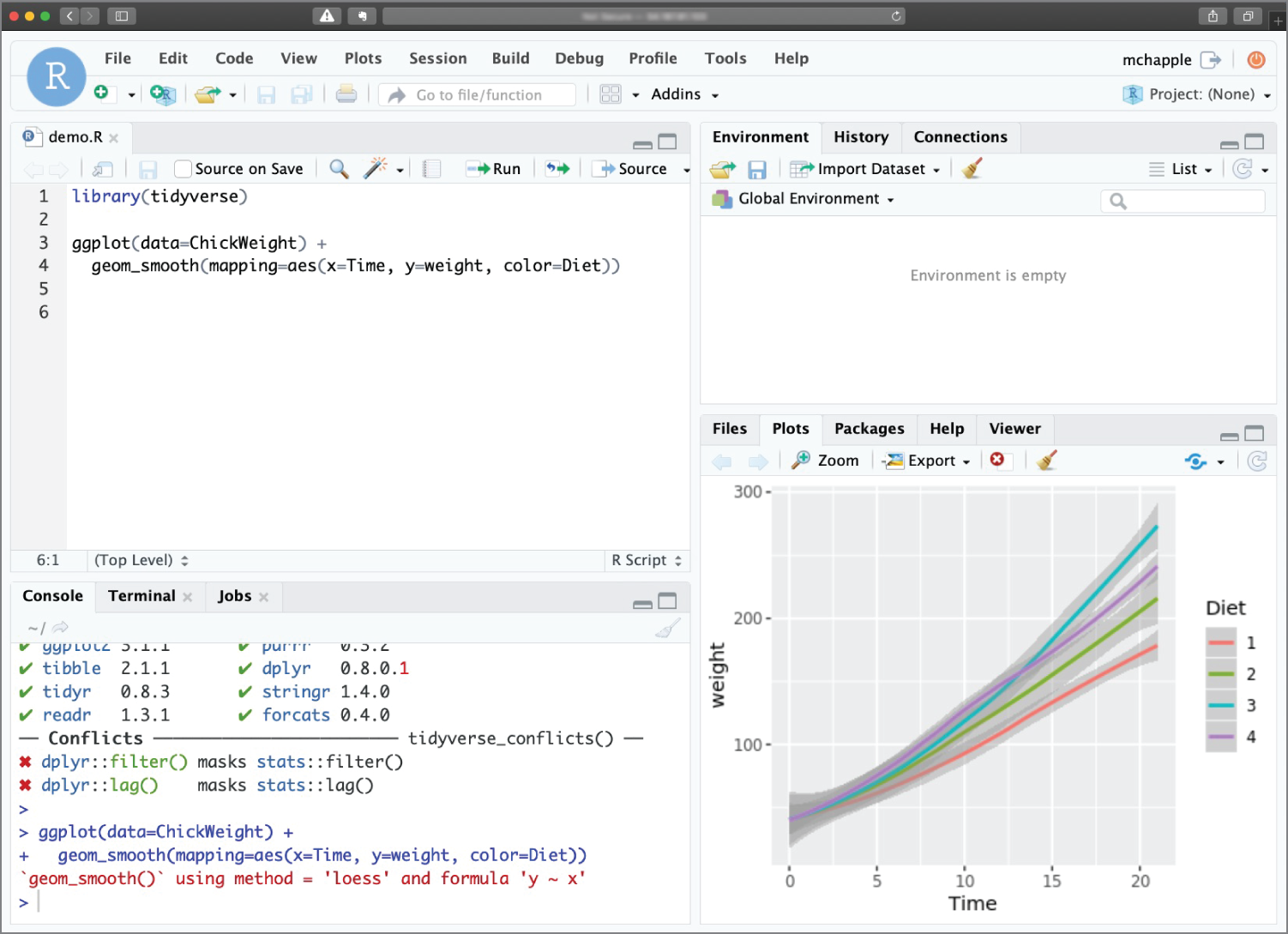
Figure 2.4 RStudio Server provides a web-based IDE for collaborative use.
Console Pane
When you first open RStudio, you won't see the view shown in Figure 2.3. Instead, you'll see a view that has only three windows, shown in Figure 2.5. That's because you haven't yet opened or created an R script.
In this view, the console pane appears on the left side of the RStudio window. Once you have a script open, it appears in the lower-left corner, as shown in Figure 2.6.
Tip
The window layout shown in Figure 2.6 is the default configuration of RStudio. It is possible to change this default layout to match your own preferences. If your environment doesn't exactly match the one shown in the figure, don't worry about it—just look for the window pane titles and tabs that we discuss.
The console window allows you to interact directly with the R interpreter. You can type commands here and R will immediately execute them. For example, Figure 2.7 shows just the console pane executing several simple commands. Notice that the command entered by the user is immediately followed by an answer from the R interpreter.
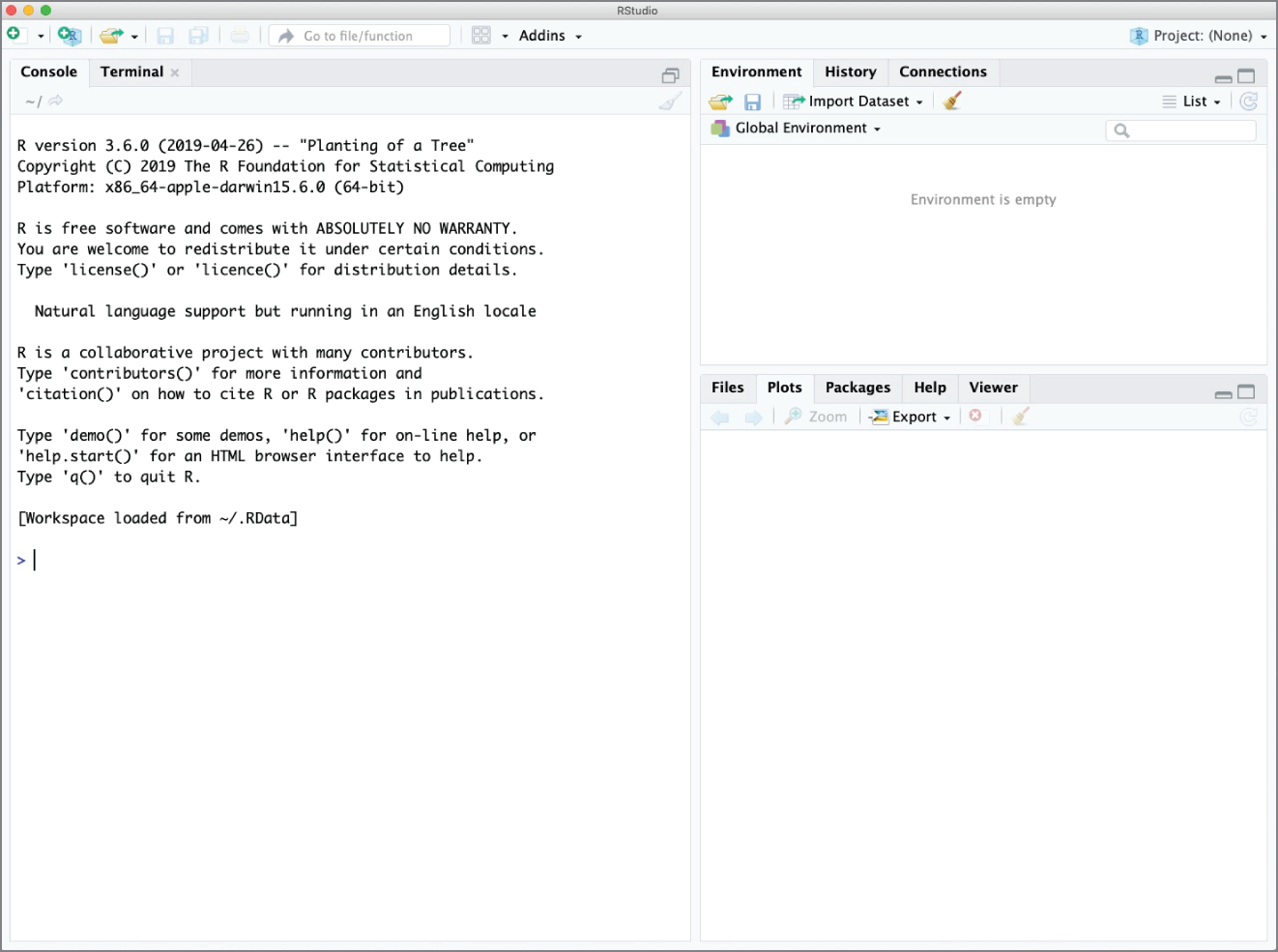
Figure 2.5 RStudio Desktop without a script open
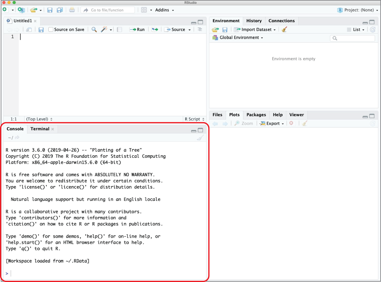
Figure 2.6 RStudio Desktop with the console pane highlighted
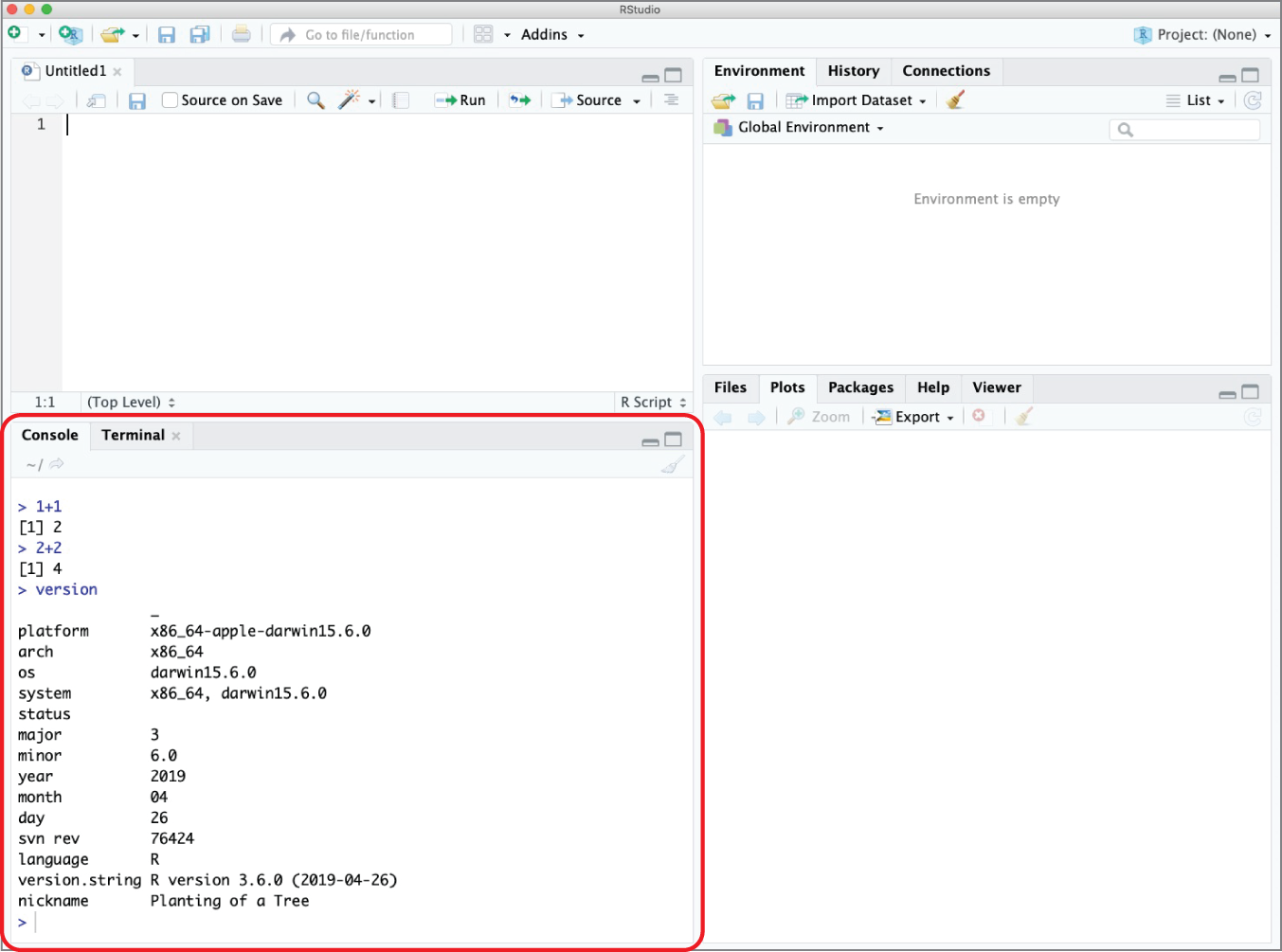
Figure 2.7 Console pane executing several simple R commands
Tip
The history of commands executed by a user in R is also stored in a file on the local system. This file is named .Rhistory and is stored in the current working directory.
You also should observe that the console pane includes a tab titled Terminal. This tab allows you to open a terminal session directly to your operating system. It's the same as opening a shell session on a Linux system, a terminal window on a Mac, or a command prompt on a Windows system. This terminal won't interact directly with your R code and is there merely for your convenience. You can see an example of running Mac terminal commands in Figure 2.8.

Figure 2.8 Accessing the Mac terminal in RStudio
Script Pane
The script pane is where the magic happens! You generally won't want to execute R commands directly in the console. Instead, you'll normally write R commands in a script file that you can save to edit or reuse at a later date. An R script is simply a text file containing R commands. When you write an R script in the RStudio IDE, R will color-code different elements of your code to make it easier to read.
Figure 2.9 shows an example of an R script rendered inside the script pane in RStudio.
This is a simple script that loads a dataset containing information about the weights of a sample of baby chickens and creates the graph shown in Figure 2.10.
Figure 2.11 shows the same script file, opened using a simple text editor. Notice that the code is identical. The only difference is that when you open the file in RStudio, you see some color-coding to help you parse the code.
You can open an existing script in RStudio either by choosing File ⇨ Open File from the top menu or by clicking the file open icon in the taskbar. You may create a new script by choosing File ⇨ New File ⇨ R Script from the top menu or by clicking the icon of a sheet of paper with a plus symbol in the taskbar.
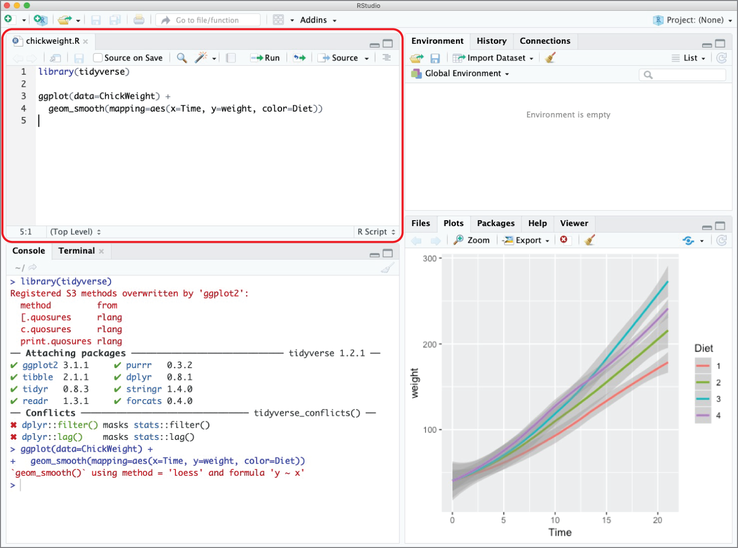
Figure 2.9 Chick weight script inside the RStudio IDE
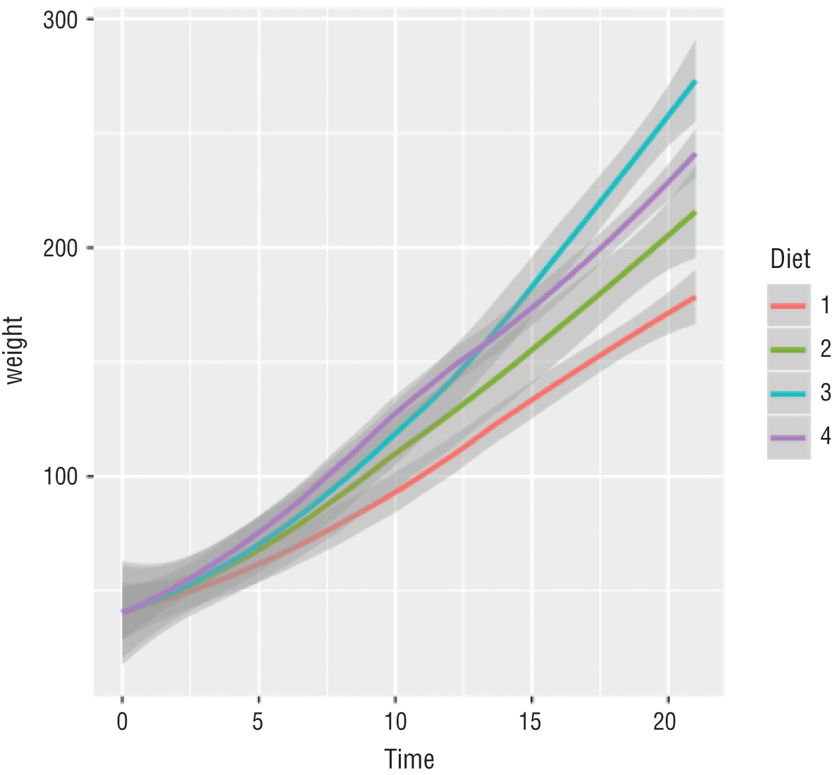
Figure 2.10 Graph produced by the chick weight script
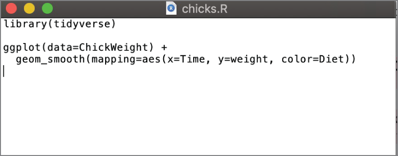
Figure 2.11 Chick weight script inside a text editor
Tip
When you are editing a script in RStudio, the name of the script will appear in red with an asterisk next to it whenever you have unsaved changes. This is just a visual reminder to save your code often! When you save your code, the asterisk will disappear, and the filename will revert to black.
Environment Pane
The environment pane allows you to take a look inside the current operating environment of R. You can see the values of variables, datasets, and other objects that are currently stored in memory. This visual insight into the operating environment of R is one of the most compelling reasons to use the RStudio IDE instead of a standard text editor to create your R scripts. Access to easily see the contents of memory is a valuable tool when developing and troubleshooting your code.
The environment pane in Figure 2.9 is empty because the R script that we used in that case did not store any data in memory. Instead, it used the ChickWeight dataset that is built into R.
Figure 2.12 shows the RStudio environment pane populated with several variables, vectors, and a full dataset stored in an object known as a tibble. We'll discuss tibbles more in Chapter 3.
You can also use tabs in the same pane to access two other RStudio features. The History tab shows the R commands that were executed during the current session and is shown in Figure 2.13. The Connections tab is used to create and manage connections to external data sources, a technique that is beyond the scope of this book.
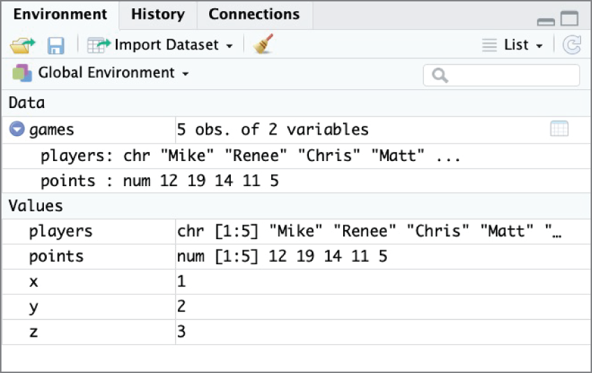
Figure 2.12 RStudio environment pane populated with data
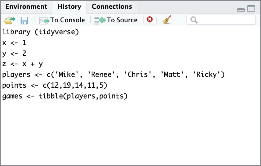
Figure 2.13 RStudio History pane showing previously executed commands
Plots Pane
The final pane of the RStudio window appears in the lower-right corner of Figure 2.9. This pane defaults to the plot view and will contain any graphics that you generate in your R code. In Figure 2.9, this pane contains the plot of chick weights by diet type that was created in our sample R script. As you can see in Figure 2.5, this pane is empty when you first open RStudio and have not yet executed any commands that generate plots.
This pane also has several other tabs available. The Files tab, shown in Figure 2.14, allows you to navigate the filesystem on your device to open and manage R scripts and other files.
Figure 2.15 shows the Packages tab in RStudio, which allows you to install, update, and load packages. Many people prefer to perform these tasks directly in R code, but this is a convenient location to verify the packages installed on a system as well as their current version number.
The Help tab provides convenient access to the R documentation. You can access this by searching within the Help tab or using the ? command at the console, followed by the name of the command for which you would like to see documentation. Figure 2.16 shows the result of executing the ?install.packages command at the console to view help for the install.packages() function.
The final tab, Viewer, is used for displaying local web content, such as that created using Shiny. This functionality is also beyond the scope of this book.
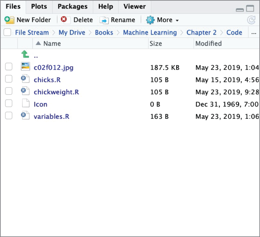
Figure 2.14 The Files tab in RStudio allows you to interact with your device's local filesystem.
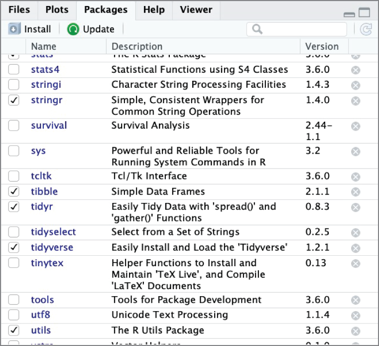
Figure 2.15 The Packages tab in RStudio allows you to view and manage the packages installed on a system.
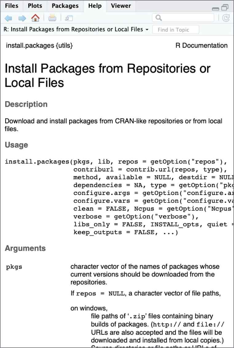
Figure 2.16 The Help tab in RStudio displaying documentation for the install.packages() command
R Packages
Packages are the secret sauce of the R community. They consist of collections of code created by the community and shared widely for public use. As you saw in Figure 2.1, the number of publicly available R packages has skyrocketed in recent years. These packages range from extremely popular and widely used packages, such as the tidyverse, to highly specialized packages that serve narrow niches of the R community.
In this book, we will use a variety of R packages to import and manipulate data, as well as to build machine learning models. We'll introduce you to these packages as they arise.
The CRAN Repository
The Comprehensive R Archive Network is the official repository of R packages maintained by the R community and coordinated by the R Foundation. CRAN volunteers manage the repository to ensure that all packages meet some key criteria, including that each package does the following:
- Makes a nontrivial contribution to the R community
- Is released under an open source license by individuals or organizations with the authority to do so
- Designates an individual as package maintainer and provides contact information for that individual
- Uses efficient code that minimizes file sizes and computing resource utilization
- Passes CRAN quality control checks
CRAN is the default package repository in RStudio, and all of the packages used in this book are available through CRAN.
Installing Packages
Before you can use a package in your R script, you must ensure that the package is installed on your system. Installing a package downloads the code from the repository, installs any other packages required by the code, and performs whatever steps are necessary to install the package on the system, such as compiling code and moving files.
The install.packages() command is the easiest way to install R packages on your system. For example, here is the command to install the RWeka package on your system and the corresponding output:
Code snippet
> install.packages("RWeka") also installing the dependencies ‘RWekajars’, ‘rJava’ trying URL 'https://cran.rstudio.com/bin/macosx/el-capitan/contrib/3.6/RWekajars_3.9.3-1.tgz'Content type 'application/x-gzip' length 10040528 bytes (9.6 MB)==================================================downloaded 9.6 MB trying URL 'https://cran.rstudio.com/bin/macosx/el-capitan/contrib/3.6/rJava_0.9-11.tgz'Content type 'application/x-gzip' length 745354 bytes (727 KB)==================================================downloaded 727 KB trying URL 'https://cran.rstudio.com/bin/macosx/el-capitan/contrib/3.6/RWeka_0.4-40.tgz'Content type 'application/x-gzip' length 632071 bytes (617 KB)==================================================downloaded 617 KB The downloaded binary packages are in /var/folders/f0/yd4s93v92tl2h9ck9ty20kxh000gn/T//RtmpjNb5IB/downloaded_packagesNotice that, in addition to installing the RWeka package, the command also installed the RWekajars and rJava packages. The RWeka package uses functions included in these packages, creating what is known as a dependency between the two packages. The install.packages() command resolves these dependencies by installing the two required packages before installing RWeka.
Hey, You!
You only need to install a package once on each system that you use. Therefore, most people prefer to execute the install.packages() command at the console, rather than in their R scripts. It is considered bad form to prompt the installation of packages on someone else's system!
Loading Packages
You must load a package into your R session any time you would like to use it in your code. While you only need to install a package once on a system, you must load it any time that you want to use it. Installing a package makes it available on your system, while loading it makes it available for use in the current environment.
You load a package into your R session using the library() command. For example, the following command loads the tidyverse package that we will be using throughout this book:
Code snippet
library(tidyverse)Note
If you were reading carefully, you might have noticed that the install.packages() command enclosed the package name in quotes while the library() command did not. This is the standard convention for most R users. The library() command will work whether or not you enclose the package name in quotes. The install.packages() command requires the quotation marks. Also, it is important to note that single and double quotation marks are mostly interchangeable in R.
Many people who code in R use the terms package and library interchangeably. They are actually slightly different. The code bundles stored in the CRAN repository (and other locations) are known as packages. You use the install.packages() command to place the package on your system and the library() command to load it into memory. Hadley Wickham, a well-known R developer, summed this concept up well in December 2014 tweet, shown in Figure 2.17.
Package Documentation
We've already discussed the use of the ? command to access the help file for a function contained within a package. Package authors also often create more detailed explanations of the use of their packages, including examples, in files called vignettes. You can access vignettes using the vignette() command. For example, the following command finds all of the vignettes associated with R's dplyr package:
Code snippet
> vignette(package = 'dplyr')Vignettes in package ‘dplyr’:
compatibility         dplyr compatibility (source, html)dplyr                 Introduction to dplyr (source, html)programming           Programming with dplyr (source, html)two-table             Two-table verbs (source, html)window-functions      Window functions (source, html)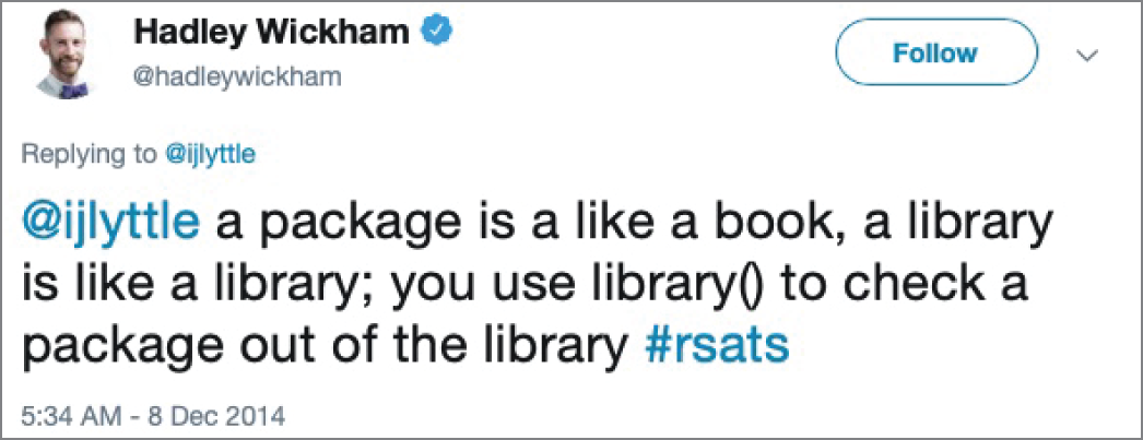
Figure 2.17 Hadley Wickham on the distinction between packages and libraries
If you wanted to see the vignette called programming, you would use this command:
Code snippet
vignette(package = 'dplyr', topic = 'programming')Figure 2.18 shows the result of executing this command: a lengthy document describing how to write code using the dplyr package.
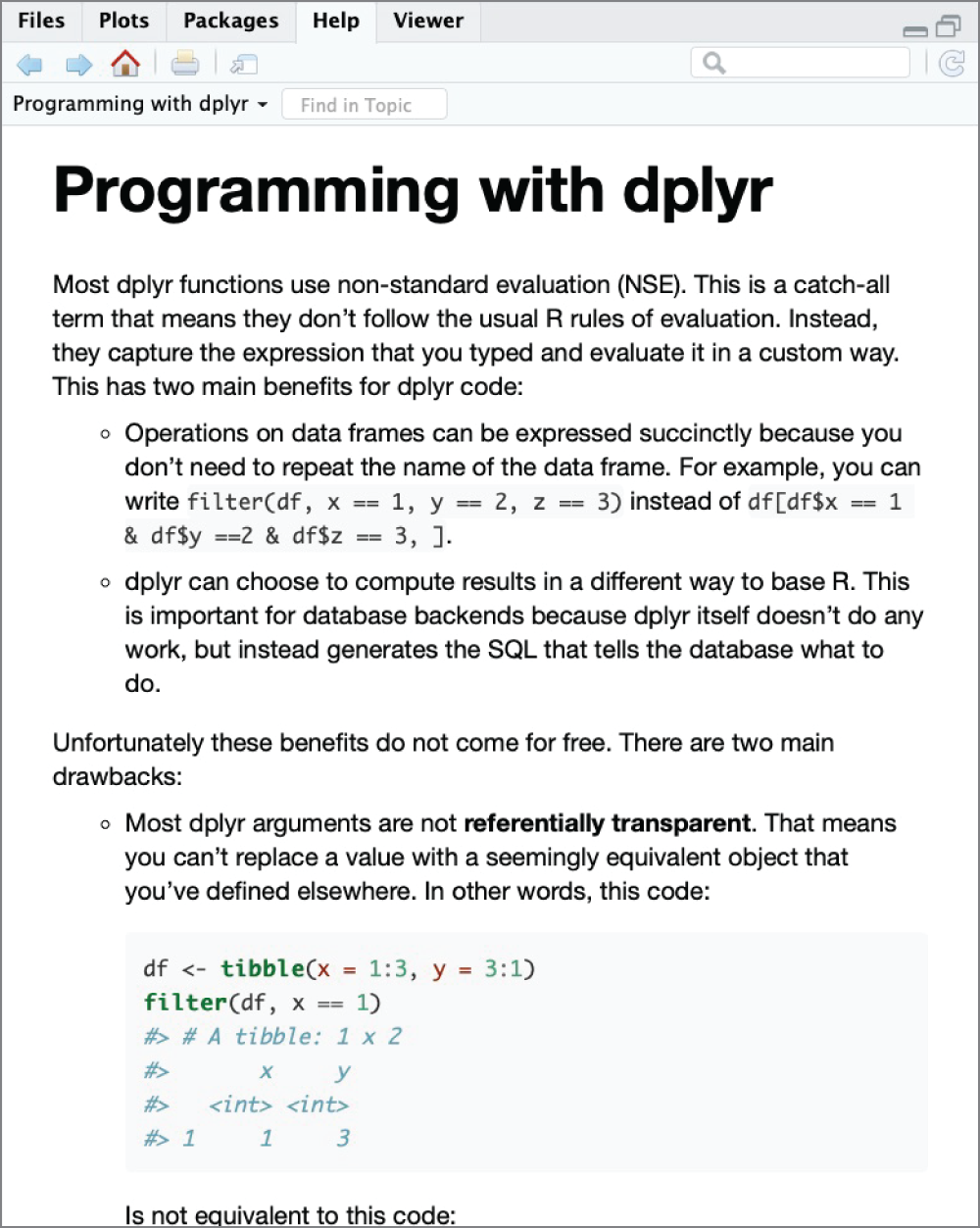
Figure 2.18 RStudio displaying the programming vignette from the dplyr package
WRITING AND RUNNING AN R SCRIPT
As we mentioned earlier, the most common way to work in RStudio is to write scripts containing a series of R commands that you can save and reuse at a later date. These R scripts are simply text files that you write inside RStudio's script window pane and save on your system or in a cloud storage location. Figure 2.9 showed a simple script open in RStudio.
When you want to execute your script, you have two options: the Run button and the Source button. When you click the Run button, highlighted in Figure 2.19, RStudio will execute the current section of code. If you do not have any text highlighted in your script, this will execute whatever line the cursor is currently placed on. In Figure 2.19, line 6 contains no code, so the Run button will not do anything. If you move the cursor to the first line of code, clicking the Run button would run line 1, loading the tidyverse, and then automatically advance to the next line of the script that contains code, line 3 (because line 2 is blank). Clicking the Run button a second time would run the code on lines 3 and 4 because they combine to form a single statement in R.
The Run button is a common way to execute code in R during the development and troubleshooting stages. It allows you to execute your script as you write it, monitoring the results.
Hey, You!
Many of the commands in RStudio are also accessible via keyboard shortcuts. For example, you may run the current line of code by pressing Ctrl+Enter. See https://support.rstudio.com/hc/en-us/articles/200711853-Keyboard-Shortcuts for an exhaustive list of keyboard shortcuts.
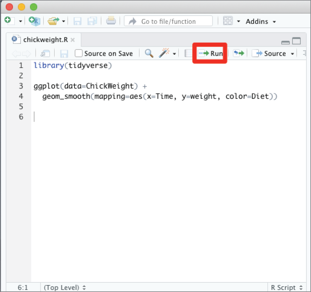
Figure 2.19 The Run button in RStudio runs the current section of code.
The Source button, highlighted in Figure 2.20, will save any changes that you've made to your script and then execute the entire file at once. This is a useful way to quickly run an entire script.
Tip
The Source button does not display any output to the screen by default. If you want to see the results of your script as it runs, click the small arrow to the right of the Source button and choose Source with Echo. This will cause each line of the script to appear in the console as it is executed, and plots will appear in the Plots pane.
Warning
When you execute a script using the Source button (or the Run button, for that matter), the script runs in the context of the current environment. This may use data that you created during earlier executions. If you want to run in a clean environment, be sure to clear objects from your workspace using the broom icon in the Environment pane before clicking the Source button.
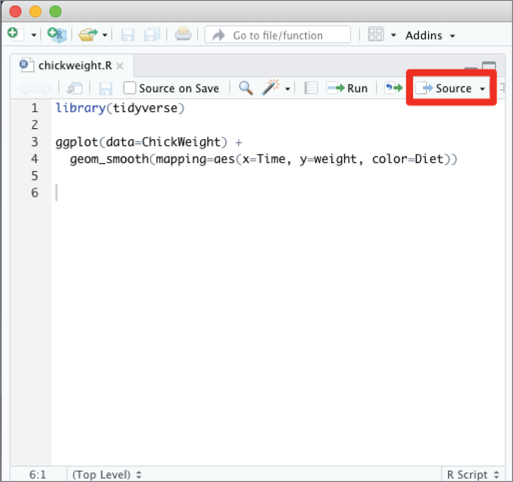
Figure 2.20 The Source button in RStudio runs the entire script.
DATA TYPES IN R
As with most programming languages, all of the variables that you create in an R script have an associated data type. The data type defines the way that R stores the information contained within the variable and the range of possible values. Here are some of the more common data types in R:
- The logical data type is a simple binary variable that may have only two values:
TRUEorFALSE. It's an efficient way to store data that can take on these two values only. These data elements are also commonly referred to as flags. For example, we might have a variable in a dataset about students calledMarriedthat would be set toTRUEfor individuals who are married andFALSEfor individuals who are not. - The numeric data type stores decimal numbers, while the integer data type stores integers. If you create a variable containing a number without specifying a data type, R will store it as numeric by default. However, R can usually automatically convert between the numeric and integer data types as needed.
Tip
R also calls the numeric data type double, which is short for a double-precision floating-point number. The terms numeric and double are interchangeable.
- The character data type is used to store text strings of up to 65,535 characters each.
- The factor data type is used to store categorical values. Each possible value of a factor is known as a level. For example, you might use a factor to store the U.S. state where an individual lives. Each one of the 50 states would be a possible level of that factor.
- The ordered factor data type is a special case of the factor data type where the order of the levels is significant. For example, if we have a factor containing risk ratings of Low, Medium, and High, the order is significant because Medium is greater than Low and because High is greater than Medium. Ordered factors preserve this significance. A list of U.S. states, on the other hand, would not be stored as an ordered factor because there is no logical ordering of states.
Note
These are the most commonly used data types in R. The language does offer many other data types for special-purpose applications. You may encounter these in your machine learning projects, but we will stick to these common data types in this book.
Vectors
Vectors are a way to collect elements of the same data type in R together in a sequence. Each data element in a vector is called a component of that vector. Vectors are a convenient way to collect data elements of the same type together and keep them in a specific order.
We can use the c() function to create a new vector. For example, we might create the following two vectors, one containing names and another containing test scores:
Code snippet
> names <- c('Mike', 'Renee', 'Richard', 'Matthew', 'Christopher') > scores <- c(85, 92, 95, 97, 96)Once we have data stored in a vector, we can access individual components of that vector by placing the number of the element that we would like to retrieve in square brackets immediately following the vector name. Here's an example:
Code snippet
> names[1][1] "Mike" > names[2][1] "Renee" > scores[3][1] 95Tip
The first element of a vector in R is element 1 because R uses 1-based indexing. This is different from Python and some other programming languages that use 0-based indexing and label the first element of a vector as element 0.
There are also functions in R that will work on an entire vector at once. For example, you can use the mean(), median(), min(), and max() functions to find the average, median, smallest, and largest elements of a numeric vector, respectively. Similarly, the sum() function adds the elements of a numeric vector.
Code snippet
> mean(scores)[1] 93 > median(scores)[1] 95 > min(scores)[1] 85 > max(scores)[1] 97 > sum(scores)[1] 465All of the components of a vector must be of the same data type. If you attempt to create a vector with varying data types, R will force them all to be the same data type. This is a process known as coercion. For example, if we try to create a mixed vector containing both character strings and numeric values:
Code snippet
> mixed <- c('Mike', 85, 'Renee', 92, 'Richard', 95, 'Matthew', 97, 'Christopher', 96)the command appears to successfully create the vector, but when we go and examine the contents of that vector:
Code snippet
> mixed [1] "Mike" "85" "Renee" "92" "Richard" "95" "Matthew" [8] "97" "Christopher" "96"we find that R has converted all of the elements to character strings. We can combine vectors of unlike types into data structures that resemble spreadsheets. The traditional way to do this in R is through a data structure known as a data frame. For example, we can combine the names and scores vectors into a data frame called testResults.
Code snippet
> testResults <- data.frame(names, scores) > testResults names scores1 Mike 852 Renee 923 Richard 954 Matthew 975 Christopher 96You may access the vectors stored within a data frame using the $ operator. For example, if you wanted to calculate the mean test score, you could use the following code:
Code snippet
> mean(testResults$scores)[1] 93In Chapter 3, we will discuss how the tidyverse package uses an enhanced version of a data frame called a tibble. We will then use tibbles as our primary data structure in the remainder of this book.
Testing Data Types
When we use objects in R, we may want to learn more about their data type, either by directly asking a question about the object's type or by testing it programmatically. The R language includes functions designed to assist with these tasks.
The class() function returns the data type of an object. For example, examine the following sample code:
Code snippet
> x <- TRUE> y <- 1> z <- 'Mike Chapple' > class(x)[1] "logical" > class(y)[1] "numeric" > class(z)[1] "character"Notice that when we assign the values of x, y, and z, we do not need to explicitly assign the data types. When you perform the assignments, R interprets the arguments you provide and makes assumptions about the correct data type. In the next section, we'll talk about how you can use the as.x() functions in R to explicitly convert data types.
If you'd like to create a factor data type in R, you can use the factor() function to convert a vector of character strings into a factor. For example, the following code creates a character vector, tests the class, converts it to a factor, and retests the class:
Code snippet
> productCategories <- c('fruit', 'vegetable', 'fruit', 'fruit', 'dry goods', 'dry goods', 'vegetable') > class(productCategories)[1] "character" > productCategories <- factor(productCategories) > class(productCategories)[1] "factor"We can also test the length of an object using the length() function. This function returns the number of components of that object. If the object is a factor or vector, the length() function returns the number of elements in that factor or vector. If the object is a single numeric, character, or logical element, the length() function returns the value 1. For example, look at this code:
Code snippet
> length(x)[1] 1 > length(y)[1] 1 > length(z)[1] 1 > length(productCategories)[1] 7R also includes a set of “is” functions that are designed to test whether an object is of a specific data type and return TRUE if it is and FALSE if it is not. The “is” functions include the following:
is.logical()is.numeric()is.integer()is.character()is.factor()
To use these functions, simply select the appropriate one and pass the object you want to test as an argument. For example, examine the following results using the same data elements x, y, and z that we created earlier in this section:
Code snippet
> is.numeric(x)[1] FALSE > is.character(x)[1] FALSE > is.integer(x)[1] FALSE > is.logical(x)[1] TRUE > is.numeric(y)[1] TRUE > is.integer(y)[1] FALSE > is.character(z)[1] TRUEDo those results make sense to you? If you look back at the code that created those variables, x is the logical value TRUE, so only the is.logical() function returned a value of TRUE, while the other test functions returned FALSE.
The y variable contained an integer value, so the is.integer() function returned TRUE, while the other functions returned FALSE. It is significant to note here that the is.numeric() function also returned FALSE, which may seem counterintuitive given the name of the function. When we created the y variable using the code:
Code snippet
> y <- 1R assumed that we wanted to create a numeric variable, the default type for values consisting of digits. If we wanted to explicitly create an integer, we would need to add the L suffix to the number during creation. Examine this code:
Code snippet
> yint <- 1L > is.integer(yint)[1] TRUE > is.numeric(yint)[1] TRUEHere we see yet another apparent inconsistency. Both the is.numeric() and is.integer() functions returned values of TRUE in this case. This is a nuance of the is.numeric() function. Instead of returning TRUE only when the object tested is of the numeric class, it returns TRUE if it is possible to convert the data contained in the object to the numeric class. We can verify with the class function that y is a numeric data type while yint is an integer.
Code snippet
> class(y)[1] "numeric" > class(yint)[1] "integer"Alternatively, we could also convert the numeric variable we created initially to an integer value using the as.integer() function, which we will introduce in the next section.
The “is” functions also work on vector objects, returning values based upon the data type of the objects contained in the vector. For example, we can test the names and scores vectors that we created in the previous section.
Code snippet
> is.character(names)[1] TRUE > is.numeric(names)[1] FALSE > is.character(scores)[1] FALSE > is.numeric(scores)[1] TRUE > is.integer(scores)[1] FALSEConverting Data Types
You may find yourself in a situation where you need to convert data from one type to another. R provides the “as” functions to perform these conversions. Some of the more commonly used “as” functions in R are the following:
as.logical()as.numeric()as.integer()as.character()as.factor()
Each of these functions takes an object or vector as an argument and attempts to convert it from its existing data type to the data type contained within the function name. Of course, this conversion isn't always possible. If you have a numeric data object containing the value 1.5, R can easily convert this to the “1.5” character string. There is not, however, any reasonable way to convert the character string “apple” into an integer value. Here are a few examples of the “as” functions at work:
Code snippet
> as.numeric("1.5")[1] 1.5 > as.integer("1.5")[1] 1 > as.character(3.14159)[1] "3.14159" > as.integer("apple")[1] NAWarning message:NAs introduced by coercion > as.logical(1)[1] TRUE > as.logical(0)[1] FALSE > as.logical("true")[1] TRUE > as.logical("apple")[1] NAMissing Values
Missing values appear in many datasets because data was not collected, is unknown, or is not relevant. When missing values occur, it's important to distinguish them from blank or zero values. For example, if I don't yet know the price of an item that will be sold in my store, the price is missing. It is definitely not zero, or I would be giving the product away for free!
R uses the special constant value NA to represent missing values in a dataset. You may assign the NA value to any other type of R data element. You can use the is.na() function in R to test whether an object contains the NA value.
Just as the NA value is not the same as a zero or blank value, it's also important to distinguish it from the “NA” character string. We once worked with a dataset that contained two-letter country codes in a field and were puzzled that some records in the dataset were coming up with missing values for the country field, when we did not expect such an occurrence. It turns out that the dataset was being imported from a text file that did not use quotes around the country code and there were several records in the dataset covering the country of Namibia, which, you guessed it, has the country code "NA". When the text file was read into R, it interpreted the string NA (without quotes) as a missing value, converting it to the constant NA instead of the country code "NA".
Note
If you're familiar with the Structured Query Language (SQL), it might be helpful to think of the NA value in R as equivalent to the NULL value in SQL
EXERCISES
- Visit the
r-project.orgwebsite. Download and install the current version of R for your computer. - Visit the
rstudio.comwebsite. Download and install the current version of RStudio for your computer. - Explore the RStudio environment, as explained in this chapter. Create a file called
chicken.Rthat contains the following R script:Code snippet
install.packages("tidyverse") library(tidyverse) ggplot(data=ChickWeight) + geom_smooth(mapping=aes(x=Time, y=weight, color=Diet))Execute your code. It should produce a graph of chicken weights as output.
Chapter 3: Managing Data
In Chapter 1, we discussed some of the foundational principles behind machine learning. We followed that discussion with an introduction to both the R programming language and the RStudio development environment in Chapter 2. In this chapter, we explain how to use R to manage our data prior to modeling. The quality of a machine learning model is only as good as the data used to build it. Quite often, this data is not easily accessible, is in the wrong format, or is hard to understand. As a result, it is critically important that prior to building a model, we spend as much time as needed to collect the data we need, explore and understand the data we have, and prepare it so that it is useful for the selected machine learning approach. Typically,  percent of the time we spend in machine learning is, or should be, spent managing data.
By the end of this chapter, you will have learned the following:
- What the tidyverse is and how to use it to manage data in R
- How to collect data using R and some of the key things to consider when collecting data
- Different approaches to describe and visualize data in R
- How to clean, transform, and reduce data to make it more useful for the machine learning process
THE TIDYVERSE
The tidyverse is a collection of R packages designed to facilitate the entire analytics process by offering a standardized format for exchanging data between packages. It includes packages designed to import, manipulate, visualize, and model data with a series of functions that easily work across different tidyverse packages.
The following are the major packages that make up the tidyverse:
readrfor importing data into R from a variety of file formatstibblefor storing data in a standardized formatdplyrfor manipulating dataggplot2for visualizing datatidyrfor transforming data into “tidy” formpurrrfor functional programmingstringrfor manipulating stringslubridatefor manipulating dates and times
These are the developer-facing packages that we'll use from the tidyverse, but these packages depend on dozens of other foundational packages to do their work. Fortunately, you can easily install all of the tidyverse packages with a single command:
Code snippet
install.packages("tidyverse")Similarly, you can load the entire tidyverse using this command:
Code snippet
library(tidyverse)In the remainder of this chapter and the rest of this text, we will use several tidyverse packages and functions. As we do so, we will endeavor to provide a brief explanation of what each function does and how it is used. Please note that this book is not intended to be a tutorial on the R programming language or the tidyverse. Rather, the objective is to explain and demonstrate machine learning concepts using those tools. For readers who are interested in a more in-depth introduction to the R programming language and the tidyverse, we recommend the book R for Data Science by Hadley Wickham and Garrett Grolemund.
DATA COLLECTION
Data collection is the process of identifying and acquiring the data needed for the machine learning process. The type/amount of data collected is often dependent on the machine learning problem and the selected algorithm. For supervised machine learning problems, not only does the collected data include variables that describe the attributes or characteristics of each observation, it also includes a variable that serves as a label or outcome for the observation. Unsupervised machine learning problems don't require that a label be assigned to each observation of the input data. Instead, a major part of the learning goal is to identify interesting ways to group the data so that meaningful labels can be assigned to it.
Key Considerations
As we collect data, there are a few important things to consider to ensure that the data collection process is successful. These include making sure that we capture the right type of historical data, that the data is relevant, that we have enough data to work with, and that we are being ethical in how we manage and use the data.
Collecting Ground Truth Data
For supervised machine learning problems, we use historical data that has outcome labels or response values to train our model. The accuracy of these labels or response values is critically important to the success of the approach. This is because this data is what the algorithm uses as a baseline for the learning process. This data serves as a source of truth upon which patterns are learned. This is why it is often referred to as the ground truth. Ground truth either can come with an existing label based on a prior event, such as whether a bank customer defaulted on a loan or not, or can require that a label be assigned to it by a domain expert, such as whether an email is spam or not. Regardless of whether the labels already exist or need to be assigned, a plan should be in place to manage the ground truth and ensure that it truly is the source of truth.
Data Relevance
As part of the data collection process, it is important to ensure that the data collected is relevant to the learning goal. The variables that are collected to describe an observation should be relevant in explaining the label or the response for the observation. For example, collecting data on the shoe size of bank customers has no relevance to whether they will or will not default on a loan. Conversely, excluding information about a customer's past loans will have an adverse impact on the effectiveness of a model that attempts to predict loan outcomes.
Quantity of Data
The amount of data needed to successfully train a model depends on the type of machine learning approach chosen. Certain types of algorithms perform well with small amounts of data, while some require a large amount of data to provide meaningful results. Understanding the strengths and weaknesses of each approach provides us with the guidance needed to determine how much data is enough for the learning task. Besides the quantity of data collected, variability in the data collected is also important. For example, if one of the predictors we intend to use to predict loan outcomes is income, then it would be beneficial to collect data on customers of sufficiently different income levels. Doing this enables our model to better determine how income level impacts loan outcome.
Ethics
There are several ethical issues to consider during the data collection process. Some of these issues include privacy, security, informed consent, and bias. It is important that processes and mitigating steps be put in place to address these issues as part of the process of acquiring new data. For example, if bias exists in the data used to train a model, then the model will also replicate the bias in its predictions. Biased predictions could prove quite harmful, especially in situations where unfavorable decisions affecting the underrepresented population are being made based on a machine learning model. The issue of biased data often stems from intrinsic human bias in the data collection process or in an absence of existing data on certain subpopulations.
Importing the Data
The readr package is the first tidyverse package that you'll likely use in almost any R code that you write for the purposes of machine learning because it is the package that allows you to import data from a standard file format into R. The readr functions load a file that is stored on disk or at a URL and imports it into a tidyverse-friendly data structure known as a tibble (more on tibbles later).
Reading Comma-Delimited Files
Comma-delimited files are the most common way to exchange data between different environments. These files, which are also known as comma-separated value (CSV) files, store data in a simple, standardized format that may be imported or exported from almost any source.
Creating a comma-separated value file from a spreadsheet or other data table is conceptually straightforward. For example, imagine that we have the spreadsheet data shown in Figure 3.1.
Converting this to a CSV file simply requires replacing the lines separating columns with commas, as shown in Figure 3.2. In CSV format, each row in the file represents a row from the spreadsheet table. However, sometimes the file may also have an optional header row that contains variable names, which is the case in our example.
We can read CSV files into R using the read_csv() function from the readr package. This function allows many different arguments, but let's take a look at a few of the most important ones, shown here:
file, the first argument toread_csv(), contains the name of the file you want to read. This may be the name of a file in R's current working directory, the full path to a file stored elsewhere on disk, a URL to be read over the HTTP or HTTPS protocol, or the path to a file on an FTP or FTPS site.col_namesspecifies where R should obtain the names of the variables used in the dataset. The default value forcol_namesisTRUE, which indicates that R should use the values appearing in the first line of the CSV file as the variable names. If this value is set toFALSE, R will generate its own column names using the sequentially numbered formatX1,X2,X3, and so on. Alternatively, you may provide a character vector of your own column names.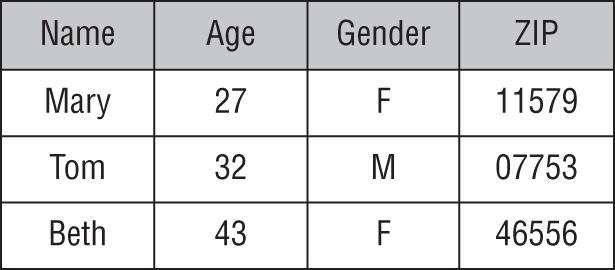
Figure 3.1 Simple spreadsheet containing data in tabular form
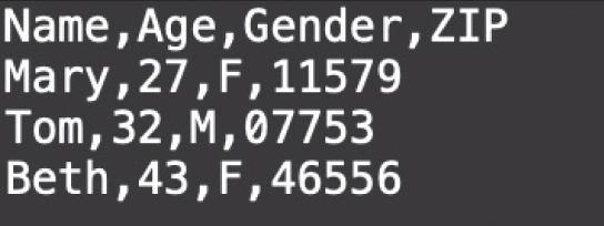
Figure 3.2 CSV file containing the same data as the spreadsheet in Figure 3.1
col_typesspecifies the data types for the columns. If you do not include this argument, R will guess the appropriate data types based on the values in the file. If you'd like to specify the column types yourself, the easiest way to do so is to provide a string with one letter corresponding to each column in the dataset, using the following values:lfor logicalnfor numericifor integerscfor charactersffor factorsDfor datesTfor datetimes
skipis an integer value indicating thatread_csv()should ignore the specified number of lines at the top of the file before attempting to read data.
These are just a small subset of the many options that you may specify when reading data from a CSV file. For more information on the read_csv() function, see the help file.
Code snippet
?read_csvLet's work through an example of reading in a CSV file. We will use a dataset, stored in the vehicles.csv file, containing vehicle fuel efficiency and emissions testing data gathered at the Environmental Protection Agency's National Vehicle and Fuel Emissions Laboratory in Ann Arbor, Michigan. The dataset contains fuel economy and emissions information for 1984–2018 model year vehicles.
Tip
All of the data files used in this book are available to you if you would like to follow along with the examples. The introduction to the book contains information on how you can obtain the data files.
To read the data, we first need to load the tidyverse packages using the library(tidyverse) command. This allows us to use the read_csv() function. We pass two arguments to the function. The first is the filename (file), and the second is a string that represents the data types for the columns (col_types). By setting col_types= "nnnfnfffffnn", we tell the read_csv() function that the first three columns of the input data should be read as numeric variables (n), the fourth should be read as a factor (f), the fifth as numeric (n), and so forth.
Code snippet
> library(tidyverse)> vehicles <- read_csv(file = 'vehicles.csv', col_types = "nnnfnfffffnn")Our dataset is now imported into a tibble called vehicles. We can get a preview of the data in the vehicles tibble by using the glimpse() command, which is provided by the dplyr package.
Code snippet
> glimpse(vehicles) Observations: 36,979Variables: 12$ citympg <dbl> 14, 14, 18, 21, 14, 18, 14, 18, 18, 20, 1…$ cylinders <dbl> 6, 8, 8, 6, 8, 8, 8, 4, 4, 4, 4, 4, 4, 4,…$ displacement <dbl> 4.1, 5.0, 5.7, 4.3, 4.1, 5.7, 4.1, 2.4, 2…$ drive <fct> 2-Wheel Drive, 2-Wheel Drive, 2-Wheel Dri…$ highwaympg <dbl> 19, 20, 26, 31, 19, 26, 19, 21, 24, 21, 2…$ make <fct> Buick, Buick, Buick, Cadillac, Cadillac, …$ model <fct> Electra/Park Avenue, Electra/Park Avenue,…$ class <fct> Large Cars, Large Cars, Large Cars, Large…$ year <fct> 1984, 1984, 1984, 1984, 1984, 1984, 1984,…$ transmissiontype <fct> Automatic, Automatic, Automatic, Automati…$ transmissionspeeds <dbl> 4, 4, 4, 4, 4, 4, 4, 3, 3, 3, 3, 3, 3, 3,…$ co2emissions <dbl> 555.4375, 555.4375, 484.7619, 424.1667, 5…The output is a transposed version of the data that shows us the number of observations or rows in the data ( ), the number of variables or columns in the data (
 ), the variable names, the data types, and a sample of the data stored in each variable.
Tibbles
Several times in Chapter 2 as well as in this chapter, we have referred to a data structure known as a tibble. So, what exactly is a tibble? A tibble is a modern version of the R data frame implemented as part of the tidyverse. Compared to data frames, tibbles make fewer assumptions about the nature of the data and are a lot more rigid to work with. For example, unlike a data frame, a tibble never changes the type of the input data, it never changes the names of variables, and it never creates row names. As a result, tibbles ensure that data quality issues are dealt with explicitly, leading to cleaner and more expressive code. Tibbles also make it easier to work with and output large datasets to the screen without overwhelming your system. The read_csv() function from the readr package reads input data directly into a tibble. This differs from the base R read.csv() function, which reads data into a data frame. For the remainder of this text, we will stick to the read_csv() function for data import.
Reading Other Delimited Files
The readr package also provides us with functions to read data stored in other types of delimited files besides CSV. For example, to read a tab-delimited (TSV) file as illustrated in Figure 3.3, we use the read_tsv() function.
The readr package does provide a more generic read_delim() function, which allows for files with custom delimiters to be read. The user simply needs to specify the character used to separate columns within the file by setting the delim argument. For example, to read a pipe-delimited file such as the one illustrated in Figure 3.4, we would need to set delim = "|" for the read_delim() function.
DATA EXPLORATION
After we acquire our data, the next thing we do is spend some time making sure that we understand it. This process is known as data exploration. Data exploration allows us to answer questions such as these:
- How many rows and columns are in the data?
- What data types are present in our data?
- Are there missing, inconsistent, or duplicate values in the data?
- Are there outliers in the data?
To answer these questions, we often need to describe the characteristics of the data with the use of statistical summaries and visualizations.
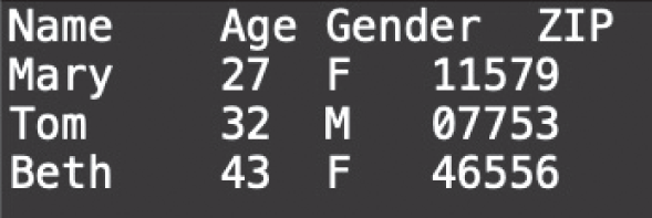
Figure 3.3 TSV file containing the same data as the spreadsheet in Figure 3.1
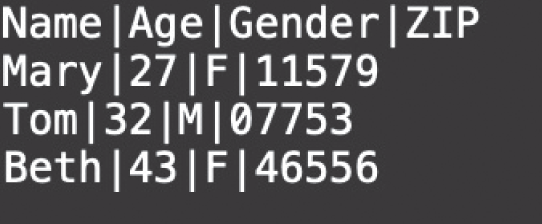
Figure 3.4 Pipe-delimited file containing the same data as the spreadsheet in Figure 3.1
Describing the Data
As part of the data exploration process, we often need to describe our data in ways that others can understand. In machine learning, there are several terms that are used to describe the structure of the data as well as the nature of the values in the data (see Figure 3.5).
Instance
An instance is a row of data. It is an individual independent example of the concept represented by the dataset. It is described by a set of attributes or features. A dataset consists of several instances. In this text, we will sometimes refer to instances as records, examples, or observations.
Feature
A feature is a column of data. It is the property or characteristic of an instance. Each instance consists of several features. In this text, we will sometimes refer to features as columns or variables. Features can be categorized based on the type of data they hold. A feature can be described as either a discrete feature or a continuous feature.
- A discrete feature is an attribute that is measured in categorical form. Discrete features typically have only a reasonable set of possible values. Examples include clothing size (small, medium, large), customer satisfaction (not happy, somewhat happy, very happy), etc.
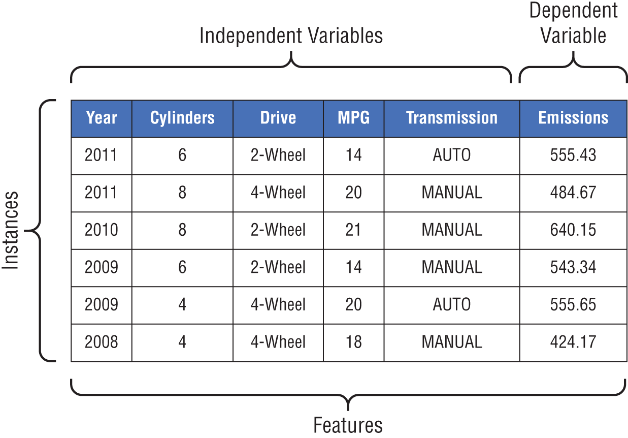
Figure 3.5 Sample dataset illustrating the instances and features (independent and dependent variables)
- A continuous feature is an attribute that is usually measured in the form of an integer or real number. A continuous feature has an infinite number of possible values between its lower and upper bounds. Examples include temperature, height, weight, age, etc.
Features can also be categorized based on their function. In Chapter 1, we discussed that with supervised learning, we use the attributes (or features) that describe our data to predict the label for each of the instances in the data. The features that describe our data are known as the independent variables, while the feature that represents the label is known as the dependent variable. The idea behind the independent and dependent monikers comes from the fact that in supervised learning, the value of the dependent variable is predicted based on the values of the independent variables. In other words, the dependent variable is “dependent” on the values of the independent variables. For classification problems, the dependent variable is also referred to as the class, and for regression problems, it is referred to as the response.
Dimensionality
The dimensionality of a dataset represents the number of features in the dataset. The higher the dimensionality of a dataset, the more detail we have about the data, but also the higher the computational complexity and resource consumption. Later, we will discuss some approaches for reducing the dimensionality of a dataset to make it easier to work with for machine learning.
Sparsity and Density
Data sparsity and density describe the degree to which data exists for the features in a dataset. For example, if 20 percent of the values in a dataset are missing or undefined, the dataset is said to be 20 percent sparse. Density is the complement of sparsity, so a dataset that is 20 percent sparse is also said to be 80 percent dense.
Resolution
Resolution describes the grain or level of detail in the data. The more detailed the data is, the finer (or higher) the resolution, and the less detailed it is, the coarser (or lower) the resolution. For example, point-of-sale retail data of individual customer purchases has high resolution. On the other hand, sales data summarized at the state or regional level has low resolution. The appropriate resolution is often dictated by the business problem and the machine learning task. If data resolution is too fine, important patterns may be obscured by noise, but if the resolution is too coarse, important patterns may disappear.
Descriptive Statistics
Descriptive statistics or summary statistics are useful in data exploration and understanding. They involve the use of statistical measures to describe the characteristics of features. For example, the frequency of a feature value tells us how often the value occurs, and the mode of the feature tells us which value occurs the most for that feature. Frequency and mode are typically used to describe categorical data. For continuous data, measures such as mean and median are often used to describe the properties of the data. Both mean and median provide a description of what could be referred to as a “typical” value for the feature.
Mean and Median
As a quick statistical refresher, the arithmetic mean (or average) of n values is the sum of the values divided by n. For example, given the set of values 1, 5, 7, 9, and 23, the mean is  . The median of the same set of values is the number that is at the midpoint of the sorted list of values, which, in this case, is
  . The median of a set of values is sometimes preferred over the mean because it is not impacted as much by a small proportion of extremely large or small values. For example, when evaluating statistics like household income or total assets, which vary greatly based on economic status, the mean may be skewed by a small number of extremely high or low values. As a result, median values are often used as a better way to describe what a “typical” household's income or total assets are.
In R, we can get summary statistics for a dataset by using the summary() function. To get the summary statistics for our vehicles dataset, we pass the name of the dataset to the summary() function.
Code snippet
> summary(vehicles)     citympg        cylinders        displacement  Min. : 6.00     Min. : 2.000     Min. :0.600  1st Qu.:15.00   1st Qu.: 4.000   1st Qu.:2.200  Median :17.00   Median : 6.000   Median :3.000  Mean :17.53     Mean : 5.776     Mean :3.346  3rd Qu.:20.00   3rd Qu.: 6.000   3rd Qu.:4.300  Max. :57.00     Max. :16.000     Max. :8.400  NA's :6                          NA's :9
               drive        highwaympg            make  2-Wheel Drive    :  491   Min.   : 9.00   Chevrolet: 3750  Rear-Wheel Drive :13194   1st Qu.:20.00   Ford     : 3044  All-Wheel Drive  : 8871   Median :24.00   Dodge    : 2461  Front-Wheel Drive:13074   Mean   :23.77   GMC      : 2414  4-Wheel Drive    : 1349   3rd Qu.:27.00   Toyota   : 1840                            Max.   :61.00   BMW      : 1774                            NA's   :8       (Other)  :21696                model                          class       year  F150 Pickup 2WD  : 213   Compact Cars           :7918 1985   : 1699  F150 Pickup 4WD  : 192   Pickup                 :5763 1987   : 1247  Truck 2WD        : 187   Midsize Cars           :5226 1986   : 1209  Jetta            : 173   Sport Utility          :5156 2015   : 1203  Mustang          : 172   Subcompact Cars        :4523 2017   : 1201  Ranger Pickup 2WD: 164   Special Purpose Vehicle:2378 2016   : 1172  (Other)          :35878  (Other)                :6015 (Other):29248  transmissiontype transmissionspeeds co2emissions  Automatic:24910   Min.   : 1.000    Min.   : 29.0  Manual :12069     1st Qu.: 4.000    1st Qu.: 400.0  Median : 5.000    Median : 467.7  Mean   : 4.954    Mean   : 476.6  3rd Qu.: 6.000    3rd Qu.: 555.4  Max.   :10.000    Max.   :1269.6
The results show two different formats for the descriptive statistics: one format for categorical features and the other for continuous features. For example, the summary statistics for the categorical features, such as drive and make, show the feature values along with the frequency for each value. For the drive feature, we see that there are 491 instances with a drive type of 2-Wheel Drive and 1,349 instances of drive type 4-Wheel Drive. Note that for some features, the summary shows only six feature values and groups everything else into Other. The six values listed are the top six in terms of frequency. Later, we will look at how to list all the values for a feature along with the associated frequencies.
The second format used by the summary() function applies to continuous features. For example, we see that for citympg, the summary shows the mean, median, minimum, maximum, and first and third quartile values. From the results, we see that the vehicle with the worst city fuel efficiency achieves a meager 6 miles per gallon (minimum), while the most efficient vehicle is rated at a whopping 57 miles per gallon (maximum). A “typical” vehicle has a city fuel efficiency rating of between 17 and 17.5 miles per gallon (median and mean). The values presented by the first and third quartiles give us an idea of how much the city fuel efficiency values differ across vehicles. In Chapter 5, we go into a bit more detail on what this means. Also note that for the citympg, displacement, and highwaympg features, the descriptive statistics list the number of missing values (NAs) for the features. We will discuss how to deal with these missing values as part of our conversation on data preparation, later in the chapter.
In the previous example, we showed the summary statistics for the entire dataset by passing the dataset to the summary() function. Sometimes, we only want to look at the statistical summary of select features within our data. One way to accomplish this is to use the select command from the dplyr package. Recall that dplyr is a package in the tidyverse that is used for data exploration and manipulation. It provides five main commands (also known as verbs).
selectfor choosing the columns or variablesfilterfor choosing rows or observationsarrangefor sorting rowsmutatefor modifying variablessummarizefor aggregating rows
Using the select verb, we can limit our vehicles data to only the features that we want. Let's assume that we intend to look only at the class feature. To do so, we pass two arguments to the select verb. The first is the input dataset, which is vehicles, and the second is the name or names of the features that we choose, which is class.
Code snippet
> library(tidyverse)> select(vehicles, class) # A tibble: 36,979 x 1 class <fct> 1 Large Cars 2 Large Cars 3 Large Cars 4 Large Cars 5 Large Cars 6 Large Cars 7 Large Cars 8 Pickup 9 Pickup 10 Pickup # … with 36,969 more rowsOur data is now limited to the class feature. Note that our output is a tibble with 36,979 rows and 1 column. The one column is the class feature. To include the cylinders feature in our output, we include it in the feature names passed to the select verb as well.
Code snippet
> select(vehicles, class, cylinders) # A tibble: 36,979 x 2 class cylinders <fct> <dbl> 1 Large Cars 6 2 Large Cars 8 3 Large Cars 8 4 Large Cars 6 5 Large Cars 8 6 Large Cars 8 7 Large Cars 8 8 Pickup 4 9 Pickup 410 Pickup 4# … with 36,969 more rowsOur output is now a tibble with two columns. To get the descriptive statistics for these two columns, we pass the select(usedcars, class, cylinders) command as the input to the summary() function. What this does is use the output of the select command as input to the summary() function.
Code snippet
> summary(select(vehicles, class, cylinders)) class cylinders Compact Cars :7918 Min. : 2.000 Pickup :5763 1st Qu.: 4.000 Midsize Cars :5226 Median : 6.000 Sport Utility :5156 Mean : 5.776 Subcompact Cars :4523 3rd Qu.: 6.000 Special Purpose Vehicle:2378 Max. :16.000 (Other) :6015We now have the descriptive statistics for the two columns: class and cylinders. Earlier, we mentioned that for categorical features, the summary() function shows only the top six feature values in terms of count. This is what we see for the class feature. To get a complete list of the values and counts for the class feature, we use a different function—the table() function. Just like the summary() function, we can also pass the output of a select command as input to the table() function.
Code snippet
> table(select(vehicles, class)) Large Cars Pickup Special Purpose Vehicle 1880 5763 2378 Vans Compact Cars Midsize Cars 1891 7918 5226 Subcompact Cars Two Seaters Minivan 4523 1858 386 Sport Utility 5156Now we have all 10 values for the class feature and their associated counts. Instead of the count values for each feature value, we can also get the proportional distribution for each value. To do this, we pass the output of the table() function as input to another function— prop.table().
Code snippet
> prop.table(table(select(vehicles, class))) Large Cars Pickup 0.05083967 0.15584521 Special Purpose Vehicle Vans 0.06430677 0.05113713 Compact Cars Midsize Cars 0.21412153 0.14132345 Subcompact Cars Two Seaters 0.12231266 0.05024473 Minivan Sport Utility 0.01043836 0.13943049The output tells us that  percent of the vehicles in the dataset are classified as Large Cars,
  percent of the vehicles are classified as Pickup, and so on. With these proportions, we can get a better sense of the distribution of values for the
 class feature.
The approach that we've used so far to pass the output of one command or function as input into another command or function is known as nesting. With this approach, we make sure that we wrap a child function within the parentheses of a parent function. In the previous example, we nested the select command within the table() function, which we then nested within the prop.table() function. As one can imagine, if we had to perform a large number of operations where each successive function relied on the output of the previous one for its input, our code would quickly become difficult to read. As a result, we sometimes use what is known as a pipe to control the logical flow of our code. Pipes are written as %>%. They are provided by the magrittr package, which is loaded as part of the tidyverse. For example, the code to list all values and the proportional distribution for the class feature in the vehicles dataset can be written as follows:
Code snippet
> library(tidyverse)> vehicles %>% select(class) %>% table() %>% prop.table(). Large Cars Pickup 0.05083967 0.15584521 Special Purpose Vehicle Vans 0.06430677 0.05113713 Compact Cars Midsize Cars 0.21412153 0.14132345 Subcompact Cars Two Seaters 0.12231266 0.05024473 Minivan Sport Utility 0.01043836 0.13943049Pipes allow us to forward the output of one expression as input to another expression. In this example, we use a pipe to forward the vehicles data as input to the select verb. Then we use another pipe to forward the output of the select verb as input to the table() function. Finally, we forward the output of the table() function to the prop.table() function. Pipes are powerful in that they allow us to write code that is simple, readable, and efficient. Going forward, we will use pipes to organize the logic of our code examples whenever possible.
We have shown how to limit or choose the variables that we want to work with by using the select command. Sometimes, instead of limiting our variables, we want to limit the observations or rows that we are working with. This is done using another one of the commands from the dplyr package—the filter command. The filter command allows us to specify the logical conditions for the rows that we intend to keep. For example, let's assume that we want to see the descriptive statistics for the CO 2 emissions of two-wheel drive vehicles only. Our condition is that for a row to be kept, the value of the drive feature must be equal to 2-Wheel Drive. This is written as follows:
Code snippet
> vehicles %>% filter(drive == "2-Wheel Drive") %>% select(co2emissions) %>% summary() co2emissions Min. :328.4 1st Qu.:467.7 Median :555.4 Mean :564.6 3rd Qu.:683.6 Max. :987.4Now we can compare the descriptive statistics of the two-wheel drive vehicles against that of the entire dataset.
Visualizing the Data
In the previous section, we discussed the use of numerical summarization to describe data in a way that allows us to better understand it. In this section, we introduce data visualization as an important part of data exploration by providing a condensed and quickly understood way of describing data.
Quite often, even after using sophisticated statistical techniques, certain patterns are understood only when represented with a visualization. Like the popular saying “a picture is worth a thousand words,” visualizations serve as a great tool for asking and answering questions about data. Depending on the type of question, there are four key objectives that inform the type of data visualization we use: comparison, relationship, distribution, and composition.
Comparison
A comparison visualization is used to illustrate the difference between two or more items at a given point in time or over a period of time. A commonly used comparison chart is the box plot. Box plots are typically used to compare the distribution of a continuous feature against the values of a categorical feature. It visualizes the five summary statistics (minimum, first quartile, median, third quartile, and maximum) and all outlying points individually. Some of the questions that box plots help us to answer include the following:
- Is a feature significant?
- Does the location of the data differ between subgroups?
- Does the variation of the data differ between subgroups?
- Are there outliers in the data?
As we mentioned earlier, the tidyverse provides us with a powerful and flexible package for visualizing data called ggplot2. The functions provided by ggplot2 follow a principle and consistent syntax known as the grammar of graphics. Instead of a detailed tutorial on the syntax and theory behind the package, we will explain some of the relevant concepts as we use it to create visualizations that help us better understand our data. For readers who are interested in an in-depth explanation of ggplot2 and the grammar of graphics, we refer you to the books ggplot2 by Hadley Wickham and The Grammar of Graphics by Leland Wilkinson.
Using ggplot2, we can create a box plot from our vehicles dataset that compares the distribution of CO 2 emissions across different vehicle classes.
Code snippet
> vehicles %>% ggplot() + geom_boxplot(mapping = aes(x = class, y = co2emissions), fill = "red") + labs(title = "Boxplot of C02 Emissions by Vehicle Class", x = "Class", y = "C02 Emissions")The first thing our code does is pass the dataset (vehicles) to the ggplot() function. This initializes the plot process. Think of this as an empty canvas. The next set of commands simply adds layers on top of the canvas. Notice the use of the + operator to add successive layers. The first layer is known as a geometry, which specifies the type of visualization we intend to create. In this case, we use the geom_boxplot() geometry to create a box plot. Within the geometry, we specify the aesthetics of the visualization using the aes() function. The aesthetics specify the size, color, position, and other visual parameters of a geometry. For the aesthetics, we specify two things. The first is the relationship between the aesthetic elements and the data. This is done by setting mapping = aes(x = class, y = co2emissions). This states that the x-axis for the visualization will be the class feature and the y-axis will be the co2emissions feature. The second thing we specify for the aesthetic is the color of the boxes (fill = "red"). After the geometry layer, we use the labs() function to add a layer for the plot title and the axis labels. See Figure 3.6.
The results show that, on average, subcompact cars, compact cars, and midsize cars have the lowest CO 2 emissions, while vans, pickups, and special-purpose cars have the highest. This is as expected.
Relationship
Relationship visualizations are used to illustrate the correlation between two or more variables. These are typically both continuous features. In other words, they show how one variable changes in response to a change in another. Scatterplots are one of the most commonly used relationship visualizations. Some of the questions that scatterplots help us answer include the following:
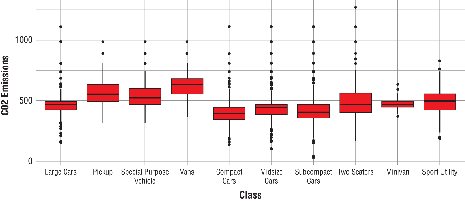
Figure 3.6 Box plot of CO 2 emissions by vehicle class
- Is a feature significant?
- How do features interact with each other?
- Are there outliers in the data?
The ggplot package provides the geom_point() geometry for creating scatterplots. Similar to what we did for the box plot, we pass our data to ggplot(), set the aesthetic parameters, and layer a title and axis labels unto the chart. See Figure 3.7.
Code snippet
> vehicles %>% ggplot() + geom_point(mapping = aes(x = citympg, y = co2emissions), color = "blue", size = 2) + labs(title = "Scatterplot of CO2 Emissions vs. City Miles per Gallon", x = "City MPG", y = "CO2 Emissions") Warning message: Removed 6 rows containing missing values (geom_point.Do not be alarmed by the warning message. It simply tells us that there are missing values for the citympg feature and that the corresponding instances were excluded from the chart. The chart results show that as city gas mileage increases, CO 2 emissions decrease. This means that vehicles with better fuel efficiency ratings emit less carbon dioxide. This is also as expected.
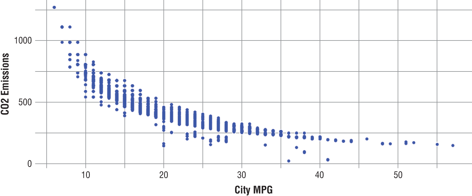
Figure 3.7 Scatterplot of CO 2 emissions versus city gas mileage
Distribution
Distribution visualizations show the statistical distribution of the values of a feature. One of the most commonly used distribution visualizations is the histogram. With a histogram you can show the spread and skewness of data for a particular feature (see Chapter 5 for a discussion on skewness). Some of the questions that histograms help us answer include the following:
- What kind of population distribution does the data come from?
- Where is the data located?
- How spread out is the data?
- Is the data symmetric or skewed?
- Are there outliers in the data?
The geom_histogram() geometry in the ggplot package allows us to create a histogram in R. For histograms, we do not set a value for the y-axis because the chart uses the frequency for the feature value as the y-value. We do specify a value for the number of bins to use (bins = 30) for the x-axis of the histogram. See Figure 3.8.
Code snippet
> vehicles %>% ggplot() + geom_histogram(mapping = aes(x = co2emissions), bins = 30, fill = "yellow", color = "black") + labs(title = "Histogram of CO2 Emissions", x = "CO2 Emissions", y = "Frequency")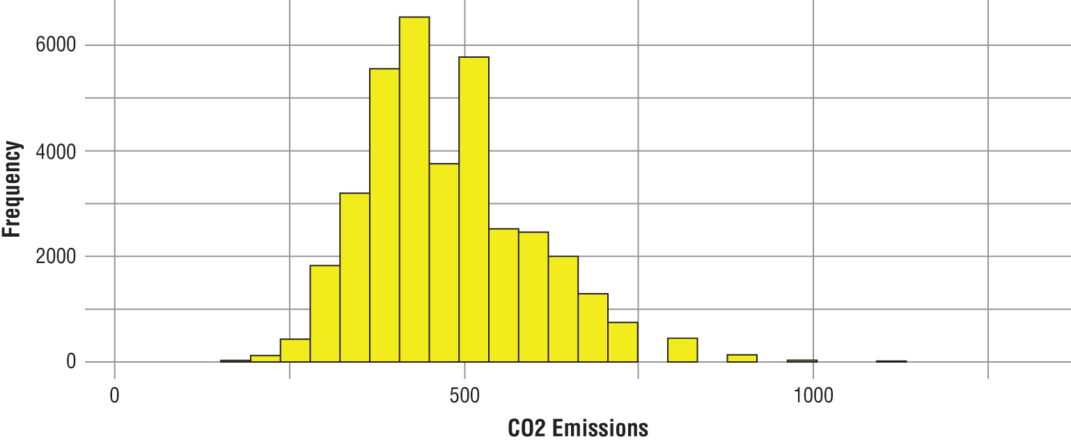
Figure 3.8 Histogram of CO 2 emissions
The chart shows that most of the CO 2 emission values are clustered between 250 and 750 grams per mile. It also shows that we do have some outliers at the low end as well as at the high end.
Composition
A composition visualization shows the component makeup of the data. Stacked bar charts and pie charts are two of the most commonly used composition visualizations. With a stacked bar chart, you can show how a total value can be divided into parts or highlight the significance of each part relative to the total value. Some of the questions that stacked bar charts help us answer include the following:
- How do distributions vary within subgroups?
- What is the relative change in composition over time?
- How much does a subgroup contribute to the total?
To create a stacked bar chart using ggplot, we use the geom_bar() geometry. To illustrate how this works, we create a visualization showing the change in drive type composition for each year. We set the x-axis to year, and we show the drive type composition by setting fill = drive. Similar to the histogram, we do not set the value for the y-axis. To help with legibility, we use the coord_flip() command to flip the axes of the chart so that the years are plotted on the y-axis and the number of cars is plotted on the x-axis. See Figure 3.9.
Code snippet
> vehicles %>% ggplot() + geom_bar(mapping = aes(x =year, fill = drive), color = "black") + labs(title = "Stacked Bar Chart of Drive Type Composition by Year", x = "Model Year", y = "Number of Cars") + coord_flip()The results show that other than in 1997, it does appear that no four-wheel drive vehicles were tested before 2010. We also see that two-wheel drive vehicles were tested only in 1984 and 1999. These two observations seem to point to a possible variance in the way vehicle drive types were classified in the impacted years. For example, it is conceivable that all four-wheel drive vehicles were classified as all-wheel drive vehicles every year except for 1997 and from 2010 to 2018. The same logic applies to the classification of two-wheel drive vehicles as either rear-wheel drive or front-wheel drive.
DATA PREPARATION
Prior to the model build process, we need to make sure that the data that we have is suitable for the machine learning approach that we intend to use. This step is known as data preparation. Data preparation involves resolving data quality issues such as missing data, noisy data, outlier data, and class imbalance. It also involves reducing the data or modifying the structure of the data to make it easier to work with.
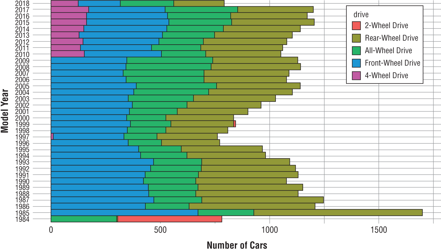
Figure 3.9 Stacked bar chart of drive type composition by year
Cleaning the Data
In computing, the saying “garbage in, garbage out” is used to express the idea that incorrect or poor-quality input will invariably result in incorrect or poor-quality output. This concept is crucially important in machine learning. If proper care is not taken at the front end to properly deal with data quality issues before training a model, then the model output will be unreliable, misleading, or simply wrong.
Missing Values
An ideal dataset is one that has no missing values and has no values that deviate from the expected. Such a dataset hardly exists, if at all. In reality, most datasets have data quality issues that need to be dealt with prior to being used for machine learning. One of the most commonly encountered data quality issues is that of missing data. There are several reasons why data could be missing. These include changes in data collection methods, human error, combining various datasets, human bias, and so forth. It is important to try to understand if there is a reason or pattern for the missing values. For example, particular groups of people may not respond to certain questions in a survey. Understanding this is useful to the machine learning process. Missing values can also have meaning. For example, the absence of a medical test can indicate a particular prognosis.
There are several approaches to dealing with missing data. One approach is to simply remove all instances with features that have a missing value. This is a destructive approach and can result in the loss of valuable information and patterns that would have been useful in the machine learning process. As a result, this approach should be used only when the impact of removing the affected instances is relatively small or when all other approaches to dealing with missing data have been exhausted or are infeasible.
A second approach to dealing with missing data is the use of an indicator value, such as N/A, “unknown,” or –1, to represent missing values. This approach is usually okay when dealing with unordered categorical features. However, if used for continuous features, it could be mistaken for real data and could lead to incorrect assumptions about the data. For example, consider an age dataset for six students. Let's assume that one of the five age values is missing, such that the values are 5, 8, 9, 14, NA, and 19. Excluding the missing value, the mean age of the students would be  . However, if we used -1 as an indicator value to represent the missing value, the mean age of the students would then become
  .
.
An alternative approach to dealing with missing data is to use a method known as imputation. Imputation is the use of a systematic approach to fill in missing data using the most probable substitute values. There are several approaches to imputing missing values. A few of them are discussed next.
Random Imputation
As the name suggests, random imputation involves the use of a randomly selected observed value as the substitute for a missing value. This is a simple approach to imputation; however, it does have some drawbacks. The biggest disadvantage with this approach is that it ignores useful information or patterns in the data when selecting substitute values.
Match-Based Imputation
Match-based imputation is an approach that involves the use of a similar instance with nonmissing values as a substitute for the missing value. There are generally two main approaches to match-based imputation. They differ based on where the instances for the nonmissing data come from.
The first type of match-based imputation is known as hot-deck imputation. In this approach, the similar instance belongs to the same dataset as the instance with missing data. For example, consider the same dataset of student ages that we discussed previously. Let's assume that for the dataset we also had gender information for each student. If we then realized that there are only two male students in the dataset, one of which is missing an age, using hot-deck imputation, we would use the observed age of the one male student as a substitute for the age of the male student whose age is missing.
The second type of match-based imputation is known as cold-deck imputation. With this approach, we use a separate dataset to get the substitute values. Using the same example that we used to illustrate the hot-deck approach, with cold-deck imputation, we identify a similar male student with a nonmissing age value from a second dataset and use their age as a substitute for the missing age in the first dataset. Note that the match we use here (age) is rather simplistic. A good match-based approach requires that we find several similarities between the two instances with which to create a match. The more, the better.
Distribution-Based Imputation
In the distribution-based imputation approach, the substitute value for a missing feature value is chosen based on the probability distribution of the observed values for the feature. This approach is often used for categorical values, where the mode for the feature is used as a substitute for the missing value. Recall that the mode of a feature is the value that has the highest frequency, which means that it is the most frequently occurring value.
Predictive Imputation
Predictive imputation is the use of a predictive model (regression or classification) to predict the missing value. With this approach, the feature with the missing value is considered the dependent variable (class or response), while the other features are considered the independent variables. There is a lot of overhead involved with predictive imputation as we essentially are training a model to resolve missing values, as part of the data preparation phase, before we actually begin the modeling process. Because of this, predictive imputation should be used only when absolutely necessary. Quite often, one of the other imputation approaches discussed here will prove to be quite sufficient in resolving the missing values in a dataset.
Mean or Median Imputation
For continuous features, the most commonly used approach for dealing with missing values is the mean or median imputation approach. As the name suggests, the approach involves the use of the mean or median of the observed values as a substitute for the missing value. To illustrate how mean and median imputation work, we will refer to our vehicles dataset. Recall that the descriptive statistics for the dataset showed that we had missing values for three of the features in the dataset— citympg, displacement, and highwaympg. As a refresher, let's take a look at the descriptive statistics for these features again.
Code snippet
> vehicles %>% select(citympg, displacement, highwaympg) %>% summary() citympg displacement highwaympg Min. : 6.00 Min. :0.600 Min. : 9.00 1st Qu.:15.00 1st Qu.:2.200 1st Qu.:20.00 Median :17.00 Median :3.000 Median :24.00 Mean :17.53 Mean :3.346 Mean :23.77 3rd Qu.:20.00 3rd Qu.:4.300 3rd Qu.:27.00 Max. :57.00 Max. :8.400 Max. :61.00 NA's :6 NA's :9 NA's :8The results show that we have six missing values for citympg, nine missing values for displacement, and eight missing values for highwaympg. The median and mean values for each of the features are not significantly different, so we could use either measure for imputation. For illustrative purposes, we will use median imputation for the citympg and highwaympg features and use mean imputation for the displacement feature. In R, to use the mean imputation approach to resolve the missing values for the citympg feature, we use the mutate verb from the dplyr package, as well as the ifelse() base R function and the median() function from the stats package.
Code snippet
> vehicles <- vehicles %>% mutate(citympg = ifelse(is.na(citympg), median(citympg, na.rm = TRUE), citympg)) %>% mutate(highwaympg = ifelse(is.na(highwaympg), median(highwaympg, na.rm = TRUE), highwaympg))Let's break down the code. The first line states that we are going to perform a series of operations against the vehicles dataset and that the resulting dataset from those operations should overwrite the original vehicles dataset. The second line uses the mutate verb to specify that we intend to modify the value of the citympg feature based on the output of the code following the equal sign (=). The ifelse() function does a logical test and returns a value depending on the result of the test. The syntax is as follows: ifelse(test, yes, no). This states that if the result of the test is TRUE, then it returns the yes value, else it returns the no value. In our example, the test is is.na(citympg). This is a test to evaluate whether the value for citympg is missing “(NA)” for each instance in the vehicles dataset. If the value is missing, then the median of the observed values is returned. However, if the value is not missing, then the citympg value is returned. This has the effect of changing only the missing values to the median of the observed values. Note that the median() function includes the argument na.rm = TRUE. This tells the function to ignore the missing values when computing the median. While not as useful for the median, ignoring missing values when computing the mean of a set of values has more significance. In the third line of the code, we also applied the same median imputation approach to resolve the missing values for the highwaympg feature.
For displacement feature, we use mean imputation instead of median imputation. To do this, we simply switch out the median() function with the mean() function.
Code snippet
> vehicles <- vehicles %>% mutate(displacement = ifelse( is.na(displacement), mean(displacement, na.rm = TRUE), displacement ))Now, let's take another look at our descriptive statistics to make sure that we no longer have the missing values in our dataset.
Code snippet
> vehicles %>% select(citympg, displacement, highwaympg) %>% summary() citympg displacement highwaympg Min. : 6.00 Min. :0.600 Min. : 9.00 1st Qu.:15.00 1st Qu.:2.200 1st Qu.:20.00 Median :17.00 Median :3.000 Median :24.00 Mean :17.53 Mean :3.346 Mean :23.77 3rd Qu.:20.00 3rd Qu.:4.300 3rd Qu.:27.00 Max. :57.00 Max. :8.400 Max. :61.00The results show that we no longer have missing values in our dataset. We also notice that the descriptive statistics all remained unchanged. This is a good outcome. It means that our imputation approach did not have an appreciable impact on the properties of the dataset. While this is a good thing, it is not always the outcome of imputation. Often, depending on the number of missing values and the imputation approach chosen, the descriptive statistics will vary slightly after imputing missing values. The objective should be to keep these changes as small as possible.
Noise
Noise is the random component of measurement error. It is often introduced by the tools used in collecting and processing data. Noise is nearly always present in data and can sometimes be difficult to get rid of, so it is important that a robust machine learning algorithm be able to handle some noise in the data. If noise presents a problem for the selected machine learning approach, instead of trying to remove it, the objective should be on minimizing its impact. The process of minimizing noise in data is known as smoothing. There are several approaches to smoothing. They include smoothing with bin means, smoothing with bin boundaries, smoothing by clustering, and smoothing by regression.
Smoothing with Bin Means
Smoothing with bin means involves sorting and grouping the data into a defined number of bins and replacing each value within a bin with the mean value for the bin. The choice of the number of bins to use is up to the user. However, it is important to note that the larger the number of bins, the smaller the reduction in noise; and the smaller the number of bins, the larger the reduction in noise. To illustrate how smoothing by bin means works, let's consider a dataset of 12 values,  , which are sorted in ascending order. Assuming that we choose to bin our data into three bins, then the values in each bin would be
  ,
,  , and
, and  . The means of the values in the bins are
  , and
, and  , respectively. Therefore, we replace the values in each bin by the mean so that we now have the following 12 values for our dataset:
  .
.
Smoothing with Bin Boundaries
A closely related alternative method to smoothing with bin means is smoothing with bin boundaries. With this approach, instead of replacing the values in each bin by the mean, we replace the values by either one of the bin boundaries based on proximity. The bin boundaries are the smallest and largest numbers in each bin. To illustrate how this works, let's consider the same dataset of 12 values, sorted in ascending order:  . Using three bins again, the bins will be
  ,
,  , and
, and  . For the first bin, the boundaries are
  and
and  . To smooth the values in this bin, we need to evaluate how close each value in the original set is to the bin boundaries and substitute each value by the boundary value closest to it. The first value is
  , which happens to be the lower bound, so we leave it as
  . The next value is 8, with a distance of
  from the lower bound and
  from the upper bound. Since
  is closer to the lower bound than the upper bound, we replace it with the lower bound
  . The next value in the set is
  , with a distance of
  from the lower bound and
  from the upper bound. Since
  is closer to the lower bound than the upper bound, we also replace it with the lower bound
  . The last value in the set is
This is the upper bound, so we leave it as is. The smoothed bin values will now be  . Applying this same approach to the other two bins, our smoothed dataset will now be
Smoothing by Clustering
Another approach to smoothing involves the use of an unsupervised machine learning approach known as clustering. We discuss clustering in much more detail in Chapter 12. With the smoothing by clustering approach, the instances in a dataset are each assigned to one of any number of clusters defined by the user. The mean of each cluster is then computed and serves as a substitute for each instance assigned to the cluster. For example, in Figure 3.10, we have 14 instances (colored circles) with two features (Feature A and Feature B), segmented into three separate clusters (red, blue, and yellow dashed lines). The mean (or center) of each cluster is represented by the black diamonds (C1, C2, and C3). To smooth this dataset by clustering, we substitute the values of the original instances with those of the cluster centers.

Figure 3.10 Illustration of the smoothing by clustering approach, on 14 instances with 2 features segmented into 3 clusters
Smoothing by Regression
Smoothing by regression involves the use of the supervised machine learning approach, known as linear regression, to smooth feature values. Linear regression is discussed in much more detail in Chapter 4. The idea behind smoothing by regression is to use a fitted regression line as a substitute for the original data. To illustrate how this works, let's consider a dataset of 14 instances, made up of one independent variable  and a dependent variable
  . Each of the instances is represented by the coordinates
  (see the yellow circles in Figure 3.11). To smooth the data by regression, we use the points on a fitted linear regression line (blue line) as a substitute for the original data. For example, the values for instance
  now become
  , after smoothing.
Outliers
An outlier is a data point that is significantly different from other observations within a dataset. Outliers manifest either as instances with characteristics different from most other instances or as values of a feature that are unusual with respect to the typical values for the feature. Unlike noise, outliers can sometimes be legitimate data. As a result, once they are identified, we should spend some time understanding why they exist in our data and whether they are useful. Quite often, the determination of whether an outlier is useful or not is dependent on the learning goal.
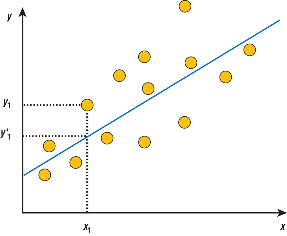
Figure 3.11 Illustration of the smoothing by regression approach on 14 instances represented by

In some cases, outliers are simply bad data. If that is the case, the outlier should be removed or replaced using one of the imputation methods that we previously discussed for dealing with missing data. Outliers could also be legitimate data, which could be interesting and useful to the machine learning process. If so, then the outlier data should be kept. However, some machine learning approaches, such as linear regression (see Chapter 4), are particularly sensitive to outliers. So, if we must keep the outlier data, then an approach such as decision trees (see Chapter 8), which are able to handle outliers in a robust way, may be more appropriate. In Chapters 4 and 5, we introduce several approaches to identifying and dealing with outliers.
Class Imbalance
Machine learning algorithms learn from the examples. As we discussed in Chapter 1, these examples are known as the training data. For a classification problem, the goal of the machine learning algorithm is to identify patterns in labeled training data that help it correctly assign labels (or a class) to new unlabeled data. The more training examples the algorithm gets, the more confident it is in the patterns it discovers and the better it does in assigning labels to new data.
Let's consider a popular classification problem: fraud detection for credit card transactions. This type of classification problem is known as a binary classification problem because there are only two class labels (Fraud or No Fraud). All of the classification problems we deal with in this text will be binary classification problems. To train a model to solve this type of problem, we need to provide the model with examples of previous credit card transactions to learn from. Each example would include several features that describe a transaction, as well as a label of whether the transaction was classified as fraudulent or not. The more examples that the model sees of fraudulent transactions, the better it becomes at identifying the patterns that correspond with fraud. Conversely, the more examples of nonfraudulent transactions it sees, the better it also becomes at learning the patterns that correspond with nonfraudulent transactions.
For classification problems, the proportion of examples that belong to each class is known as the class distribution. Ideally, we want the class distribution of training data to be uniform or balanced for the learning algorithm to have an equal shot at learning the patterns that correspond to each class. However, for some problems, such as our fraud detection example, this is not the case. The vast majority of credit transactions are not fraudulent. Therefore, the class distribution for the training data will not be balanced. It will be skewed toward the nonfraud examples. This is known as class imbalance.
There are several binary classification problems where class imbalance is not only common, it is expected. Some of these problems include spam detection, intrusion detection, churn prediction, loan default prediction, and so on. For these problems, a significant proportion of the observed examples belong to one class. The class with more examples is called the majority class, while the class with fewer examples is called the minority class.
There are several problems associated with class imbalance in machine learning. One problem has to do with the effectiveness of the learning process. Due to the nature of class imbalance problems, most often the minority class is the class of interest. This is because the minority class typically represents a rare but important event that needs to be identified. However, because there are fewer examples for the minority class, it is more challenging for a model to effectively learn the patterns that correspond with the minority class and to differentiate them from those associated with the majority class.
A second problem with learning against imbalanced data is that it can result in deceptively optimistic predictive accuracy. Let's consider a problem where 99.9 percent of the observed and future examples belonged to the majority class. Without any machine learning, one could simply predict that all future examples belong to the majority class and achieve a predictive accuracy of 99.9 percent. This is known as the accuracy paradox. Here the predictive accuracy is simply reflecting the underlying class distribution of the dataset.
There are several approaches to dealing with class imbalance in machine learning.
- Collect more data: To minimize the imbalance in the distribution between the majority and minority class, we can attempt to collect more examples of the minority class.
- Change the performance metric: Since we know that predictive accuracy can be misleading with imbalanced data, we should use other measures of performance when evaluating a model trained against imbalanced data. Measures such as precision, recall, kappa, and the ROC curve are often used. We discuss these measures extensively in Chapter 9.
- Try a different algorithm: Certain machine learning algorithms are particularly sensitive to class imbalance, while others are not. When training a model to solve a class imbalance problem, we should consider models such as decision trees and random forest, which handle the imbalance in class distribution well.
- Resample the data: A common approach to dealing with class imbalance is to change the class distribution of the training data with the use of sampling. There are two common ways that this is done. The first is to select fewer examples from the majority class for the training data. This is known as under-sampling. The second approach involves creating more copies of the minority class for the training data. This is known as over-sampling. The copies created either can be duplicates of the existing data or can be synthetic examples, which are derived from the existing minority examples. One of the most popular algorithms used to generate synthetic examples is called the Synthetic Minority Over-sampling Technique (SMOTE). We illustrate the use of SMOTE to deal with class imbalance in Chapter 5.
Transforming the Data
As part of the data preparation process, it is often necessary to modify or transform the structure or characteristics of the data to meet the requirements of a particular machine learning approach, to enhance our ability to understand the data, or to improve the efficiency of the machine learning process. In this section, we discuss several approaches that help us accomplish these things.
Normalization
The goal of standardization or normalization is to ensure that an entire set of values has a particular property. Often, this involves scaling data to fall within a small or specified range. Four of the common approaches to normalization include decimal scaling, z-score normalization, min-max normalization, and log transformation.
Decimal Scaling
Decimal scaling as a method of normalization involves moving the position of the decimal point on a set of values, such that the maximum absolute value is less than or equal to 1. Let's consider a dataset with five values:  . To normalize this dataset using decimal scaling, we need to divide each original value
  by a multiple of 10, such that the maximum absolute value of the dataset is less than or equal to 1. Mathematically this is represented as follows:

where  is the smallest integer such that
  . For our example dataset, since the maximum value is
  , we set
  . Therefore, to normalize the first value by decimal scaling, we compute
  . Using this same approach for the remaining four values, our normalized dataset will now be
  .
.
To illustrate how normalization by decimal scaling is done in R, let's attempt to normalize the co2emissions feature of our vehicles dataset. Before we do so, we once again take a look at the descriptive statistics for the feature.
Code snippet
> vehicles %>% select(co2emissions) %>% summary() co2emissions Min. : 29.0 1st Qu.: 400.0 Median : 467.7 Mean : 476.6 3rd Qu.: 555.4 Max. :1269.6The results show that the minimum value is  , while the maximum value is
  . Consider Equation 3.1, the smallest integer value for
  such that
  is
is  . In other words,
  is the number of digits before the decimal place for the number
  Using the
 mutate verb, we create a new normalized version of the co2emissions feature, called co2emissions_d, based on Equation 3.1.
Code snippet
> vehicles %>% select(co2emissions) %>% mutate(co2emissions_d = co2emissions / (10^4)) %>% summary() co2emissions co2emissions_d Min. : 29.0 Min. :0.00290 1st Qu.: 400.0 1st Qu.:0.04000 Median : 467.7 Median :0.04677 Mean : 476.6 Mean :0.04766 3rd Qu.: 555.4 3rd Qu.:0.05554 Max. :1269.6 Max. :0.12696The descriptive statistics provide a statistical summary of the values for the co2emissions feature, before and after normalization (co2emissions_d) by decimal scaling.
Z-Score Normalization
The second normalization approach that we look at is known as z-score, or zero mean normalization. It gets its name from the fact that the approach results in normalized values that have a mean of  and a standard deviation of
  . Given value
  of feature
  , the normalized value for the feature
  is computed as follows:

where  and
and  are the mean and standard deviation of feature
  , respectively. Using the same example from the discussion on decimal scaling, we can use z-score normalization to transform the values of the five-value dataset. First, we need to compute the mean and standard deviation of the values. Using a calculator, we see that those values are
  and
and  , respectively. Then we can use the formula from Equation 3.2 to compute the normalized values. Based on this, to normalize the first value in the dataset, we compute
  . Using this same approach for the remaining four values, our normalized dataset will now become
  .
.
To illustrate how z-score normalization is implemented in R, let's again use the co2emissions feature from the vehicles dataset. This time we use the mean() function that we introduced earlier, as well as the sd() function, which helps us compute the standard deviation of the feature values.
Code snippet
> vehicles %>% select(co2emissions) %>% mutate(co2emissions_z = (co2emissions - mean(co2emissions)) / sd(co2emissions)) %>% summary() co2emissions co2emissions_z Min. : 29.0 Min. :-3.79952 1st Qu.: 400.0 1st Qu.:-0.64988 Median : 467.7 Median :-0.07483 Mean : 476.6 Mean : 0.00000 3rd Qu.: 555.4 3rd Qu.: 0.66972 Max. :1269.6 Max. : 6.73242From the descriptive statistics, we see that the normalized values for the co2emissions feature (co2emissions_z) go from  to
to  . Notice that the mean of the transformed values is now
  .
.
Tip
It's important to note that instead of explicitly specifying the formula for z-score normalization as we did in our example, we can use the scale() base R function instead.
Min-Max Normalization
With min-max normalization, we transform the original data from the measured units to a new interval defined by user-specified lower and upper bounds. Most often, the new bounding values are  and
and  . Mathematically, this transformation is represented as follows:

where  is the original value for feature
  ,
,  is the minimum value for
  ,
,  is the maximum value for
  ,
,  is the user-defined lower bound for the normalized values, and
  is the user-defined upper bound. Applied to our five-value dataset of
  , assuming that we decide to use
  and
and  as the lower and upper bounds of our transformed values, the first value will become
  . Using this same approach for the remaining four values, our normalized dataset will now be
  .
.
To illustrate how min-max normalization is done in R, let's once again use the co2emissions feature from the vehicles dataset. We use  and
and  as our lower and upper bounds.
Code snippet
> vehicles %>% select(co2emissions) %>% mutate(co2emissions_n = ((co2emissions - min(co2emissions)) / (max(co2emissions) - min(co2emissions))) * (1 - 0) + 0 ) %>% summary() co2emissions co2emissions_n Min. : 29.0 Min. :0.0000 1st Qu.: 400.0 1st Qu.:0.2991 Median : 467.7 Median :0.3537 Mean : 476.6 Mean :0.3608 3rd Qu.: 555.4 3rd Qu.:0.4244 Max. :1269.6 Max. :1.0000The descriptive statistics show that the min-max normalized values (co2emissions_n) for our feature now fall between  and
and  .
.
Log Transformation
The normalization approaches discussed so far are usually good if the data distribution is roughly symmetric. For skewed distributions and data with values that range over several orders of magnitude, the log transformation is usually more suitable. With log transformation, we replace the values of the original data by the logarithm, such that:

where  is the original value for feature and
  is the normalized value. The logarithm used for log transform can be the natural logarithm, log base 10, or log base 2. This is generally not critical. However, it is important to note that log transformation works only for values that are positive. Using a log transformation for our five-value dataset of
  , we get
  .
.
To illustrate how log transformation is done in R, let's refer once again to the co2emissions feature from the vehicles dataset.
Code snippet
> vehicles %>% select(co2emissions) %>% mutate(co2emissions_b = log10(co2emissions)) %>% summary() co2emissions co2emissions_b Min. : 29.0 Min. :1.462 1st Qu.: 400.0 1st Qu.:2.602 Median : 467.7 Median :2.670 Mean : 476.6 Mean :2.665 3rd Qu.: 555.4 3rd Qu.:2.745 Max. :1269.6 Max. :3.104Discretization
Discretization involves treating continuous features as if they are categorical. This is often done as a pre-step before using a dataset to train a model. This is because some algorithms require the independent data to be binary or to have a limited number of distinct values. The process of discretization can be accomplished using the binning approaches we discussed previously: smoothing with bin means and smoothing with bin boundaries. For example, we can effectively reduce the number of distinct values for a continuous feature based on the number of bins we choose for any of the two approaches. Besides binning, we could also discretize continuous features into binary values by coding them in terms of how they compare to a reference cutoff value. This is known as dichotomization. For example, given the values  , we can code all values below
  as
as  and all values above as
  to yield
  .
.
Dummy Coding
Dummy coding involves the use of dichotomous (binary) numeric values to represent categorical features. Dummy coding is often used for algorithms that require that the independent features be numeric (such as regression and  -nearest neighbor) and as a way to represent missing data. To explain how dummy coding works, consider the
 drive feature from the vehicles dataset. Let's assume that we have only three values for this feature, coded as follows:
| Drive | Code |
| Front-Wheel Drive | 1 |
| Rear-Wheel Drive | 2 |
| All-Wheel Drive | 3 |
Using dichotomous values coded as  or
or  , we could represent the feature values as follows:
| Drive | Front-Wheel Drive | Rear-Wheel Drive | All-Wheel Drive |
| Front-Wheel Drive | 1 | 0 | 0 |
| Rear-Wheel Drive | 0 | 1 | 0 |
| All-Wheel Drive | 0 | 0 | 1 |
This way of representing the data is known as full dummy coding. This is also sometimes called one-hot encoding. Notice that instead of the one original variable, we now have  variables, where
  represents the number of class levels for the original variable. On close observation, we notice that there is some redundancy to this approach. For example, we know that a vehicle that is neither Front-Wheel Drive nor Rear-Wheel Drive is All-Wheel Drive. Therefore, we do not need to explicitly code for All-Wheel Drive. We could represent the same data as follows:
| Drive | Front-Wheel Drive | Rear-Wheel Drive |
| Front-Wheel Drive | 1 | 0 |
| Rear-Wheel Drive | 0 | 1 |
| All-Wheel Drive | 0 | 0 |
This approach means that we only need  variables to dummy code a variable with
  class levels. In this example, we chose to not explicitly code All-Wheel Drive. This is called the baseline. We could have also chosen to exclude Front-Wheel Drive or Rear-Wheel Drive instead. The choice of which value to use as the baseline is often arbitrary or dependent on the question that a user is trying to answer. For example, if we wanted to evaluate the impact on CO 2 emissions of going from a four-wheel drive car to a two-wheel drive car, it makes sense to use the All-Wheel Drive value as a baseline when training a regression model. In this scenario, the coefficients of the regression model provide us with useful insight into the marginal change in emissions when we go from a four-wheel drive car to a two-wheel drive car. It's okay if this doesn't quite make sense at this stage. We discuss regression, model coefficients, and the use of baseline values in more detail in Chapters 4 and 5.
We can do dummy coding in R using the dummies package. The package provides us with a function called dummy.data.frame() to accomplish this. To illustrate how to dummy code in R, we use the vehicles dataset once again and attempt to dummy code the drive feature to get results similar to our conceptual example in the previous paragraphs. Note that the drive feature currently has more than three values.
Code snippet
> vehicles %>% select(drive) %>% summary() drive 2-Wheel Drive : 491 Rear-Wheel Drive :13194 All-Wheel Drive : 8871 Front-Wheel Drive:13074 4-Wheel Drive : 1349To simplify our illustration, we will recode the 2-Wheel Drive vehicles to Front-Wheel Drive and recode 4-Wheel Drive vehicles to All-Wheel Drive. Instead of overwriting our original dataset, we create a copy of the vehicles dataset, which we call vehicles2. We also create a copy of the drive feature, which we call drive2. The values for drive2 are recoded from drive using the recode() function from the dplyr package (which is loaded as part of the tidyverse package).
Code snippet
> library(tidyverse)> vehicles2 <- vehicles %>% mutate(drive2 = recode(drive, "2-Wheel Drive" = "Front-Wheel Drive")) %>% mutate(drive2 = recode(drive2, "4-Wheel Drive" = "All-Wheel Drive")) %>% select(drive, drive2)Descriptive statistics for the duplicate dataset (vehicles2) show that we now have only three values for the drive2 feature.
Code snippet
> head(vehicles2) # A tibble: 6 x 2 drive drive2 <fct> <fct> 1 2-Wheel Drive Front-Wheel Drive2 2-Wheel Drive Front-Wheel Drive3 2-Wheel Drive Front-Wheel Drive4 Rear-Wheel Drive Rear-Wheel Drive 5 Rear-Wheel Drive Rear-Wheel Drive 6 Rear-Wheel Drive Rear-Wheel Drive > summary(vehicles2) drive drive2 2-Wheel Drive : 491 Front-Wheel Drive:13565 Rear-Wheel Drive :13194 Rear-Wheel Drive :13194 All-Wheel Drive : 8871 All-Wheel Drive :10220 Front-Wheel Drive:13074 4-Wheel Drive : 1349We are now ready to dummy code the drive2 feature. However, before we do so, we learn from the documentation provided for the dummy.data.frame() function that the input dataset for this function has to be a data frame. Using the data.frame() base R function, we make it one.
Code snippet
vehicles2 <- data.frame(vehicles2)Then, we use the dummy.data.frame() function to dummy code the drive2 feature. We pass three arguments to the function. The first (data) is the input dataset. The second argument (names) is the column name for the feature we intend to dummy code. The third argument (sep) is the character used between the name of the feature and the feature value to create a new column name.
Code snippet
> library(dummies)> vehicles2 <- dummy.data.frame(data = vehicles2, names = "drive2", sep = "_")A preview of our dataset shows that the drive2 feature is now dummy coded as three new features.
Code snippet
> head(vehicles2) drive drive2_Front-Wheel Drive drive2_Rear-Wheel Drive drive2_All-Wheel Drive1 2-Wheel Drive 1 0 02 2-Wheel Drive 1 0 03 2-Wheel Drive 1 0 04 Rear-Wheel Drive 0 1 05 Rear-Wheel Drive 0 1 06 Rear-Wheel Drive 0 1 0Reducing the Data
Prior to the model build process, we sometimes find that the data is too large or too complex to use in its current form. As a result, we sometimes have to reduce the number of observations, the number of variables, or both, before we proceed with the machine learning process. In the following sections, we discuss some of the most popular approaches to data reduction.
Sampling
Given an observed dataset, sampling is the process of selecting a subset of the rows in the dataset as a proxy for the whole. In statistical terms, the original dataset is known as the population, while the selected subset is known as the sample. In supervised machine learning, sampling is often used as a means to generate our training and test datasets. There are two common approaches to this. They are simple random sampling and stratified random sampling.
Simple Random Sampling
The simple random sampling process involves randomly selecting  instances from an unordered set of
  instances, where
  is the sample size and
  is the population size. There are two major approaches to simple random sampling. The first approach assumes that whenever an instance is selected for the sample, it cannot be chosen again. This is known as random sampling without replacement. To help illustrate how this approach works, let's consider a bag of
  colored marbles and assume that we intend to randomly select
  of these marbles to create a sample. To do so, we dip into the bag
  different times. Each time, we select one random marble, make note of the color of the marble, and drop it into a second bag. The tally of the marbles selected over all the iterations represents the sample. With this approach, the first time we dip into the bag, the probability of selecting a particular marble is
  . However, the second time we dip into the bag, because we placed the previously selected marble into a second bag, the probability of selecting a particular marble will now be
  . For subsequent iterations, the probability of selecting a particular marble will be
  ,
,  ,
,  , …, and so on. The probability of selecting a particular marble increases with each subsequent iteration.
The second approach to simple random sampling assumes that an instance can be selected multiple times during the sampling process. This is known as random sampling with replacement. Let's use the same  colored marbles from the previous example to illustrate how this approach works. Just like before, we also dip into the bag
  different times to create our sample, with one notable difference. This time, we select one random marble, make note of the color of the marble, and then return the selected marble into the bag (instead of dropping it into a second bag). With this approach, because we return the selected marble into the original bag, the probability of selecting a particular marble remains the same (
 ) across all iterations. This approach to sampling is also known as bootstrapping and forms the basis for a popular method used in evaluating the future performance of a model. We discuss this in more detail in Chapter 9.
To do simple random sampling in R, we use the sample() base R function. Let's say we want to generate a sample of  numbers between
  and
and  . To do this, we pass three arguments to the
 sample() function. The first argument is the number of items to choose from. We set this to  , which is the population size. The second argument is the number of items to choose. This, we set to
  , which is the sample size. The final argument specifies whether the sampling should be done with or without replacement. This time we set the argument to
 replace = FALSE, which indicates that we intend to do simple random sampling without replacement.
Code snippet
> set.seed(1234)> sample(100, 20, replace = FALSE) [1] 28 80 22 9 5 38 16 4 86 90 70 79 78 14 56 62 93 84 21 40Note that we called another base R function before the sample() function— set.seed(1234). This function sets the seed for the random number generation engine in R. By setting the seed as  , we guarantee that whenever we run the random sampling code, we get the same set of random numbers. The seed value,
  in this case, is arbitrary and could be any integer value. The important thing is that the same random numbers will be generated whenever we use this seed. A different seed will yield a different set of random numbers. We will use the
 set.seed() function extensively in the rest of the book, whenever we intend to run code that depends on the generation of random numbers. This allows the reader to replicate the results from the text.
Now that we understand how to do simple random sampling without replacement in R, we can easily do simple random sampling with replacement by setting the replace argument in the sample() function to TRUE.
Code snippet
> set.seed(1234)> sample(100, 20, replace = TRUE) [1] 28 80 22 9 5 38 16 4 98 86 90 70 79 78 14 56 62 4 4 21Note that this time, we have some duplicates in our sample. For example, we have three occurrences of the number  .
.
As we mentioned earlier, sampling is often used in machine learning to split the original data into training and test datasets prior to the modeling process. To do so, we use the simple random sampling without replacement technique to generate what we call a sample set vector. This is simply a list of integer values that represent the row numbers in the original dataset. Using our vehicles dataset as an example, we know that it consists of  instances. This is the population size. Let's assume that we intend to split the data such that
  percent of the data is used for the training set and
  percent for the test set. To do so, we first need to generate a sample set vector of
  numbers that represent the rows of the original data, which we will use as the training set. Using the
 sample() function, we do this as follows:
Code snippet
> set.seed(1234)> sample_set <- sample(36979, 27734, replace = FALSE)The sample_set object now has  numbers, as we can see from the global environment window in RStudio. In this example, we explicitly specified the values for the population size and the sample size. Instead of doing this, we could have also used the
 nrow() function to get the number of rows of the vehicles dataset and set that as the population size in the sample() function. Using this same approach, the sample size would then be specified as nrow(vehicles) * 0.75.
Code snippet
> set.seed(1234)> sample_set <- sample(nrow(vehicles), nrow(vehicles) * 0.75, replace = FALSE)Now, we can select the rows of the vehicles dataset that are represented in the sample set vector as our training set. This is specified as vehicles[sample_set, ].
Code snippet
> vehicles_train <- vehicles[sample_set, ]> vehicles_train # A tibble: 27,734 x 12 citympg cylinders displacement drive highwaympg make model class <dbl> <dbl> <dbl> <fct> <dbl> <fct> <fct> <fct> 1 23 4 1.9 Fron... 31 Satu... SW Comp... 2 14 8 4.2 All-... 23 Audi R8 Two ... 3 15 8 5.3 4-Wh... 22 GMC Yuko... Spor... 4 25 4 1.9 Fron... 36 Satu... SC Subc... 5 17 6 2.5 Fron... 26 Ford Cont... Comp... 6 17 6 3.8 Fron... 27 Chev... Mont... Mids... 7 20 4 2 Fron... 22 Plym... Colt... Comp... 8 10 8 5.2 All-... 15 Dodge W100... Pick... 9 22 4 1.6 Rear... 26 Suzu... Vita... Spor...10 17 6 4 Rear... 22 Niss... Fron... Pick...# ... with 27,724 more rows, and 4 more variables: year <fct>,# transmissiontype <fct>, transmissionspeeds <dbl>,# co2emissions <dbl>To select the rows of the vehicles dataset that are not represented in the sample set vector, we specify this as vehicles[-sample_set, ]. These instances make up our test set.
Code snippet
> vehicles_test <- vehicles[-sample_set, ]> vehicles_test # A tibble: 9,245 x 12 citympg cylinders displacement drive highwaympg make model class <dbl> <dbl> <dbl> <fct> <dbl> <fct> <fct> <fct> 1 14 8 4.1 Rear... 19 Cadi... Brou... Larg... 2 18 8 5.7 Rear... 26 Cadi... Brou... Larg... 3 19 4 2.6 2-Wh... 20 Mits... Truc... Pick... 4 18 4 2 2-Wh... 20 Mazda B200... Pick... 5 23 4 2.2 2-Wh... 24 Isuzu Pick... Pick... 6 18 4 2 2-Wh... 24 GMC S15 ... Pick... 7 21 4 2 2-Wh... 29 Chev... S10 ... Pick... 8 19 4 2 2-Wh... 25 Chev... S10 ... Pick... 9 26 4 2.2 2-Wh... 31 Chev... S10 ... Pick...10 21 4 2.2 2-Wh... 28 Dodge Ramp... Pick...# ... with 9,235 more rows, and 4 more variables: year <fct>,# transmissiontype <fct>, transmissionspeeds <dbl>,# co2emissions <dbl>Now we have two new objects that represent our training and test sets—a  -sample dataset called
 vehicles_train and a  -sample dataset called
 vehicles_test.
Stratified Random Sampling
Stratified random sampling is a modification of the simple random sampling approach that ensures that the distribution of feature values within the sample matches the distribution of values for the same feature in the overall population. To accomplish this, the instances in the original data (the population) are first divided into homogenous subgroups, known as strata. Then the instances are randomly sampled within each stratum. The membership of an instance within a stratum is based on its shared attribute with other instances within the stratum. For example, using color for stratification, all instances within the blue stratum will have a color attribute of blue.
To illustrate how stratified random sampling works, let's once again consider the previous example of a bag with  colored marbles. This time, we assume that of the
  marbles,
  of them are blue,
  are red, and
  of them are yellow. To generate a stratified sample of 20 marbles based on color from the original set, we would first need to group the marbles into three strata by color and then randomly sample from each stratum. Since 20 is a fifth of the population, we would need to also sample a fifth of the marbles in each strata. This means that for the blue stratum, we sample
  marbles. For the red stratum, we sample
  marbles. And for the yellow stratum, we sample
  marbles. This gives us a total of
  marbles that maintain the same color distribution as the population.
There are several R packages that provide functions for stratified random sampling. One such package is the caTools package. Within this package is a function called sample.split() that allows us to generate stratified random samples from a dataset. To illustrate how this function works, we will generate a stratified random sample from the vehicles dataset using the drive feature for stratification. Before we begin, let's note the proportional distribution of values for the drive feature in the vehicles dataset.
Code snippet
> vehicles %>% select(drive) %>% table() %>% prop.table(). 2-Wheel Drive Rear-Wheel Drive All-Wheel Drive 0.01327781 0.35679710 0.23989291 Front-Wheel Drive 4-Wheel Drive 0.35355202 0.03648016Now, let's assume that we intend to select  percent of the data for our sample. Using the simple random sampling approach, the proportional distribution of values for the
 drive feature would be as follows:
Code snippet
> set.seed(1234)> sample_set <- sample(nrow(vehicles), nrow(vehicles) * 0.01, replace = FALSE)> vehicles_simple <- vehicles[sample_set, ]> vehicles_simple %>% select(drive) %>% table() %>% prop.table(). 2-Wheel Drive Rear-Wheel Drive All-Wheel Drive 0.008130081 0.344173442 0.260162602 Front-Wheel Drive 4-Wheel Drive 0.349593496 0.037940379Note that while the proportional distributions are close to those of the original dataset, they are not quite the same. For example, the distribution for 2-Wheel Drive cars in the original dataset is  percent, but
  percent in the sample dataset. To ensure that the distribution of values for the
 drive in the sample are as close as possible to that of the original dataset, we need to stratify the dataset using the drive feature and random sample from each stratum. This is where the sample.split() function from the caTools package comes in. We pass two arguments to the function. The first is the feature that we intend to use for stratification. In our case, that would be vehicles$drive. The second argument specifies how much of the original data should be used to create the sample (SplitRatio). Since we intend to use  percent of the data for the sample, we set this value to
  .
.
Code snippet
> library(caTools)> set.seed(1234)> sample_set <- sample.split(vehicles$drive, SplitRatio = 0.01)Similar to the sample() function, the sample.split() function returns a sample set vector. However, this vector does not list the row numbers that are to be selected. Instead, the vector is a logical vector of the same size as the original data with elements (which represent instances) that are to be selected, set as TRUE, and those that are not, set to FALSE. As a result, we use the subset() function to select the rows that correspond to TRUE for the sample.
Code snippet
> vehicles_stratified <- subset(vehicles, sample_set == TRUE)Now, let's take a look at the proportional distribution of values for the drive feature in the sample.
Code snippet
> vehicles_stratified %>% select(drive) %>% table() %>% prop.table(). 2-Wheel Drive Rear-Wheel Drive All-Wheel Drive 0.01351351 0.35675676 0.24054054 Front-Wheel Drive 4-Wheel Drive 0.35405405 0.03513514We can see that the proportional distribution of values for the drive feature is now much closer to those of the original dataset. This is the value of stratified random sampling. In practice, stratified random sampling is often used in creating the test dataset that is used to evaluate a classification model on highly imbalanced data. In such a scenario, it is important for the test data to closely mimic the class imbalance present in the observed data.
Dimensionality Reduction
As the name suggests, dimensionality reduction is simply the reduction in the number of features (dimensions) of a dataset prior to training a model. Dimensionality reduction is an important step in the machine learning process because it helps reduce the time and storage required to process data, improves data visualization and model interpretability, and helps avoid the phenomenon known as the curse of dimensionality. There are two major approaches to dimensionality reduction: feature selection and feature extraction.
The Curse of Dimensionality
The curse of dimensionality is a phenomenon in machine learning that describes the eventual reduction in the performance of a model as the number of features (dimensions) used to build it increase without a sufficient corresponding increase in the number of examples.
Feature Selection
The idea behind feature selection (or variable subset selection) is to identify the minimal set of features that result in a model with performance reasonably close to that obtained by a model trained on all the features. The assumption with feature selection is that some of the independent variables are either redundant or irrelevant and can be removed without having much of an impact on the performance of the model. For most of the machine learning approaches we introduce in the rest of the text, we will perform feature selection to some extent as part of data preparation.
Feature Extraction
Feature extraction, which is also known as feature projection, is the use of a mathematical function to transform high-dimensional data into lower dimensions. Unlike with feature selection, where the final set of features is a subset of the original ones, the feature extraction process results in a final set of features that are completely different from the original set. These new features are used in place of the original ones. While feature extraction is an efficient approach to dimensionality reduction, it does present one notable disadvantage—the values for the newly created features are not easy to interpret and may not make much sense to the user. Two of the most popular feature extraction techniques are principal component analysis (PCA) and non-negative matrix factorization (NMF). The mechanics of how these two approaches work is beyond the scope of this book. For readers interested in a more detailed explanation, we refer you to the book The Elements of Statistical Learning by Trevor Hastie, et al.
EXERCISES
- For all manual transmission vehicles in the
vehiclesdataset, list the descriptive statistics for thedrive,make,model, andclassvariables only. - Using the min-max normalization approach, normalize the values of the
co2emissionsvariable in thevehiclesdataset so that they fall between the values of 1 and 10. Show the descriptive statistics for the original and normalized variables. - In the
vehiclesdataset, discretize theco2emissionsvariable using the High value for emission levels at or above 500 grams per mile and Low for emission levels below this mark. Using the discretized variable for the strata, generate a stratified random sample of percent of the dataset. Show the proportional distribution of values for the discretized variable for the original population and for the sample.