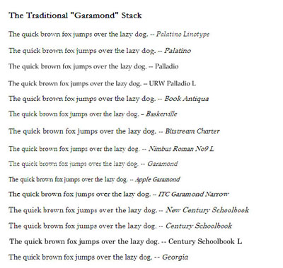
font-family: "Palatino Linotype", Palatino, Palladio, "URW Palladio L", "Book Antiqua", Baskerville, "Bookman Old Style", "Bitstream Charter", "Nimbus Roman No9 L", Garamond, "Apple Garamond", "ITC Garamond Narrow", "New Century Schoolbook", "Century Schoolbook", "Century Schoolbook L", Georgia, serif;
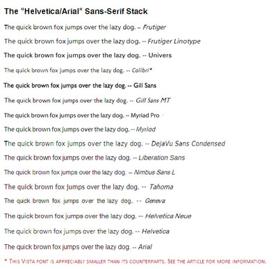
 The Helvetica/Arial-based sans serif stack:
font-family: Frutiger, "Frutiger Linotype", Univers, Calibri, "Gill Sans", "Gill Sans MT", "Myriad Pro", Myriad, "DejaVu Sans Condensed", "Liberation Sans", "Nimbus Sans L", Tahoma, Geneva, "Helvetica Neue", Helvetica, Arial, sans-serif;
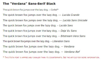
 The Verdana-based sans serif stack:
font-family: Corbel, "Lucida Grande", "Lucida Sans Unicode", "Lucida Sans", "DejaVu Sans", "Bitstream Vera Sans", "Liberation Sans", Verdana, "Verdana Ref", sans-serif;
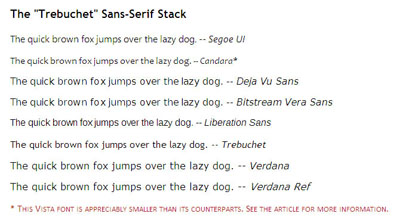
 The Trebuchet-based sans serif stack:
font-family: "Segoe UI", Candara, "Bitstream Vera Sans", "DejaVu Sans", "Bitstream Vera Sans", "Trebuchet MS", Verdana, "Verdana Ref", sans-serif;
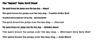
 The heavier “Impact” sans serif stack:
font-family: Impact, Haettenschweiler, "Franklin Gothic Bold", Charcoal, "Helvetica Inserat", "Bitstream Vera Sans Bold", "Arial Black", sans-serif;
 The monospace stack:
font-family: Consolas, "Andale Mono WT", "Andale Mono", "Lucida Console", "Lucida Sans Typewriter", "DejaVu Sans Mono", "Bitstream Vera Sans Mono", "Liberation Mono", "Nimbus Mono L", Monaco, "Courier New", Courier, monospace;
 “A good rule of thumb is that the closer to one another are the font sizes of the various levels, the more elegant the overall impression will be. If you’re after a disjointed or modern feel, try using font sizes that are further apart on the scale.”
– Andy Hume
“A good rule of thumb is that the closer to one another are the font sizes of the various levels, the more elegant the overall impression will be. If you’re after a disjointed or modern feel, try using font sizes that are further apart on the scale.”
– Andy Hume
Rationale behind the Stacks
It’s true that there are an unusually large number of fonts in most of the stacks, but there’s a reason for this: there’ll be a huge disparity of what people are likely to have on their machines. It’s better to use a more common font as an approximation than going back to the generic, fallback serif or sans serif choice. There are also a lot of Linux fonts towards the bottom of most of the stacks, mostly because different flavors of Linux provide different fonts for their users. A lot of fonts undergo name changes over the different operating systems, which is why I’ve listed them all; for example, Palatino, Palatino Linotype, Palladio, URW Palladio L, and Book Antiqua are all (more or less) the same font. Additionally, some thought has been put into which variants have a larger Unicode character family, and which then precede its cousin in its stack (kudos to my friend, Tommy Olsson for reminding me of this important font element). As noted above, the general ordering is: the less widespread Windows fonts, then Mac fonts, then Linux varieties, then universal fonts, and finally, the generic family name. This is why the more well-known fonts (Arial, Verdana, Georgia) bring up the rear – they are as close to universal as you can have. Certainly you’ll want to reorder these stacks to suit the needs of your site and its regular users. Of course, your font stacks will be largely determined by what you’re actually styling. What works beautifully for a header might well strike out as body text. Yes, it’s obvious, but how many sites have we visited (or be honest, created) that violated this caveat? I once designed a site for a high school mythology class that used an ancient Greek typographical font (the name of which escapes me now). I thought that since the Greek typography looked so good in the headers, it would also complement the body text. That decision lasted all of thirty seconds. As I remember, the body text ended up presented in Verdana – a much more readable choice.Frequently Asked Questions about Definitive Font Stacks
What are definitive font stacks and why are they important in web design?
Definitive font stacks are a group of fonts listed in a CSS style declaration. They are important in web design because they ensure that if the first font in the stack is not available on a user’s system, the browser will attempt to display the next font in the stack. This ensures that the website maintains a consistent look and feel across different systems and browsers.
How do I choose the right font stack for my website?
Choosing the right font stack for your website depends on several factors. These include the nature of your content, your target audience, and the overall aesthetic you want to achieve. It’s important to choose fonts that are widely available across different systems to ensure maximum compatibility.
What is the difference between serif and sans-serif fonts?
Serif fonts have small lines or strokes attached to the ends of larger strokes in a letter or symbol. Examples include Times New Roman and Georgia. Sans-serif fonts, on the other hand, do not have these strokes. Examples include Arial and Helvetica. The choice between serif and sans-serif fonts can significantly impact the readability and overall aesthetic of your website.
How can I ensure that my chosen font stack is compatible with most systems and browsers?
To ensure maximum compatibility, it’s advisable to include a mix of web-safe fonts, system fonts, and web fonts in your font stack. Web-safe fonts are fonts that are pre-installed on many computer systems, while system fonts are specific to the operating system. Web fonts are downloaded from the internet and can be used on any website.
What are some examples of popular font stacks?
Some popular font stacks include the “Helvetica/Arial” stack, which includes Helvetica, Arial, and sans-serif, and the “Georgia/Time” stack, which includes Georgia, “Times New Roman”, Times, and serif. These stacks are popular because they include widely available, web-safe fonts.
Can I use custom fonts in my font stack?
Yes, you can use custom fonts in your font stack. However, keep in mind that not all users may have these fonts installed on their systems. Therefore, it’s important to include fallback fonts in your stack to ensure that your website displays correctly for all users.
How do I implement a font stack in CSS?
To implement a font stack in CSS, you list the fonts in order of preference in the “font-family” property. For example, font-family: Helvetica, Arial, sans-serif;. The browser will display the first font in the list that is available on the user’s system.
What is the role of the generic family in a font stack?
The generic family is the last item in a font stack and serves as the final fallback option. It includes generic font families like serif, sans-serif, monospace, cursive, and fantasy. If none of the specific fonts in the stack are available, the browser will display a font from the generic family.
How does the font stack affect website performance?
The font stack can impact website performance, especially if it includes web fonts. Web fonts need to be downloaded from the internet, which can slow down page load times. Therefore, it’s important to balance aesthetic considerations with performance when choosing your font stack.
Can I use different font stacks for different elements on my website?
Yes, you can use different font stacks for different elements on your website. For example, you might choose one font stack for headings and another for body text. This can help to create visual hierarchy and improve readability.
 Michael Tuck
Mike is an educator, freelance writer, and self-taught PC user who maintains a Windows resource site at ToeJumper. His hobbies include basketball, politics, and spoiling his cats.