This article was sponsored by Microsoft. Thank you for supporting the sponsors who make SitePoint possible.
Welcome back to our series of articles using Microsoft’s modern IDE: Visual Studio Community 2015 to quickly design and build an attractive, functional site for a client. If you missed the last instalment, check it out here.
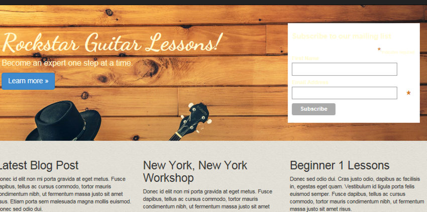
Now that Andy has the website front page available, he can begin building out the site a little more. This will involve implementing an email signup form, as well as contact and about pages.
We’ll start with an email signup form then move into creating some additional pages. The email signup form will be front and center on the homepage. It will be placed on the right side of the jumbotron, where there is some empty space available.
For the email signup form, we’ll use a form from MailChimp. Andy is using his client’s MailChimp account and will use an existing list for the homepage. Everyone that signs up on the homepage will go into this list.
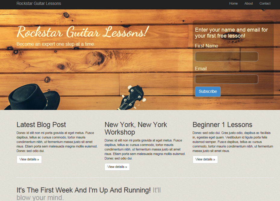
Our signup form will be designed to look like this:
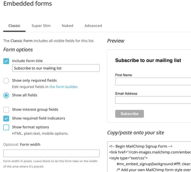
Getting Code from MailChimp
Once logged into MailChimp, select the list you want people added to. Click Signup Forms. Click embedded forms. Classic style is fine. The client wants to capture first name and email address. MailChimp actually has these as the default so we can leave things as they are.
Your screen in MailChimp should look like the following:
Copy the HTML. This is what we’ll paste into the jumbotron. In the jumbotron under this line:
<p><a class="btn btn-primary btn-lg" href="#" role="button">Learn more »</a></p>Add the MailChimp form code. If you run the app, it should look like the following:
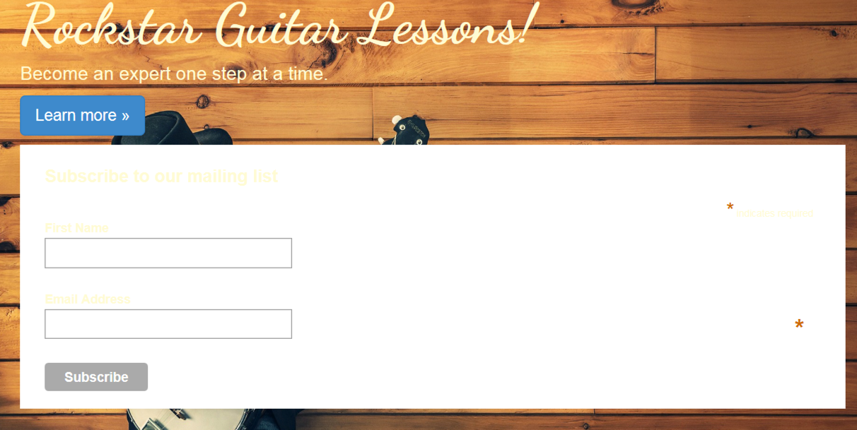
Obviously this isn’t what we want it to look like but this is good a starting point. From here, we’ll format the form using Bootstrap and get everything aligned properly.
Modifying Signup Form With Bootstrap
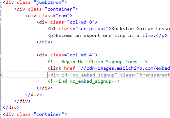
With the current formatting, we’ve lost our responsive design. The site title needs to be left while the signup form goes to the right. They should also be on the same row. Bootstrap will help us get things back in order.
We can add a couple of columns. Surround the jumbotron with a
and the MailChimp code with a
. This formatting means the site title text will take up 2/3 of the jumbotron while the signup format takes up 1/3.
Your code should look like the following:
Remember, Bootstrap is using a 12 grid system. 8 + 4 = 12 and you can see from these numbers how we get 2/3 and 1/3.
If you run the site, you’ll see we have two columns and our responsive web design is back.
Next, we’ll begin polishing the signup form UI so it blends in better with the site.
UI Polishing
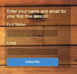
Rather than going through lots of little steps, it will be easier to display what the finished MailChimp modifications should look like. Then we can step through. Replace your current MailChimp code with the following:
<!-- Begin MailChimp Signup Form -->
<link href="//cdn-images.mailchimp.com/embedcode/classic-081711.css" rel="stylesheet" type="text/css">
<div id="mc_embed_signup" class="transparent-background soft-border-radius">
<form action="#" method="post" id="mc-embedded-subscribe-form" name="mc-embedded-subscribe-form" class="validate" target="_blank" novalidate>
  <div id="mc_embed_signup_scroll">
  <h3>Enter your name and email for<br /> your first FREE lesson!</h3>

  <div class="mc-field-group">
  <label for="mce-FNAME" class="not-bold">First Name </label>
  <input type="text" value="" name="FNAME" class="transparent-background soft-border-radius" id="mce-FNAME">
  </div>
  <div class="mc-field-group">
  <label for="mce-EMAIL" class="not-bold">Email </label>
  <input type="email" value="" name="EMAIL" class="required email transparent-background soft-border-radius" id="mce-EMAIL">
  </div>


  <div id="mce-responses" class="clear">
  <div class="response" id="mce-error-response" style="display:none"></div>
  <div class="response" id="mce-success-response" style="display:none"></div>
  </div>
  <!-- real people should not fill this in and expect good things - do not remove this or risk form bot signups-->
  <div style="position: absolute; left: -5000px;"><input type="text" name="b_f27f671242f9376d66eb9034e_a5f924c1e8" tabindex="-1" value=""></div>

  <input type="submit" class="btn btn-primary btn-lg" value="Subscribe" name="subscribe" />

  </div>
  </form>
</div>
<!--End mc_embed_signup-->
I’ve added a few lines of space in the code to better help break up the form for discussion.
There are a few custom classes that we’ll create, which include not-bold, transparent-background, and soft-border-radius. We define these classes in site.css.
Since most of the MailChimp code is the same as what we copied from MailChimp, let’s discuss what’s going on with these custom classes.
not-bold is defined as follows:
.not-bold {
    font-weight:normal;
}
It simply removes bold letters. This is used to de-emphasize the form field labels. Our call to action is bolded. If the form field labels are also bolded, the eye will struggle a little to figure out where to focus. Worse case scenario: people simply give up and bypass our signup form.
The screenshot below shows the use of .not-bold
transparent-background provides semi transparency to the form background and input fields, providing a little more depth to our design. It is defined as:
.transparent-background {
   background-color: rgba(0, 0, 0, 0.25)
}
rgba simply means red, green, blue and alpha. Alpha sets opacity. The lower this value, the more transparent. Values can range from 0 to 1.
soft-border-radius makes our form and input fields express a little elegant detail with rounded corners. This class is defined as:
.soft-border-radius {
  border-radius: 10px;
}
Finally, we have a full-width blue button. .max-width helps us here. Not only does the blue provide great contrast and brings the eye right to it, but the large size makes it irresistible for clicking. .max-width is defined as:
.max-width {
width:100%;
}
Adding the above classes to site.css and pasting in the above form code should result in the same signup form as shown above.
Thank You Page
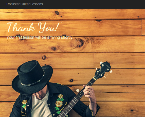
When users sign up, it’s usually nice to provide a confirmation page to let them know everything went well. How many times have you signed up to someone’s list only to be greeted by an extremely unimaginative thank you page?
Andy knows his client is a true artist and wants to go the extra mile. This means not skimping by using a some stock thank you page. However, we’ll keep things consistent by using the same color scheme and theme from the home page.
To create the thank you page, open Controllers/HomeController.cs. Add the following:
public IActionResult ThankYou()
    {
        ViewBag.Message = "Your thank you page.";

        return View();
    }
Because this is an MVC app, when someone types in /Home/ThankYou, it will hit the above method. Of course, we aren’t expecting anyone to type in the thank you page since this will be produced as a confirmation from signing up to our client’s email list.
We need a view for this method to serve up. Open the Views/Home folder and make a copy of Contact.cshtml. Rename the copied file to ThankYou.cshtml.
Our thank you page will basically be the jumbotron from the home page. Clear out the code in ThankYou.cshtml, leaving only the ViewBag code at the top. Paste in the following:
<div class="jumbotron jumbotron-tall">
<div class="container">
    <h1 class="scriptfont">Thank You!</h1>
    <p>Your first lesson will be arriving shortly.</p>
</div>
</div>
Making a copy of the Contact page allows us to take full advantage of the existing page structure. We’ll have our familiar navigation and footer without needing to do anything.
You probably noticed the class jumbotron-tall. This is a new class, which adds some extra height to the thank you page. Otherwise, we’d end up with a fairly short strip running across the top. It wouldn’t have been too impressive.
The larger image looks great and gives some additional air time to our artist (i.e. client).
jumbotron-tall is defined as:
.jumbotron-tall {
min-height:800px;
}
Your final thank you page should look like the following:
Contact Page
We want to give potential customers an opportunity to contact our client directly through his site. This is where the contact page will come. We’ll follow the basic outline as above to create the contact page. Our final page will look like the following:
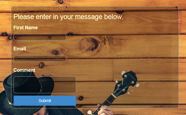
Open Views/Home and you’ll notice there is already a Contact.cshtml. Just as we did earlier with the thank you page, clear out everything except the top ViewBag code. We’re going to use the jumbotron again. We’ll use two columns as before except the right side will be empty. This lets our contact form align more to the left.
There are a few new CSS classes we’re going to introduce that will also effect our homepage. The first class is:
.button-xl {
width:100%;
margin-top:10px;
}
This is specifically for the blue button at the bottom of the form. Adding this class will create a wider button and add a little space between the top of the button and bottom of the comment box. We can also apply this class to our homepage button.
Next up is a modification to an existing class:
.soft-border-radius {
border-radius: 10px;
border: 1px solid #999
}
For this form, we’ll be using a structure similar to the MailChimp form code. But we aren’t going to use MailChimp’s CSS since we aren’t using their signup form.
One thing the MailChimp CSS provided was darker borders around the input fields. That is now gone. To compensate, we’re adding a border inside soft-border-radius, which will have the same effect.
In the contact form, we’ve added a comment textarea box. This box can have scrollbars, which by default will be fairly white. This brighter color will create a large contrast with our darker colors. To help the scrollbars blend in better, we need to modify the textarea:
textarea {
scrollbar-arrow-color:#333;
scrollbar-base-color:#333;
scrollbar-darkshadow-color:#333;
scrollbar-shadow-color:#333;
color:#fffad5;
}
Notice the color of fffad5, which changes our comment field text from black to a brighter yellow. We’re doing the same for the input field:
input {
color:#fffad5;
}
All of the above CSS classes go into site.css.
Now we can move on to the form code.
<div class="jumbotron">
<div class="container">
 <div class="row">
 <div class="col-md-8">
   <div class="transparent-background soft-border-radius">
   <form action="#" method="post" class="form-format" target="_blank" novalidate>
   <div>
   <h2>Please enter in your message below.</h2>

   <div>
   <label for="FNAME">First Name </label><br />
   <input type="text" value="" name="FNAME" class="transparent-background soft-border-radius" id="FNAME">
   </div>
   <div>
   <label for="EMAIL">Email </label><br />
   <input type="email" value="" name="EMAIL" class="transparent-background soft-border-radius" id="EMAIL">
   </div>

   <div>
   <label for="COMMENT">Comment </label><br />
   <textarea value="" cols="30" rows="3" name="comment" class="transparent-background soft-border-radius" id="COMMENT">  </textarea>
   </div>
   <div>
   <input type="submit" class="btn btn-primary btn-lg button-xl" value="Submit" name="submit" />
   </div>
   </div>
   </form>
   </div>
   </div>

 <div class="col-md-4">
 </div>
 </div>
 </div>
</div>
You might notice some similarities with the MailChimp form. This is actually a modified version of that form. The contact form sits in the left column, which is col-md-8 wide. This creates a 2/3 wide column since our right column is col-md-4. Remember, 8 + 4 = 12, which is the number of columns making up our 12 column grid in Bootstrap.
Summary
Andy’s client now has a great looking signup form that’s sure to attract signups. He’s also added a contact form that blends in well with the overall theme of the site. At this point, Andy’s client is off to a great start.
Coming up next, we’ll add a way for customers to purchase lessons. Andy’s client recognizes that mobile is a large part of the web now. He wants to ensure the mobile site provides a great user experience. One part of this is sending notifications once a new lesson is available.
Andy has some exciting features to build out for the website. We’re going to continue following along and watching over his shoulder as everything comes together.
 Brett Romero
Brett Romero is a software developer versed in .NET, PHP, Python, and iOS to name a few. He builds desktop, web and mobile applications. As well, he knows Illustrator and Photoshop backwards and forward. His design skills aren't too shabby either. Brett also founded Bitesize Business School, which helps entrepreneurs develop needed technical skills for running an online business while also teaching them invaluable business skills. His undergraduate major was mathematics but he finished with a degree in business administration then went on to study mathematics at the University of Washington. He also has an MBA from Arizona State University.