
Although React is one of the most popular and most used front-end frameworks in the world, many developers still struggle when it comes to refactoring code for improved reusability. If you’ve ever found yourself repeating the same snippet of code all throughout your React app, you’ve come to the right article.
In this tutorial, you’ll be introduced to the three most common indicators that it’s time to build a reusable React component. Then we’ll go on to look at some practical demos by building a reusable layout and two exciting React hooks.
By the time you’ve finished reading, you’ll be able to figure out by yourself when it’s appropriate to create reusable React components, and how to do so.
This article assumes a basic knowledge of React and React hooks. If you want to brush up on these topics, I recommend you to check out “Getting Started with React” guide and “Intorduction to React Hooks”.
Key Takeaways
Top Three Indicators of a Reusable React Component
First let’s look at some indications of when you might want to do this.
Repetitive creation of wrappers with the same CSS style
My favorite sign of knowing when to create a reusable component is the repetitive use of the same CSS style. Now, you may think, “Wait a minute: why don’t I simply assign the same class name to elements that share the same CSS style?” You’re absolutely right. It’s not a good idea to create reusable components every time some elements in different components share the same style. In fact, it may introduce unnecessary complexity. So you have to ask yourself one more thing: are these commonly styled elements wrappers?
For example, consider the following login and signup pages:
// Login.js
import './common.css';

function Login() {
  return (
    <div className='wrapper'>
      <main>
        {...}
      </main>
      <footer className='footer'>
        {...}
      </footer>
    </div>
  );
}
// SignUp.js
import './common.css';

function Signup() {
  return (
    <div className='wrapper'>
      <main>
        {...}
      </main>
      <footer className='footer'>
        {...}
      </footer>
    </div>
  );
}
The same styles are being applied to the container (the <div> element) and the footer of each component. So in this case, you can create two reusable components — <Wrapper /> and <Footer /> — and pass them children as a prop. For example, the login component could be refactored as follows:
// Login.js
import Footer from "./Footer.js";

function Login() {
  return (
    <Wrapper main={{...}} footer={<Footer />} />
  );
}
As a result, you no longer need to import common.css in multiple pages or create the same <div> elements to wrap everything.
Repetitive use of event listeners
To attach an event listener to an element, you can either handle it inside useEffect() like this:
// App.js
import { useEffect } from 'react';

function App() {
  const handleKeydown = () => {
    alert('key is pressed.');
  }

  useEffect(() => {
    document.addEventListener('keydown', handleKeydown);
    return () => {
      document.removeEventListener('keydown', handleKeydown);
    }
  }, []);

  return (...);
}
Or you can do it directly inside your JSX like this, as is demonstrated in the following button component:
// Button.js
function Button() {
  return (
    <button type="button" onClick={() => { alert('Hi!')}}>
      Click me!
    </button>
  );
};
When you want to add an event listener to document or window, you’d have to go with the first method. However, as you may have already realized, the first method requires more code with the use of useEffect(), addEventListener() and removeEventListener(). So in such case, creating a custom hook will allow your components to be more concise.
There are four possible scenarios for using event listeners:
- same event listener, same event handler
- same event listener, different event handler
- different event listener, same event handler
- different event listener, different event handler
In the first scenario, you can create a hook where both the event listener and the event handler are defined. Consider the following hook:
// useEventListener.js
import { useEffect } from 'react';

export default function useKeydown() {
  const handleKeydown = () => {
    alert('key is pressed.');
  }

  useEffect(() => {
    document.addEventListener('keydown', handleKeydown);
    return () => {
      document.removeEventListener('keydown', handleKeydown);
    }
  }, []);
};
You can then use this hook in any component as follows:
// App.js
import useKeydown from './useKeydown.js';

function App() {
  useKeydown();
  return (...);
};
For the other three scenarios, I recommend creating a hook that receives an event and an event handling function as props. For example, I will pass keydown and handleKeydown as props to my custom hook. Consider the following hook:
// useEventListener.js
import { useEffect } from 'react';

export default function useEventListener({ event, handler} ) {
  useEffect(() => {
    document.addEventListener(event, props.handler);
    return () => {
      document.removeEventListener(event, props.handler);
    }
  }, []);
};
You can then employ this hook in any component as follows:
// App.js
import useEventListener from './useEventListener.js';

function App() {
  const handleKeydown = () => {
    alert('key is pressed.');
  }
  useEventListener('keydown', handleKeydown);
  return (...);
};
Repetitive use of the same GraphQL script
You don’t really need to look for signs when it comes to making GraphQL code reusable. For complex applications, GraphQL scripts for a query or a mutation easily take up 30–50 lines of code because there are many attributes to request. If you’re using the same GraphQL script more than once or twice, I think it deserves its own custom hook.
Consider the following example:
import { gql, useQuery } from "@apollo/react-hooks";

const GET_POSTS = gql`
  query getPosts {
    getPosts {
    user {
      id
      name
      ...
      }
      emojis {
         id
         ...
      }
      ...
  }
`;

const { data, loading, error } = useQuery(GET_POSTS, {
  fetchPolicy: "network-only"
});
Instead of repeating this code in every page that requests posts from the back end, you should create a React hook for this particular API:
import { gql, useQuery } from "@apollo/react-hooks";

function useGetPosts() {
  const GET_POSTS = gql`{...}`;
  const { data, loading, error } = useQuery(GET_POSTS, {
    fetchPolicy: "network-only"
  });
  return [data];
}

const Test = () => {
  const [data] = useGetPosts();
  return (
    <div>{data?.map(post => <h1>{post.text}</h1>)}</div>
  );
};
Building Out Three Reusable React Components
Now that we’ve seen some common signs of when to create a new component that you can share throughout your react application, let’s put that knowledge into practice and build out three practical demos.
1. Layout component
React is normally used for building complex web apps. This means that a large number of pages need to be developed in React, and I doubt that every page of an app will have a different layout. For instance, a web app consisting of 30 pages usually uses less than five different layouts. Therefore, building a flexible, reusable layout that can be utilized in many different pages is essential. This will save you very many lines of code and consequently a tremendous amount of time.
Consider the following React functional component:
// Feed.js
import React from "react";
import style from "./Feed.module.css";

export default function Feed() {
  return (
    <div className={style.FeedContainer}>
      <header className={style.FeedHeader}>Header</header>
      <main className={style.FeedMain}>
        {
          <div className={style.ItemList}>
            {itemData.map((item, idx) => (
              <div key={idx} className={style.Item}>
                {item}
              </div>
            ))}
          </div>
        }
      </main>
      <footer className={style.FeedFooter}>Footer</footer>
    </div>
  );
}

const itemData = [1, 2, 3, 4, 5];
This is a typical web page that has a <header>, a <main> and a <footer>. If there are 30 more web pages like this, you would easily get tired of repeatedly writing HTML tags and applying the same style over and over.
Instead, you can create a layout component that receives <header>, <main> and <footer> as props, as in the following code:
// Layout.js
import React from "react";
import style from "./Layout.module.css";
import PropTypes from "prop-types";

export default function Layout({ header, main, footer }) {
  return (
    <div className={style.Container}>
      <header className={style.Header}>{header}</header>
      <main className={style.Main}>{main}</main>
      <footer className={style.Footer}>{footer}</footer>
    </div>
  );
}

Layout.propTypes = {
  main: PropTypes.element.isRequired,
  header: PropTypes.element,
  footer: PropTypes.element
};
This component doesn’t require <header> and <footer>. So, you can use this same layout for pages regardless of whether they contain a header or a footer.
Using this layout component, you can turn your feed page into a much more sophisticated block of code:
// Feed.js
import React from "react";
import Layout from "./Layout";
import style from "./Feed.module.css";

export default function Feed() {
  return (
    <Layout
      header={<div className={style.FeedHeader}>Header</div>}
      main={
        <div className={style.ItemList}>
          {itemData.map((item, idx) => (
            <div key={idx} className={style.Item}>
              {item}
            </div>
          ))}
        </div>
      }
      footer={<div className={style.FeedFooter}>Footer</div>}
    />
  );
}

const itemData = [1, 2, 3, 4, 5];
Pro tip for creating layouts with sticky elements
Many developers tend to use position: fixed or position: absolute when they want to stick a header to the top of the viewport or a footer to the bottom. However, in the case of layouts, you should try to avoid this.
Since the elements of a layout will be the parent elements of passed props, you want to keep the style of your layout elements as simple as possible — so that passed <header>, <main>, or <footer> are styled as intended. So, I recommend applying position: fixed and display: flex to the outermost element of your layout and setting overflow-y: scroll to the <main> element.
Here’s an example:
/* Layout.module.css */
.Container {
  /* Flexbox */
  display: flex;
  flex-direction: column;

  /* Width & Height */
  width: 100%;
  height: 100%;

  /* Misc */
  overflow: hidden;
  position: fixed;
}

.Main {
  /* Width & Height */
  width: 100%;
  height: 100%;

  /* Misc */
  overflow-y: scroll;
}
Now, let’s apply some styles to your feed page and see what you’ve built:
/* Feed.module.css */
.FeedHeader {
  /* Width & Height */
  height: 70px;

  /* Color & Border */
  background-color: teal;
  color: beige;
}

.FeedFooter {
  /* Width & Height */
  height: 70px;

  /* Color & Border */
  background-color: beige;
  color: teal;
}

.ItemList {
  /* Flexbox */
  display: flex;
  flex-direction: column;
}

.Item {
  /* Width & Height */
  height: 300px;

  /* Misc */
  color: teal;
}

.FeedHeader,
.FeedFooter,
.Item {
  /* Flexbox */
  display: flex;
  justify-content: center;
  align-items: center;

  /* Color & Border */
  border: 1px solid teal;

  /* Misc */
  font-size: 35px;
}
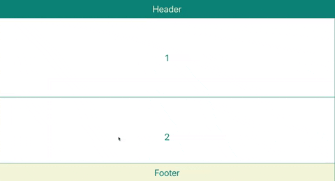
Sticky header and footer demo
And here’s the code in action.
This is what it looks like on desktop screens.
This is what it looks like on mobile screens.
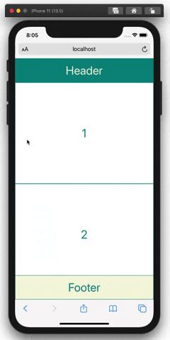
This layout works as intended on iOS devices, too! In case you don’t know, iOS is notorious for bringing unexpected position-related problems to the development of web apps.
2. Event Listener
Often, the same event listener is used more than once throughout a web app. In such a case, it’s a great idea to create a custom React hook. Let’s learn how to do this by developing a useScrollSaver hook, which saves the scroll position of a user’s device on a page — so that the user doesn’t need to scroll all again from the top. This hook will be useful for a web page in which a large number of elements, such as posts and comments, are listed; imagine the feed pages of Facebook, Instagram and Twitter without a scroll saver.
Let’s break down the following code:
// useScrollSaver.js
import { useEffect } from "react";

export default function useScrollSaver(scrollableDiv, pageUrl) {
  /* Save the scroll position */
  const handleScroll = () => {
    sessionStorage.setItem(
      `${pageUrl}-scrollPosition`,
      scrollableDiv.current.scrollTop.toString()
    );
  };
  useEffect(() => {
    if (scrollableDiv.current) {
      const scrollableBody = scrollableDiv.current;
      scrollableBody.addEventListener("scroll", handleScroll);
      return function cleanup() {
        scrollableBody.removeEventListener("scroll", handleScroll);
      };
    }
  }, [scrollableDiv, pageUrl]);

  /* Restore the saved scroll position */
  useEffect(() => {
    if (
      scrollableDiv.current &&
      sessionStorage.getItem(`${pageUrl}-scrollPosition`)
    ) {
      const prevScrollPos = Number(
        sessionStorage.getItem(`${pageUrl}-scrollPosition`)
      );
      scrollableDiv.current.scrollTop = prevScrollPos;
    }
  }, [scrollableDiv, pageUrl]);
}
You can see that the useScrollSaver hook needs to receive two items: scrollableDiv, which must be a scrollable container just like the <main> container in your layout above, and pageUrl, which will be used as an identifier of a page so that you can store scroll positions of multiple pages.
Step 1: Save the scroll position
First of all, you need to bind a “scroll” event listener to your scrollable container:
const scrollableBody = scrollableDiv.current;
scrollableBody.addEventListener("scroll", handleScroll);
return function cleanup() {
  scrollableBody.removeEventListener("scroll", handleScroll);
};
Now, every time scrollableDiv is scrolled by a user, a function called handleScroll will be run. In this function, you should utilize either localStorage or sessionStorage to save the scroll position. The difference is that data in localStorage doesn’t expire, while data in sessionStorage is cleared when the page session ends. You can use setItem(id: string, value: string) to save data in either storage:
const handleScroll = () => {
  sessionStorage.setItem(
    `${pageUrl}-scrollPosition`,
    scrolledDiv.current.scrollTop.toString()
  );
};
Step 2: Restore the scroll position
When a user comes back to a web page, the user should be directed to his or her previous scroll position — if there is any. This position data is currently saved in sessionStorage, and you need to take it out and use it. You can use getItem(id: string) to obtain data from the storage. Then, you simply need to set scroll-top of the scrollable container to this obtained value:
const prevScrollPos = Number(
  sessionStorage.getItem(`${pageUrl}scrollPosition`)
);
scrollableDiv.current.scrollTop = prevScrollPos;
Step 3: Use useScrollSaver hook in any web page
Now that you’ve finished creating your custom hook, you can use the hook in any web page you’d like as long as you pass the two required items to the hook: scrollableDiv and pageUrl. Let’s go back to Layout.js and use your hook in there. This will allow any web page that uses this layout to enjoy your scroll saver:
// Layout.js
import React, { useRef } from "react";
import style from "./Layout.module.css";
import PropTypes from "prop-types";
import useScrollSaver from "./useScrollSaver";

export default function Layout({ header, main, footer }) {
  const scrollableDiv = useRef(null);
  useScrollSaver(scrollableDiv, window.location.pathname);
  return (
    <div className={style.Container}>
      <header className={style.Header}>{header}</header>
      <main ref={scrollableDiv} className={style.Main}>
        {main}
      </main>
      <footer className={style.Footer}>{footer}</footer>
    </div>
  );
}
Scrollsaver Demo
And here’s the code running in a Sandbox. Try scrolling the page, then using the arrow in the bottom left and corner to reload the app.
You’ll find yourself positioned at where you left off!
3. Query/Mutation (specific to GraphQL)
If you like to use GraphQL with React, as I do, you can reduce your codebase even further by creating a React hook for GraphQL queries or mutations.
Consider the following example for running a GraphQL query getPosts():
import { gql, useQuery } from "@apollo/react-hooks";

const GET_POSTS = gql`
  query getPosts {
    getPosts {
    user {
      id
      name
      ...
      }
      emojis {
         id
         ...
      }
      ...
  }
`;

const { data, loading, error } = useQuery(GET_POSTS, {
  fetchPolicy: "network-only"
});
If there are more and more attributes to request from the back end, your GraphQL script will take up more and more space. So, instead of repeating the GraphQL script and useQuery every time you need to run query getPosts(), you can create the following React hook:
// useGetPosts.js
import { gql, useQuery } from "@apollo/react-hooks";

export default function useGetPosts() {
  const GET_POSTS = gql`
  query getPosts {
    getPosts {
    user {
      id
      name
      ...
      }
      emojis {
         id
         ...
      }
      ...
  }
  `;

  const { data, loading, error } = useQuery(GET_POSTS, {
    fetchPolicy: "network-only"
  });

  return [data, loading, error];
}
Then, you can use your useGetPosts() hook as follows:
// Feed.js
import React from "react";
import Layout from "./Layout";
import style from "./Feed.module.css";
import useGetPosts from "./useGetPosts.js";

export default function Feed() {
  const [data, loading, error] = useGetPosts();
  return (
    <Layout
      header={<div className={style.FeedHeader}>Header</div>}
      main={
        <div className={style.ItemList}>
          {data?.getPosts.map((item, idx) => (
            <div key={idx} className={style.Item}>
              {item}
            </div>
          ))}
        </div>
      }
      footer={<div className={style.FeedFooter}>Footer</div>}
    />
  );
}
Conclusion
In this article, you’ve learned the three most common indicators of a reusable React component and the three most popular uses cases. Now you have the knowledge of when to create a reusable React component and how to do so easily and professionally. You’ll soon find yourself enjoying refactoring lines of code into a sophisticated reusable React component or hook. Using these refactoring techniques, our development team at Clay was able to reduce our codebase to a manageable size. I hope you can, too!
FAQs About Creating Reusable React Components
What Are Reusable Components in React.js?
Reusable components in React.js are fundamental building blocks that encapsulate specific pieces of user interface (UI) functionality, making it possible to construct applications in a modular and efficient manner. These components are designed to be used throughout your application or even across different projects, offering a level of code reusability that significantly simplifies development. They promote a clear separation of concerns by encapsulating their logic and rendering, ensuring that their internal implementation details remain hidden from the rest of the application. This not only enhances code organization and maintainability but also enables developers to work more collaboratively by sharing and reusing components across teams and projects.
One of the primary advantages of reusable components is their ability to maintain consistency in the user interface. By employing the same components across different parts of the application, you can ensure a uniform look and feel, adhering to design guidelines and creating a more polished user experience. These components are parameterized through props, allowing for customization and adaptation to various use cases. This parameterization feature provides a balance between consistency and flexibility, giving developers the power to fine-tune component behavior and appearance according to the specific requirements of each application feature or page.
Reusability not only saves time and effort but also simplifies the testing process. Isolated and encapsulated components are easier to test, and you can create unit tests to verify their correctness and functionality. By incorporating reusable components into your React applications, you can establish a maintainable, modular, and consistent codebase, ultimately promoting development efficiency and improving the overall quality of your user interfaces.
What is an example of a reusable component in React?
A common example of a reusable component in React is a “Button” component. Buttons are a fundamental part of user interfaces and are used throughout applications for various interactions. Creating a reusable Button component in React allows you to maintain a consistent look and behavior while reducing code duplication. Here’s a simple example of a reusable Button component:import React from 'react';const Button = ({ label, onClick, style }) => {return (<button style={style} onClick={onClick} > {label} </button> ); }; export default Button;
In this example, the Button component is constructed as a functional component that takes three key props: “label” for the text displayed on the button, “onClick” for the click event handler, and an optional “style” prop for customizing the button’s appearance. This component encapsulates the button’s HTML structure and behavior, making it easily reusable throughout the application without the need to duplicate code.
The usage of this Button component showcases its reusability and flexibility. In the parent component (in this case, “App”), you can pass in specific label text, click event handling functions, and style preferences to create different buttons with varying purposes and appearances. By employing such reusable components, you maintain a unified user interface style and improve code maintainability. These components can be extended beyond buttons to encompass more complex UI elements, such as input fields, cards, or navigation bars, resulting in a modular and maintainable React application. Reusable components not only expedite development but also lead to a more consistent, user-friendly interface that adheres to design guidelines and best practices.
How to create reusable components in React?
Creating reusable components in React.js is a foundational practice for building modular and maintainable applications. The process begins with a clear plan, where you identify the specific functionality or user interface (UI) element that you want to encapsulate within the component. Once you’ve defined the component’s purpose, you create a new JavaScript/JSX file within your React project. It’s a good practice to name the file starting with an uppercase letter, adhering to React’s naming conventions.
In this new component file, you define your component’s behavior and rendering logic. Components can be functional or class-based, depending on your needs. When parameterizing your component, you accept props as inputs, which allows you to customize its appearance and behavior. Defining prop types using PropTypes or TypeScript ensures type safety and clarity, making it easier to understand how the component should be used. Once your component is built, it’s ready for use in other parts of your application. You can import and incorporate it, passing in specific props to configure its behavior for each use case.
The result is a more organized codebase that encourages code reusability and maintains a consistent UI style. Reusable components can be easily integrated into different parts of your application, enhancing development efficiency and contributing to a user-friendly and visually consistent user interface.
What are the benefits of reusable components in React?
Reusable components in React offer numerous benefits that significantly enhance the development process and the quality of applications. They promote modularity by breaking down complex user interfaces into smaller, self-contained building blocks, making codebases more organized and maintainable. These components focus on specific functionality or UI elements, allowing developers to manage and update them independently, which reduces the risk of unintended side effects and streamlines the development process.
The primary advantage of reusable components is their reusability, which saves time and effort. You can use the same component in various parts of your application or across different projects, eliminating the need to rewrite similar code. This not only accelerates development but also ensures a consistent user interface. Consistency is another critical benefit. By employing the same component for specific UI elements, you maintain a uniform look and behavior, adhering to design guidelines and improving the user experience.
Additionally, reusable components are highly customizable. They accept props, which enable developers to fine-tune their behavior and appearance to suit different use cases. This parameterization enhances the flexibility and versatility of your components. When issues arise, these isolated components are easier to test and debug, allowing for efficient problem-solving. Furthermore, by sharing and reusing components across projects, teams can collaborate more effectively, maintain a unified UI style, and ensure code consistency, which is essential for large-scale and long-term development efforts. In summary, reusable components in React streamline development, encourage code reusability, maintain UI consistency, and provide customizability, ultimately leading to more efficient, high-quality applications.
What makes a good reusable component in React?
A well-designed reusable component in React exhibits several crucial characteristics. First and foremost, reusability is the core attribute. These components should be created with the intent of being used across different parts of your application or even in separate projects. To achieve this, they must be highly parameterized, allowing developers to customize their appearance and behavior through props. This versatility is a fundamental aspect of what makes a component truly reusable.
Encapsulation is equally important. Reusable components should encapsulate their internal logic and rendering, shielding the implementation details from the rest of the application. This separation of concerns leads to cleaner, more modular code and simplifies integration.
Modularity is another key attribute. Good reusable components should have a singular purpose, focusing on a specific piece of functionality or a particular UI element. This modular design enhances code maintainability and debugging efficiency. Furthermore, ease of testing is vital. Isolated components are easier to test, promoting the creation of robust and reliable code.
Finally, these components should maintain a clear API, specifying the props they accept and their intended purposes. This clarity helps other developers understand how to use the component effectively. By contributing to a consistent user interface when the same component is used for specific UI elements, they ensure a cohesive and user-friendly application. In essence, a good reusable component is reconfigurable, encapsulated, modular, easily testable, and contributes to code maintainability and UI consistency.
 Hanbyeol (Benny) Joo
I have studied computer science at The University of Edinburgh, and currently, I am a freelance software engineer based in London. I focus on optimisation both in life and in coding.