
When building apps in Angular, it’s common to make use of a component library — such as Material UI and PrimeNG — to assist in designing complex UIs. Yet, in the sea of free or affordable component library options lies a hidden trap for developers. These seemingly convenient choices often fall short of the enterprise-grade functionality and performance demanded by complex projects. As a result, precious developer hours are squandered on debugging and patching together a subpar design.
Kendo UI for Angular is a commercial component library designed from the ground up to increase developer productivity. It offers advanced functionality that’s been evolving for over ten years by seasoned experts in the field. This way, developers can spend more time on what’s really important, like building exciting new features and experiences.
Here’s a quick summary of what Kendo UI has to offer:
- professional-quality UI design and design tools
- the largest library of Angular components available
- productivity tools and resources
- acclaimed professional support and documentation
In this article, we’ll explore five things to consider when choosing a component library, and we’ll outline why a commercial Angular components library — such as Kendo UI for Angular — might be the right choice for your team.
We created this article in partnership with Kendo UI for Angular. Thank you for supporting the partners who make SitePoint possible.
1. Complex Components and Advanced Functionality
Complex components, such as Kendo UI’s Data Grid, can require an entire team of developers to build and maintain if created in-house. There’s rich functionality in components like this that could easily cause any software project to go sideways, because developers can spend hours if not weeks trying to put together even trivial functionality like paging.
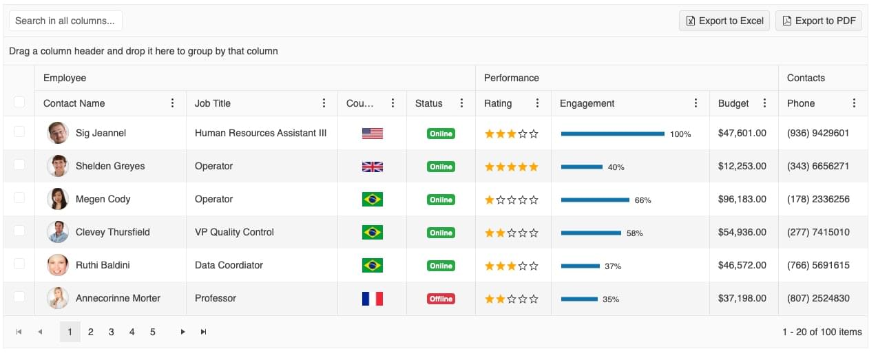
The Kendo UI data grid
Components like this can have lots of tricky functionality, which means more bugs and higher usability demands. The grid in Kendo UI, for example, has advanced filtering, sorting, grouping, aggregates, virtual scrolling and so much more. This isn’t just a stereotypical HTML table, but a rich component meant to help users interact with their data. With Kendo UI, you get all this functionality right out of the box.
Other examples of complex components that aren’t normally found in non-commercial libraries are event calendars, pivot grids, and rich text editors.
2. Professional-quality, Accessible UI Design
Complex functionality means the standards for good design are high, because users expect a UI that’s performant and easy to use.
Accessibility is also a concern. Accessible UI design is more than a UI that’s aesthetically pleasing. Designing accessible components typically includes providing keyboard shortcuts, ensuring sufficient color contrast, and building functionality designed for users with disabilities. These are features that are often overlooked in free or low-cost component libraries, and may be sacrificed in in-house alternatives.
Part of the price of Kendo UI includes dedicated resources that work to deliver components that are modern, consistent, performant and accessible. Kendo UI offers four base themes: Kendo Default, Material, Fluent and Bootstrap. A ThemeBuilder also helps developers and designers customize the user experience.
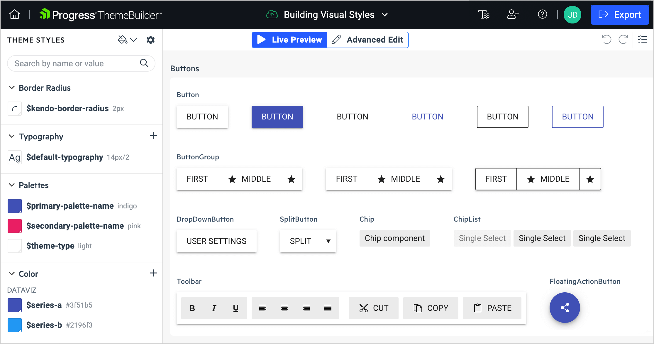
Each Kendo UI theme centers around delivering a use experience that’s consistent, without requiring much effort from developers. Guidelines are available for each theme to help with UI design.
If you’re already using another library, such as Material UI, Kendo UI for Angular will fit right in alongside it; there’s no need to pick one library over the other. The ThemeBuilder also helps maintain a consistent UI with lesser-known libraries.
3. Developer Productivity Tools
Components aren’t the only thing developers get from Kendo UI. There are tools and resources available to make sure developers are as productive as possible.
For example, the Visual Studio Code Productivity tool adds scaffolding and code snippets to the developer experience. This helps developers focus on the code and deliver valuable features. It’s an extension available via the marketplace in Visual Studio Code. Simply search for “Kendo UI Productivity Tools” and install the extension. This developer-friendly tool helps with project creation and integration of the Kendo UI for Angular components. The team at Kendo UI constantly invests efforts to enhance the existing functionality and add new features.
The ThemeBuilder, mentioned above, helps developers edit themes without wrestling with CSS and HTML. This helps drive a consistent user experience with any existing design guidelines. This tool is accessible via the Web and gives developers full control over the look-and-feel of the Kendo UI for Angular components.
Lastly, the Virtual Classroom is an on-demand class that teaches developers how to use Kendo UI for Angular. The online course is designed to help you get started. There are many components available in Kendo UI, and this developer resource can help navigate the library.
4. The Largest Selection of Components Available
A UI library should be the primary source of components, especially in cases where multiple apps are involved. This reduces complexity in the code, gives developers one place to go for help, and keeps licensing costs down.
Kendo UI for Angular has well over a hundred components available. The library has charts, grids, drop-downs, and date inputs, to name but a few. Each one is professionally crafted and maintained, and has productivity tools available. This gives developers the best chance at being as productive as possible without having to reinvent the wheel.
Kendo UI aims to provide everything developers need to build complex, feature-rich UIs. This way, licensing is easy to manage, there’s one place to go for help, and developers won’t feel the need to hunt down components from other libraries and potentially bring in risky dependencies.
5. Acclaimed Support and Documentation
Kendo UI’s commercial license helps maintain a team of professionals who provide expert support promptly. They meticulously create documentation and demos for every component feature.
Kendo UI offers forums, a feedback portal, and technical support. This helps developers overcome any productivity obstacle while in the middle of a project.
The forums in particular have over three million members, with well over 280K problems solved. They provide a community where developers can ask questions and learn from each other. Having such a large community with members worldwide helps developers overcome very difficult problems.
The feedback portal allows your team to become co-creators in the product, helping to shape the future of Kendo UI for Angular, so the rest of the community can benefit from exciting new component features.
Conclusion
Learning how to build complex, feature-rich UIs takes a huge amount of effort. As the complexity of the UI component increases, user demand for usability, performance, and accessibility also goes up.
Kendo UI for Angular provides a simple answer to the question: “How do I build that component?” It enables enterprise developers to focus on the business logic instead, rather than having the overhead of trying to build a complex UI.
If you’d like to give Kendo UI a try, there’s a comprehensive Getting Started tutorial available to walk you through the process. There’s also a full-featured 30-day free trial available along with the tutorial, which includes access to everything — including support, documentation, and productivity tools.
Frequently Asked Questions (FAQs) about Choosing Angular Components Library
What are the key factors to consider when choosing an Angular Components Library?
When choosing an Angular Components Library, it’s crucial to consider several factors. Firstly, the library’s compatibility with your project’s Angular version is paramount. Secondly, the library’s size and performance impact on your application should be evaluated. A lightweight library that doesn’t compromise on performance is ideal. Thirdly, the library’s documentation and community support can significantly influence your development process. A well-documented library with an active community can provide quick solutions to potential issues. Lastly, consider the library’s customization capabilities. A library that allows for easy customization can help you tailor your application to your specific needs.
How does Angular Material compare to other Angular Component Libraries?
Angular Material is a popular choice among Angular Component Libraries due to its comprehensive set of pre-built components, robust documentation, and active community support. It adheres to Material Design principles, providing a modern and responsive user interface. However, it may not be the best choice for projects that require a high degree of customization, as it can be challenging to override the default styles.
What is the role of Angular Components in application architecture?
Angular Components play a crucial role in defining the structure of an Angular application. They are the building blocks of the application’s user interface, encapsulating specific functionality and data. Each component consists of a class that handles data and functionality, an HTML template that determines the UI, and component-specific styles. Components interact with each other through inputs, outputs, and services, forming a tree-like structure that defines your application’s architecture.
How can I create a custom Angular Component?
Creating a custom Angular Component involves defining a new class decorated with the @Component decorator. This decorator provides metadata that determines how the component behaves. The class should include properties for data and methods for functionality. An HTML template and CSS styles associated with the component are also required. Once created, the component can be used in other parts of your application by including its selector in the desired location in the HTML.
What is the difference between Angular Components and Directives?
While both Angular Components and Directives are used to add behavior to elements in your application, they serve different purposes. Components are used to control a section of the UI, including its appearance and behavior. They have a template and may contain other components. On the other hand, Directives are used to add behavior to existing elements. They do not have their own templates and cannot contain other components or directives.
How can I test Angular Components?
Angular provides testing utilities that make it possible to test components in isolation, without needing to run the entire application. These utilities include TestBed for creating a testing module and ComponentFixture for interacting with the component’s template. You can use these tools to simulate user interactions, check the component’s state, and verify that it behaves as expected.
Can I use multiple Angular Component Libraries in a single project?
Yes, it’s possible to use multiple Angular Component Libraries in a single project. However, this can lead to increased complexity and potential conflicts between libraries. It’s generally recommended to stick with a single library that meets your needs, if possible.
How can I optimize the performance of Angular Components?
Optimizing the performance of Angular Components can involve several strategies. These include using the OnPush change detection strategy to minimize unnecessary checks, lazy loading modules to reduce the initial load time, and using trackBy with ngFor to avoid unnecessary DOM manipulations.
What are some common pitfalls when working with Angular Components?
Some common pitfalls when working with Angular Components include not properly managing component state, overusing components leading to unnecessary complexity, and not taking advantage of Angular’s built-in performance optimizations. It’s also important to avoid tightly coupling components, as this can make your application harder to maintain and test.
How can I learn more about Angular Components?
The official Angular documentation is a great resource for learning more about Angular Components. It provides detailed guides on creating and using components, as well as best practices for structuring your application. Additionally, there are many online tutorials and courses available that cover Angular Components in depth.
 Camilo Reyes
Husband, father, and software engineer from Houston, Texas. Passionate about JavaScript and cyber-ing all the things.