I tend to opt for <button> tags rather than <input type="submit" /> but, whichever you prefer, the standard style follows your OS conventions. It can be a little uninspiring…
 Let’s build a better button using CSS3 styles, animations and transformations:
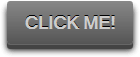 View the button demonstration…
The HTML
No surprises here — we only require a single button tag:<button>Click me!</button>The CSS
Our button should work well in the latest browsers but also degrade gracefully in older applications. That said, I’m only going to add CSS prefixes when they’re absolutely necessary. Firefox, Opera and IE10 support transitions, transformations and animations without prefixes — but we still require -webkit- for Chrome and Safari. Let’s start with some basic styles to format the button:button
{
display: block;
font-size: 1.1em;
font-weight: bold;
text-transform: uppercase;
padding: 10px 15px;
margin: 20px auto;
color: #ccc;
background-color: #555;
background: -webkit-linear-gradient(#888, #555);
background: linear-gradient(#888, #555);
border: 0 none;
border-radius: 3px;
text-shadow: 0 -1px 0 #000;
box-shadow: 0 1px 0 #666, 0 5px 0 #444, 0 6px 6px rgba(0,0,0,0.6);
cursor: pointer;background-color has been defined for browsers which do not support linear-gradients. I’ve also set the cursor to pointer — I’ve never understood why browsers don’t do that by default?
The box-shadow is the most interesting property: box-shadow: 0 1px 0 #666, 0 5px 0 #444, 0 6px 6px rgba(0,0,0,0.6). This defines the edge of the button, a 5px “depth” and a light shadow around it.
We complete the block by stating we want transition effects applied to every style when a hover or focus event occurs. Prefixless and -webkit alternatives are required:
-webkit-transition: all 150ms ease;
	transition: all 150ms ease;
}pulsate animation which makes the text glow:
button:hover, button:focus
{
	-webkit-animation: pulsate 1.2s linear infinite;
	animation: pulsate 1.2s linear infinite;
}

@-webkit-keyframes pulsate
{
	0%   { color: #ddd; text-shadow: 0 -1px 0 #000; }
	50%  { color: #fff; text-shadow: 0 -1px 0 #444, 0 0 5px #ffd, 0 0 8px #fff; }
	100% { color: #ddd; text-shadow: 0 -1px 0 #000; }
}

@keyframes pulsate
{
	0%   { color: #ddd; text-shadow: 0 -1px 0 #000; }
	50%  { color: #fff; text-shadow: 0 -1px 0 #444, 0 0 5px #ffd, 0 0 8px #fff; }
	100% { color: #ddd; text-shadow: 0 -1px 0 #000; }
}button:active
{
color: #fff;
text-shadow: 0 -1px 0 #444, 0 0 5px #ffd, 0 0 8px #fff;
box-shadow: 0 1px 0 #666, 0 2px 0 #444, 0 2px 2px rgba(0,0,0,0.9);
-webkit-transform: translateY(3px);
transform: translateY(3px);
-webkit-animation: none;
animation: none;
}- the animation is switched off and the text is set to it’s ‘fully glowed’ state
- the button is moved down 3 pixels using translateY
- the
box-shadowwhich defines the button depth is changed to 0 2px 0 #444. It’s therefore been reduced from 5px to 2px, but the 3px translation makes it appear that the button has sunk into the page. - the outer shadow is also reduced to give the impression the button is lower.
View the button demonstration…
The code works as expected in all modern browsers. The only issue I discovered was in Opera — it plays the pulsate animation just once? But they’re switching to WebKit soon, so let’s not worry too much…
Please use the code however you like!
Frequently Asked Questions (FAQs) about Building a Better Button in CSS3
How Can I Add a Hover Effect to My CSS3 Button?
Adding a hover effect to your CSS3 button can make it more interactive and visually appealing. To do this, you can use the “:hover” pseudo-class selector in your CSS. This selector allows you to define a different style for the button when the mouse pointer is over it. Here’s a simple example:.button:hover {
background-color: #4CAF50; /* Green */
color: white;}
In this example, the button’s background color changes to green and the text color changes to white when you hover over it.
How Can I Create a Rounded Button in CSS3?
CSS3 introduces the “border-radius” property, which you can use to create rounded corners for your button. The higher the value, the more rounded the corners will be. Here’s an example:.button {
border-radius: 12px;}
In this example, the button will have rounded corners with a radius of 12 pixels.
How Can I Add a Shadow to My CSS3 Button?
You can add a shadow to your CSS3 button using the “box-shadow” property. This property allows you to create a shadow effect around the button’s frame. Here’s an example:.button {
box-shadow: 0 8px 16px 0 rgba(0,0,0,0.2);}
In this example, the button will have a shadow that’s offset 8 pixels down and has a blur radius of 16 pixels.
How Can I Create a Gradient Background for My CSS3 Button?
CSS3 introduces the “linear-gradient” function, which you can use to create a gradient background for your button. Here’s an example:.button {
background: linear-gradient(to right, #ff7f00, #ff5500);}
In this example, the button’s background will be a gradient that transitions from #ff7f00 to #ff5500 from left to right.
How Can I Add a Transition Effect to My CSS3 Button?
You can add a transition effect to your CSS3 button using the “transition” property. This property allows you to specify the speed of the hover effect. Here’s an example:.button {
transition: 0.3s;}
In this example, the hover effect will transition over a period of 0.3 seconds.
How Can I Create a 3D Button in CSS3?
You can create a 3D button in CSS3 using the “box-shadow” and “text-shadow” properties. These properties allow you to create a 3D effect by adding multiple shadows to the button and its text. Here’s an example:.button {
box-shadow: 0 5px 0 #006600;
text-shadow: 0 1px 1px #009900;}
In this example, the button will have a 3D effect with a green shadow.
How Can I Create a Responsive Button in CSS3?
You can create a responsive button in CSS3 using the “min-width” and “max-width” properties. These properties allow you to specify the minimum and maximum width of the button, ensuring it scales properly on different screen sizes. Here’s an example:.button {
min-width: 100px;
max-width: 200px;}
In this example, the button’s width will be between 100 and 200 pixels, depending on the screen size.
How Can I Add an Icon to My CSS3 Button?
You can add an icon to your CSS3 button using the “content” property in combination with the “::before” or “::after” pseudo-elements. This allows you to insert an icon before or after the button’s text. Here’s an example:.button::before {
content: "\f067";
font-family: FontAwesome;}
In this example, the button will display a plus icon before its text, assuming you’re using the FontAwesome icon library.
How Can I Create a Full-Width Button in CSS3?
You can create a full-width button in CSS3 using the “width” property. Setting this property to “100%” will make the button span the full width of its parent container. Here’s an example:.button {
width: 100%;}
In this example, the button will span the full width of its parent container.
How Can I Create a Disabled Button in CSS3?
You can create a disabled button in CSS3 using the “:disabled” pseudo-class selector. This selector allows you to define a different style for the button when it’s disabled. Here’s an example:.button:disabled {
background-color: #cccccc;
color: #666666;}
In this example, the button’s background color will be #cccccc and the text color will be #666666 when it’s disabled.
 Craig Buckler
Craig is a freelance UK web consultant who built his first page for IE2.0 in 1995. Since that time he's been advocating standards, accessibility, and best-practice HTML5 techniques. He's created enterprise specifications, websites and online applications for companies and organisations including the UK Parliament, the European Parliament, the Department of Energy & Climate Change, Microsoft, and more. He's written more than 1,000 articles for SitePoint and you can find him @craigbuckler.