
In this article, I’ll share my top tips for effective data visualization, which can be easily implemented to make your data easier to understand and believe.
Data plays a significant role in modern business processes and has become a crucial element in our everyday decision-making. Whether we’re presenting data to support our decisions, or consuming data presented by others, effective data visualization is key to making sense of it all.
As a data analyst, I’ve always been passionate about data visualization, constantly seeking ways to communicate data in a more accessible and understandable way.
However, I’ve also seen firsthand how neglecting basic rules of data visualization can make your data difficult to understand and even misleading.
The tips offered in this article are simple yet essential. They help you lay a strong foundation for effective data visualization before you move on to more advanced techniques.
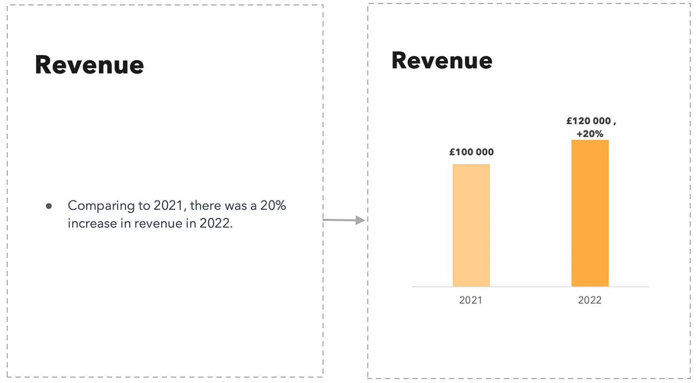
Use Graphs Whenever Possible
Graphs are a powerful way to present data. Instead of presenting data in plain text or tables, try converting it to a graph. This will make the data much more digestible and easier to understand. There are many types of graphs, including bar charts, line charts, and pie charts, so be sure to choose the one that best suits your data.
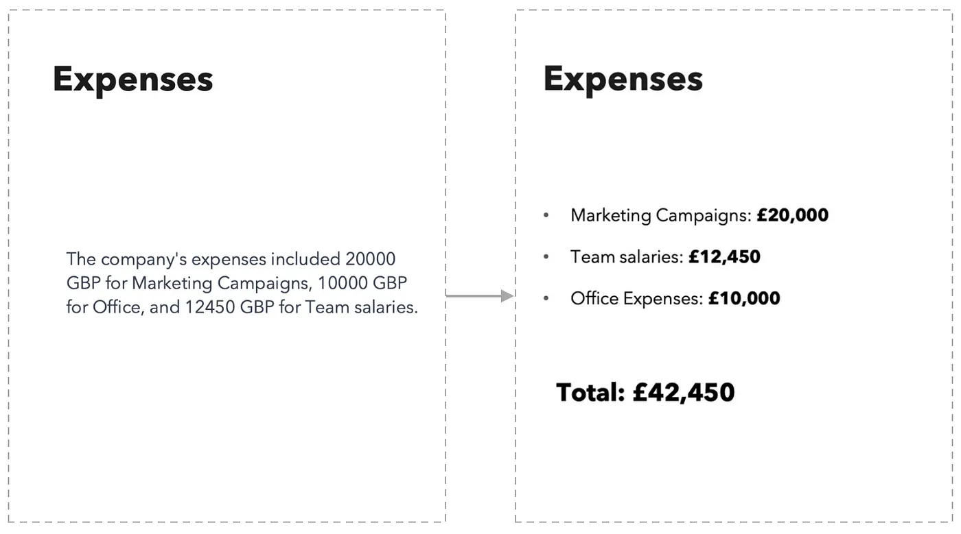
Make Your Data Visible
If you can’t use graphs to present your data, make sure to use bullet points and make your data visible. To make your data visible, you can use bold font, change font size, and use commas to separate large numbers in thousands.
Don’t be afraid to highlight your most important numbers and make them very big.
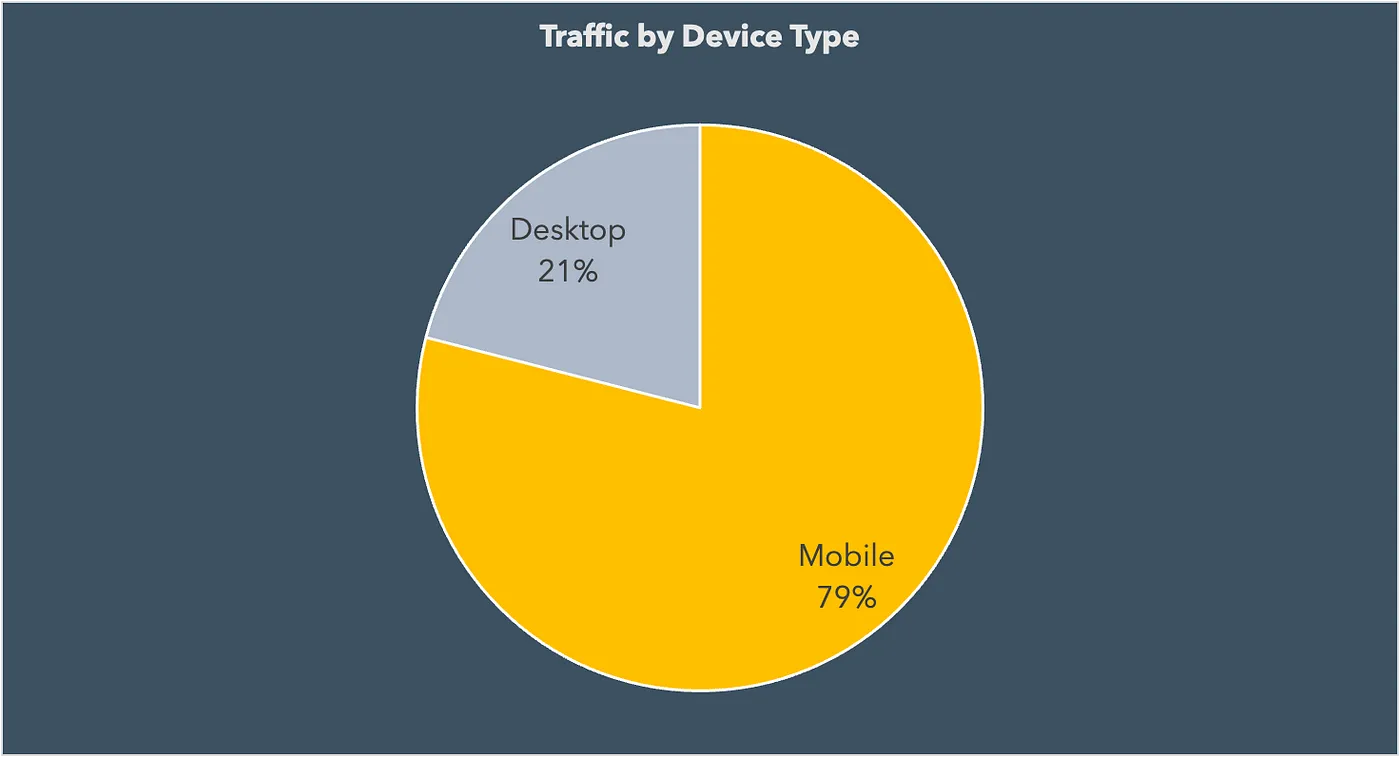
Pie Charts Aren’t Always the Best Option
Pie charts have long been a popular tool for data visualization, but their effectiveness can depend on the nature of the data being presented. While they’re great for displaying data with two categories, pie charts can become hard to interpret when there are more than three categories involved.
Despite their limitations, pie charts can clearly illustrate which category is the most dominant when used appropriately. For example, take the following chart, which demonstrates the dominant device type when it comes to traffic.
The following pie chart is a good example of how difficult it can be to identify the highest or lowest shares between categories when there are too many present in a single chart.
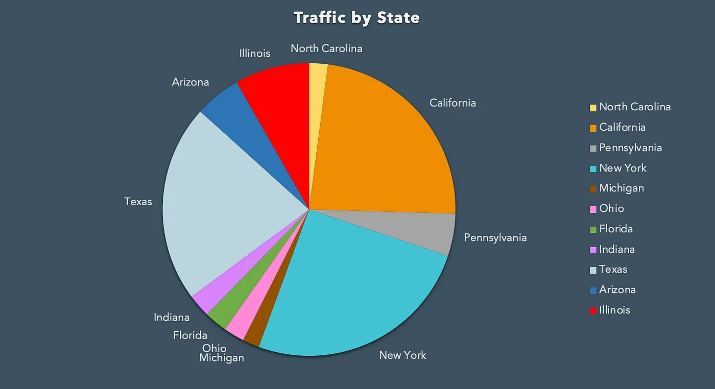
Thus, if your data has more than three categories, using a different type of chart might be a better solution.
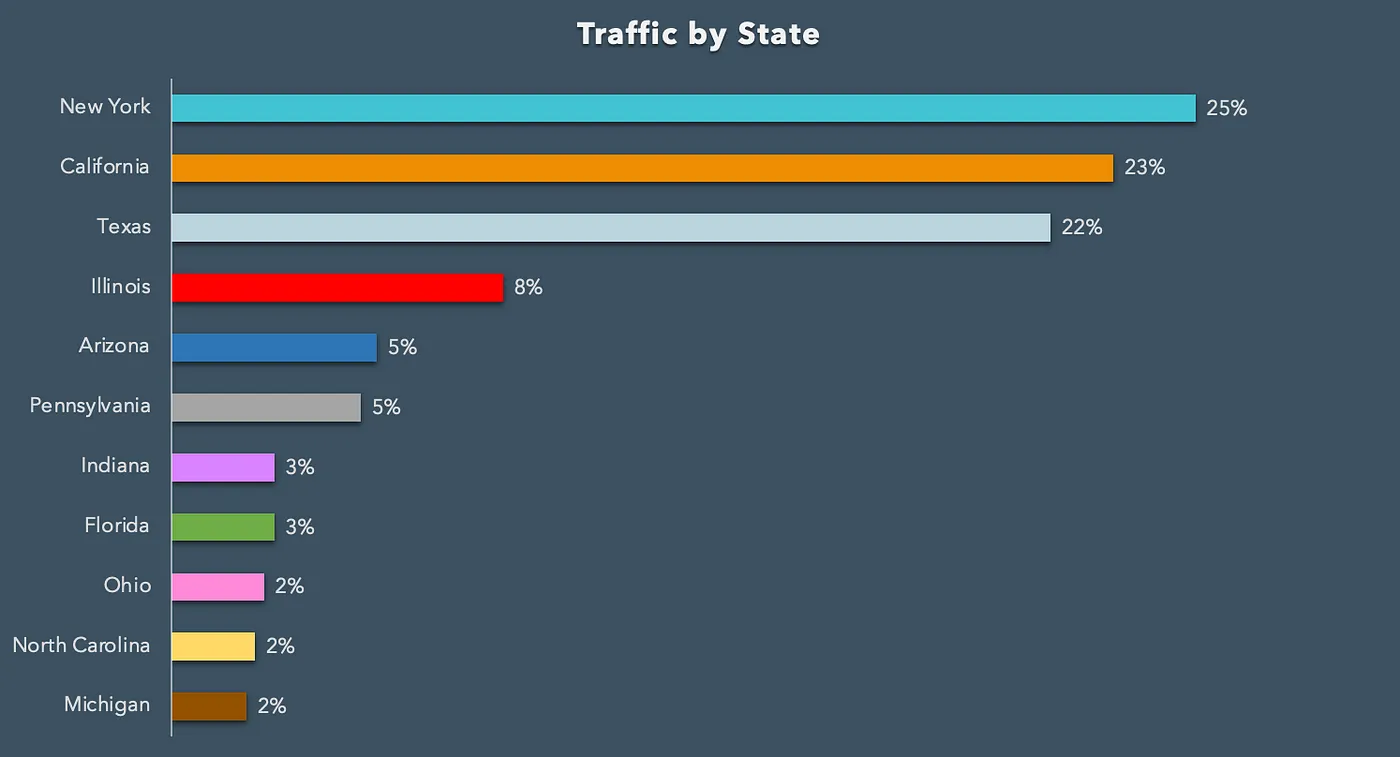
Bar Charts Are Quite Universal
When in doubt, a bar chart is usually a safe choice. They are great for presenting a lot of data in a clear and concise way. Bar charts offer a strong alternative to pie charts, particularly when there are more than three categories of data. Make sure to sort your bar chart by the values you want to highlight.
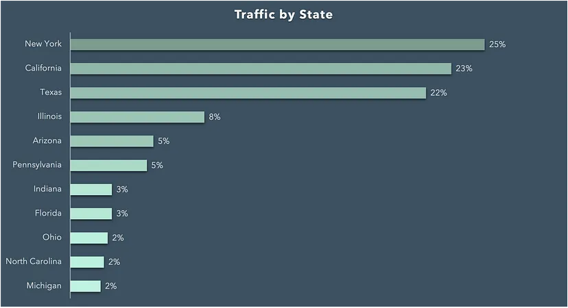
Use Colors
Colors can help make your data more engaging and easier to understand. Use different colors to differentiate between categories or to highlight important data points.
However, be careful not to use too many colors, as this can make your graph look cluttered. Instead, we can differentiate between categories by using various shades of the same color. This can be an effective way to ensure that the graph is easy to read and not overcrowded. Furthermore, color coding can be useful for navigating through data values.
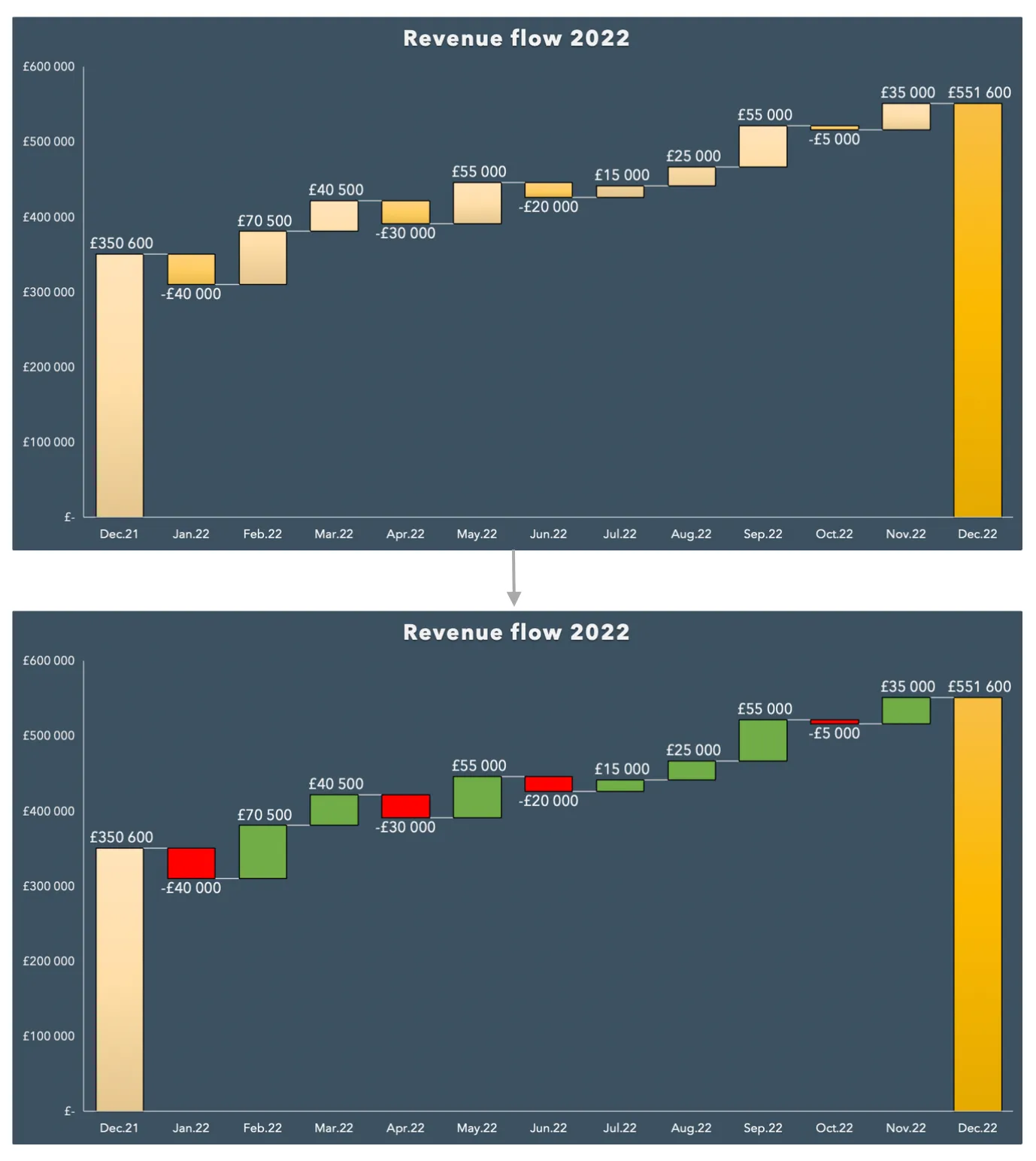
Use Colors Logically
When using colors, make sure they make sense for the data you’re presenting. For example, use red for negative data points and green for positive ones.
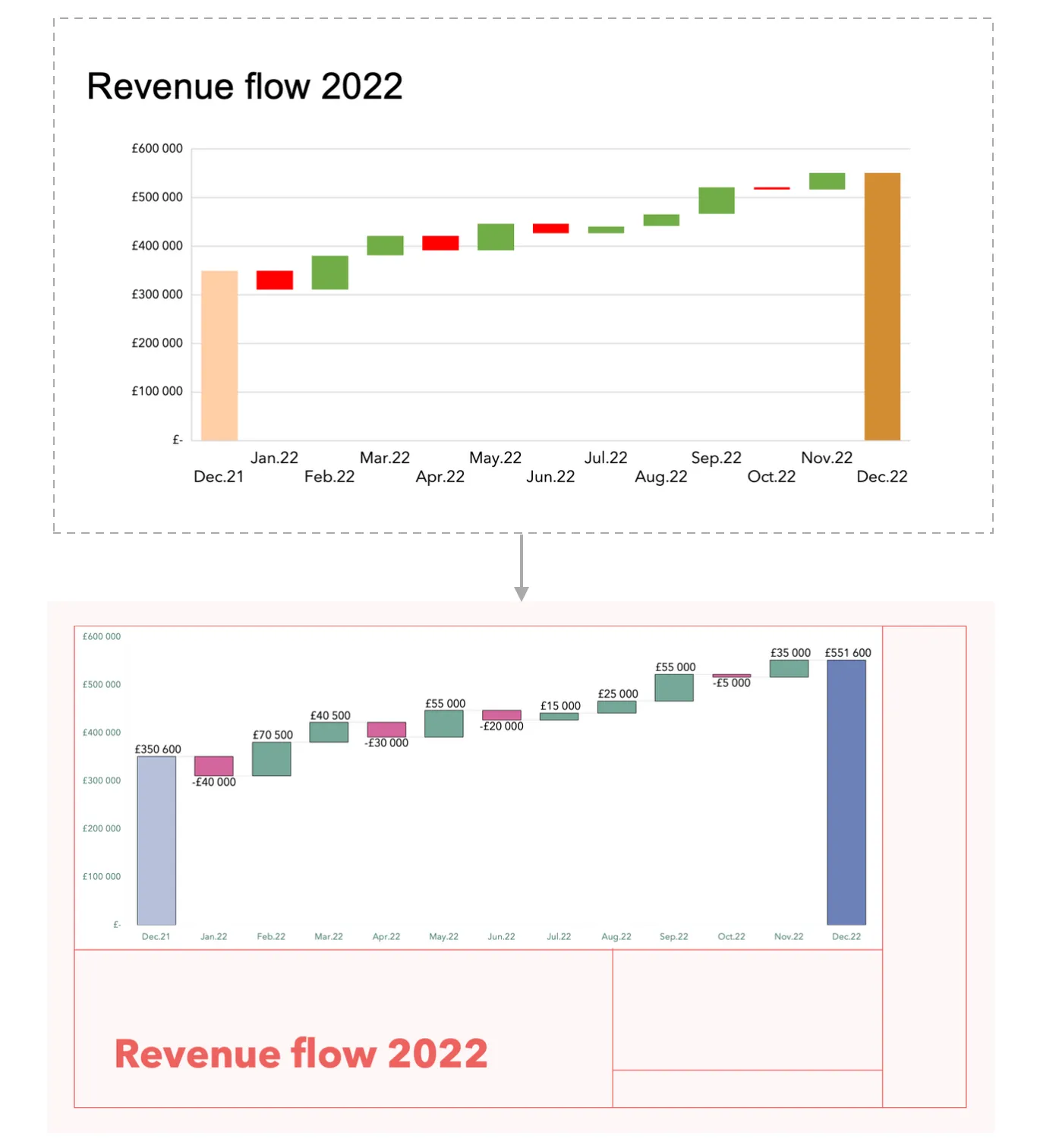
Make Your Visualization Look Ready
Invest time in making your visualization look professional and polished:
- Use clear fonts and graphs that are appropriately sized to ensure readability.
- Label your axes and data points clearly to help your audience understand the information being presented.
- Consider changing default visualization settings to custom ones.
- You can also customize your graphs with presentation templates, brand colors, and fonts to make them visually appealing and consistent with your brand identity.
Conclusion
Data visualization plays a vital role in making your data easy to understand and trust. By following these simple tips and tricks, you can create appealing and practical graphs that will assist you in communicating data more clearly.
If you enjoyed this article, check out Building Interactive Data Visualizations with D3.js and React and The Best React Chart Libraries for Data Visualization in 2024.
 Mariia Merkulova
Mariia is a Data Analyst at Bumble, driven by her passion for data visualization and data storytelling. She is dedicated to making products more efficient by uncovering valuable insights from data and translating them into actionable strategies.