People love naming things. And developers love acronyms. And thus here we are, finding ourselves with all of these CSS naming conventions and methodologies: BEM, SMACSS, Point North, ITCSS, OOCSS, Title CSS, Idiomatic CSS, Atomic Design, SUIT CSS, Kickoff CSS, etc.
We often hear “Are you using OOCSS or BEM?” but these things are not mutually exclusive. In fact, most of the time, we’re taking concepts and ideas of the aforementioned ideologies, and mixing them up, customizing them to suit (no pun intended) our own needs.
So what have I been using these days? Well that would be Atomic OOBEMITSCSS. Yep. Atomic OOBEMITSCSS.
The first time I heard this ridiculous term was from a tweet via Dan Eden, who tweeted:
@mrmrs_ @hcatlin we’re adopting OOBEMITSCSS.
Not even kidding.
— Daniel Eden (@_dte) May 6, 2015
I’m sure he doesn’t even remember tweeting that joke, but the more I thought about it, the more I realized it wasn’t a joke, and it hasn’t left my mind since. OOBEMITSCSS is exactly we’ve adopted, too. That sounds crazy, but it makes sense when you break it down.
Atomic CSS
Let’s Start with Atomic Design. Atomic Design is a systems-thinking methodology solidified by Brad Frost. Upon further research in finding how it relates to styling, I came upon this article on Atomic Sass. While I’m not using the directory structure outlined there, I do use the concepts and ideas expressed by Brad’s Atomic Design methodology in design work and extend them onto my development work (via Sass modules and components).
The gist is basically to design and develop in terms of systems thinking — to create individual molecules or elements which, when combined and placed together, weave a web of modules, components, and eventually entire layout systems. (Officially, there are 5 components to this: atoms, molecules, organisms, templates, and pages) You can start to see this in the following example:
Take this example from my Pinterest board:
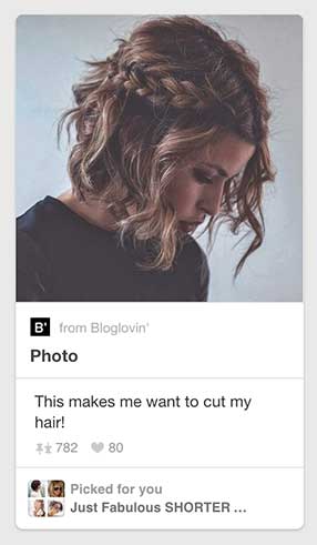
Here we see a card. This card is made up of a few atoms:
- caption text
- header text (pin type)
- body text (caption)
- callout text (message)
- callout text (title)
- callout image (mini board)
- source icons
- local icons
- numeric treatment
- main image
- dividers
These are then pulled together in sets of molecules:
- Image & Citation (main image + source icon + caption text)
- Pin Metadata (pin type text + hr + body text + [local icon + numeric treatment] x2)
- Callout (callout image + callout text (message) + callout text (title))
Those molecules then comprise an organism aka the card itself:
- (Image & Citation) + (Pin Metadata) + divider + (Callout)
The home page of Pinterest is full of these organisms. They make up a big part of the homepage layout:
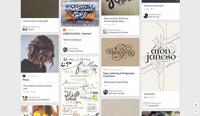
These elements are reused and remixed in other places on the site:
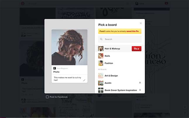
In the above “pin view” modal (which we see by clicking the “Pin It “button), we see the same treatment as we do on the homepage without the callout on the bottom, and placed in a different context.
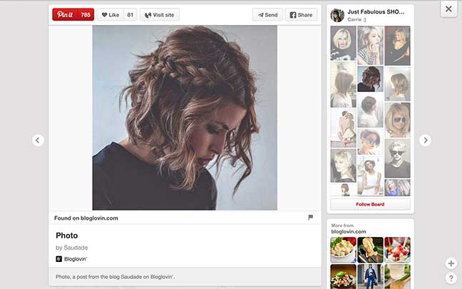
This is the view from clicking the image itself. Notice how the same header treatment and on the *type* of pin and source icon follows us throughout both of these views on the site. Atomic design thinking allows us to create modular, consistent design systems.
BEM
BEM is the system I use to mark things up. BEM Stands for Block, Element, Modifier. This is especially useful on a huge team, like the one I am now working within at IBM. I wrote a post about it once, but other people have written better posts since (I can’t believe that was 2013!).
So let’s take a look back at our first example of the card:
How would we mark this up? Well we would separate the markup based on its atomic structure first. This means we would start at the most basic level, and extend from there. Let’s isolate a small section to examine its markup. (note: I am intentionally disregarding treatment for links and interaction here in this example, but the ideas for marking those up persist. Using atomic markup allows for easy reuse of script actions whenever building components. I.e. the action for clicking the heart will always change its styling, such as fill color, and increase the hearts-count)
<div class="card">
  <img src="..." alt="..." class="card__source-icon">
  <a href="" class="card__source-link"></a>

  <section class="card__metadata">
    <h2 class="metadata__pin-type"></h2>
    <hr>
    <p class="metadata__caption"></p>
    <span class="metadata__pins"></span>
    <span class="metadata__hearts"></span>
  </section>

  <hr>

  <section class="card__callout">
    <img src="..." alt="..." class="callout__board-preview">
    <p class="callout__msg"></p>
    <a href="..." class="callout__board-title"></a>
  </section>
</div>
These class names are semantic to the content presented, and are broken up by their atomic molecules. Those molecules become the blocks in BEM. We don’t have modifiers in the above example, but if we wanted to separate the metadata of hearts (i.e. if *only* the heart was clickable), for instance (normally I’d just use a pseudo-element for the icon), we could write it like this:
<div class="metadata__hearts">
  <a href="..." class="metadata__hearts--icon"></a>
  <p class="metadata__hearts--count"></p>
</div>
Some argue that this leads to long selectors (it does), but semantically it makes a ton of sense and really cleans up your markup by limiting the number of classes you use. And by limiting I mean, seriously, try to use only **one class per element** if you can. Frankly, I find BEM invaluable for use within teams and works really well in an object-oriented manner (read on friends!).
OOCSS
OOCSS stands for Object-Oriented CSS. From Nicole Sullivan’s OOCSS workshop:
Basically, a CSS “object” is a repeating visual pattern, that can be abstracted into an independent snippet of HTML, CSS, and possibly JavaScript. That object can then be reused throughout a site.
The examples Nicole shows in her workshop use multiple classes to achieve this format, which, at this point, may leave you thinking: “Wait. Doesn’t this contradict BEM?” Nope. It doesn’t have to. We have Sass to make things right :) So it’s less OOCSS and more OOSCSS!
I like to think of the way I write my Sass as Object-Oriented. If we think of the card as an “object” which pulls in various “classes” to comprise it, we can still keep everything nested nice and neat with the use of the almighty ampersand (if you’ve read any of my previous blog posts you’ll know how much I love the ampersand.
Example time! Let’s use the metadata section for this, as it provides a good example of hidden complexity:
<section class="card__metadata">
  <h2 class="metadata__pin-type"></h2>
  <hr>
  <p class="metadata__caption"></p>
  <span class="metadata__pins"></span>
  <span class="metadata__hearts"></span>
</section>
We’ll want to be thinking modularly and in the realm of object-oriented encapsulation. Icons are a great start:
%icon {
  content: '';
  display: block;

  &--pins {
    @extend %icon;
    background-image: url('../img/pins.svg');
  }

  &--heart {
    @extend %icon;
    background-image: url('../img/heart.svg');
  }
}
Woah. What’s going on here? Well A) like I said earlier, I overuse ampersands, so make sure you’re familiar with those. B) We’re creating an invisible (aka “placeholder selector“) in Sass. This means that none of this code is processed into CSS until we @extend it. All of our icons will have some shared properties (in this case, content: '' and display: block). Then we specify the background-image for each individual icon while *extending* the styled from its parent block. This can be done with a simple @each loop and icons can be organized within a map to make things cleaner. Nothing is being output here, but technically, this is what’s going on behind-the-scenes:
%icon,
%icon--pins,
%icon--heart {
  content: ';
  display: block;
}

%icon--pins {
  background-image: url('../img/pins.svg');
}

%icon--heart {
  background-image: url('../img/heart.svg');
}
So continuing on, let’s see what the block looks like when written in a object-oriented Sassy way. Let’s just get a grounds for some typography that we’ll instantiate in a moment when building out our component:
%font-stack--body {
  // actual Pinterest font stack (!)
  font-family: 'Helvetica Neue','Helvetica','ヒラギノ角ゴ Pro W3','Hiragino Kaku Gothic Pro','メイリオ','Meiryo','MS Pゴシック',arial,sans-serif;
}

%font-stack--headers {
  @extend %font-stack--body;
  font-weight: 600; //headers are the same typeface as everything else but have a heavier weight
}

%type--base-body {
  @extend %font-stack--body; //extend the body stack
}

%type--base-h2 {
  @extend %font-stack--headers; //extend headers (which extend body stack and give them a heavier weight)
  font-size: 1.5em; //font-size adjustment
}
And now to the molecule! This is where it gets really delicious:
.metadata {
  &__pin-type {
    @extend %type--base-h2; //extend base header styling
  }

  &__caption {
    @extend %type--base-body; //extending normal body copy
  }

  &__hearts {

    &:hover {
      color: red; //unique hover color
    }

    &:after {
      @extend %icon--heart; // extending heart icon on pseudo element
    }
  }

  &__pins {

    &:hover {
      color: green; //unique hover color
    }

    &:after {
      @extend %icon--pins; // extending pins icon on pseudo element
    }
  }
}
What does that look like in CSS? Despite all of the nesting, we output one single class for everything!
.metadata__pins:after,
.metadata__hearts:after {
  content: ';
  display: block;
}
.metadata__pins:after {
  background-image: url('../img/pins.svg');
}
.metadata__hearts:after {
  background-image: url('../img/heart.svg');
}
.metadata__pin-type,
.metadata__caption {
  font-family: 'Helvetica Neue','Helvetica','ヒラギノ角ゴ Pro W3','Hiragino Kaku Gothic Pro','メイリオ','Meiryo','MS Pゴシック',arial,sans-serif;
}
.metadata__pin-type {
  font-weight: 600;
}
.metadata__pin-type {
  font-size: 1.5em;
}
.metadata__hearts:hover {
  color: red;
}
.metadata__pins:hover {
  color: green;
}
Bellisimo!
ITCSS
Okay, this is where we pull it all together. We’re almost at the finish line! So. Let’s talk ITCSS. First of all, what is ITCSS? Well IT (lol) is a methodology for how to author your stylesheets that answers the exigent question of of how the heck do I order my styles?
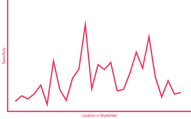
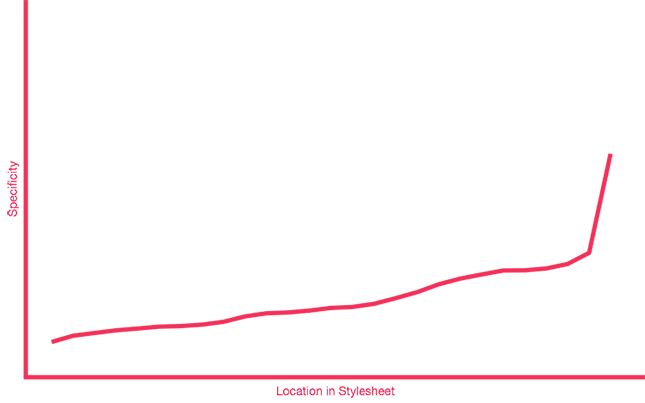
Here is an excellent visual, stolen directly from Harry Roberts’ blog post on the Specificity Graph (sorry, hope you don’t mind!)
In Essence:
This is what your specificity graph (probably) looks like:
This is what your specificity graph *should* look like:
The specificity graph is an analysis of your CSS code specificity. When using !important statement and overriding your code earlier-than-necessary, it creates these dramatic peaks, causing you to then need to override it again to override the too-specific override. Do you see why this is problematic? Not only is it confusing and non-semantic, but it also causes you to write less-performant code and produce larger stylesheets because of all of your overrides. Your stylesheet size can be represented as the area below the graph.
How, you ask? In the example above, we see that we supply the broadest styles first, and then we only apply specific styles when we need to, to the element or modifier. Otherwise, we extend from existing code, that is created earlier in the flow of the styles. It helps to organize your stylesheets modularly, and use the first few imports as helpers or variables that don’t output any CSS (like the placeholder selectors for icons and typography). I could (and have) written entire posts on this subject (and have even made a tool for authoring your stylesheet architecture, forcing you to plan a route before delving in).
So there you have it, Atomic OOBEMITSCSS.
 Una Kravets
Una Kravets is a Front End Developer currently residing in Austin, Texas. She co-founded the SassyDC and ATXSass meet-ups, is a core member of the Open Design Foundation team, and is a big advocate of performance-first design.