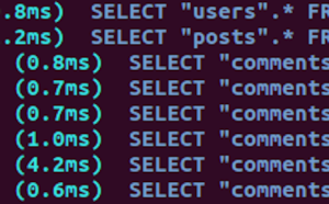
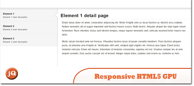
- 1. Responsive HTML5 GPU accelerated CSS transitions
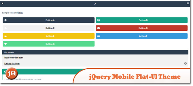
- 2. jQuery Mobile Flat-UI Theme (Metro Like)
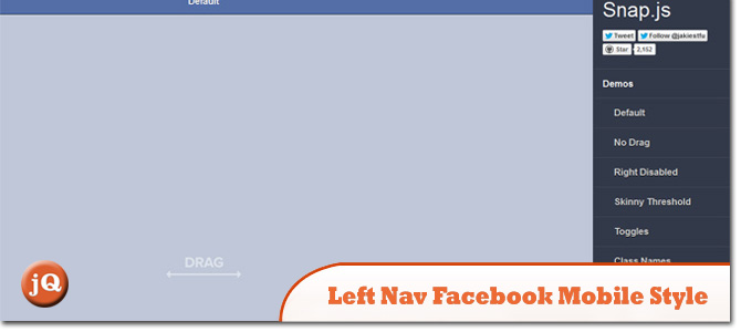
- 3. Left Nav Facebook Mobile Style
- 4. CSS3 Mobile Device Switcher (mobile to ipad)
- 5. Android Address Book replica with AngularJs
- 6. Mobile, Tablet & Desktop CSS Thing’os
- Frequently Asked Questions (FAQs) about Mobile Website Bootstrap Helper Layouts
Check out or collection of 5+ Sick Mobile Website Bootstrap Helper Layouts that you would definitely find useful in making your website layouts more responsive and interesting! Enjoy :)
Related Posts:
1. Responsive HTML5 GPU accelerated CSS transitions
A technique for enhancing the graphical performance of your web app by unlocking the potential of the graphical processing unit (GPU).
 SourceDemo
2. jQuery Mobile Flat-UI Theme (Metro Like)
Theme for jQuery Mobile based on Flat-UI.
 SourceDemo
3. Left Nav Facebook Mobile Style
A Library for creating beautiful mobile shelfs in Javascript (Facebook and Path style side menus)
 SourceDemo
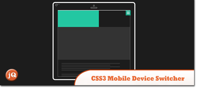
4. CSS3 Mobile Device Switcher (mobile to ipad)
Animation for showcasing responsive layouts.
 SourceDemo
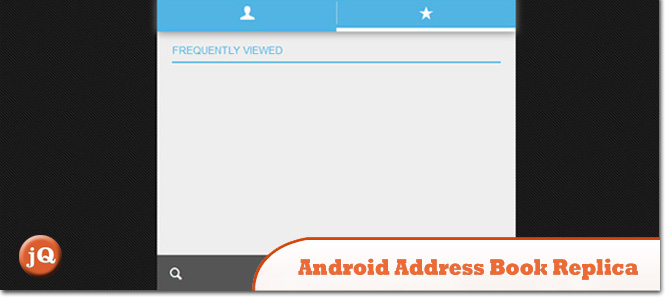
5. Android Address Book replica with AngularJs
Android addressbook replica with AngularJs
 SourceDemo
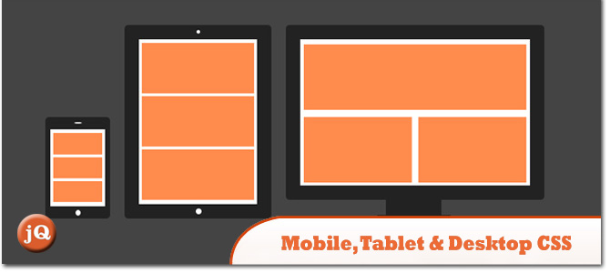
6. Mobile, Tablet & Desktop CSS Thing’os
Attempt to create responsive icons, inspired by Zurb Foundation Illustration.
 SourceDemo
Frequently Asked Questions (FAQs) about Mobile Website Bootstrap Helper Layouts
What is a Mobile Website Bootstrap Helper Layout?
A Mobile Website Bootstrap Helper Layout is a pre-designed layout that helps developers to create mobile-friendly websites quickly and efficiently. It is built on the Bootstrap framework, a popular open-source toolkit for developing with HTML, CSS, and JS. These layouts are responsive, meaning they automatically adjust to different screen sizes, making them ideal for mobile web development.
How do I use a Mobile Website Bootstrap Helper Layout?
To use a Mobile Website Bootstrap Helper Layout, you first need to download and install the Bootstrap framework. Once installed, you can choose a helper layout that suits your needs, download it, and incorporate it into your project. You can then customize the layout by adding your content, changing colors, fonts, and other design elements.
Can I customize a Mobile Website Bootstrap Helper Layout?
Yes, you can customize a Mobile Website Bootstrap Helper Layout to suit your specific needs. You can change the colors, fonts, images, and other design elements. You can also add or remove sections, change the layout structure, and add your own CSS and JavaScript code to enhance functionality.
Are Mobile Website Bootstrap Helper Layouts compatible with all browsers?
Mobile Website Bootstrap Helper Layouts are designed to be compatible with all modern web browsers, including Chrome, Firefox, Safari, and Edge. However, it’s always a good idea to test your website on different browsers and devices to ensure it looks and functions as expected.
Do I need to know how to code to use a Mobile Website Bootstrap Helper Layout?
While having some knowledge of HTML, CSS, and JavaScript can be beneficial when using a Mobile Website Bootstrap Helper Layout, it’s not strictly necessary. Many layouts come with user-friendly interfaces that allow you to customize your website without writing any code.
Are Mobile Website Bootstrap Helper Layouts free to use?
Many Mobile Website Bootstrap Helper Layouts are free to use, but some may require a license or offer premium features for a fee. Always check the terms of use before downloading and using a layout.
Can I use a Mobile Website Bootstrap Helper Layout for an e-commerce website?
Yes, many Mobile Website Bootstrap Helper Layouts are suitable for e-commerce websites. They often include features like product grids, shopping carts, and checkout pages. However, you may need to integrate with an e-commerce platform or payment gateway to handle transactions.
How do I update a Mobile Website Bootstrap Helper Layout?
Updating a Mobile Website Bootstrap Helper Layout typically involves downloading the latest version of the layout and replacing the old files with the new ones. However, if you’ve made customizations to the layout, you’ll need to merge your changes with the new files.
Can I use a Mobile Website Bootstrap Helper Layout for a multi-page website?
Yes, you can use a Mobile Website Bootstrap Helper Layout for a multi-page website. Many layouts include multiple page templates, and you can also create additional pages by duplicating and modifying existing templates.
How do I optimize a Mobile Website Bootstrap Helper Layout for SEO?
To optimize a Mobile Website Bootstrap Helper Layout for SEO, you should ensure your website has a clear structure, uses relevant keywords, and includes meta tags for each page. You should also make sure your website loads quickly, is mobile-friendly, and doesn’t have any broken links or errors.
 Sam Deering
Sam Deering has 15+ years of programming and website development experience. He was a website consultant at Console, ABC News, Flight Centre, Sapient Nitro, and the QLD Government and runs a tech blog with over 1 million views per month. Currently, Sam is the Founder of Crypto News, Australia.