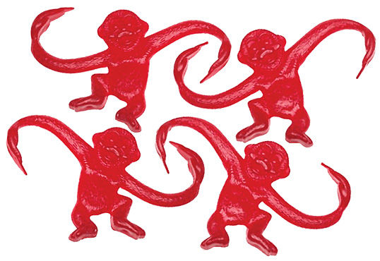
Design theory describes unity as the way in which the different elements of a composition interact with one another. A unified layout is one that works as a whole rather than being identified as separate pieces. Take the monkeys below for example. Their similarity of shape (not to mention their sameness of color) enables them to be recognized as a group, rather than four disparate elements.
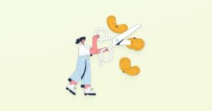
 Although less of an issue these days, unity is one of the many reasons why web designers have always despised HTML frames. It’s important that unity exists not only within each element of a web page, but across the entire web page—the page itself must work as a unit. We can use a couple of approaches to achieve unity in a layout (aside from avoiding frames): proximity and repetition.
Proximity
Proximity is an obvious, but often overlooked, way to make a group of objects feel like a single unit. Placing objects close together within a layout creates a focal point towards which the eye will gravitate. Take a look at the digital painting just below. While composed of a seemingly random assortment of strokes, the five strokes that are the closest to each other appear to form a unified object.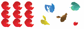 We practice the concept of proximity on the Web when we start setting margins and padding for elements. For instance, when I define the CSS style rules for sites, I usually change the default margin that exists between common HTML elements such as headings (
h1, h2, h3 …), paragraphs, blockquotes, and even images. By altering these values, I can cause more or less space to appear between elements, thereby creating groups.
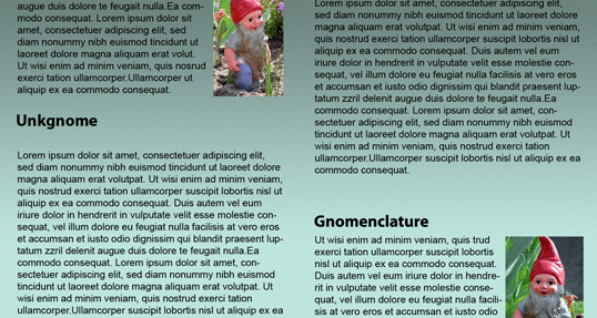
If you look at the two columns of text presented below you’ll notice that they look similar. The only difference is in the placement of the headings. In the column on the left, the word “Unkgnome” is equidistant from the top and bottom paragraphs. The result is that it looks more like a separator than a heading for the next paragraph. In the second column, the “Gnomenclature” heading is placed closer to the paragraph that follows it. In accordance with the rules of proximity, this heading appears to belong to that block of text.
Repetition
A gaggle of geese, a school of fish, a pride of lions. Any time you bring a set of like items together, they form a group. In the same way, repetition of colors, shapes, textures, or similar objects helps to tie a web page design together so that it feels like a cohesive unit. The image example below illustrates repetition. Even though there exists other similar strokes, the nine red strokes on the left-hand side appear to be a unified group because they repeat a shape, color, and texture. The strokes to the right of this group have no repeated pattern, so they appear isolated even though there are other shapes nearby.
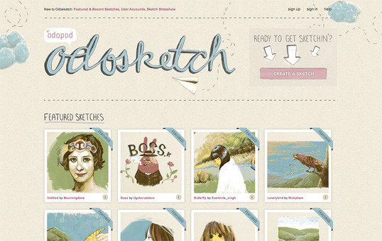
Whether you notice it or not, repetition is often used in website designs to unify elements of the layout. An example of this concept at work among unmodified HTML elements is the bulleted list. The bullet that precedes each list item is a visual indicator that the bullet items are parts of a whole. Repeated patterns and textures can also help to unify a design. Take a look at the screenshot of Odosketch, a digital canvas app and art community created by Odopod. This layout contains many eye-catching elements, but the repeated thumbnail images with the “Featured” banners create a unified gallery, while the sketchy header elements make the user-created thumbnails fit with the site.
The Principles of Beautiful Web Design
This article is from Jason Beaird’s The Principles of Beautiful Web Design book (the second edition of which is out now). This is the sixth part of the first chapter.Frequently Asked Questions about Unity in Design
What is the importance of unity in design?
Unity in design is a fundamental principle that ensures all elements of a design work together to create a cohesive, harmonious final product. It’s crucial because it brings a sense of order and balance to a design, making it more visually appealing and easier to understand. Without unity, a design can appear chaotic and disjointed, which can confuse or distract the viewer. Unity also helps to convey a consistent message or theme throughout a design, enhancing its overall impact and effectiveness.
How can I achieve unity in my designs?
Achieving unity in design involves careful consideration of all design elements and how they interact. This can include the use of consistent colors, shapes, and textures, as well as the strategic placement of elements to create balance and harmony. Repetition of certain elements can also help to create unity, as can the use of alignment and proximity. Additionally, unity can be achieved through the use of a common theme or concept that ties all elements of the design together.
What is the difference between unity and harmony in design?
While unity and harmony are closely related concepts in design, they are not the same. Unity refers to the overall cohesion of a design, ensuring that all elements work together as a whole. Harmony, on the other hand, refers to the balance and pleasing arrangement of these elements. In other words, harmony can be seen as a component of unity, contributing to the overall sense of cohesion in a design.
Can a design have too much unity?
Yes, it’s possible for a design to have too much unity. This is often referred to as over-unity and can result in a design that is monotonous or lacks visual interest. While unity is important for creating a cohesive design, it’s also important to incorporate some variety and contrast to keep the viewer engaged. This can be achieved through the use of different colors, shapes, or textures, or by introducing unexpected elements that break up the unity and add interest.
How does unity relate to other principles of design?
Unity is closely related to other principles of design such as balance, contrast, and hierarchy. For example, balance contributes to unity by ensuring that elements are distributed evenly throughout a design, while contrast can be used to break up unity and add visual interest. Hierarchy, meanwhile, can help to guide the viewer’s eye through the design in a logical and cohesive way, contributing to the overall sense of unity.
What are some examples of unity in design?
Examples of unity in design can be found in many different mediums, from graphic design and web design to architecture and interior design. For instance, a website that uses a consistent color scheme and typography throughout is demonstrating unity. Similarly, a building that incorporates repeating shapes or patterns in its design is also showing unity.
How does unity contribute to the effectiveness of a design?
Unity contributes to the effectiveness of a design by creating a sense of cohesion and harmony. This makes the design more visually appealing and easier to understand, which can enhance its overall impact. Additionally, unity can help to convey a consistent message or theme throughout a design, making it more memorable and engaging for the viewer.
Can unity be achieved with contrasting elements?
Yes, unity can be achieved even when using contrasting elements. This is often done through the use of a common theme or concept that ties the contrasting elements together. For example, a design might use contrasting colors or shapes, but achieve unity through the repetition of these elements or through their arrangement in a balanced, harmonious way.
What role does unity play in branding and logo design?
In branding and logo design, unity is crucial for creating a consistent and recognizable identity. This can be achieved through the use of consistent colors, shapes, and typography, as well as through the repetition of certain elements. A unified brand or logo design is more likely to be memorable and recognizable to consumers, enhancing its overall effectiveness.
How can I improve unity in my existing designs?
Improving unity in existing designs can involve a variety of strategies. This might include introducing repetition of certain elements, using a consistent color scheme or typography, or rearranging elements to create a more balanced and harmonious layout. Additionally, consider whether there is a common theme or concept that could tie all elements of the design together. If not, it might be worth introducing one to enhance the overall unity of the design.
 Jason Beaird
Jason Beaird is a designer and front-end developer with over ten years of experience working on a wide range of award-winning web projects. With a background in graphic design and a passion for web standards, he’s always looking for accessible ways to make the Web a more beautiful place. When he’s not pushing pixels in Photoshop or tinkering with markup, Jason loves sharing his passion for the Web with others.