Design is about visual communication and effective delivery of a carefully-crafted message. The message is delivered through a combination of imagery, color, words, and typography. Understanding typography will help you make your message strong, compelling, and persuasive. It’s important to choose the right typeface for the right occasion, and to make sure that it reinforces your design and your message. In order to choose the right typeface, you have to understand the fundamentals of type, the differences between typefaces, and why you should and shouldn’t use different typefaces in certain situations.
Anatomy
To understand type, it’s a good idea to understand the parts and pieces that make up a typeface. The variation found in each of these parts and pieces is what distinguishes typefaces from one another.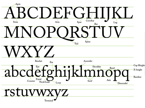
Definitions of Type Anatomy
- Apex – The portion of letters A, M, and N where two strokes meet to form a peak.
- Stem – Any vertical line found in any letter, such as the ones found in H, B, d, b, F, or any other letter that contains a vertical line.
- Arm – The horizontal stroke that connects to a stem on one end, but not on the other, such as in the letters E, F, and T.
- Spur – The part of some uppercase G’s that sticks out, similar to a chin on a person’s face.
- Crossbar – The thin bar between two stems, such as the ones found in the letters A and H.
- Leg – The downward diagonal stem, such as the one found in the letters K and R.
- Stem – The vertical stroke found in any letter, such as D, B, b, d, H, F, etc.
- Tail – The descender found on the letter Q.
- Spine – The middle diagonal line that connects the rounded portions found on the letter S.
- Bracket – The curved part of a letter between the stem and the serif. If there is not bracket present in the letter, but there is still a serif, then you’re usually viewing a slab serif typeface.
- Eye – The enclosed portion of the lowercase e.
- Ear – A decorative flourish usually on the upper right side of the bowl on a lowercase g.
- Ascender – The part of a lowercase letter that rises above the x-height, such as a b, d, h, etc.
- Shoulder – The rounded part of a letter such as r, m, or n. This name comes from the fact that it resembles a human shoulder.
- Bowl – The curved part of a letter that encloses the circular portion of a letter, such as a B, P, g, D, etc.
- Counter – The closed or partially-enclosed circular or curved area of empty space of some letters such as o, and d.
- Finial – The tapered portion of the end of the stroke of a letter such as in the letter c or e.
- Neck/Link – The thin line that connects the upper and lower bowls of a lowercase g.
- Loop – The rounded portion of a lowercase g.
- Serif – The squared or rectangular end on the stroke of a letter, including the stems, legs, arms, etc.
- Axis – The line that bisects a letter down the middle is referred to as an axis.
- Descender – The portion of a letter that extend below the baseline, found in y, p, or q.
- Terminal – The end of any stroke in a letter that doesn’t end in a serif.
- Cap Height – The height from the baseline of a typeface to the top of the uppercase letters.
- X-Height – The height of the lowercase portion of letters, which is typically defined by the height of the lowercase x.
- Baseline – The line on which any letter sits. any letter whose stem goes below this point is called a descender.
Classification
Typefaces are classified by their different styles and features. The features are determined by a set of rules that are based on the differences in structure and style.Serif
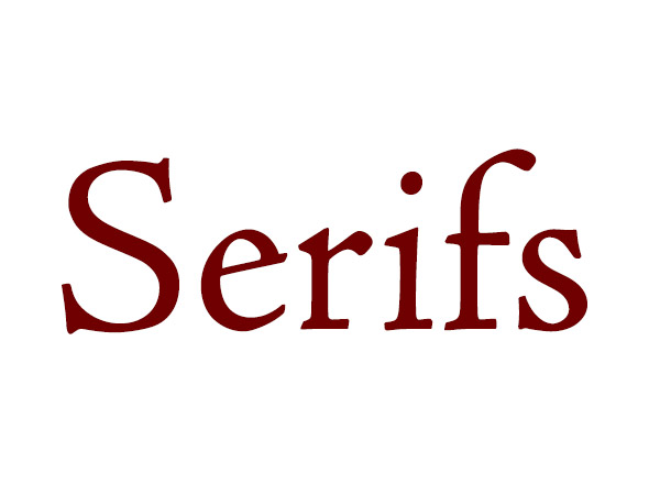 Serif fonts have been used for decades. Their negative space makes them easy to read at small sizes. That is why they have been favored for body copy in books. Serif fonts also look great in large sizes, although some professional serif fonts have a display version that is optimized for large type sizes. Good examples of serif typefaces are: Baskerville, Didot, Caslon, Pigeon, Quaver Serif, Sabon, Bembo, Bodoni, Clarendon, Garamond, Georgia, Goudy, & Meta Serif.
Sans Serif
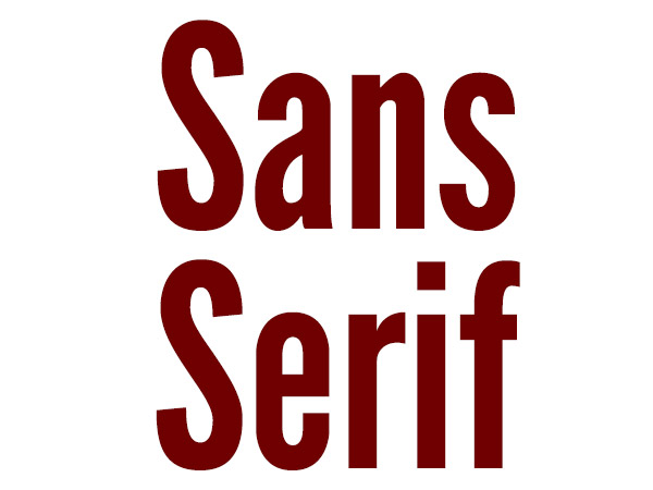 Sans serif literally means “without serifs,” and they are also used for both body copy and display purposes. Some fonts, such as Futura are preferred for body copy because of their balance between positive and negative space, making them easy to read. Other sans serif typefaces, such as League Gothic, are used for display purposes. You wouldn’t use League Gothic for large amounts of text. Good examples of sans serif fonts are Futura, Arial, Helvetica, League Gothic, Gill Sans, Optima, Franklin Gothic, Frutiger, Bebas, Franchise, Akzidenz Grotesk, Univers, Meta, and DIN. There are also many others available, but those are a good start.
Slab Serif
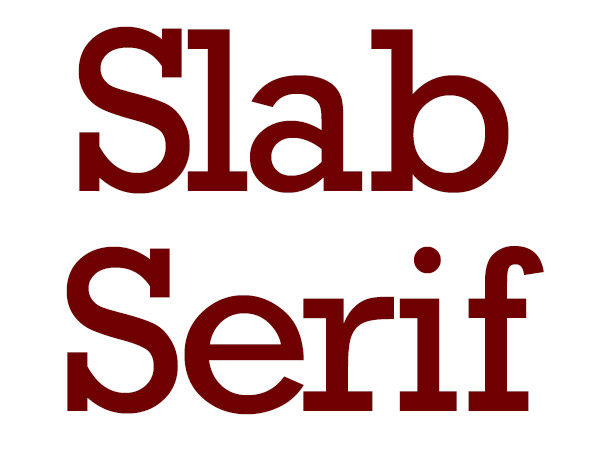 Slab serif fonts have a unique appearance because of their rigid serifs. A slab serif contains no brackets, making their serifs appear blocky, but this gives the typeface a grounded appearance. The slab serifs make the font appear very stable, which makes slab serif fonts good for traditional identities. This type of font gives the impression of stability. Good examples of slab serif fonts are: Rockwell, Museo, Chunk, and Nilland.
Gothic
 Gothic is meant to be decorative, and it really shows. The decorative flourishes and swashes really show off an old-time craftsmanship. It is meant to emulate the type styles of old. These fonts should be used sparingly, because they can be difficult to read in large doses. good examples would be Lucida Blackletter, Deutsch Gothic, Perry Gothic, Rothenburg Decorative, and Urdeutsch.
Script
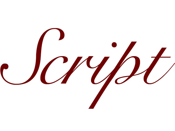 Script typefaces are meant to be elegant and decorative. Their appearance undeniably states importance and formality. These typefaces are great for invitations, greeting cards, anniversaries, graduations, and romantic applications. The tone of these typefaces is serious. Good examples are Scriptina, Pro, Snell Roundhand, and Edwardian Script.
Brush
 Brush fonts are meant to emulate custom hand-lettered type. They have thick and thin varying strokes and are very round and fluid. These typefaces appear as though they were made by an artist with a brush. Some examples are Brush Script MT, Ballpark, Artbrush, Bello, Reklame Script, and Lobster.
Handwriting
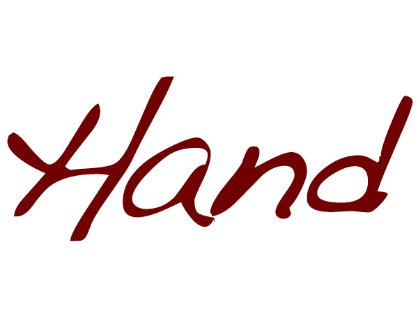 Handwriting fonts are designed to simulate natural handwriting. This gives a design a more personal touch and makes the design appear friendlier. You will find typefaces like these on organic or personal products where an emotional connection is needed. Good examples are Journal, Handwriting – Dakota, Grimshaw Hand, Noteworthy, and Windsong.
Ligatures
Ligatures are when two letters are visually combined to optimize reading and viewing. Strokes are combined, such as the crossbars of two seperate letters, or the crossbar of a “t” with the stem if an “i”. Examples of this are ff, fi, ffi, fl, fh, tt, ti, etc. You can see examples shown below.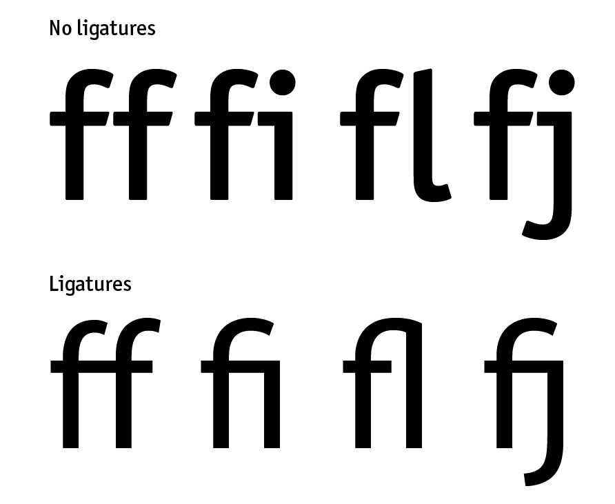
Kerning & Tracking
Kerning is the amount of space between two letters and tracking is the space between a group of letters. Many times the spacing between two letters needs to be optimized, such as with an “o” and a “v” next to each other, or an uppercase “T” with most lowercase letters. This applies to many different combinations of letters and depends on the typeface. The example below shows where some letters could be kerned a little tighter so that the word flows more cohesively.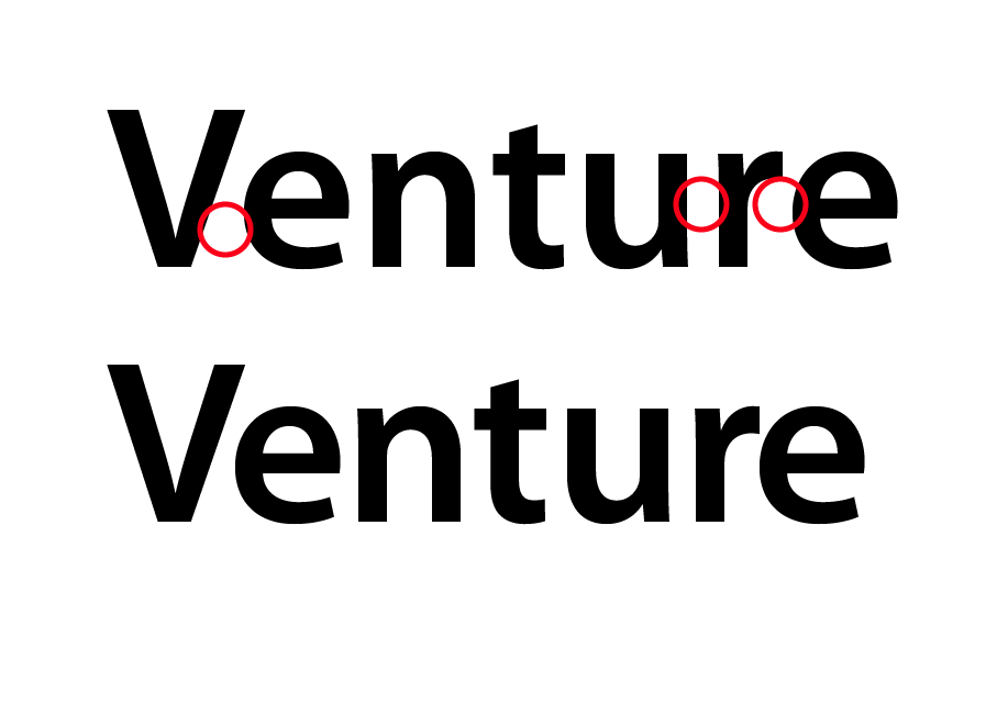 Below, you can see that the stacked type isn’t working well in the first example. The tracking is normal, but the word “photography” is just too large and there isn’t enough contrast and size difference between the letters. In the bottom example, the type size of the word was reduced and the tracking was increased dramatically, creating an elegant effect with more impact, while reducing the dissonant visual competition between the two words.

Leading
Leading is the amount of space between each line of text. Finding the optimum amount of space between lines of text will make large bodies of text easier to read. When you read large amounts of text and the lines are too close together, you often end up re-reading lines by mistake. This makes for an unpleasant read and can be very frustrating. Opening up the leading of a large body of text will make it easier to read, while making its overall appearance more elegant. As you can see below, 2pt of leading makes a huge difference in readability. Imagine squinting to read an entire book. Your eyes would get tired and you might end up with a headache from having to concentrate on not losing your place.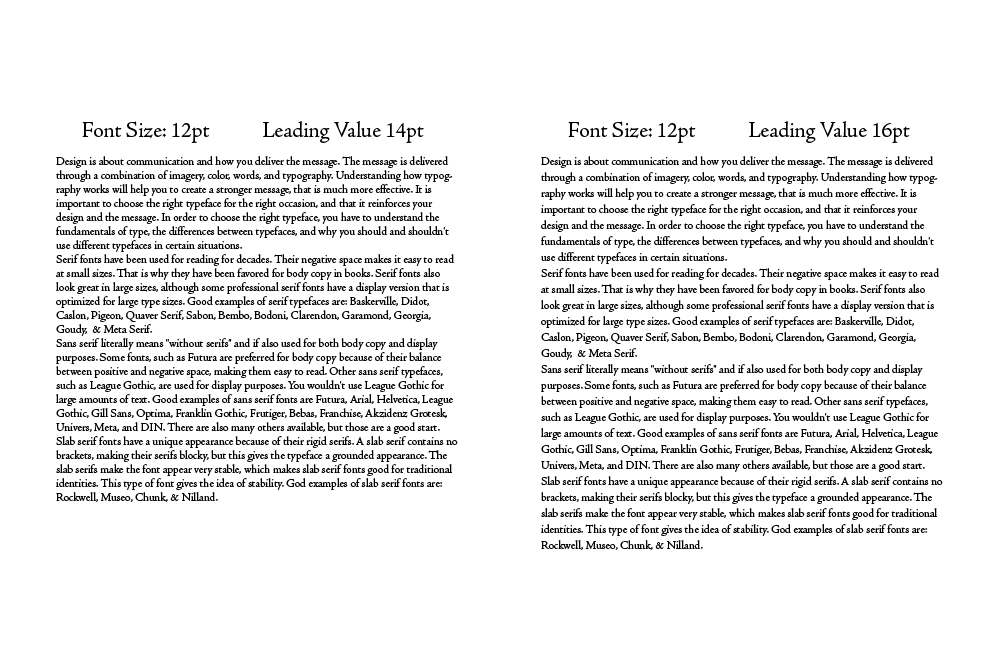
Conclusion
Typography is an essential skill for any designer. Our whole career depends on being able to send an effective message and elicit a powerful, positive response. If someone can’t read the message, then the whole design fails. Following these principles will ensure that you understand type and how to avoid major mistakes, such as not having enough leading, or not kerning your type properly. In large bodies of text you may not kern every word, but on large headlines, kerning is essential. If you follow the guidelines from this article, your designs will be easy and enjoyable to read. (If you liked this article, you’ll love Color Theory 101.) What is your experience with typography? Do you have any tips on working with type? Share your thoughts in the comments section below.Frequently Asked Questions (FAQs) about Typography 101
What is the importance of understanding type anatomy in typography?
Understanding type anatomy is crucial in typography as it helps you make more informed decisions about typeface selection and how to use them effectively. It’s like understanding the building blocks of a language. Each part of a typeface – the stroke, counter, bowl, serif, stem, etc., plays a unique role in how that typeface communicates. By understanding these elements, you can better appreciate the nuances of different typefaces and use them to create more effective and aesthetically pleasing designs.
How does typography impact the readability of content?
Typography greatly impacts the readability of content. The choice of typeface, size, line length, line spacing, and letter spacing all affect how easily readers can process the information. A well-chosen typeface can improve readability, making the text easy on the eyes and helping to guide readers through the content. Conversely, poor typography can make content difficult to read and understand, potentially turning readers away.
What are the different parts of a letter in typography?
In typography, a letter is made up of several parts. The ‘stem’ is the main vertical stroke of a letter. The ‘bowl’ is the curved part of the letter that encloses the circular or curved parts (like in ‘d’, ‘b’, ‘o’, ‘D’, and ‘B’). The ‘serif’ is the small stroke or extension at the end of a main stroke. The ‘baseline’ is the line where the letters sit. The ‘x-height’ is the height of a lowercase ‘x’. Understanding these parts can help you better understand and appreciate different typefaces.
How can I improve my typography skills?
Improving your typography skills involves practice, study, and experimentation. Start by learning the basics of type anatomy and understanding how different typefaces affect readability and mood. Experiment with different typefaces, sizes, and layouts in your designs. Study good examples of typography in books, magazines, and online. Consider taking a course or workshop on typography to deepen your knowledge.
What is the difference between a typeface and a font?
In typography, a ‘typeface’ refers to a family of related fonts, while a ‘font’ refers to one particular style and weight within a typeface. For example, ‘Helvetica’ is a typeface, and ‘Helvetica Bold’ is a font. Understanding this distinction can help you better understand and use typography in your designs.
How does typography contribute to brand identity?
Typography is a powerful tool in establishing and reinforcing brand identity. The choice of typeface, size, color, and layout can convey a brand’s personality and values. For example, a modern, minimalist brand might use a clean, sans-serif typeface, while a traditional, established brand might use a serif typeface. Consistent use of typography across all brand materials can help create a cohesive and recognizable brand identity.
What is the role of whitespace in typography?
Whitespace, or negative space, plays a crucial role in typography. It helps to balance text and images, guiding the reader’s eye through the layout. Proper use of whitespace can make a design feel elegant and open, improving readability and comprehension. It can also help to emphasize certain elements, creating a visual hierarchy in the design.
What are some common typography mistakes to avoid?
Some common typography mistakes to avoid include using too many different typefaces, not considering readability, neglecting typography hierarchy, and not aligning text properly. These mistakes can make your design look unprofessional and difficult to read. By understanding the principles of typography, you can avoid these pitfalls and create more effective and aesthetically pleasing designs.
How does typography affect the mood of a design?
Typography can greatly affect the mood of a design. Different typefaces can evoke different emotions and associations. For example, serif typefaces can convey a sense of tradition and reliability, while sans-serif typefaces can convey a sense of modernity and simplicity. The size, weight, spacing, and color of the text can also influence the mood. By understanding these effects, you can use typography to create the desired mood for your design.
What is the difference between kerning, leading, and tracking in typography?
In typography, ‘kerning’ refers to the adjustment of space between two individual letters, ‘leading’ refers to the vertical space between lines of text, and ‘tracking’ refers to the overall spacing between letters in a word or block of text. Proper use of kerning, leading, and tracking can greatly improve the readability and appearance of your text.
 James George
James George is a professional web developer and graphic designer. James is an expert in design, and a professional web developer, with a special interest in WordPress. Founder of Design Crawl, James has been a professional designer since 2005.