Websites are fundamentally rectangular things.
And with good reason, of course. Like the clay tablets, papyrus, and books that came before , websites are mostly comprised of lines of stacked letters, words, and sentences. Likewise, our cameras take rectangular photos. It’s no mystery why rectangular ‘bricks’ tend to build rectangular ‘walls’.
The many “blocks” that make up a website are rectangularly shaped by default — for the developers out there, you’ll know that I’m talking about <div>, <article>, <sections> elements and other similar code tags.
Before CSS3, we had to insert bitmap images into our web designs if we wanted to make different shapes. However, modern day web standards (SVG support for example) allows for more flexibility in this regard.
Let’s take a look at a few websites that have used modern web standards to design irregularly shaped layouts, and more importantly, how that has affected the user experience.
Easee: Simple SVG Example
SVG stands for Scalable Vector Graphic. It’s a modern, technically-mature file format that can be scaled up and down with no loss of quality. Rather than the standard ‘grid of pixels’ (i.e. PNG, JPG, etc), SVG is more like an ‘image recipe’ – double the size of the cake by simply doubling the ingredients.
In recent times we’ve seen modern browsers improving their SVG capabilities, which is awesome news because SVG allows us to create unique shapes without adding to the websites loading times.
Let’s dive right into my first example.
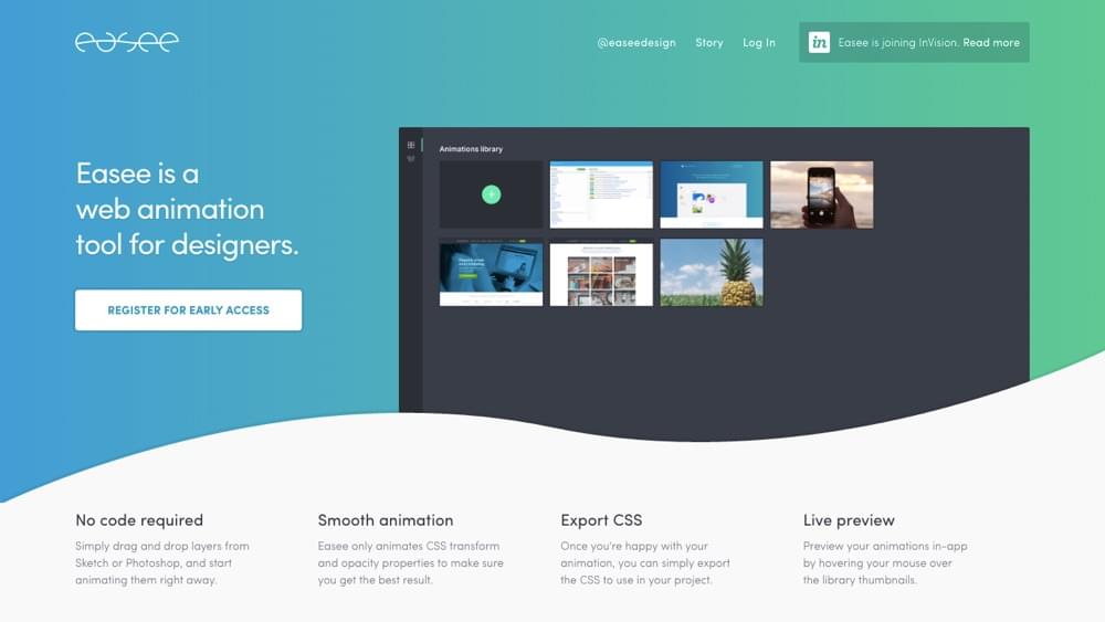
If you take a look at the footer of Easee you’ll see that they’ve used wavy curves in the background. It adapts to any screen size instantly since it’s an inline SVG and the file size of the image is very low – less the 1kb. A bitmap image would have been 4 to 5 times the size.
In fact, here’s the entire SVG shape – including a subtle drop-shadow you may not have even noticed on the site.
<svg width="1440px" height="204px" viewBox="0 0 1440 204" version="1.1" class="homepage__features__wave">
 <defs>
 <filter x="-50%" y="-50%" width="200%" height="200%" filterUnits="objectBoundingBox" id="filter-1">
 <feoffset dx="0" dy="-4" in="SourceAlpha" result="shadowOffsetOuter1"></feoffset>
 <fegaussianblur stdDeviation="0" in="shadowOffsetOuter1" result="shadowBlurOuter1"></fegaussianblur>
 <fecolormatrix values="0 0 0 0 0 0 0 0 0 0 0 0 0 0 0 0 0 0 0.056 0" in="shadowBlurOuter1" type="matrix" result="shadowMatrixOuter1"></fecolormatrix>
 <femerge>
 <femergenode in="shadowMatrixOuter1"></femergenode>
 <femergenode in="SourceGraphic"></femergenode>
 </femerge>
 </filter>
 </defs>
 <path d="M6.05022984e-08,204 C0.00535896441,203.997351 356.00274,28.000572 720,104 C1084,180 1440,4 1440,4 L0,4 L0,204 L0,4 L1440,4 L1440,204 L0,204 Z" fill="#F9F9F9" filter="url(#filter-1)"></path>
 </svg>
It also does a lot more than offer something visually “different” — it adds a friendly, curvy, bouncy, fun personality to the design. An ordinary square might not have had the same effect.
By the way, did I mention that SVG images can be easily animated? Refresh the web page and look a little closer!
Aardvark Brigade: Traditional Bitmap Example
Let’s take a look at another example that essentially accomplishes the same thing using a bitmap image. I used the Google Chrome dev tools to inspect the topmost background image (under the menubar) and it was a whopping 197kb.
Since SVG files are composed of geometric shapes, it’s harder to create textures with SVG, and since bitmaps are not scalable, the bitmap in this example is very wide (2300px) to account for all screen sizes — another factor contributing to its heavy file size.
Is it worth it?
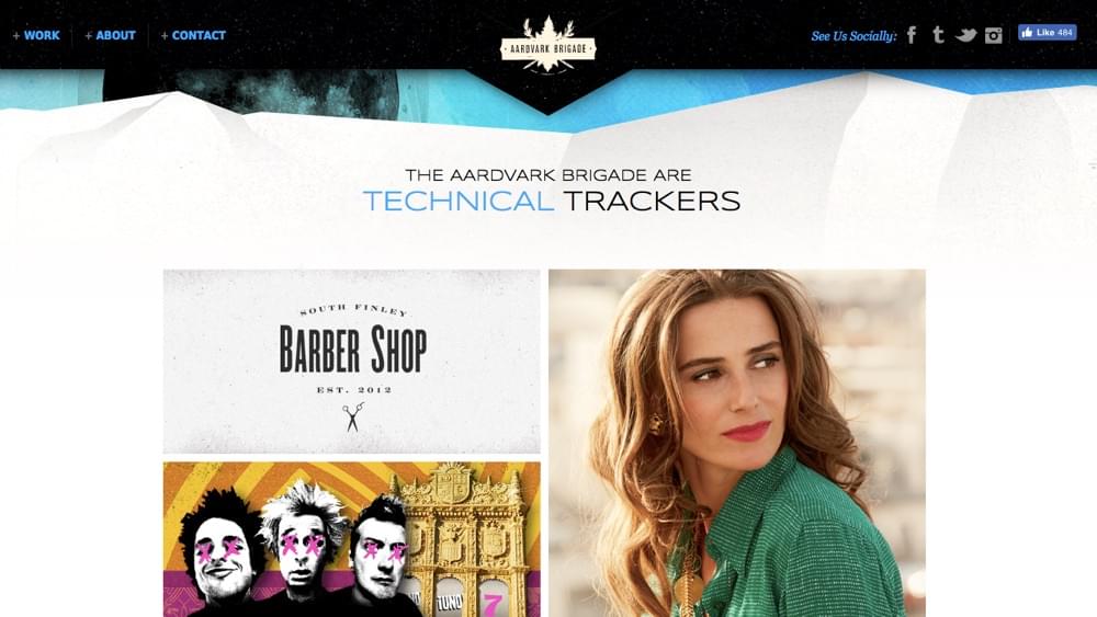
My gut told me no, but the tests I ran said otherwise.
I pointed tools.pingdom.com at the site and found it loaded in a swift 1.26 seconds. Since the design uses a lot of textured bitmaps, I was expecting something much higher, but the test did indicate that the website has been heavily optimized. So, this confirms that bitmaps can still be a viable choice if you’re considering the overall performance and optimizing responsibly (and throwing enough beefy servers at the problem).
Note: you can embed bitmaps into SVG files, creating an SVG/bitmap hybrid, which can sometimes be a suitable compromise.
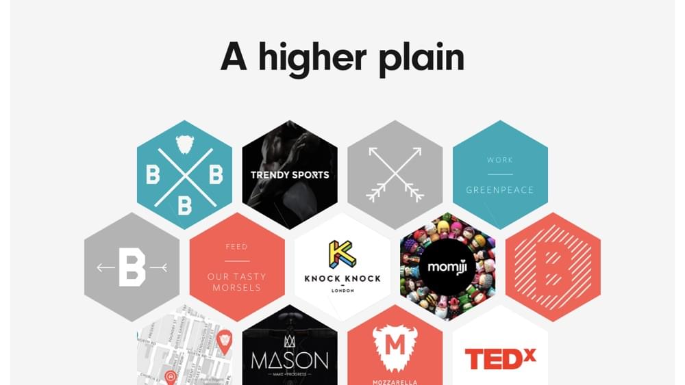
Built By Buffalo: CSS Transforms Example
So far, our examples have been somewhat complex. For simpler shapes (shapes that you can give a name to, like a hexagon, triangle or diamond), you can create using simple HTML and CSS.
Built By Buffalo uses a series of rotated rectangles to create a hexagon. Modern day web standards support transformations like rotate, skew and scale, sometimes eliminating the need for images altogether and even allowing for the shapes to be styled and animated with native web code.
Joyce Vherck’s website is by far my favorite current example. Her use of shapes is much more than a visual aesthetic, it’s an integral component of her brand.
Better yet, Joyce has used modern web standards to skew traditional boxed elements in a variety of ways. If you were looking for a lightweight method of creating shapes in web design with a reasonable amount of compatibility in modern web browsers, this would be the way to do it — the only drawback is that the shapes would have to be relatively simple.
Slanted sections have become a huge trend in web design, so if you were wondering how to accomplish that — now you know.
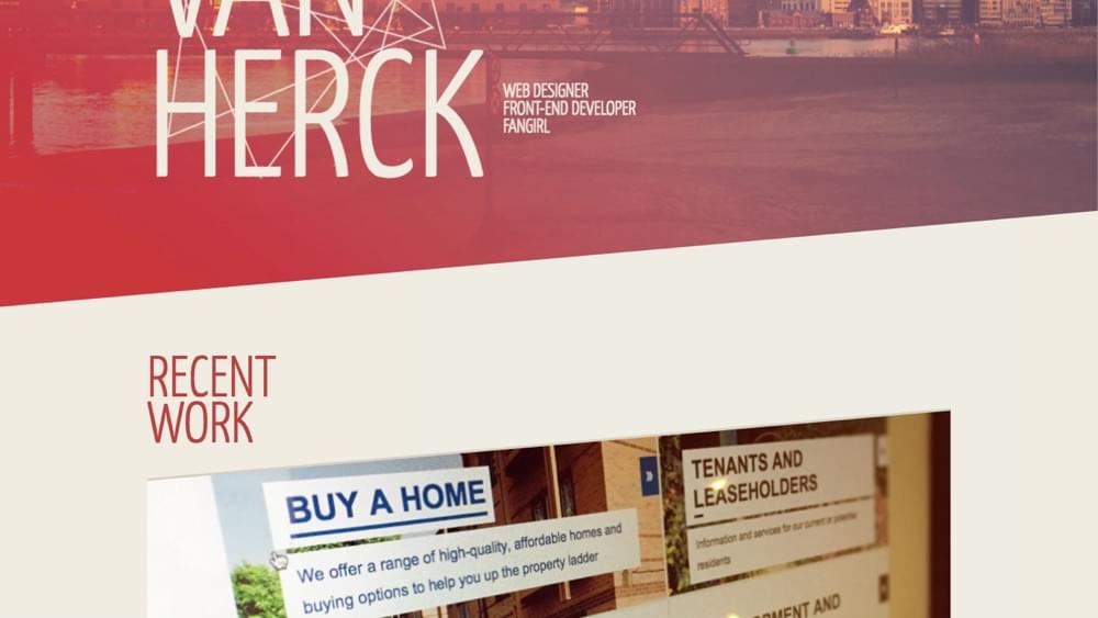
If you scroll down on Joyce’s web page you’ll see shapes being used not only in different ways but created using a variety of the methods I’ve mentioned in this article, which iterates on the fact that there’s no right or wrong way to create shapes. It depends on the situation.
CSS Masking
Shape masking in web design can be accomplished with the clip-path property, although browser support is still quite flaky. For this reason, there aren’t many use-cases on the web, but there are some examples on CodePen that can show us exactly how masking works.
See the Pen Visualizing clip-path by Karen Menezes (@imohkay) on CodePen.
https://codepen.io/imohkay/pen/KpdomOAs you can see in Karen Menezes example, the idea is to create a shape to use as a stencil and then cut around it. CSS has common shapes built in, but you can also stencil around a custom-made SVG shape.
Let’s look at something more advanced.
See the Pen Reverse clip path with blend modes by Zeaklous (@Zeaklous) on CodePen.
https://codepen.io/Zeaklous/pen/mVEwje
I absolutely fell in love with this beautiful example as soon as I saw it. An animated GIF inside an SVG shape — who’d have thought it possible? Zach Saucier (the creator) has even used other not-fully-supported-yet web tricks such as blending modes, which is why the animated triangle shape has a blue overlay.
Masking has many use-cases. Firstly it would eliminate the need for “hacky” shape-creation methods like combining multiple shapes to create another shape, and secondly, it would make SVG formats more useful.
Masking lets us carve completely unique shapes (since we can optionally use SVG) out of ordinary squares non-destructively — it’s the most native solution, a solution that browsers are actively working towards supporting because the shapes can remain fully customizable with code.
It’s tempting the think: “These new features aren’t supported properly – why would I waste my time even looking at them?”
The problem with that approach is, there is never a single obvious day when it suddenly becomes ok to use ‘new feature x’. As was the case with SVG, it’s a gradual process that happens over a multi-year period. If you wait for ‘perfect browsers support day’, you’ve probably missed the boat.
In short: Play early, play often.
Conclusion
Like all trends, there’s a massive difference between using them to heighten the emotional appeal or user experience and using them for the sake of being trendy.
As we’ve seen in the examples, shapes can be used to enrich the identity or brand of a website, but like any aspect of web design, they do need a fair amount of consideration in regards to web performance.
And of course, the method you choose depends on the shape required.
Have you used shapes in web design before? What do you think were the biggest challenges and was it worth it?
Frequently Asked Questions (FAQs) on Designing Outside the Box
What are the benefits of designing outside the square layout?
Designing outside the square layout offers numerous benefits. It allows for more creativity and innovation, as it breaks away from the traditional and predictable square layout. This can result in a more engaging and visually appealing design that stands out from the crowd. Additionally, non-square layouts can offer better usability and user experience, as they can be tailored to the specific content and functionality of the website. They can also be more adaptable to different screen sizes and devices, providing a more responsive design.
How can I start designing outside the square layout?
To start designing outside the square layout, you need to first understand the principles of design and layout. This includes understanding the use of space, balance, alignment, contrast, and hierarchy. Once you have a good grasp of these principles, you can start experimenting with different shapes, angles, and arrangements. You can also draw inspiration from nature, architecture, art, and other sources. Remember, the key is to be creative and not be afraid to break the rules.
Are there any tools or software that can help me design outside the square layout?
Yes, there are many tools and software that can help you design outside the square layout. These include graphic design software like Adobe Illustrator and Photoshop, web design tools like Sketch and Figma, and prototyping tools like InVision and Marvel. These tools offer a wide range of features and capabilities that can help you create unique and innovative designs.
What are some examples of websites that have successfully designed outside the square layout?
There are many websites that have successfully designed outside the square layout. Some examples include the websites of Spotify, Airbnb, and Apple. These websites have used non-square layouts to create a unique and engaging user experience. They have used different shapes, angles, and arrangements to present their content in a visually appealing and intuitive way.
Can designing outside the square layout affect the performance of my website?
Designing outside the square layout can potentially affect the performance of your website, depending on how it’s implemented. For example, complex shapes and animations can increase the load time of your website, which can negatively impact user experience and SEO. However, with proper optimization and best practices, you can minimize these impacts and ensure that your website performs well.
Is designing outside the square layout suitable for all types of websites?
Designing outside the square layout can be suitable for all types of websites, depending on the specific needs and goals of the website. For example, a creative portfolio website might benefit from a non-square layout to showcase the creativity and innovation of the portfolio. On the other hand, a corporate website might prefer a more traditional square layout for its simplicity and professionalism.
How can I ensure that my non-square layout is accessible to all users?
To ensure that your non-square layout is accessible to all users, you need to follow accessibility best practices. This includes ensuring that your website is navigable with a keyboard, providing alternative text for images, using sufficient contrast for text and background colors, and providing captions for videos. You should also test your website with different assistive technologies to ensure that it’s accessible to all users.
Can I use a combination of square and non-square layouts in my website design?
Yes, you can use a combination of square and non-square layouts in your website design. This can provide a balance between the creativity and innovation of non-square layouts and the simplicity and familiarity of square layouts. The key is to ensure that the different layouts work together harmoniously and provide a cohesive and intuitive user experience.
How can I measure the success of my non-square layout design?
You can measure the success of your non-square layout design through various metrics. These include user engagement metrics like time on page and bounce rate, conversion metrics like sign-ups and purchases, and user feedback through surveys and user testing. You can also use A/B testing to compare the performance of your non-square layout with a traditional square layout.
What are some common mistakes to avoid when designing outside the square layout?
Some common mistakes to avoid when designing outside the square layout include neglecting usability and user experience, overcomplicating the design, not optimizing for performance, and not testing the design with real users. It’s important to remember that while creativity and innovation are important, they should not come at the expense of usability, performance, and accessibility.
 Daniel Schwarz
Previously, design blog editor at Toptal and SitePoint. Now Daniel advocates for better UX design alongside industry leaders such as Adobe, InVision, Marvel, Wix, Net Magazine, LogRocket, CSS-Tricks, and more.