High Dynamic Range (HDR) is a photographic technique where multiple exposures of the same image are layered and merged together. With the different exposures merged together, you are able to get a wider range of tonal values, which gives you a more detailed and dramatic image. You can merge these different exposures together with image editing software such as Photoshop.
Method #1: Merge to HDR Pro
Photoshop has several great tools for simulating HDR. One is Merge to HDR Pro. This method allows you to take multiple exposures of the same scene, bring them into Photoshop at the same time, and merge them together to create a true HDR photo. This does take some forethought though, as you will need at least 3 separate images to combine into a single HDR image.Step 1: The Setup
For the best results, your three images should have the same exact perspective of the subject, but they should have distinctly different exposures. This will prevent ghosting. You can achieve this by using a steady tripod and simply changing the settings on your camera in between photographs.Step 2: Import Your Images
Open up Photoshop and choose “File” > “Automate” > “Merge to HDR Pro.” A small box will come up, and you can choose within a drop-down menu to open discrete files or a folder of images.
Step 3: Selecting Your Files
If you only want to select certain images, hold down command/ctrl and click on each image that you want. Once you have made your selections, you want to make sure that “Attempt to Automatically Align Image Sources” is checked. Then, just click “OK.” Photoshop then overlays each image onto its own layer and tries to position each image over the next one as precisely as possible. This helps to make your HDR image look as sharp as possible.Step 4: Begin Adjusting Your Image
Once you select your images, Photoshop does all of the hard work for you and overlays each image automatically. Then a dialog box pops up and you have several options available.
Step 5: Remove Ghosts
It is important to have the Remove Ghosts option checked, because you will get much cleaner, more professional looking results. Here is the result if you forget to check Remove Ghosts: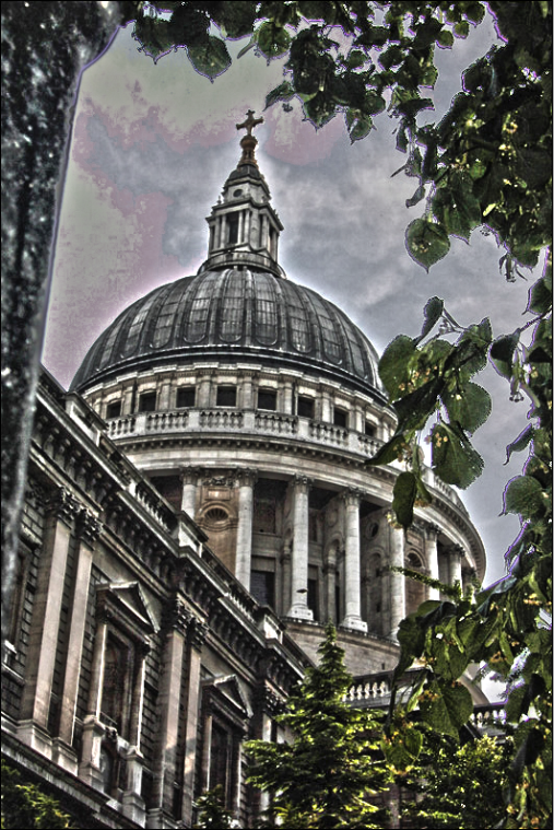 Do you see all of the purple fringe and the purple blotches in the sky? This isn’t normally found in HDR images. Here is the much better result with the Remove Ghosts option checked:
 You will notice that there are no purple fringes or blotches found in the sky.
Step 6: Radius
You can adjust Edge Glow with 2 sliders. Radius determines the size of the glow effect. If you turn the radius up too high, then your image will get strange halos of color around certain objects. If this happens, reduce the Strength setting and it should help. To get the results that I did for the HDR image, you will want to set the Radius to 18. You don’t want too much of a halo effect on your image.Step 7: Strength
Strength determines the contrast of the glow effect. Set the Strength to .75. This will make your image look gritty and sharper. If areas of color begin to look blown out or faint, then you went to far. Too much Strength will make your image look more like a photocopy, which is not what we want.Step 8: Gamma – Don’t Muddy It Up!
The next box, Tone and Detail, controls Gamma, Exposure, Detail, Shadow, and Highlight. The Gamma slider controls the difference between highlights and shadows. This setting enables you to control how much contrast is in your image, and it can be used to blend harsh areas of your image that have too much contrast. Gamma is a setting that you may want to just leave alone. If your image looks too gray or muddy, then you can move the slider to the left to lighten it up, but otherwise, leave it set at 1.Step 9 Exposure – Lighten Things Up a Bit
Exposure adjusts the overall image tone, which dictates whether it is light or dark. You have to adjust the Exposure value for each image. It really just depends on the image itself. If your image has a lot of image information in its shadow regions, then you will want to increase the Exposure. If there are more details in the highlight portions, then you would decrease the setting.Step 10: The Devil Is In The Details
The Detail setting looks for image detail, or pixel information in your image. You can adjust the Detail slider to get the desired stylized HDR look. Most likely, you will bump this setting up pretty far, maybe even all the way to 300. Otherwise, 250 should be plenty. This one setting does a lot for achieving the HDR look, but the other sliders are important too. The other settings depend on the images that you merged, because every situation is different. Detail is important, because it tells Photoshop how much contrast you want within the details of your image. Setting this too low will make your image look cloudy and more like an oil painting than an HDR image. For this image, we set the Detail slider to 250.Step 11: Expose Hidden Details
The Shadow slider allows you to control the level of luminance in the shadow regions of your image, while the Highlight slider controls the luminance level in the highlight areas of your image. If areas of your shadows or highlights look too dark, these are the sliders that you would use to adjust them. This is great for making details show up in dark areas, but be careful when adding luminance to the highlight areas of your images, as it tends to blow out these areas very easily. For shadow, I set our image to 45% and for highlight, I set that to -15%. This actually brings back some detail in the bright sky.Step 12: Don’t Add Too Much Punch to Your Colors
You can adjust colors in your HDR image via 2 sliders, Vibrance and Saturation, or via a tonal curve. It really just depends on your preference. For Vibrance and Saturation, I left both of those at 0 for this image, because the foliage is already bright and colorful, and we don’t want it to overpower our image.Step 13: Preview like a Pro
If your image just isn’t looking right, or if you think that one exposure is hindering you from getting the desired HDR mix, Photoshop has a section at the bottom where you can turn off each individual exposure in the preview. This allows you to see how your HDR image would look with and without each of your exposures.
Method #2: HDR Toning
Another option for HDR involves the use of “Image” > “Adjustments” > “HDR Toning.” The difference between this menu and using method #1 (the Merge to HDR Pro option) is that you don’t need multiple exposures to create this effect. Method #2 will simulate the HDR effect using a single exposure. Using HDR Toning gives you several options. A dialog box pops up, allowing you to tweak many different settings.Step 1: Select Your Image
In the image below, which you can download here.Step 2: Try a Preset
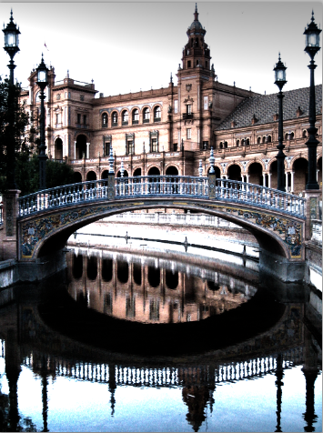
We are going to choose a preset from the HDR Toning menu. There are several different presets, such as flat, monochromatic, more saturated, photorealistic, saturated, and surrealistic. They each have their own results, but if you are looking for the gritty, highly-detailed look that HDR is known for, then “more saturated” or “surrealistic” is the way to go. Original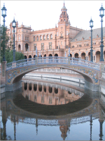 Surrealistic
 More Saturated
 You will notice that there is a lot more detail in each image, and each variant is richer in either color or contrast. This works great for simulating the HDR effect.
Comparing Both Methods
Let’s do a side-by-side comparison of the Merge to HDR Pro image and the midtone version of our image created with HDR Toning: As you can see, the results are a little unexpected! The results from my own merged exposures (via the “Merge to HDR Pro” technique) weren’t as sharp or as detailed as Photoshop’s HDR Toning method. These were both done with the same exact settings, but you can see the difference in the results. The Merge to HDR Pro technique may be more natural, but it relies on your photography skills and your ability to choose the right set of exposures to merge together. The HDR Toning image is more rugged, gritty and detailed, but it doesn’t offer the same degree of control as the more intensive “Merge to HDR Pro” method.
Which HDR result looks best to you? Do you prefer one method over another? Do you often use HDR in photography or design projects?
As you can see, the results are a little unexpected! The results from my own merged exposures (via the “Merge to HDR Pro” technique) weren’t as sharp or as detailed as Photoshop’s HDR Toning method. These were both done with the same exact settings, but you can see the difference in the results. The Merge to HDR Pro technique may be more natural, but it relies on your photography skills and your ability to choose the right set of exposures to merge together. The HDR Toning image is more rugged, gritty and detailed, but it doesn’t offer the same degree of control as the more intensive “Merge to HDR Pro” method.
Which HDR result looks best to you? Do you prefer one method over another? Do you often use HDR in photography or design projects?
Frequently Asked Questions on Simulating High Dynamic Range (HDR) with Photoshop
What is the difference between HDR and regular images?
High Dynamic Range (HDR) images are different from regular images in terms of their ability to display a wider and richer range of colors, brighter whites, and deeper, more detailed blacks. HDR images also contain more data, which means they can show more detail in the brightest and darkest areas of the picture. This makes them more realistic and closer to what the human eye sees in the real world.
How does HDR Toning work in Photoshop?
HDR Toning in Photoshop allows you to apply HDR-like effects to a single image. It works by adjusting the tonal range of an image, enhancing the details in the shadows and highlights. This feature can be accessed through the ‘Image’ menu, under ‘Adjustments’, and then ‘HDR Toning’.
Can I use HDR Toning on any image?
Yes, you can use HDR Toning on any image. However, the results may vary depending on the quality and the content of the image. Images with a wide range of light and dark areas usually yield the best results.
What is Tone Mapping in HDR processing?
Tone Mapping is a technique used in image processing to map one set of colors to another, in order to approximate the appearance of high dynamic range images in media with a more limited dynamic range. In simpler terms, it’s a method to bring HDR images to devices and prints that can only handle lower dynamic range.
How can I achieve the best results with HDR Toning in Photoshop?
To achieve the best results with HDR Toning in Photoshop, start with a high-quality image with a wide range of light and dark areas. Experiment with different settings in the HDR Toning dialog box to find what works best for your image. Remember, subtlety is key when applying HDR Toning.
Can HDR Toning improve the quality of my smartphone photos?
Yes, HDR Toning can significantly improve the quality of smartphone photos by enhancing the details in the shadows and highlights. However, the results may vary depending on the quality of the original photo.
What are the alternatives to Photoshop for HDR processing?
There are several alternatives to Photoshop for HDR processing, including software like Lightroom, Photomatix Pro, and Aurora HDR. These programs offer similar HDR processing capabilities and can be easier to use for beginners.
Can I use HDR Toning on black and white images?
Yes, HDR Toning can be used on black and white images to enhance the details in the shadows and highlights. It can add depth and dimension to your black and white photos, making them more dramatic and visually appealing.
What are the common mistakes to avoid when using HDR Toning?
Some common mistakes to avoid when using HDR Toning include overdoing the effects, which can result in an unnatural look, and not adjusting the image properly, which can lead to loss of detail in the shadows and highlights.
How can I learn more about HDR Toning and other Photoshop techniques?
There are many resources available online to learn more about HDR Toning and other Photoshop techniques. Adobe’s official website offers tutorials and guides, and there are numerous online courses and YouTube tutorials available. Practice is also key to mastering these techniques.
 James George
James George is a professional web developer and graphic designer. James is an expert in design, and a professional web developer, with a special interest in WordPress. Founder of Design Crawl, James has been a professional designer since 2005.