The Sailfish UI is written using the QML declarative language that allows user interfaces to be described in terms of their visual components and how they interact and relate with each other.
It has a JSON-like syntax with support for Javascript expressions and dynamic property bindings. One of its key features is that it’s highly readable and allows components to be reused and customized within a user interface.
With QML, creating performant, fluid and appealing applications is simple and the QtQuick module provides the basic components to start.
The Sailfish SDK includes Sailfish Silica, an extension QML module, providing additional types designed for use by Sailfish applications.
When writing Sailfish applications with QML, you will need to make use of both the Sailfish Silica and QtQuick modules. You should use Silica whenever possible, as these components have a Sailfish look and feel, behave consistently with standard Sailfish applications and enable apps to make use of unique Sailfish features, such as pulley menus and application covers.
In this article I will describe the most common components, how to use them and when.
Basic Components
QTQuick provides the basic object types an app will need, such as Image, Rectangle, Circle, Item, and ListView. A Complete list can be found here.
Any of these can be used in Sailfish applications, but you should use the right Silica components when available (SilicaListView vs ListView, SilicaGridView vs GridView etc. ) as they have the Sailfish look and feel.
To use these components just add the following to your QML file:
import QtQuick 2.0And in the QML file add:
import Sailfish.Silica 1.0to start using Silica components.
Theme
Now let’s discuss the Silica components. The Theme object provides common style information like colors, fonts and margins. Colors will match the ambiance selected by the user.
Let’s start with an example:
Text {
    color: Theme.primaryColor
    font.family: Theme.fontFamily
    font.pixelSize: Theme.fontSizeMedium
}
A Text element is a read-only formatted text view. Here I defined the three most common property for text, using the relative Theme’s property. The Theme object define a set of property for sizes, colors, and fonts:
Two standard fonts are used in the Sailfish UI:
Theme.fontFamily– the default font, used for label, button etcTheme.fontFamilyHeading– used to display heading text. Titles, pages headers etc.
The font pixel size is defined by this properties:
Theme.fontSizeExtraSmallTheme.fontSizeSmallTheme.fontSizeMediumTheme.fontSizeLargeTheme.fontSizeExtraLarge
And the color values:
Theme.primaryColor– used for LabelsTheme.secondaryColor– used for less prominent parts of the UITheme.highlightColor– used for active and selected areas of the UITheme.secondaryHighlightColor– a less prominent highlight color
In the Silica module, a Label component is available, and it should be used in preference to the Text element as it makes use of the properties above.
Finally the Theme object exposes all the standard item size and padding values:
itemSizeSmall– small item size, for example used in one-line list itemsitemSizeMedium– medium item size, for example used in two-line list itemsitemSizeLarge– large item size used in complex list items, used in items with some content to previewitemSizeExtraLarge– extra large item size, one fourth of the portrait width, used in list header gridspaddingSmall– small padding, commonly used between labels close togetherpaddingMedium– medium padding, common margin within UI componentspaddingLarge– large padding, commonly used as page margin close to the display borders
Use these wherever possible, so the application will look coherent to the platform look and feel.
Page and PageStack
A Page defines an individual screen of content to which the user may navigate from within the app. It’s usually sized to the full width and height of the screen for the current orientation. It may be resized due to orientation changes or the input panel displayed.
To ensure that the content is scrollable if the page is too small, put everything in a SilicaFlickable.
If you need to display a page title use the PageHeader type which is made for this use.
An example:
import QtQuick 2.0
import Sailfish.Silica 1.0
Page {
SilicaFlickable {
contentHeight: column.height
anchors.fill: parent
VerticalScrollDecorator {}
Column {
spacing: Theme.paddingLarge
id: column
width: parent.width
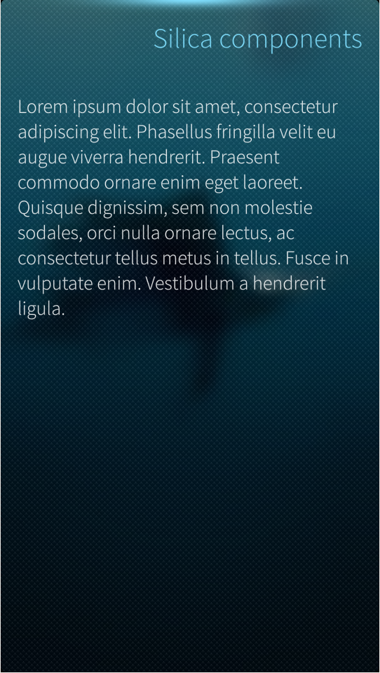
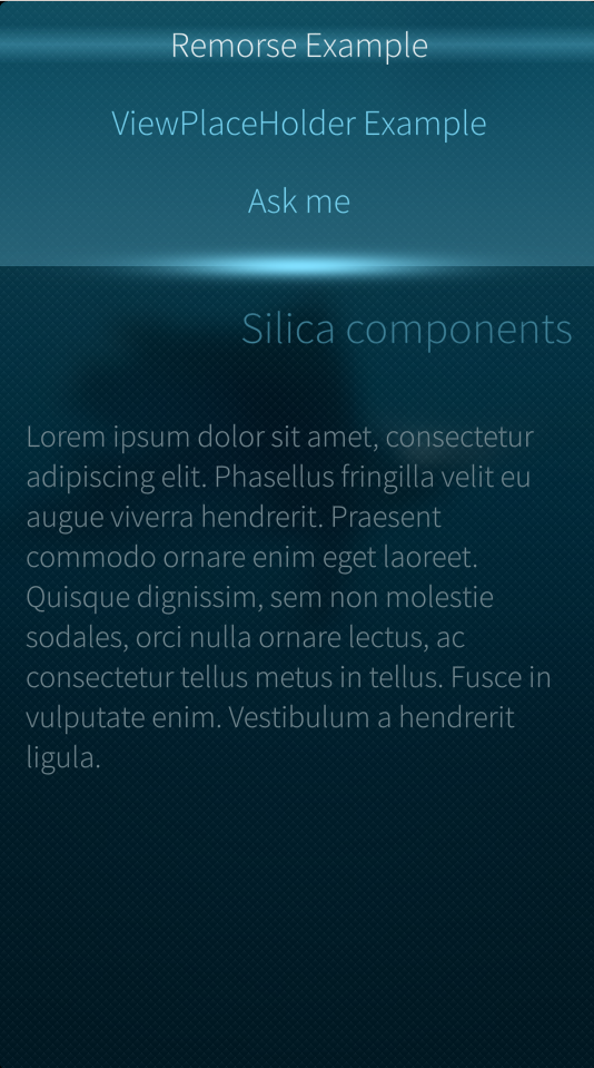
PageHeader {
title: "Silica components"
id: header
}
Label {
text: "Lorem ipsum dolor sit amet, consectetur adipiscing elit. Phasellus fringilla velit eu augue viverra hendrerit. Praesent commodo ornare enim eget laoreet. Quisque dignissim, sem non molestie sodales, orci nulla ornare lectus, ac consectetur tellus metus in tellus. Fusce in vulputate enim. Vestibulum a hendrerit ligula."
font.pixelSize: Theme.fontSizeSmall
wrapMode: Text.Wrap
anchors {
left: parent.left
right: parent.right
margins: Theme.paddingLarge
}
}
}
}
}Above I defined a Page that contains just one child, a SilicaFlickable to ensure that if the content will be too long to fit, it will be scrollable. I added a VerticalScrollDecorator to give visual feedback to the user while scrolling.
Following this, Column and QtQuick components are used to vertically position a series of items without using anchors. I used the Theme object to set the spacing property.
I used the PageHeader type to display the page title and finally created a Label, with some text and a property to display it as I wish.
Pages are handled with a stack-based navigation model provided by the PageStack type. Our ApplicationWindow (the top-level component of a Sailfish application) has a property called pageStack that holds an instance of this, always displaying the top-most page in its page stack.
A page may be pushed (the push() method) onto the stack to place it at the top of the stack, or popped (the pop() method) to remove it.
With this model it’s simple to provide hierarchical navigation within an application where gestures and standard buttons allow the user to navigate back and forth
In the image above you can see that the indicators in the top-left (or top-right) margins of a page stack indicate whether the page can be swiped back or forward. Navigation gestures can be invoked pragmatically, via the navigateBack() and navigateForward() functions.
As an example, if I add this code as a child of the Column object:
Button {
            text: "next page"
            onClicked: pageStack.push("MyPage.qml")
        }

        Button {
            text: "previous page"
            onClicked: pageStack.pop()

        }
where MyPage.qml is the name of the page itself and the user can navigate through more instances of the same page, back and forth.
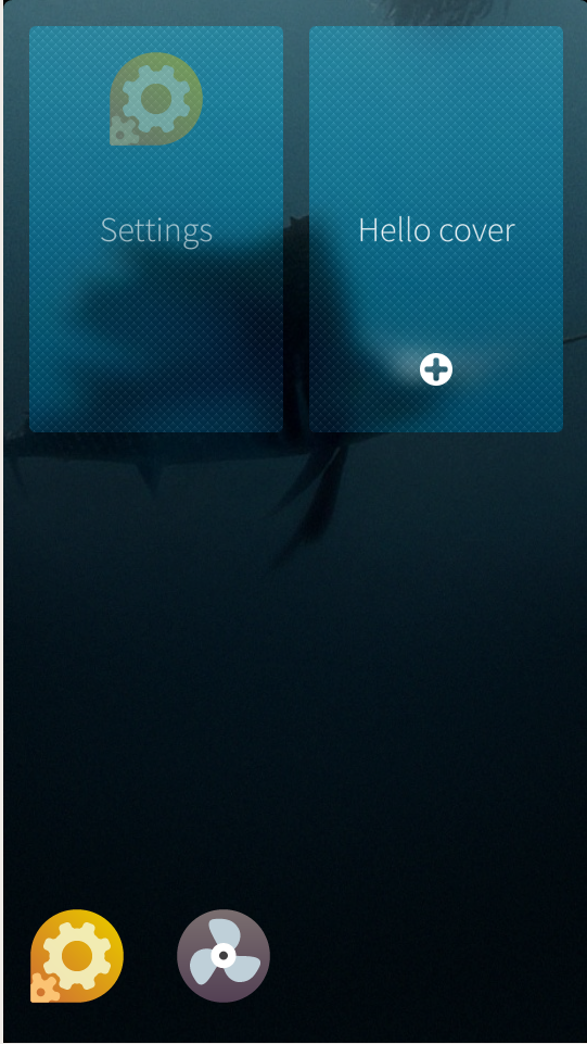
Cover
Active covers is one of the distinctive elements of Sailfish. It’s the visual representation of an application running in the background and it will be visible on the Home screen.
It can be used to display real time information to the user (like the currently playing song) and to provide one or two cover actions that can be triggered directly without the need to open the application (eg. Pause, skip song).
The ApplicationWindow holds the instance of the Cover that can be created using a top-level element, the CoverBackground type:
import QtQuick 2.0
import Sailfish.Silica 1.0

CoverBackground {

    Image {
        id:background
        fillMode: Image.PreserveAspectCrop
        source: "landscape.png"
    }

    Label {
        anchors.centerIn: parent
        id: label
        width: parent.width
        horizontalAlignment: Text.AlignHCenter
        text: "Hello cover"
    }


    CoverActionList {
        id: coverAction

        CoverAction {
            iconSource: "image://theme/icon-cover-new"
            onTriggered: addItem()
        }

    }

    function addItem() {
        console.log("Adding item")
    }

}
In this example I created a CoverBackground object and added an Image as its child that will be used as a background and will fill the entire cover, preserving the image aspect ratio.
I added a centered label and a CoverActionList with one CoverAction.
CoverAction specifies the action to take when a cover gesture is activated. It’s defined with an icon and a function to be triggered at the right time. Sailfish only handles two CoverActions for a cover. You can see how javascipt-like functions and syntax can be used in QML to declare functions and using them as a callback for events.
RemorsePopup and RemorseItem
Another interesting element in the Sailfish UI toolkit is the RemorsePopup.
This allows destructive options to be performed after a remorse period has elapsed. Users change their mind, or hit the wrong button, so providing them an option to cancel a destructive action is always good, especially on touch devices.
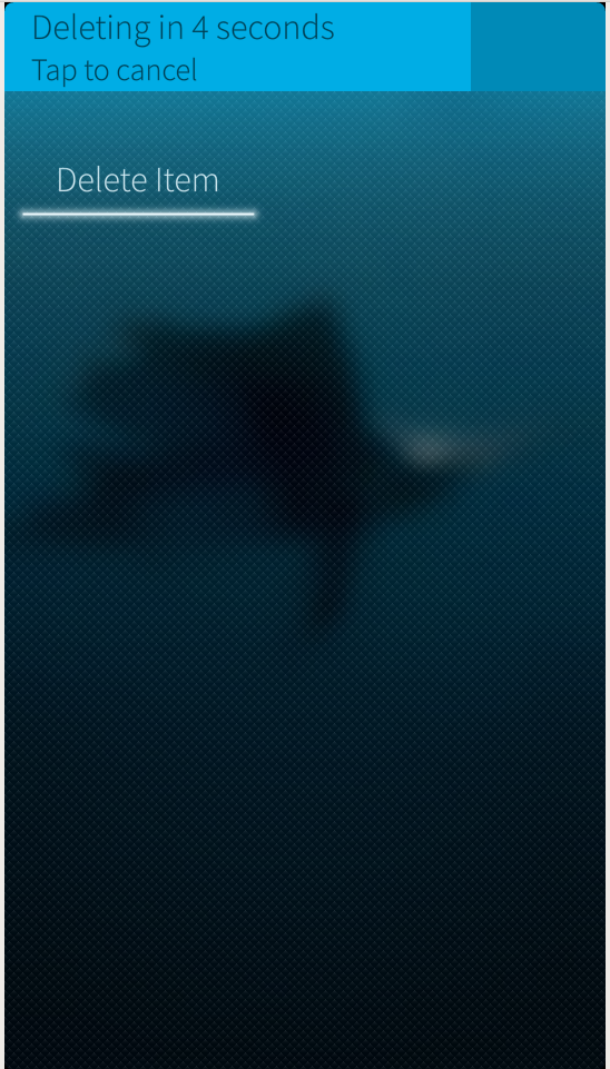
The user can tap the popup before the timeout and cancel the destructive action.
Adding a RemorsePopup is easy. If I have a “delete” Button:
Button {
   text: "Delete Item"
   onClicked: deleteItem()
}
Leaving the deleteItem method, I can just change the code like this:
Button {
   id: button
   text: "Delete Item"
   onClicked: remorse.execute("Deleting",  deleteItem )
   RemorsePopup { id: remorse }

}
When a user clicks the button, the RemorsePopup will be displayed with the specified text.
Once the timeout has expired, the deleteItem callback will be called.
The RemorseItem type works in the same way, but can be attached to an object (like a list element) where it will become a sibling to its target parent.
Pulley Menu
In Sailfish menus are usually represented as a Pulley menu. It is positioned above/under the content of the view and is accessed by dragging the view down/up. The menu items are activated by either:
- Dragging the view down/up to highlight a menu item and releasing to activate.
- Dragging or flicking to expose the entire menu, and tapping a menu item to activate.
Pulley menus should be added to a SilicaFlickable, SilicaListView, SilicaGridView or SilicaWebView to work.
The PullDownMenu is used to create a pulley menu, and it will be populated by declaring MenuItem objects as its children.
import QtQuick 2.0
import Sailfish.Silica 1.0

Page {
        SilicaListView {
            PullDownMenu {
                MenuItem {
                    text: "Option 1"
                    onClicked: console.log("Clicked option 1")
                }
                MenuItem {
                    text: "Option 2"
                    onClicked: console.log("Clicked option 2")
                }
            }
            header: PageHeader { title: "Header" }
            delegate: MyListItem {}
            model: MyModel {}
        }
    }
ViewPlaceholder
Another handy component is the ViewPlaceholder. It provides placeholder text to be displayed in empty views when no content is available.
In this way the user will be aware that the app is ready but that there is nothing to show.
If the view has a PullDownMenu, tapping the ViewPlaceholder will show the menu to indicate to the user that options may be available.
Page {
    SilicaListView {
        id: view
        anchors.fill: parent
        model: ListModel { }

        ViewPlaceholder {
            enabled: view.count == 0
            text: "Nothing to show now"
        }

        delegate: BackgroundItem {
            width: view.width
            Label { text: "Item " + index }
        }
    }
}
In this example I added a ViewPlaceholder to a SilicaListView and binded its enabled property to the count property of list itself.
As soon as we add something to the list model our ViewPlaceholder will disappear.
Dialog
Dialog is a generic container for displaying a dialog that accepts user input. It will show as a modal dialog box added to the top of a PageStack. The user can accept a dialog (confirming modifications, or input and proceed) pushing the page from right to left, or tapping the Accept Button. Conversely, dialog is rejected by pushing the page from left to right or tapping the Cancel Button.
A simple dialog is created in this way:
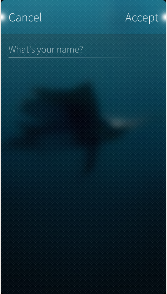
import QtQuick 2.0
import Sailfish.Silica 1.0

Dialog {
    property string name

    Column {
        width: parent.width

        DialogHeader { }
        TextField {
            id: nameField
            width: 480
            placeholderText: "What's your name?"
        }
    }

    onDone: {
        if (result == DialogResult.Accepted) {
            name = nameField.text
        }
    }
}
The onDone event will be triggered when the user accept or dismisses the dialog. The DialogResult.Accepted holds the user intention.
DialogHeader should be used to provide page indicators at the top of the dialog page.
The Dialog can be displayed pushing it to the pageStack as a normal Page.
Column {
    Label {
        id: displayedName
    }

    Button {
        text: "Ask me"
        onClicked: {
            var dialog = pageStack.push("NameInputDialog.qml", {"name": displayedName.text})
            dialog.accepted.connect(function() {
                displayedName.text = "My name: " + dialog.name
            })
        }
    }
}
Above I connected the signal “accepted” of the dialog to a javascript function that updated the label, using the name property of the Dialog (set when the dialog is accepted).
If the dialog is rejected, the onRejected signal handler is called and the result is set to DialogResult.Rejected.
Conclusion
This is a brief introduction to the most popular Silica components that are important to understand and use correctly to create a native application with the Sailfish look and feel. I will be covering more components in more detail in future articles. In the meantime enjoy Sailfish and I would love to know your opinions.
Frequently Asked Questions (FAQs) about Silica Components and User Interfaces in Sailfish OS
What are Silica Components in Sailfish OS?
Silica Components are a set of QML types provided by Sailfish OS for building user interfaces. They are designed to provide a distinctive look and feel, with fluid animations and effects. Silica Components include a variety of elements such as buttons, sliders, text fields, and many more. They are highly customizable and can be used to create a unique and user-friendly interface for your Sailfish OS applications.
How do I start using Silica Components in my Sailfish OS application?
To start using Silica Components in your Sailfish OS application, you first need to import the Sailfish.Silica module in your QML file. This can be done by adding the line “import Sailfish.Silica 1.0” at the beginning of your QML file. Once the module is imported, you can start using the Silica Components in your application.
What is the difference between Silica Components and other QML types?
Silica Components are specifically designed for Sailfish OS and provide a distinctive look and feel that is consistent with the Sailfish OS user interface. They also include additional features and properties that are not available in standard QML types. For example, Silica Components support theming, which allows you to easily change the appearance of your application to match the current Sailfish OS theme.
Can I use Silica Components in other operating systems?
Silica Components are designed specifically for Sailfish OS and are not compatible with other operating systems. However, the underlying technology, QML, is a part of the Qt framework, which is cross-platform. This means that you can use standard QML types to build user interfaces for applications that run on different operating systems.
How can I customize the appearance of Silica Components?
Silica Components are highly customizable. You can change their appearance by setting different properties such as color, size, and font. For example, you can change the color of a button by setting its “color” property. You can also use CSS-like syntax to style your components.
What are some common use cases for Silica Components?
Silica Components can be used to build a wide range of user interfaces for Sailfish OS applications. They are particularly useful for creating interfaces that are intuitive and easy to use. Some common use cases include creating forms, menus, dialogs, and navigation structures.
Are there any resources available to help me learn more about Silica Components?
Yes, there are several resources available to help you learn more about Silica Components. The Sailfish OS website provides comprehensive documentation, including a guide to Silica Components and a reference manual. There are also several tutorials and examples available online that can help you get started.
Can I use Silica Components in commercial applications?
Yes, you can use Silica Components in commercial applications. However, you should be aware that Sailfish OS is a proprietary operating system, and there may be licensing requirements or restrictions that apply.
How do I debug issues with Silica Components?
Debugging issues with Silica Components can be done using the same tools and techniques that you would use for any other QML application. The Qt Creator IDE, which is included with the Sailfish SDK, provides a powerful debugger that can help you diagnose and fix issues.
Can I contribute to the development of Silica Components?
Yes, Sailfish OS is developed by Jolla, a company that encourages community involvement. If you’re interested in contributing to the development of Silica Components, you can get involved by joining the Sailfish OS community and participating in the development process.
 Michele Tameni
An unconventional software engineer, interested in research and development of innovative apps, experimenting on emerging technology and interaction methods. A contributor to some open source projects, some for work, mostly for passion. When not at a keyboard Michele is usually travelling around the world, taking photographs or writing about adventures.