It’s funny how it’s almost always the imperfections in a technology that become its signature – the bit that we celebrate.
What am I talking about?
- The hiss and crackle of a vinyl record
- The sprocket holes in movie film reels
- The clicks, whistles and squeals of dial-up internet
- The linear brush stroke in a painting
Each is not much more than an accidental side-effect of their creation process. For instance, dialup modems hacked audio phone tech to make data connections work. It was never a great system to send data so we moved away from it. Yet that tinny whine can still make people smile.

Similarly, we rarely rely on moving mechanical reels to drive today’s digital video. Yet perforated film reels are still easily the most common visual motif in logos for film companies and photographers.
Which brings us to the ‘halftone pattern’.
The Halftone
The ‘halftone’ – those little dots that you see in most printed photographs – are another side-effect of an imperfect process. A case of ‘this is the best we can do with what we have‘.
Before the invention of the halftone, almost all color imagery was hand-painted, and skilled painters might hand mix hundreds of different colors to recreate what their eyes were seeing.
Obviously hand mixing hundreds of colors for each image wasn’t an option for the print process. Unlike painters, printing presses can only print solid ink in a limited set of colors at any one time.
Halftones changed the game by giving printers a lot more tones out of a smaller number of inks. Glass screens with grids of tiny lenses allowed print houses to convert tonal imagery into differently sized dots. While it wasn’t a perfect, mirror-like reproduction – early screens were very coarse – it was a revolution for color printing.
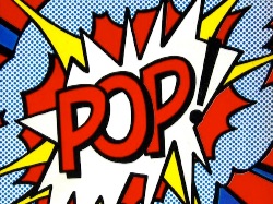
But halftones can’t help but have their own ‘look’, and artists and designers picked up an that.
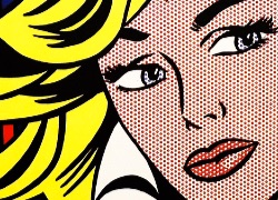
1960’s Pop Art master Roy Lichtenstein adopted the halftone dot (Ben-Day dots) in all of his most iconic works. His bold, comic-inspired work vibrates with hand-stencilled dots which you’ll find on everything from canvas to tiles to cups and crockery.
Khoi Vin Introduces a Wildcard
Khoi Vin (formerly design extraordinaire at NYT) has also adopted the halftone effect in a big way for his new Wildcard iPhone App.
Bored with the blurred background photo effect that has become common in the past two years, Khoi uses halftones in two ways:
- Color feature images in the browse view use a subtle newspaper-like halftone.
- -Upon opening a ‘card’, the feature image transforms into a dark, monotone version that becomes the background.
You’ll get a sense of it in this animation (which I’ve slowed slightly).
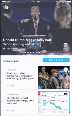
It’s a seriously cool effect, giving the app a trustworthy ‘newspapery’ feel, while still making it visually distinctive – it certainly doesn’t look like another Flipbook.
There was one interesting decision though.
At the moment, the Wildcard CMS automatically generates two extra images for every featured news image – one color and one monotone version each time. Khoi mentions that these images compress nicely, but I do wonder if there was another way.
This means users need to download three images for the ‘editorial value’ of a single image. That’s not crazy, but perhaps not ideal either.
It also means that the Wildcard servers need to manage and store three times as many image assets – images that become instantly redundant if they retire this visual effect in two years.
Again, not a tragedy, but something you wouldn’t take on lightly.
Generating On-the-fly Halftones
There have been some excellent solutions for generating on-the-fly halftone effects. David DeSandro created this crazy, interactive ‘breathing’ halftone – which is fun to play around with.
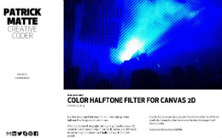
However, I think Patrick Matte’s color halftone filter probably best fits the bill for our application. Patrick’s approach renders the original image into a Canvas element while letting you interactively adjust the level of detail.
It’s a great solution and if used in a ‘Wildcard-like’ layout, would allow ‘live tweaking’ of the effect without creating any legacy issues.
It would be interesting to know if Khoi’s team considered building a filter like this, but decided not to – perhaps for performance reasons on IOS. Performance for Patrick’s canvas solution seems fine on the web.
Nevertheless, there’s no denying that Wildcard is a beautiful design and a great UI. I suspect we’ll be seeing the ‘halftone dot’ quite a bit over the next year.
Originally published in the SitePoint Design Newsletter.
Frequently Asked Questions about Halftones and Dots
What is the history of halftone dots in design?
Halftone dots have a rich history in design, dating back to the 19th century. They were initially used in print media to reproduce grayscale images using black ink. The technique involves varying the size and spacing of black dots to create different shades of gray. Over time, halftone dots have evolved and are now used in various forms of digital and print media, including comics, posters, and graphic design.
How can I create halftone effects in Adobe Photoshop?
Adobe Photoshop offers several tools and features that can be used to create halftone effects. The most common method is to use the ‘Color Halftone’ filter, which can be found under the ‘Filter’ menu. This filter allows you to control the size of the dots and the angles of the color channels, giving you a lot of flexibility in creating your halftone effect.
What are some common uses of halftone dots in modern design?
In modern design, halftone dots are often used to create a vintage or retro aesthetic. They are commonly seen in comic books, where they are used to add depth and shading to illustrations. Halftone dots can also be used in graphic design to create interesting textures and patterns.
How can I create a halftone pattern in Illustrator?
Creating a halftone pattern in Illustrator can be done using the ‘Effect’ menu. By selecting ‘Pixelate’ and then ‘Color Halftone’, you can adjust the max radius and channels to create a halftone pattern. You can also create a halftone pattern manually by creating a series of circles of varying sizes and arranging them in a grid.
What is the difference between halftone dots and comic dots?
While both halftone dots and comic dots are used to create shading and depth, they are used in different contexts. Halftone dots are typically used in print media to reproduce grayscale images, while comic dots, also known as Ben-Day dots, are used in comic books to add color and shading.
How can I use halftone dots in my own design work?
Halftone dots can be used in a variety of ways in your design work. They can be used to create interesting textures and patterns, to add depth and shading to illustrations, or to create a vintage or retro aesthetic. The key is to experiment with different sizes and spacings of dots to achieve the desired effect.
Can I use halftone dots in digital design?
Yes, halftone dots can be used in digital design. Many digital design software, such as Adobe Photoshop and Illustrator, have tools and features that allow you to create halftone effects.
What are some tips for working with halftone dots?
When working with halftone dots, it’s important to consider the size and spacing of the dots. Smaller dots spaced closely together will create a lighter shade, while larger dots spaced further apart will create a darker shade. It’s also important to consider the medium in which your design will be displayed, as this can affect how the halftone dots appear.
Are there any resources for free halftone dot patterns?
Yes, there are many resources online where you can find free halftone dot patterns. Websites like Freepik and Vecteezy offer a wide range of free vector patterns, including halftone dots.
Can halftone dots be used in color designs?
Yes, halftone dots can be used in color designs. In fact, they are often used in comic books to add color and shading. By varying the size and spacing of colored dots, you can create a wide range of hues and tones.
 Alex Walker
Alex has been doing cruel and unusual things to CSS since 2001. He is the lead front-end design and dev for SitePoint and one-time SitePoint's Design and UX editor with over 150+ newsletter written. Co-author of The Principles of Beautiful Web Design. Now Alex is involved in the planning, development, production, and marketing of a huge range of printed and online products and references. He has designed over 60+ of SitePoint's book covers.