Bootstrap is unanimously considered the de facto standard for quickly achieving a really responsive design in web and mobile sites. However, while Bootstrap does a great job with tables, menus, and general layout via the native grid system, it’s not as good as it should be when it comes to handling images. In particular, Bootstrap offers just one predefined class to style images responsively. Here’s its definition:
.img-responsive {
  display: block;
  max-width: 100%;
  height: auto;
}
The net effect of the img-responsive class is that the image is displayed as a block and properly resized to neither exceed the width of the container nor be stretched beyond its own original width. This is an excellent compromise, yet it’s a compromise. In particular, Bootstrap’s solution makes two assumptions:
- You’re always going to link a given image for each specific page and scenario
- Your main concern is that the image displays nicely when you resize the screen
The Bootstrap solution doesn’t specifically address any of the concerns below:
- The need to resize the image on a per-device basis
- Resize the image on a per-scenario basis
Serving a per-device image is serving the requesting device an image appropriate according to its actual capabilities. In this context, regardless of the screen size, a smartphone is not the same as a tablet and both are not the same as a desktop computer. Put another way, it’s one thing to deal with a desktop browser window resized to 480px in width; it’s quite another to deal with a low-end smartphone device of the same screen size. Ideally, you might want to be able to serve distinct images on a per-device basis.
But there’s more to it.
When you consider serving a smaller image to smaller mobile devices, are you sure you just want the same image only smaller? Look at the following two images:
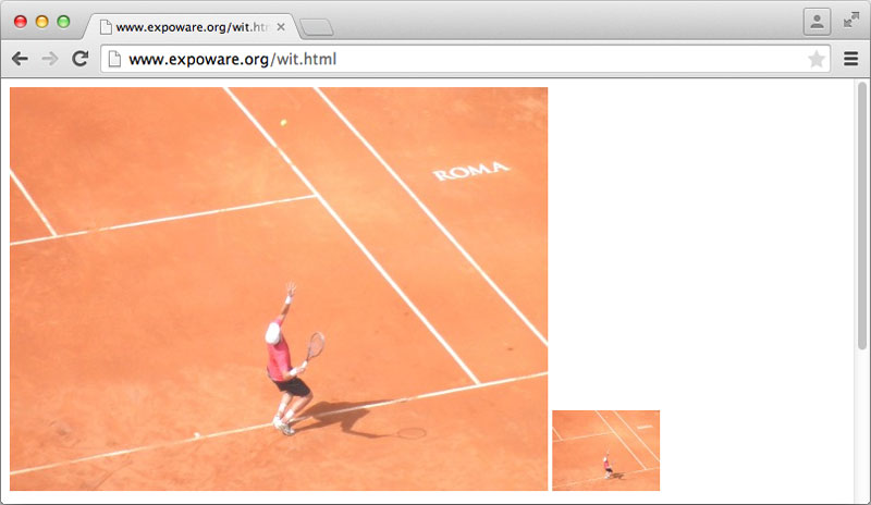
The original image is 2560x1920px. The larger image in the page is 500px wide; the small thumbnail-sized one is 100px wide. Is the thumbnail acceptable to you?
When it comes to images in a mobile and web scenario, there are a few aspects to consider before committing to one solution or the other.
- The size of the download
- The need for thumbnails
- Art direction
Let’s see the major points of each aspect.
Size of the Download
If you’re concerned about the size of the download and the impact on low-end devices, you have two possible options: 1) Maintain multiple copies of the image and 2) use a server-side routing algorithm to detect devices and intelligently serve the most appropriate copy of the image. A framework like Bootstrap won’t be helpful in this scenario. You can write your own server-side infrastructure (i.e., an HTTP handler) or you can use something like WURFL Image Tailor (WIT).
WIT is a free server-side tool that acts as a proxy between the WURFL web site and the source of the image. Instead of requesting the image directly from the origin server, you pass the origin URL to the WIT service. WIT will get the image from the original server, resize it to match the capabilities of the detected device and serve back to the user agent just the bits it reckoned appropriate. In other words, the image is resized on-the-fly based on the type of requesting device and the resized image is cached for further use. If you have no other concerns about the image except the size of the download, here’s all you need:
<img src="http://wit.wurfl.io/full-url-of-the-image" alt="example">As mentioned, WIT is a free service with a limit of 20,000 images per month per website. Past that limit, your pages will still work unchanged and WIT will simply act as a redirector.
Need for Thumbnails
Another scenario is when you need to serve thumbnails. For example, imagine a news portal where each news item has a large image when viewed in detail mode and suffices to have a thumbnail when it’s listed on the home page. Should the thumbnail be a separate image or just the same image rendered in a smaller container? It depends on the expected usage of the pages.
If you expect users to mostly look at headlines and click occasionally to read the news then you might want to use a separate thumbnail image on smartphones and other low-end devices. This would ensure that smaller images are served and the rendering of the page is as quick as possible. When the user then clicks to read the news, they download the full image using a service like WIT to optimize the download.
Thumbnails can be distinct images you keep on the server or they can be created on-the-fly and cached with WIT. In this case, you use an extended syntax as below:
<img src="http://wit.wurfl.io/w_100/https://www.sitepoint.com/images/tennis1.jpg"
     alt="example">
The w_100 command instructs the WIT service to resize the original image to a width of 100 pixels, keeping the aspect ratio. Alternatively, you can set a fixed height using the h_XXX command or even indicate a percentage of the screen you want the image to take. In this case, you use the pc_XX command, where XX is a number (the percentage) between 1 and 100. Note that when using the percentage command WIT will set the longest screen dimension as the width. In this way, you’re guaranteed optimal results regardless of the current orientation of the device.
On desktop browsers, it doesn’t really make a huge difference and you can simply go with Bootstrap-style responsive images and just place the image in an outermost div, properly resized to show as a thumbnail.
Thumbnails are relatively easy to get when all images have the same size or at least the same ratio. When this is not the case, you can ask WIT to put the resized image in a box of a fixed size. WIT will do the job of fitting the image as-is if the dimensions are compatible with the ratio of the original image. Otherwise, it just follows your instructions, as shown:
<img src="http://wit.wurfl.io/w_200/h_200/m_cropbox/full-url" alt="example">The example will resize the image to be a 200×200 image resampled to fit the size. If the original image is not a square then the image is cropped from the center and a section of the specified size is taken. The list of valid resampling options is in the table below. To use boxing you must indicate both width and height.
| Name | Command | Description |
|---|---|---|
| Box | m_box | Returns an image contained in the given box that retains the original aspect ratio. |
| Stretch | m_stretch | Returns an image that matches the given box regardless of the original aspect ratio. |
| CropBox | m_cropBox | Returns an image that matches the given box resampled with cropping from the center if dimensions don’t match. |
| Letterbox | m_letterbox | Like “box” except it may be padded with empty space if the resized image doesn’t fit exactly. You can choose the color of the padding as m_letterbox_aarrggbb. |
Art Direction
Finally, there are situations in which you just want to have different copies of the same image to use in various situations. This is the case, for example, when you want to match a specific pixel density to adjust for retina display or when you want to ensure the image delivers significant content even with a smaller size. As an example, look back at the thumbnail in the image shown earlier. Assuming that 100×75 is the size we’re aiming for, which of the following thumbnails is a better fit?
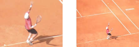
The point is that the one on the right can be easily obtained through WIT; the one on the left requires some art direction and a bit of work on your own.
Final Thoughts
Even though “responsive” is a very common adjective today and Bootstrap is an extremely popular and well-done framework, when it comes to images and mobile devices, there’s a lot more to consider. Sometime in the future, all in-use browsers will support native solutions richer than today’s img element. At the moment, it seems that we’ll have a nice, media query-like syntax to link different images to the same place. With WIT, in most cases, you can create and maintain a single image and leave the burden of resizing and caching to the service.
For more info, check out the WURFL Image Tailor service and its documentation.
 Dino Esposito
A long-time trainer and top-notch consultant, over the past 15 years Dino has been the author of many popular books for Microsoft Press that helped the professional growth of thousands of .NET and Web developers. Latest book is “Microsoft .NET: Architecting Applications for the Enterprise” (MS Press, 2014, 2Ed). Scheduled to hit bookshelves in 2015 is also “Modern Web Development: Understanding domains, technologies, and user experience” from MS Press. CTO of Crionet, a firm specializing in Web-based and mobile solutions for sport events across Europe, at the moment Dino is also technical evangelist for JetBrains, where he focuses on Android and Kotlin development.