Cross-Browser Testing Methodologies
Part 1 – Frontend Web Testing Overview
Web technology has significantly advanced over the past few years. With mature web apps in the form of responsive and progressive apps, React, and others, developers are being challenged more than ever to ensure the continuous quality of web apps, regardless of which platforms they are being consumed on (mobile, desktop, or both). In the first part of this book, you will be able to catch up on all the important advancements within web technologies, the challenges in building a top-notch web app, the available testing solutions that can help overcome some of these challenges within a development team, and the main differences between the leading web development frameworks that can impact testing strategies.
In this part, we will cover the following chapters:
- Chapter 1, Cross-Browser Testing Methodologies
- Chapter 2, Challenges Faced by Fronted Web Application Developers
- Chapter 3, Top Web Test Automation Frameworks
- Chapter 4, Matching Personas and Use Cases to Testing Frameworks
- Chapter 5, Introducing the Leading Frontend Web Development Frameworks
Over the past few years, web technology has advanced significantly. End users are now exposed to a whole new level of mature web apps in the form of responsive and progressive apps such as React and Flutter. With these advancements, developers are challenged more than ever with ensuring the continuous quality of their web apps, regardless of which platforms (mobile, desktop, or both) they are being used on.
This chapter covers the most advanced web technologies and web application types you will come across, including responsive and progressive types. It is specifically designed to cover the main trends that typically impact web application developers, along with the various testing types that are relevant for such applications. The web landscape offers developers a wide range of web application types across different application frameworks. Applications such as responsive web, progressive web, Flutter, React Native, and more are only a subset of the range of such applications. In this chapter, we will outline the main application types and what they mean as well as how they differ from each other to help frontend developers consider different testing activities.
This chapter will cover the following main topics:
- An overview of the web landscape
- Understanding web application types
- Testing types for web applications
- Understanding headed and headless browsers within app development and testing
An overview of the web landscape
The web landscape is at its most advanced stage today compared to some years ago. Today, web applications can leverage the unique capabilities of the different web browsers that were simply not available a few years ago. From interaction with location services, cameras, and more to being installed as apps on a smartphone, tablet, or laptop, today, web applications are closer than ever to mobile applications.
With all of this in mind, there are other aspects within the web landscape that are important to understand: web technologies that are available and are constantly changing for web application developers.
Based on Hackr.io (https://hackr.io/blog/web-development-frameworks), web developers have a wide array of choices when building their websites. With ExpressJS, Angular, React, Vue, Ember, and more, developers can choose the most relevant technology for their next web application.
With web technologies growing and running on different omni-channels, the quality and growth of vulnerabilities are also becoming a great challenge. Based on the ongoing monitoring of web trends by the HTTP Archive (https://httparchive.org/reports/state-of-the-web), 59.4% of crawled pages contain at least one known third-party JavaScript vulnerability:
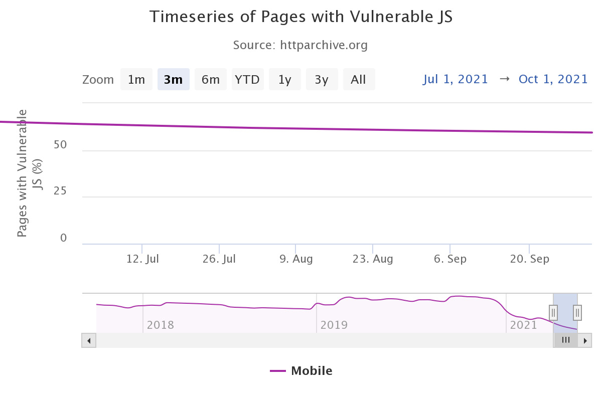
Figure 1.1 – Web pages with vulnerable JavaScript code (source: https://httparchive.org/reports/state-of-the-web)
In addition to the level of growth of web technologies and maturity of browser capabilities, an additional area that has completely changed in terms of both awareness and importance is web application accessibility compliance. Organizations that build web applications today, and in the future, must adhere to strict accessibility rules across desktop and mobile devices. Not meeting these guidelines, such as section 508, Americans with Disabilities Act (ADA), and Web Content Accessibility Guidelines (WCAG), can result in massive fines and brand damage.
Today, web application developers should be more equipped with the knowledge, tools, and continuous training around web application quality. This is to ensure their apps are solid and don't introduce any kind of business risk to their brand – whether quality-related, security-related, accessibility-related, availability-related, or in terms of compatibility across factors that includes different screen sizes and resolutions.
Now that we've looked at a brief overview of the current web landscape, let's examine the various types of web applications and what each of them mean from a development and testing perspective.
Understanding web application types
When building a web application in the ever-changing digital marketplace, developers have various choices in terms of whether to build a traditional web application, a responsive one, or a progressive application. Each choice comes with advantages, disadvantages, and technology implications, such as the language in which the app is developed, the target platforms on which it will run, and which technology stack would fit such an application. A progressive web application (PWA) that is intended to run on both web and mobile apps can be developed in JavaScript; however, testing one on real mobile devices and browsers will require a mix of frameworks such as Selenium, Appium, and more.
Let's learn more about each of the application types.
Traditional web applications
The most basic web application type is one that is developed and designed from the bottom up to run on desktop machines (for example, Windows 11 with the Edge browser and macOS with Safari). While fully supported to run on mobile smartphones and tablets, such applications are not designed to be responsive.
If you navigate from your Windows desktop Chrome browser to the MSN website (http://msn.com), you will be able to work through the site, navigate around it, and use it as required. However, if you choose to navigate to the browser menu, under the More tools submenu, and select the Developer tools option (this one can also be triggered through a click on by pressing the F12 button on your keyboard), you will see a Toggle device toolbar button that is aimed at helping developers and testers to validate their web apps from a responsive standpoint. In this menu option, if a user selects an iPhone device, they will see that the website isn't mobile-ready. As a matter of fact, in the top-level banner of this web application, there is a callout to download a relevant mobile app for both Android and iOS:
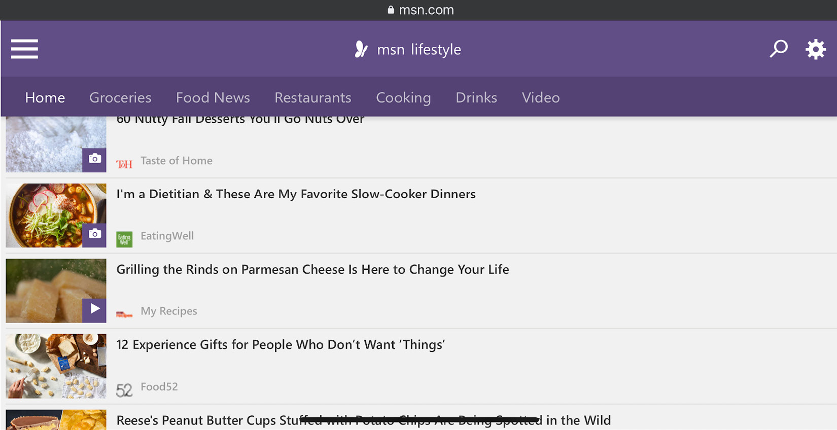
Figure 1.2 – The MSN web application on an iPhone 13 Pro Max in landscape orientation mode
Such a web application type would be developed, tested, and mostly dedicated to desktop web users. Additionally, it will require the organization to maintain a mobile-specific native or hybrid app to ensure a proper user experience across all digital devices.
Responsive web applications
In contrast to traditional web applications, responsive web applications are adjustable across most desktop and mobile screen sizes and resolutions. Such a unique design allows web developers to make their apps accessible across the maximum number of digital channels using a single code base and a consistent user experience. However, it is not as simple as that; responsive web apps require, in addition to a unique development workflow, things such as an agreed content strategy that shows customers the most relevant content above and beyond the fold. Such visible content across all types of screens needs to be constantly maintained, optimized, and tested to ensure business growth and success:

Figure 1.3 – Responsive Web Design for Desktop, Notebook, Tablet and Mobile Phone (originally created by Muhammad Rafizeldi (Mrafizeldi), retrieved from https://commons.wikimedia.org/wiki/File:Responsive_Web_Design_for_Desktop,_Notebook,_Tablet_and_Mobile_Phone.png, licensed and made available under CC BY-SA 3.0 (https://creativecommons.org/licenses/by-sa/3.0/deed.en))
Responsive web apps are a much stronger application type with clear benefits to both the developers and the end users. Maintaining a single code base over time and automatically serving any screen size or resolution are clear cost-efficient software development methods.
New types of digital platforms such as foldable smartphones and home devices, such as Google Hub and Amazon Echo Show, have also entered the market; such applications need to be updated to ensure a continuous user journey across all platforms.
In a nutshell, here is a list of the building blocks of a solid responsive web design (RWD) test plan that both developers and test engineers should execute continuously:
- Compatibility testing across the most relevant desktop browsers, OS versions, and mobile devices
- Visual testing coverage across different layouts, screen sizes, resolutions, and languages to ensure the proper display of all graphical elements on these platforms
- The end-to-end functional testing of all business flows, links, forms, and other web UI dependencies
- Accessibility of the pages across all different platforms
- Client-side performance testing
- Load testing at peak levels and normal ones
- Testing across different environment conditions (both web and mobile), including networks, working with sensors, incoming events, location-aware events, and more
PWAs
PWAs are one of the most advanced web application types with unique characteristics. Initially developed and led by Google, these application types have been adopted by all the other browser vendors, including Apple, Microsoft, and Mozilla. PWAs are those applications that are built on top of the responsive web app code base, allowing mobile users to install a web link on their Android and iOS devices. Following this, they can interact with these apps offline through different sensors with access to mobile OS functions such as the contact list, camera, location, and more:
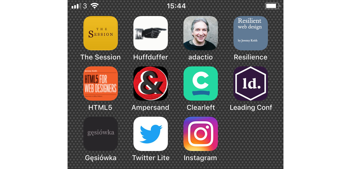
Figure 1.4 – PWA icons on a mobile device (Originally titled "Progressive web apps on my home screen." Created by Jeremy Keith, retrieved from https://www.flickr.com/photos/adactio/42535353742, and licensed and made available under CC BY 2.0 (https://creativecommons.org/licenses/by/2.0/))
A PWA can be installed through a link on any mobile iOS or Android device, as well as on Windows hybrid laptops such as Microsoft Surface. Once they are installed, the user can launch them from their mobile device home screen and enjoy the unique features of the app, which are attributed to the ServiceWorker component that is built into each PWA. In the preceding screenshot, the Twitter Lite icon is the PWA application shortcut that was installed from the web browser on the mobile device.
Service Workers
Service workers are scripts that run in the background of a user's browser, enabling web application developers to add features such as push notifications, offline caching, mobile device sensor engagement, and a proxy that can handle various network requests from your web application. PWAs utilize service workers to enrich web applications running on mobile devices.
PWAs offer users from a single code base the ability to consume a web application on any desktop screen or mobile device screen with the additional features of offline caching, push notifications, sensor support (such as location, camera, and audio), and contact list access. With such reach supported capabilities, web application developers can deploy their apps easily, immediately, and bypass the mobile application stores.
Google and other browser vendors provide tools to validate the PWAs via their browser developer tool capabilities that are available from within the browser, as well as other guidelines and recommended practices. Developers can generate MANIFEST.MF files and JavaScript service worker scripts, which will be added to their web applications. Many enterprise web applications (https://www.pwastats.com/) across market verticals such as Instagram, Lyft, Twitter, eBay, and others, have already adopted this technology and are seeing many benefits daily. As the leader behind these types of applications, Google has created a great baseline (https://web.dev/progressive-web-apps/) and checklist for complying with the PWA requirements.
The building blocks of a PWA test plan include those of the solid RWD that were mentioned earlier, along with the following PWA-specific scenarios:
- The validation of PWA manifests file correctness (pointing to the home URL, theme, icon, and more).
- The validation of the PWA service workers, which comprises critical components of the PWA application, includes registering for push notifications, caching abilities, and more.
- PWA installation and functionality across the platform and in parallel with the native applications.
- PWAs provide a custom offline page to serve users when they are offline.
- PWAs work with any input type such as a mouse, keyboard, stylus, or touch.
- PWAs work fine with all mobile device sensors such as location services, audio, camera, and more.
- PWAs should be tested against all third-party dependencies such as social media integrations (for instance, Facebook and LinkedIn), other APIs, analytics services, and more.
- The PWA testing of security, privacy policies, and permissions of the app to adhere to Apple and Google requirements.
As you might have gathered, this is a superset of the pillars of an RWD plan with additional PWA-specific testing considerations.
The following code snippet demonstrates a basic service worker registration in JavaScript as part of building the foundation of a PWA application:
If ('serviceWorker' in navigator) {window.addEventListener('load',function(){navigator.serviceWorker.regisdter('/sw.js').then(function( registration) {//Registration was successfulconsole.log('ServiceWorker registration with scope:' ,registration.scope);} function(err){//registration failed ☹console.log('ServiceWorker registration failed:',err);});});Now that we've established the main web application types that are available for application developers, let's go through the key testing types that need to be considered upon each web application release.
Testing types for web applications
Software testing consists of various types: functional, API, integration, non-functional, unit, accessibility, and ad hoc exploratory testing. In this chapter, we will only discuss the high-level functional and non-functional testing types, while later in the book, we will also cover API testing and other types of testing as part of the specific test automation framework overview. Each of these types can be divided within the traditional testing pyramid and scoped based on whether there is a major release or a small hotfix release on the market.
In this section, we will highlight the key testing considerations across the previously mentioned types as they relate to modern web applications.
With web applications that are intended to run on any kind of desktop and mobile OS and device, covering all angles of the app is crucial to ensure a top-notch user experience.
Web applications are based on continuous interactions between components, UIs (the presentation layer), databases, microservices that communicate through an API gateway with other components, servers, various APIs such as payment, authentications, business workflows (the business layer), and more.
Testing these types of applications that have multiple layers of architecture, as identified earlier, is a challenging task, especially in an Agile and DevOps reality. Multiple personas take part in the software development life cycle, different code changes (that is, pull requests) are submitted many times a day, and this ought to be properly classified and tested.
Functional testing of web applications
Let's go through the key areas of the functional testing category of web applications. Bear in mind that such testing scenarios can be broken into different types of testing, including sanity, regression, smoke, integration, and usability testing by the customer. The scope of the testing suite should be determined by the phase in the software development life cycle (SDLC), the changes within the software iteration, and the defect history of your web application (that is, stability and reliability).
The following list offers a few suggested testing pillars to consider as part of your web app testing plans. Whether you validate the following scenarios through manual testing or automation, these are the fundamental pillars to ensure that your web apps work well across the entire user journey on your website:
- The website links across the entire website should work fine, including the following:
- Navigation links
- Social media links
- MailTo links
- Website forms to test for relevant pages such as registration forms and order forms:
- Form field testing (positive/negative inputs)
- The verification of mandatory filled fields
- The submission of forms across all platforms (mobile/desktop)
- Testing web application policies regarding cookies:
- Cookies are deleted when the web cache is cleared
- Business flow verification of the entire user flow within the website:
- All internal links and user journeys are working
- UI and layout testing
- Localization testing
- The compatibility of the website across all screen sizes and resolutions
- Usability and user experience testing
The non-functional testing of web applications
Complementing functional testing with non-functional testing is imperative for the quality of your web application. At the end of the day, it does not really matter if your app fails in production either because of a functional crash or due to an availability issue due to load-related defects.
Including all types of testing within continuous integration (CI) jobs makes all the difference between a high-performing Agile team and a slow one. Such testing types should include both functional and non-functional tests that are running through automation frameworks upon any code changes.
When covering non-functional testing activities, typically, teams should consider security testing (both static and dynamic), performance and load testing, and accessibility. In some practices, teams might consider accessibility as a functional testing type, but regardless of the bucket that these testing types fit, they are all important. And executing as many of them that bring value is part of the definition of a ready and high-quality web application – if they all pass of course 😊.
Security testing
Security testing involves the following:
- Ensuring authorized access to secure pages is kept
- Preventing users from downloading restricted files without appropriate access and authentication
- Terminating user inactivity sessions automatically
- Redirecting a website to encrypted SSL pages, upon the use of SSL certificates
- Adopting industry-proven tests such as OWASP Top 10, CWE, CERT, and others
- Including code quality standards such as JSLint within SAST and DAST (https://www.jslint.com/)
Performance and load testing
Performance and load testing involve the following:
- Measuring against benchmarks and KPI web application response times according to different network conditions (web and mobile)
- Load testing your web application to determine its behavior under normal (single-user performance) and peak loads (millions of virtual users)
- Stress testing your web app to determine its breakpoint when it is pushed to beyond normal load at peak time
- Determining how the site recovers from crashes or availability issues
Accessibility testing
Accessibility testing involves the following:
- Covering the most common accessibility rules: WCAG, ADA, 508, and, if in Canada, ACA
- Executing accessibility tests across different platforms and languages (web and mobile)
- Ensuring proper accessibility IDs (web elements) for ease of test automation
As mentioned earlier, the combination of exploratory testing and automated testing of both the functional and non-functional areas of your web application should be included in every organization's test plan. Additionally, this should be continuously maintained to adapt to recent web application changes, defects coming from production, platform changes in the market such as new OS versions or mobile devices, and changes to industry standards such as accessibility and new security rules.
Later in this book, we will cover specific examples and tools to help cover most of the testing types recommended in this section.
After covering the main testing types that are applicable for web applications, in the next section, we will focus on the main differences between using headed browsers and headless browsers throughout the development and testing phases.
Understanding headless and headed browsers within app development and testing
In the same way that web application developers and testers have choices around frameworks and languages, they also have the option to choose whether to exercise their web application against a web browser with its UI loaded (that is, headed) or its UI unloaded (that is, headless).
Headless Browsers
A headless browser is a normal browser that simply does not load its UI during runtime.
The decision regarding how to use the web browser depends on the goal and objectives behind the developer's and tester's actions. We will cover these methods in a bit more detail next.
Choosing between headed browsers and headless browsers
Using a headless browser could be extremely beneficial when there is no need to explore any elements or actions on the browser UI, and the main objective is to ensure that tests or other actions on the browsers are just running properly. Another scenario where headless browsers can become very cost-effective is when running a massive set of tests in parallel where there is no need to view the browser UI. Such execution will run much faster due to the savings on memory and other hardware resources that UI browsers typically consume, along with the environment initiation time that each browser would typically take to render the HTML pages. Additionally, you can consider the parallel-testing-at-scale use case as part of a regression build within CI after or in parallel with the UI-based cross-browser testing.
It is important to understand that developers and testers cannot only rely on headless browser testing, which is harder to debug and does not always expose the real end user experience across the different platforms. Combining headed testing with headless testing should be strategically planned and executed by the different teams. All major browser vendors including Google, Mozilla, and Microsoft offer a headless option that the end user can turn on through command-line flags or within the various test automation frameworks such as Selenium and Puppeteer.
Selenium offers a nice set of code samples that can be used to launch any of the supported web browsers in headed or headless mode. Here is a sample configuration within the Selenium 4 (https://github.com/SeleniumHQ/selenium/blob/trunk/javascript/node/selenium-webdriver/chrome.js#L333) framework that would launch the Chrome browser in headless mode:
let driver = new Builder().forBrowser('chrome').setChromeOptions(new chrome.Options().headless()).build();Note that, later in the book, as we dive deeper into the Selenium framework, we will learn how to use this framework in both headed and headless modes. In general, most testing frameworks such as Selenium, Playwright, and Cypress support the two methods of how to test a web application.
To use the various browsers from the command-line interface, developers and testers can leverage dozens of options to take screenshots, remotely debug a web application, and more.
Here is a simple command-line option that uses the headless Microsoft Edge browser that is built on Chromium to capture a screenshot of the PacktPub website home page:
Msedge –-headless –-disable-gpu –screenshot=c:\[..]\packt.png –window-size=1280,1696 https://www.packtpub.com/Prior to running the preceding command, please ensure that you have the Edge browser in the system environment path.
As you can see, in Figure 1.5, the browser captured the home page with the window size that was specified in the command line:

Figure 1.5 – The PacktPub website screen capture using the Edge headless browser CLI
Headless browser testing frameworks
Now that we've established the notion of a headless browser environment that is fast, cost-efficient, and quite easy to use, let's explore an automation framework that works well with the Chrome headless browser, called Puppeteer (https://developers.google.com/web/tools/puppeteer). This tool is a node library developed by Google and comes with a high-level API to control headless Chrome over the DevTools protocol. It has all the benefits of the Chrome browser, including form submission, user inputs, along with additional headless-specific features such as measuring the runtime performance of the web application and more.
Note
Microsoft is leading the development of an equivalent framework that is derived from Puppeteer, called Playwright. Later in the book, we will examine it in more depth.
To get started with this headless solution, please run the following npm install command:
npm install puppeteerWhile installing the solution, developers can start scripting in JavaScript and utilize the APIs available in this framework. Using the following code snippet as an example, developers can automatically navigate to a specific website and capture a screenshot:
const puppeteer = require('puppeteer');(async() => {const browser = await puppeteer.launch({headless:false}); // default is trueconst page = await browser.newPage();await page.goto('https://www.packtpub.com');await page.screenshot({path: 'Packt.png'});await browser.close();})();If setting the headless flag to false, the execution of the code will launch the built-in Chrome browser.
Figure 1.6 is a screenshot of the preceding code sample that was executed:

Figure 1.6 – A screenshot of the Packt home page taken through Puppeteer JavaScript test in headless mode
The preceding example is a simple use case of Puppeteer; however, this framework can extend the DevTools protocol capabilities and generate, through automated code, an HTTP Archive file (HAR) for security, performance, and other web traffic analysis. In the recent Selenium 4 version, as well as within Cypress, developers can also leverage the Chrome DevTools Protocol (CDP) to benefit from some of Puppeteer's capabilities.
To generate an HAR file as part of a test automation script, developers should include the following lines of code in their test automation scenarios, after installing the puppeteer-har node module:
const puppeteerHar = require('puppeteer-har');const har = new puppeteerHar(page);await har.start({path: 'results.har'});await page.goto('https://www.packtpub.com');await har.stop();Adding the preceding code to the screenshot example will generate a results.har file from the PacktPub website. Developers can use any HAR file viewer to analyze the generated resource or simply add the Google Chrome HAR viewer browser extension.
When examining the generated HAR file, developers can get insights on page load times, page statistics, website requests, and response header details:
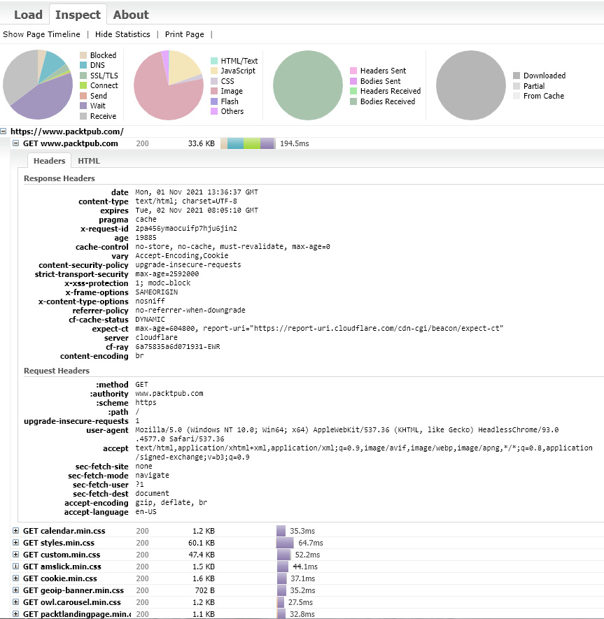
Figure 1.7 – A screenshot of the Packt home page HAR file generated through the automated Puppeteer script
Developers can then use these insights to optimize website performance, detect security vulnerabilities, and more.
As mentioned earlier, Google designed the headless browser tool to help developers test and debug their web applications. Additionally, to succeed in debugging a web application while running in headless mode, Headless browsers provide a remote debugging capability that can be used either manually from the CLI or within the automated JavaScript code:
--remote-debugging-port=9222 (example)While running the tests with headless mode and adding this command, developers can use a headed Chrome browser to navigate to http://localhost:9222 and inspect all the outputs coming from the execution.
Summary
Nowadays, building a winning web application is harder than ever due to the massive digital transformation in progress, and the cost of failure to the brands when something goes wrong. Utilizing all testing types earlier on in the development stages and acknowledging the different methods, tools, and browser-provided capabilities can be a great start in terms of building a quality plan for your web application. Such a plan must cover all the functional and non-functional aspects of testing. Additionally, it should consider cost and time efficiency tools such as headless browser testing, web developer tools, HAR files, and more techniques that were mentioned in this chapter.
Throughout this chapter, we have learned about the advanced web landscape and the new modern application types. We defined and provided insights into responsive web applications, PWAs, and how to properly address the quality of these types of applications. Additionally, we looked at the different testing types that are available to developers and test engineers and broke down each testing type into a web-related use case.
After covering those topics, we then discussed the concept of using headless browsers in conjunction with a headed browser as part of a development workflow to expedite feedback, address environment setup, performance, and stability, and help debug on real browsers more efficiently.
Finally, we closed the chapter with a few statements around overall cross-browser testing considerations.
That concludes this chapter! Hopefully, it will help you learn more about the web application landscape and how to build a proper testing strategy for your future web applications.
In the following chapter, we will unfold the key challenges that web application developers face and explain the reasons behind these challenges.