Charting with pChart
Created and maintained by Jean-Damien Pogolotti, a systems engineer based in Toulouse, France, pChart is a library that creates anti-aliased charts and graphs using PHP. It’s object-oriented code has been recently redesigned and makes it easy to add beautiful, eye-catching data. The library is free for non-profit use and for inclusion in GPL distributed software; licensing plans for other uses start at just 50€. In this article I’ll take you through installing pChart and using it to generate a basic chart, line chart and plot graph.
Key Takeaways
- pChart is a PHP library, created by Jean-Damien Pogolotti, that allows developers to generate anti-aliased charts and graphs. It is free for non-profit use and GPL distributed software, with other licensing plans available.
- The library requires PHP 5+ and the GD and FreeType extensions. It is object-oriented and has been redesigned recently to facilitate the addition of visually appealing data.
- Creating a chart with pChart involves a three-step process: defining the data, creating the image file, and outputting the file. The library supports a variety of chart types and has extensive customization options.
- pChart allows developers to save charts as images and provides a built-in error handling mechanism. It can be used with other PHP frameworks, but compatibility should be checked. The last update to pChart was in 2011, but it remains functional and is supported by a community of users.
Installation
pChart likes PHP 5+ and requires the GD and FreeType extensions. These should be installed and enabled by default with version 5, but it’s a good idea to double check using the phpinfo() function. The function generates a full description of your PHP installation. If you see a “gd” section which reports both GD and Free Type support are enabled in its output, you should be able to use pChart.
If you are working on a local development system, don’t forget to check your hosting server before deploying your application. A shared hosting scheme shouldn’t pose any problems, but if you are using a VPS then you may have to ask the administrator to recompile PHP with GD and FreeType support if it’s lacking.
pChart can be download from www.pchart.net/download. As of this writing, the latest version of the library is 2.1.3. Download the library and make note of the MD5 checksum listed alongside it on the webpage; it’s a good idea to verify the checksum of the file you download to make sure they match. On unix systems you can verify the checksum like this:
jajeronymo@web1:~$ md5sum  pChart2.1.3.zip
7895f71126638cbfb73b69c987418107  pChart2.1.3.zip
Then unzip the package. In my case the contents are automatically put into a folder pChart2.1.3. Read the readme.txt file which explains what pChart is, what it’s requirements are, and perhaps most importantly what the various files in code base are. Then either move the folder or create a symbolic link to it (or both), depending on the needs of your application.
jajeronymo@web1:~$ unzip pChart2.1.3.zip
jajeronymo@web1:~$ sudo -i
[sudo] password for jajeronymo: ********
root@web1:~# mv /home/jajeronymo/pChart2.1.3 /srv/www/lib/
root@web1:~# cd /srv/www/lib
root@web1:/srv/www/lib# ln -s pChart2.1.3 pChart
Did you read the readme.txt file yet? No!? Do it now, please. It’s a healthy habit.
Now you can use require_once statements to make the various pChart classes available to your PHP scripts. The documentation offers a reminder that they should be included after the session has been started (if you’re using them) and before anything is sent to the browser, otherwise PHP may throw the infamous “headers already sent” error.
<?php
session_start();
require_once "../lib/pChart/class/pDraw.class.php";
require_once "../lib/pChart/class/pImage.class.php";
require_once "../lib/pChart/class/pData.class.php";
Above I used full relative paths because PHP will look for included files only in a few select default directories, like the current working directory,
/usr/share/php, and /usr/share/pear. You can use set_include_path() if you’d like to have PHP search other directories:<?php
define("PCHART_PATH", /srv/www/lib/pChart");
set_include_path(get_include_path() . PATH_SEPARATOR . PCHART_PATH);
require_once "class/pDraw.class.php";
...Create a Single Series Chart
No matter how complex the chart, a pChart chart is created by a three-step process: define the data, create the image file, and output the file. We start with data definition.
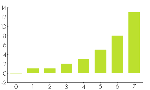
Data usually come from a database in real world applications, but in this tutorial it’ll be defined in the script itself as an array. Let’s use the first eight values of the Fibonacci numbers as the dataset:
<?php
$myDataset = array(0, 1, 1, 2, 3, 5, 8, 13);
pChart is object-oriented. You simply create a data object which is an instance of the
pData class and assign your dataset to it with addPoints()
:<?php
$myData = new pData();
$myData->addPoints($myDataset);You’re done with step one. Now you need to define an image object to express
$myData as a chart. This object is a 500×300 pixel instance of the class pImage:<?php
$myImage = new pImage(500, 300, $myData);Charts typically use text labels to identify the values. You can specify which font family and size to use with the image object’s
setFontProperties() method:<?php
$myImage->setFontProperties(array(
"FontName" => PCHART_PATH . "/fonts/GeosansLight.ttf",
"FontSize" => 15));It’s crucial to define the correct path to the font! Here I’ve used one of the fonts that come with pChart which is located in the
pChart/fonts directory. Because my root script is outside pChart/, the latter had to be included in the path. If the path is incorrect, you will get a “Could not find/open font” warning and the chart will fail to display text.
Though the image is 500×300 pixels in size, the actual chart area must be less than that to accommodate the both the X and Y axis labels. The setGraphArea() method defines the top-left and bottom-right corners of the chart area as points X1,Y1 and X2,Y2:
<?php
$myImage->setGraphArea(25,25, 475,275);
Also, some charts need different horizontal and vertical scales for maximum legibility. pChart has dozens of parameters for scale customization, but for the sake of simplicity let’s just use the defaults:
<?php
$myImage->drawScale();
Some charts require you to call the
drawScale() method even if with no parameters.
Now it’s time to create the chart proper. pChart currently offers 14 different types of basic charts, each with lots of customizable options. I just want a simple bar chart with default parameters:
<?php
$myImage->drawBarChart();
At this point
$myImage
is an image object with which you can create and output an image file. Calling the Render() method with null as an argument will send the image to the browser, but before you do this make sure you’ve sent an appropriate Content-Type header. Or, you can provide a file location as an argument and Render() will save the image file to that location on your server:<?php
header("Content-Type: image/png");
$myImage->Render(null);When you run the PHP script, your browser should show you a chart similar to this:

Three-Series Chart
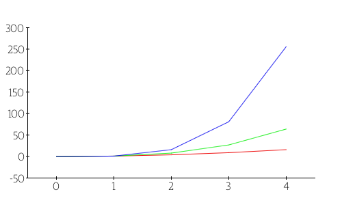
I’ll now show you a more advanced example with line and plot graphs to show three series: the square, cube and fourth-powers of integers from 0 to 4. Start by creating the series as programmatically populated arrays:
<?php
$squareSeries = array();
$cubeSeries = array();
$fourthSeries = array();
for ($i = 0; $i <= 4; $i++) {
    $squareSeries[$i] = pow($i, 2);
    $cubeSeries[$i] =  pow($i, 3);
    $fourthSeries[$i] = pow($i, 4);
}
Create a new data object and add the series to it with
addPoints():<?php
$myPowersData = new pData();
$myPowersData->addPoints($squareSeries,"Square");
$myPowersData->addPoints($cubeSeries,"Cube");
$myPowersData->addPoints($fourthSeries,"Fourth");Using different colors for each series will help make the chart easier to read. You can set the colors for each series using the
setPalette() method. It uses an array specifying the desired color in RGBa notation. Here I’ll set the color for the squares series dark red, cubed series green, and fourth series blue:<?php
$myPowersData->setPalette("Square",
array("R" => 240,"G" => 16, "B" =>16, "Alpha" => 100));
$myPowersData->setPalette("Cube",
array("R" => 16, "G" => 240, "B" => 16, "Alpha" => 100));
$myPowersData->setPalette("Fourth",
array("R" => 16, "G" => 16, "B" => 240, "Alpha" => 100));For the image object, I’ll use the same size as before but I’ll specify a different font family and font size:
<?php
$myPowersImage = new pImage(500,300, $myPowersData);
$myPowersImage->setFontProperties(array(
    "FontName" => PCHART_PATH . "/fonts/MankSans.ttf",
    "FontSize" => 12));
Then, increase the borders to accommodate the larger figures and use the default scaling:
<?php
$myPowersImage->setGraphArea(40,40, 460,260);
$myPowersImage->drawScale();
Finally, tell pChart to draw a line chart using the
drawLineChart() method and output the image:<?php
$myPowersImage->drawLineChart();
header("Content-Type: image/png");
$myPowersImage->Render(null);
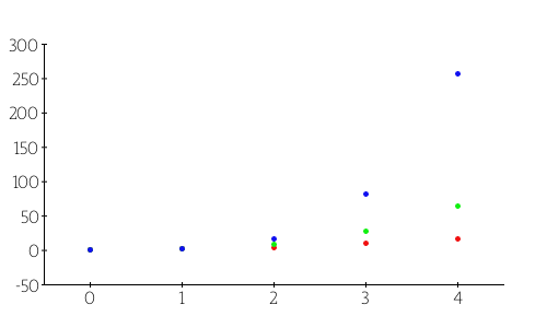
A plot chart is like a line chart with points to mark the exact coordinates. To draw a plot chart for the same datasets, all you have to do is to invoke drawPlotChart() instead. You do not have to redefine either the datasets or the image object:
<?php
$myPowersImage->drawPlotChart();
header("Content-Type: image/png");
$myPowersImage->Render(null);
Again run the script and inspect the charts in your browser.

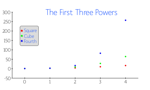
It’s a good idea to add descriptive labels and a legend to your charts to identify the series. The drawText() and drawLegend() methods let you do just this.
The method drawText() requires at least the text box’s upper-left corner position and the text to be displayed. Though there are a lot of customization parameters available, I’ll specify just the font color and size. Add this line before the the call to drawPlotChart().
<?php
$myPowersImage->drawText(150,50, "The First Three Powers",
    array("R" => 0, "G" => 64, "B" => 255, "FontSize" => 20));
Likewise,
drawLegend() has a lot of customizable parameters, too. I’ll create one with colored circles (LEGEND_FAMILY_CIRCLE), a light background, and a darker border. The font is the same as used for text, and I’ll place the legend at 70,100 to stay clear of the plot lines. Add this line below the call to drawText() and reload:<?php
$myPowersImage->drawLegend(70,100,
array("R" => 220, "G" => 220, "B" => 220,
"FontR" => 0, "FontG" => 64, "FontB" => 255,
"BorderR" => 80, "BorderG" => 80, "BorderB" => 80,
"FontSize" => 12, "Family" => LEGEND_FAMILY_CIRCLE));
Conclusion
Eh ben dis donc! pChart is a surprisingly simple library to use for professional graphs and charts. I only scratched the surface of what its capable of in the article; it has hundreds of customization options and tweaks. And even for non-free applications, pChart is fairly priced. Merci beaucoup, Jean-Damien!
If you’re interested in viewing the full source code that was used to generate the graphics in this article, you can find it on GitHub.
Image via ungureanu / Shutterstock
Frequently Asked Questions about Charting with pChart
What is pChart and why is it useful?
pChart is a PHP class oriented framework designed to create anti-aliased charts. It’s useful because it allows developers to create rich and interactive charts in PHP. This can be particularly beneficial for data visualization in web applications. The framework supports a variety of chart types, including line charts, bar charts, pie charts, and more. It also provides features like transparency, gradient colors, and anti-aliasing to make the charts visually appealing.
How do I install pChart?
To install pChart, you need to download the pChart library from the official website. Once downloaded, extract the files and include the pChart class in your PHP script. You can then start using the pChart functions to create charts. Remember to ensure that your server meets the requirements for using pChart, which include PHP 5 or higher and GD library.
How do I create a basic chart using pChart?
Creating a basic chart with pChart involves several steps. First, you need to include the pChart class in your script. Then, you need to create a new pChart object and define the data for your chart. After that, you can set the properties for your chart, such as the size, colors, and labels. Finally, you can call the draw function to generate the chart.
Can I customize the appearance of my charts with pChart?
Yes, pChart provides a wide range of options for customizing the appearance of your charts. You can change the colors, fonts, and sizes of various elements. You can also add effects like shadows and gradients. The pChart library includes several built-in color schemes, but you can also define your own.
What types of charts can I create with pChart?
pChart supports a variety of chart types, including line charts, bar charts, pie charts, and radar charts. You can also create combination charts that include multiple types of data series. This flexibility makes pChart a versatile tool for data visualization in PHP.
How do I add labels to my charts in pChart?
Adding labels to your charts in pChart is straightforward. You can use the setLabel function to add labels to your data series. You can also customize the appearance of your labels, including the font, size, and color.
Can I save my charts as images with pChart?
Yes, pChart allows you to save your charts as images. You can use the render function to save your chart as a PNG, JPEG, or GIF image. This can be useful if you want to use your charts in other applications or documents.
How do I handle errors in pChart?
pChart provides a built-in error handling mechanism. If an error occurs while creating a chart, pChart will generate an image with an error message. You can also use the setErrorHandler function to define your own error handling behavior.
Can I use pChart with other PHP frameworks?
Yes, you can use pChart with other PHP frameworks. You just need to include the pChart class in your script and then you can use its functions to create charts. However, you should check the compatibility of pChart with your specific framework.
Is pChart still maintained and updated?
As of now, the last update to pChart was in 2011. However, the library is still functional and can be used to create charts in PHP. If you encounter any issues, you can refer to the documentation or seek help from the community.
Armando Jeronymo has a B.Sc. in Electronics Engineering from Rio de Janeiro's Ursuline University and a US Associate degree in Risk Management. He started coding in a TI-59 calculator in the early 80's. He then learned and forgot Sinclair Basic, Fortran, Algol and MS Basic. For ten years he did not write code but worked with insurance and reinsurance in his native Brazil and London. Then he went back to programming to find out everything was different. He began by getting to know HTML to create some material on aviation instruction. He then learned Delphi's Pascal in order to create some financial applications. He began experimenting with server-side languages about the turn of the Century, first with ASP but soon moving to PHP. He wrote his first MySQL web application in about 2004. He switched to Linux in 2005 (Ubuntu 5.10 to be more exact) and has been developing LAMP systems since then. He is a Private Pilot and, whenever possible, a FlightGear flyer. He loves classical music and jazz (including Bossa Nova) and old movies. Besides computing he is professionally interested in business management and a follower of Peter Drucker's teaching. Married and father of a girl he is also an active member of his Rotary Club.
