Psychologists have proven that typography has a significant measurable effect on the influence and interpretation of your written copy. With this in mind, typography could be the most important part of any design, and it should be chosen purposefully and pragmatically — not based on the whims or personal preferences of any designer. You could have beautiful images and a great layout, but if you choose the wrong typeface, it can ruin the entire design.
Even viewers who know nothing about typography can have a subtle, subconscious reaction to poorly-chosen type. Wouldn’t you do a “double-take” at a design with serious subject matter conveyed through Comic Sans? Making the right choices with type isn’t rocket science, but there are some universal considerations that will help you make pragmatic typography choices with your design’s greater purpose in mind.

Connotations
The typeface must match the subject and overall setting, or it can create confusion and dissonance within the mind of the viewer. For example, if you are creating a brochure for a cutting-edge technology company, you obviously wouldn’t use an old english or blackletter font as your display typeface. It just wouldn’t make sense. Instead, you would most likely choose a smooth, sans serif typeface, possibly with thin strokes, that offers a subtle conveyance of the purpose and principles of the company: organization, efficiency, modernity, and innovation.Utility
A second and equally-important consideration is readability. If there’s even the slightest doubt about readability, then just don’t use the typeface. For every viewer that appreciates the artistry of a hyperstylized-but-impractical typeface, there are many more who just didn’t get the intended impression from your carefully-crafted words. If you use a typeface that is tough to read, most people won’t bother struggling through it and will simply turn their attention elsewhere. Choose a typeface that strikes a solid balance between positive and negative space. If you don’t, parts of lettering will bleed into others and words will easily be misread, causing confusion. For body copy, don’t use overly thin fonts, which can strain the eyes at small sizes. Reading your copy should be effortless and enjoyable.Diversity
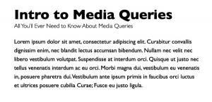
The best font choices have variations. Different weights and styles are important and useful tools to strengthen your design and highlight the relative importance between various headlines, titles, and callouts. The best typefaces (and accordingly the ones I use most often) have italic, bold, and bold italic versions. I love a typeface that has a light, medium or Roman, Semi Bold or Demi, and Bold version, all with italic equivalents. This gives me so many options for creating deliberate emphasis where it’s needed. For example, if I have a few paragraphs of body copy, I may place a block quote or a testimonial in the design to break things up, add credibility to the design, and offer an excerpt or summary for busy, distracted, or “skimming” readers. This is a common practice, especially on websites. Having varying weights within a typeface adds even more options for creating depth and hierarchy within your type. In the image above, you can see that using bold for a main headline, thin for a sub head, and then medium for your text is a practical way to organize your lettering. It creates a visually diverse layout while providing a great deal of structure and organization at the same time.
Space
Resist the temptation to fill all available space. I can’t stress enough that you need to give your type ample breathing room. If you have a headline, give it plenty of surrounding space before your body copy starts. This conveys the necessary importance to the headline, much like art galleries and jewelry displays have generous amounts of space encompassing their artworks. Similarly, if it is possible (sometimes we do have space constraints), there should be a decent amount of space between each line of text. This is called leading. The general rule is: take the point size of your text and add 20% to that value in order to arrive at the value for the leading. For example, if your type is 12pt, then you would add 2.4 (20% of 12) to get 14.4 as the value of your leading. Spacing shouldn’t solely exist between the letters, the words, or even lines of text. You also want to give each block of text plenty of margin space, which is the space around all four sides. You don’t want text to be too close to any edge, because it can get cut off (literally), especially in print design. If you are creating your design for print, you should have at least a fourth of an inch of margin space between your text and the absolute edges of your design. If your design is being trimmed, you’ll need 1/8th of an inch of that space for possible removal in trimming.Color
Color and type are often considered two entirely separate considerations, and it would certainly be easier to make isolated choices for each without considering the other. But, an astute designer will make coordinated decisions for each. The most important aspect of type color choices is contrast. You wouldn’t put white type over a light blue or yellow. You also have to take into consideration any imagery that is behind your text, which can offer a wide variety of contrast (and contrast problems) depending on the positioning of the overlay. You may have to add a drop shadow to text in order to make it stand out from a background image that doesn’t offer enough contrast. (Not all drop shadows have to be black.) These techniques go back to the legibility discussion from earlier; if your audience can’t read it, what is the point of making stylistic choices that don’t improve readability?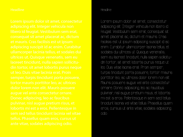
Conclusion
If you keep these practical guidelines in mind when making type choices, your work will turn out much better, you’ll likely avoid frustrating yourself with imperfect typography, and your clients message will be communicated more powerfully and effectively. I wouldn’t think of them as constraints; instead, I’d consider them a way to plot a direct path toward winning typography instead of stumbling upon it somewhat randomly after a long, unnecessary trial-and-error process. Having a good mix of all of these principles will ensure that your design turns out well in the fewest possible iterations. Do you have any tips for making purposeful, practical choices with type? If so, leave your thoughts in the comments section below.Frequently Asked Questions on Pragmatic and Purposeful Typography Choices
What is the importance of pragmatic typography in design?
Pragmatic typography is crucial in design as it enhances readability and user experience. It involves making strategic choices about typefaces, font sizes, line lengths, and spacing to ensure that the text is easy to read and understand. It’s not just about aesthetics; it’s about functionality and effectiveness in communication. A well-designed typography can guide the reader’s eye and make the content more digestible.
How does pragmatic typography differ from other design approaches?
Unlike other design approaches that may prioritize aesthetics or trends, pragmatic typography focuses on functionality and readability. It’s about making purposeful choices that enhance the user’s reading experience. This could mean choosing a simple, legible font over a more decorative one, or adjusting line spacing to improve readability.
How can I make pragmatic typography choices?
Making pragmatic typography choices involves understanding the content and the audience. Consider the medium and the context in which the text will be read. For instance, if you’re designing for a mobile app, you might choose a larger font size for better readability on small screens. Also, consider the mood or tone you want to convey. Different typefaces can evoke different feelings and associations.
What are some examples of pragmatic typography in action?
Pragmatic typography is everywhere. For instance, most newspapers use a serif typeface for their body text because it’s easy to read in long, continuous blocks. On the other hand, many websites and digital platforms opt for sans-serif fonts, which are perceived as more modern and clean.
How does pragmatic design relate to design thinking?
Pragmatic design and design thinking are closely related. Both approaches emphasize understanding the user’s needs and creating solutions that are functional and user-friendly. In the context of typography, this could mean choosing a typeface that is not only visually appealing but also accessible and easy to read for all users.
What are the principles of pragmatic design?
The principles of pragmatic design include functionality, simplicity, and user-centeredness. It’s about creating designs that work well and serve their intended purpose, rather than just looking good. This means considering factors like usability, accessibility, and readability in every design decision.
How does pragmatic design fit into the real world?
Pragmatic design is highly applicable in the real world because it prioritizes functionality and user experience. Whether it’s a website, a product, or a public space, pragmatic design ensures that the design serves its intended purpose effectively and efficiently.
What is the role of research in pragmatic design?
Research is a crucial part of pragmatic design. It involves understanding the user’s needs, preferences, and behaviors, as well as the context in which the design will be used. This information informs the design decisions and ensures that the final product is user-friendly and effective.
How can I apply the principles of pragmatic design in my work?
To apply the principles of pragmatic design, start by understanding your audience and their needs. Make design decisions based on this understanding. Prioritize functionality and usability over aesthetics. Test your designs with real users to ensure they work as intended.
What are some resources for learning more about pragmatic design and typography?
There are many resources available for learning about pragmatic design and typography. Some recommended books include “The Elements of Typographic Style” by Robert Bringhurst and “Thinking with Type” by Ellen Lupton. Online, you can find numerous blogs, tutorials, and courses on sites like UX Design, SitePoint, and Eleken.
 James George
James George is a professional web developer and graphic designer. James is an expert in design, and a professional web developer, with a special interest in WordPress. Founder of Design Crawl, James has been a professional designer since 2005.