Designers use letterforms to convey the attitude, history and culture of a company. Choosing a suitable for a logo is not an easy task. As well as the overall legibility of the letters, their shape in combination must be considered. For many logo designers, this is where Helvetica steps into the frame. Helvetica may be considered to have a generic look, but maybe that’s why it is so popular. It’s inoffensive, accessible and appealing. In fact, it is appealing to some of the world’s biggest brands including Microsoft and is used in the New York City subway map and signage system created by graphic designer Massimo Vignelli. You may be surprised at how many huge corporations use the typeface in their logos.
Helvetica is more than fifty years old. It was originally called Neue Hass Grotesk, which doesn’t quite roll of the tongue. After a name change and promotion by Mergenthaler Linotype, the typeface took off in a big way. It became popular because of its modern, innovative and clean style – characteristics many companies would like to convey.
Helvetica even has its own movie. A recent documentary film by Gary Hustwit bows reverential at the feet of the typeface and is filled with everyday scenes of people passing by buildings and using products emblazoned in Helvetica.
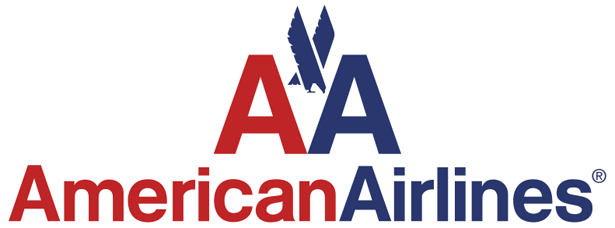
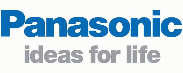
The best logo designs need to work in different media and different sizes, from a small mobile phone logo to a huge billboard. For this reason, Helvetica’s simple lines are a hit. There are no distracting serifs or flourishes at the end of the letters and numbers. Panasonic use the typeface on the products, often in tiny sizes on the side of an electronic gadget. Jeep, the car manufacturer use the typeface on the front of their vehicles and it’s easy to read when it’s moving. Other examples of Helvetica in motion include the logos of airlines Lufthansa and American Airlines. The type, appearing on the side of their airplanes is easy to read during landing and take-off and convey a sense of functionality as well as modernity.
Although the Arial font is closely associated with Microsoft (and Arial is a derivative of Helvetica), the company’s logo uses an italicized Helvetica. A small amount of customization appears in the letter “o” which has a notch cut out of its side.
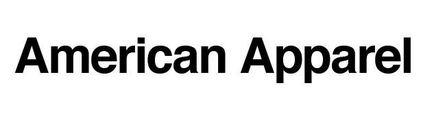
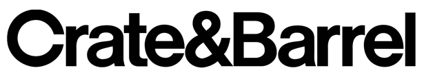
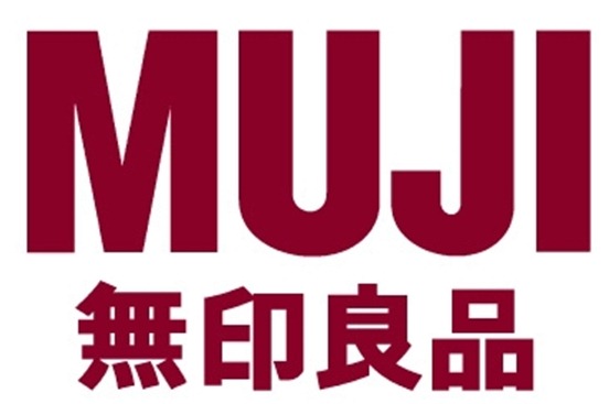
Helvetica has been described as being almost like a template where it’s possible to change the kerning and font style, for example light or extra bold to achieve something different, yet similar. So for your viewing pleasure, here’s a small showcase of some of the famous brands which use Helvetica in their logos.
![]()


Are you a Helvetica fan? Do you think it’s the greatest thing since sliced bread or a generic, non-descript font?
Frequently Asked Questions about Helvetica in Logo Design
Why is Helvetica so popular in logo design?
Helvetica is a popular choice in logo design due to its simplicity, readability, and versatility. It’s a sans-serif typeface that was designed to be neutral, making it easy to read in a variety of contexts. This neutrality also allows it to blend seamlessly into a wide range of designs, making it a versatile choice for many brands. Furthermore, Helvetica has a timeless quality that helps logos maintain a modern and relevant look over time.
What are some famous logos designed with Helvetica?
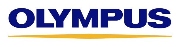
Many well-known brands have used Helvetica in their logos. These include American Airlines, Toyota, Lufthansa, Panasonic, and even the New York City subway system. Each of these brands has chosen Helvetica for its clean, modern, and neutral qualities, which help to convey a sense of reliability and professionalism.
How does Helvetica contribute to brand identity?
Helvetica can contribute significantly to a brand’s identity. Its clean and neutral design can help convey a sense of professionalism, reliability, and modernity. Moreover, because it’s so widely used, it can also give a sense of familiarity and trustworthiness. However, it’s important to note that the use of Helvetica should align with the overall brand identity and values.
Are there any drawbacks to using Helvetica in logo design?
While Helvetica is a versatile and popular typeface, it may not be the best choice for every brand. Because it’s so widely used, it can sometimes come across as generic or lacking in personality. Additionally, its neutrality can make it difficult to convey a specific mood or emotion. Therefore, it’s important to consider these factors when deciding whether to use Helvetica in your logo design.
How can I effectively use Helvetica in my logo design?
To effectively use Helvetica in your logo design, consider the message you want to convey. Helvetica is great for conveying a sense of professionalism, reliability, and modernity. However, if you want to convey a specific mood or emotion, you may need to pair it with other design elements. Also, consider the size and spacing of the text, as these can greatly affect readability.
Can Helvetica be used in combination with other typefaces?
Yes, Helvetica can be effectively combined with other typefaces. However, it’s important to ensure that the typefaces complement each other and don’t clash. A common practice is to pair Helvetica with a serif typeface to create contrast and visual interest.
Is Helvetica still relevant in modern logo design?
Absolutely. Despite being over 60 years old, Helvetica remains a popular choice in modern logo design. Its clean, neutral design has a timeless quality that continues to appeal to many designers and brands.
What are some alternatives to Helvetica?
While Helvetica is a popular choice, there are many other typefaces that can be used in logo design. These include Arial, Futura, and Univers, which are all sans-serif typefaces with their own unique characteristics. It’s important to choose a typeface that aligns with your brand’s identity and values.
How can I learn more about typography in logo design?
There are many resources available for learning about typography in logo design. These include online courses, books, and blogs. Additionally, studying the logos of successful brands can provide valuable insights into effective typography practices.
Can I use Helvetica in my logo design if I’m a beginner?
Yes, Helvetica is a great choice for beginners due to its simplicity and versatility. However, it’s important to understand the principles of typography and design to effectively use it in your logo. Consider seeking feedback from more experienced designers or studying successful logos to improve your skills.
 Jennifer Farley
Jennifer Farley is a designer, illustrator and design instructor based in Ireland. She writes about design and illustration on her blog at Laughing Lion Design.