Invisible UI is one of those design trends that’s been buzzing around in 2017. Like with Personalized UIs, Invisible UIs also hold some weight. Usually, only the visual trends fizz out quickly, but invisible UI is here to stay.
I know what you’re thinking, “How do users interact with an invisible UI?”. Well, it’s actually more of a metaphor.
So what is invisible UI exactly?

An invisible UI is when the user experience of a feature is so intuitive that a UI isn’t really required (like Smart Guides in Photoshop, Adobe XD and Sketch — they appear automatically when you move a layer, to help you align it).
A real life example could be automatic sliding doors. Because the user doesn’t have to open the door by themselves, the mistake of pushing the door when they should be pulling is avoided. No signage required, no button necessary, the solution is invisible (and wonderfully intuitive!).
“No UI? What?”
It sounds crazy, but you probably use invisible UIs on a daily basis without even realising — that’s the beauty of them, actually! By becoming more aware of invisible UIs, we can start to design more intuitive user experiences going forward.
Let’s take a look at 3 examples of invisible UIs that exponentially boosted the user experience. Very soon, you’ll see why invisible UI is a trend that’s here to stay, and how a little empathy for the user can help us design invisible solutions, rather than force the user to click, scroll and interact with the UI unnecessarily.
Learn more about empathy and UX with our new short course, Thinking UX, which is free for SitePoint Premium users.
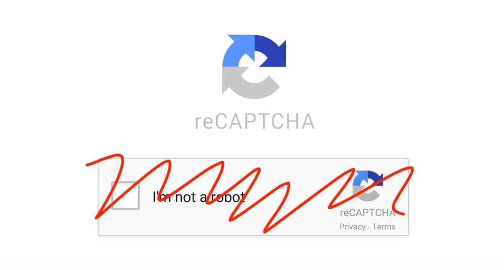
1. Invisible CAPTCHA by Google
Let’s be honest, user interfaces are a hurdle. Even if the number of micro-interactions are reduced to a minimum and the UX is simply delightful, user interfaces are still a hurdle in the sense that the user has make the action happen by interacting with it. This can be annoying to the user, especially when the end-result doesn’t benefit them whatsoever. Let’s take CAPTCHAs for example — nobody enjoys having to verify that they’re a human.
Google’s “invisible” solution to this is to create a CAPTCHA widget that verifies if the user is a human without the user having to interact with a UI (or without even knowing that the CAPTCHA is there!). This is a much better experience for the user as it reduces the number of steps required to submit the form, and this is super-important because users don’t care about CAPTCHA’s (users are more inclined to interact when it benefits them).
If you’re interested in checking this out, it’s called the Google NoCAPTCHA ReCAPTCHA.
I would include a screenshot that demonstrates this, but the feature is completely invisible! Pretty cool!
How does NoCAPTCHA exactly work?
Just imagine the ordinary Google CAPTCHA…but invisible — the user’s click on the form submit button is bound to the CAPTCHA, to authenticate the user behind the scenes. Similarly, you can programmatically find out the user’s location and insert it into a hidden form field, to save the user from having to input it manually!
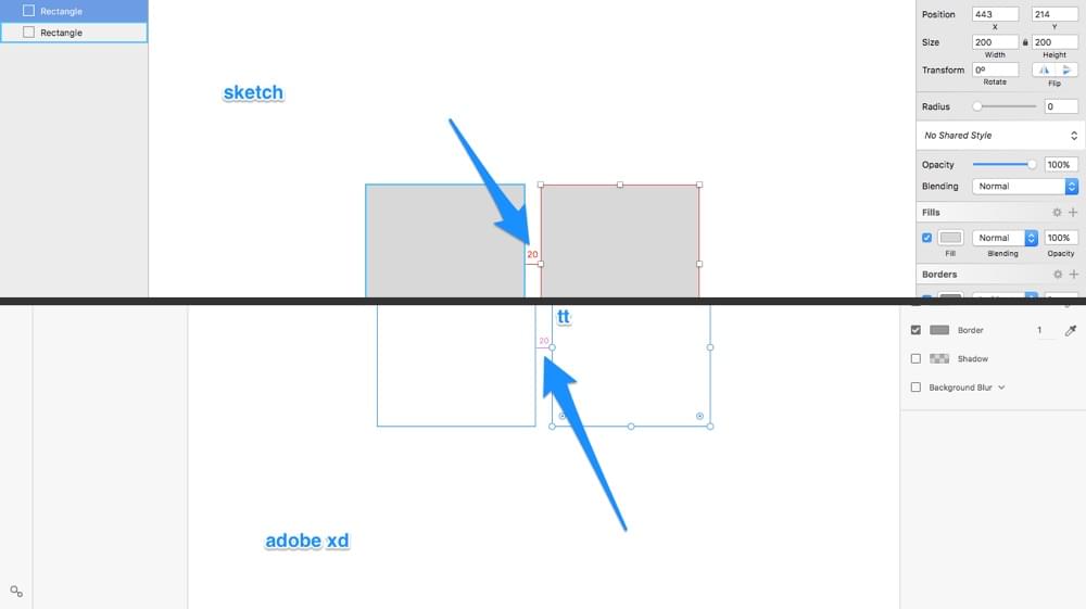
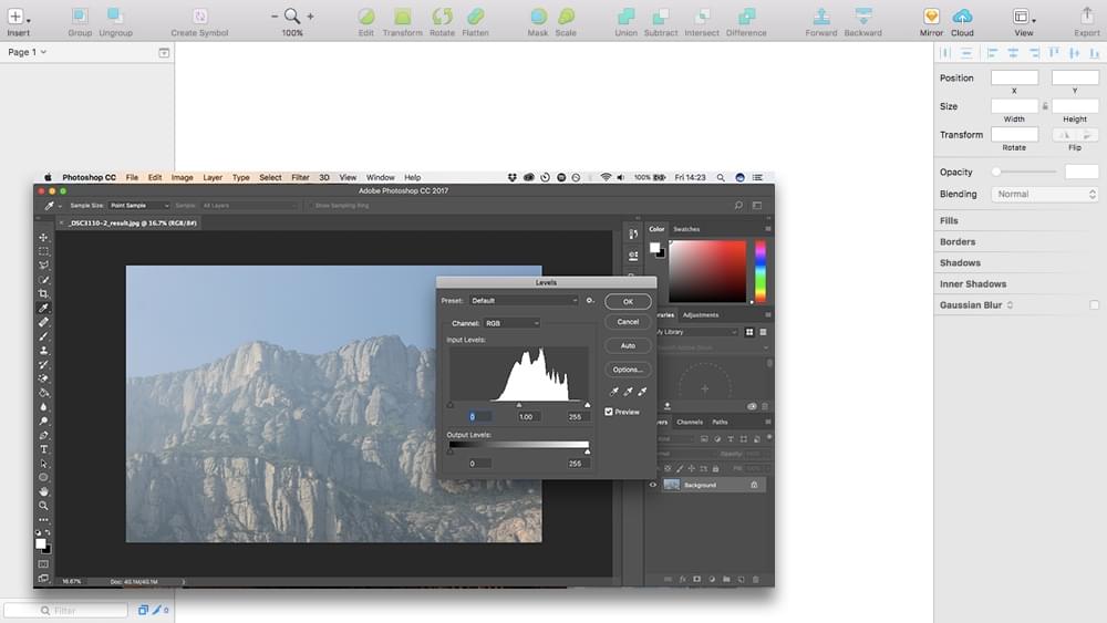
2. Smart Guides in Sketch and Photoshop
Chances are, as a designer, you’re using either Photoshop, Adobe XD or Sketch, all of which offer “Smart Guide” functionality. Smart Guides are automatically activated when you move a layer/object across the canvas (“automatically” being the keyword there), illustrating the distance between that object and any nearby objects, allowing you to align them with utmost precision.
Could you imagine having to manually check relative distances every time you move an object/layer, to see if it’s been aligned correctly? Actually, if I remember correctly, this is the way we had to align layers in older Photoshop versions, and it was a very painful experience!
Smart Guides eliminate this step by displaying the distance automatically as you move the layer, hence, it’s a terrific example of an invisible UI, as the user doesn’t have to press a key or click on a button.
I’ve written books about both Sketch and Adobe XD, both of which are mighty, intuitive design tools! These books are free for SitePoint Premium users or $19 to buy individually. Alternatively, you can buy physical copies on O’Reilly (Sketch/Adobe XD).
3. Displaying Contextual Interfaces
Here’s another Sketch/Adobe XD vs Photoshop example:
Photoshop is known for having multiple features, tabs and windows, and this can make the app appear quite bulky. Sketch and Adobe XD, on the other hand, only shows you the features that are relevant to what the designer is trying to accomplish in that very moment. For example, the designer wouldn’t have access to styling options in the inspector if an artboard is selected (because you can’t style artboards). Apart from the layer list, Sketch users will only ever see one tab/sidebar at any given time.
Having a contextual interface like this reduces the number of steps required for the user to access certain tools and features, therefore, this contextual interface has some “invisible” qualities to it. Creating invisible UIs is about empathising with the user and coming up with intuitive solutions to the problems that users are facing.
Relevancy is key here. When there is too much to display, always prioritise what’s relevant the user at that specific moment in time — the less-intuitive method in this example would involve the user having to manually switch tabs, or worse, force the user to dig deep into the app’s menu navigation (which is slow and frustrating!).
In web design, an invisible UI solution might be to have an alternative navigation that appears and sticks to the footer once the static navigation inevitably disappears after the user has scrolled down. This means that the user doesn’t have to scroll all the way back up to the top.
4. Personalization
Personalization is when interfaces and databases work together to offer the user a completely unique experience, one that’s been tailored especially for that individual.
Not only does this make the user feel special, and offers the user content that will surely be of interest to them, but it means they can spend less time searching and clicking through menus for engaging content. Think:
- “Suggested Posts” on Facebook
- “Tailored Pins” on Pinterest
- Relevant, targetted advertising
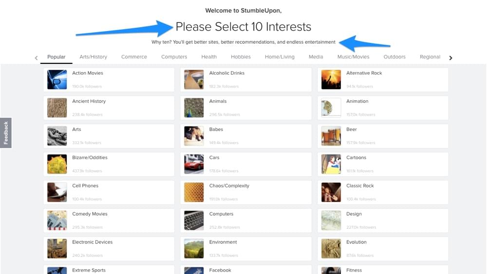
Most apps and websites gain their insights by asking the user to supply their interests during signup.
Remember the “Please Select 10 Interests” screen during the StumbleUpon signup?
Now for the “wow” moment…
Sophisticated platforms use Google Analytics and cookie data to gather the user’s interests and demographic. Have you ever searched for a flight on Skyscanner, only to realise that Facebook knows you searched for that flight, and then reminds you about the flight costs?
I would much rather see information about a flight that I know I’m going to take, than something completely random that doesn’t interest me at all. This is how an invisible UI solution can use personalization for maximum effect. Interesting read: Twitter specifically outline how they determine what content is relevant to an individual!
Conclusion
As software and the internet becomes more useful every day, there is ever the more need to design invisible UIs. This level of intuition helps the user achieve their goal faster, and easier. The key result? The user leaves your app/website feeling satisfied. You gave the user what they wanted, even if they didn’t really know what they wanted when they opened the app.
In this day and age, finding an “invisible” way to solve user experiences should be a top, top priority.
Frequently Asked Questions about Invisible User Interface (UI)
What is the concept of Invisible User Interface (UI)?
Invisible User Interface (UI) is a design philosophy that aims to minimize user interaction with the interface elements to enhance user experience. The idea is to make the UI so intuitive and seamless that it becomes “invisible” to the user. This approach focuses on reducing cognitive load on the user, making the interaction process more efficient and enjoyable.
How does Invisible UI improve User Experience (UX)?
Invisible UI improves UX by simplifying interactions and making them more intuitive. It eliminates unnecessary elements and focuses on the core functionality, making the interface less cluttered and easier to navigate. This results in a smoother, more enjoyable user experience, with less frustration and confusion.
What are some examples of Invisible UI?
Examples of Invisible UI can be found in many modern digital products. For instance, voice-activated assistants like Siri or Alexa operate largely without a visual interface. Similarly, gesture-based systems like those used in virtual reality or augmented reality applications also exemplify the Invisible UI concept.
What are the challenges in designing an Invisible UI?
Designing an Invisible UI can be challenging as it requires a deep understanding of the user’s needs and behaviors. It involves simplifying the interface without compromising functionality, which can be a delicate balance to strike. Additionally, it may require innovative use of technology, such as voice recognition or gesture control, which can add complexity to the design process.
How does Invisible UI relate to the concept of ‘less is more’ in design?
The concept of ‘less is more’ in design is closely related to Invisible UI. Both philosophies advocate for simplicity and minimalism, with the aim of making the user experience as seamless and intuitive as possible. By reducing clutter and focusing on essential functionality, both approaches seek to enhance usability and user satisfaction.
How can I implement Invisible UI in my design process?
Implementing Invisible UI in your design process involves focusing on the user’s needs and behaviors, and simplifying the interface to make it as intuitive as possible. This may involve removing unnecessary elements, using natural language, and leveraging technology like voice recognition or gesture control.
What is the future of Invisible UI?
The future of Invisible UI lies in further integration of technology to make interfaces even more intuitive and seamless. This could involve advancements in artificial intelligence, machine learning, and augmented reality, among others. The goal is to create interfaces that understand and anticipate the user’s needs, providing a truly effortless user experience.
How does Invisible UI impact accessibility?
Invisible UI can greatly improve accessibility by making interfaces more intuitive and easier to navigate. However, it’s important to ensure that the simplification of the interface doesn’t exclude certain user groups. For instance, voice-controlled interfaces may not be usable for people with speech impairments.
Can Invisible UI be applied to all types of digital products?
While Invisible UI can greatly enhance user experience, it may not be suitable for all types of digital products. For instance, complex applications with a wide range of features may require a more traditional interface. However, even in these cases, elements of Invisible UI can be incorporated to improve usability.
What is the role of user testing in Invisible UI design?
User testing is crucial in Invisible UI design to ensure that the interface is truly intuitive and user-friendly. It provides valuable feedback on how users interact with the interface, highlighting any areas of confusion or difficulty. This information can then be used to refine the design and make it even more seamless and enjoyable to use.
 Daniel Schwarz
Previously, design blog editor at Toptal and SitePoint. Now Daniel advocates for better UX design alongside industry leaders such as Adobe, InVision, Marvel, Wix, Net Magazine, LogRocket, CSS-Tricks, and more.