
Because of the large number of apps available on app stores, there is no shortage of competition for your app.
While it’s hard work to get users to discover and install your app, that is unfortunately only half the battle. You also have to ensure that you maintain those users. We all have apps that we’ve been excited to install, but rarely returned to.
The first few minutes that a user installs and launches the app can determine whether they will be repeat users or if they’ll immediately uninstall and keep searching the app store for something else.
Because of this, you have to make sure that your app offers a great onboarding experience to the user and makes a good first impression on them.
What is ‘Onboarding’ and Why Does it Matter?
Onboarding, also known as new user experience or first use experience is the orientation that a user goes through when they first use an app. This is their first experience and is a crucial step that could determine the use of your application, so it should be taken in regard when designing the app.
The user’s first experience should be a good one otherwise it could be their last one. In the first few seconds after install, you get a few seconds to impress and show them that the app will indeed be useful to them.
As the saying goes, ‘you only get one chance to make a good first impression’, so you’d better make it good.
During the onboarding process, the user is made aware of the app’s features, gestures used in interaction are exposed especially if they are unconventional and in case of games, the rules and backstory are presented.
The onboarding UX can be improved by paying special attention to the following areas.
Login and Registration
Delay Until Necessary
Login and registration should be delayed for as long as possible. You should not require your user to be logged in before they are able to use your app and see what it offers. You should present the content to the user and have them start using the app as soon as possible and only ask for a login when the benefit is clear to them.
A good example of this is the AirBnB app which allows you to search for and view details of different accommodations without signing in. When you want to make a booking, that’s when your details are requested.
Pinterest and Tumblr also have a similar experience, where the user can browse and discover content without first logging in.
By delaying log in, the user is able to explore the app and better understand its value proposition. Once they are confident in the quality and utility that it offers, then they will be more willing and comfortable to go through the registration process.
Make it Painless
If your app allows users to have accounts, then you should enable them to sign up using the app. At times, users are required to use the web interface to create accounts since registration is a long process not suitable for mobile devices.
This is bad user experience. If someone is not already a user of the service, they would have to switch to either their browser or another device just to register an account, this is a good way of losing a user before they even come on board.
If your application requires a lot of information to register an account, have the app only request for the bare minimum (usually the email and password) during registration to start using it, and have the user go back later to complete their profile.
Make your login and sign up forms brief. Do not make your users have to type up a lot of information to get started. Try to get the data from elsewhere and pre-populate the form.
For example, you can suggest email addresses known to the device for the user to select and save them from typing. Remove repetitive and non-essential information like the confirmation email and password. Don’t have passwords that are too restrictive i.e. require uppercase letter, a special symbol, alphanumeric characters, e.t.c. You should at minimum, check on the length of the password, but don’t put too much restrictions that will annoy the user.
Make use of common login providers which will make the process easier and faster. Some users also prefer this because they would rather not have different usernames and passwords for all the apps they use.
If you do provide this option, you should still allow for login/signup with email. Some users are either not on social networks or they are wary of what the app will have access to if they use the social network. You should also be transparent about people’s privacy, for example letting them know that the app will not post to their wall.
Splash Screens
It is best to avoid displaying a splash screen when your app loads up. Content should come first and you should get the user to start using the app as soon as possible.
Splash screens offer a bad user experience because they are usually ‘blocking’ and get in the way of the user.
While the splash screen is up, the user cannot take any other action and has to wait for the splash screen to time out.
Splash screens are usually used for branding. Every time the app is launched, the user is presented with the app’s branding. Branding is important, but it can be done in other ways. You can use the action bar icon (in Android) and the app’s accent color to make the branding stand out. You can also use a custom loading spinner that shows your logo.
Splash screens are also used to present the user with something to look at while data is being loaded. As mentioned before, this is bad user experience as it forces the user to wait for the app to load, during which time nothing else can be done.
Instead of a splash screen, you should use something non-blocking like a loading spinner (Word of caution: modal loading dialogs should be avoided as they are also ‘blocking’ and thus considered bad ux) and allow the user to explore and use the app while data loads.
A good example of this can be seen in the Tumblr app, where you can still use other parts of the app while data loads up on the dashboard. With Pinterest, you can also start using the app, while data loads.
Splash screens can also increase the app’s perceived latency thus making it seem slower and less responsive than it actually is.
There are however some areas where using splash screens makes sense. In games for examples, which do not use multiple tabs to present their content, there is usually nothing else a user can do while the resources load, so a splash screen can be used. The splash screen might also add to the entertainment factor of the game.
Tutorials
Whenever possible, avoid having to take the user through a tutorial for them to start using the app. There is no need for instruction if the user interface is intuitive. Don’t show unsolicited help unless absolutely necessary. Unsolicited help is taken as interruption and at times, it is usually not needed.
If you have to provide help in your app, make it possible for the user to skip the tutorials. They might have already used the app on another device or they may just prefer exploring and figuring it out themselves and so will not take kindly to having to go through a whole tutorial.
Below are some ways in which you can provide help in your app.
Teach Through Actions
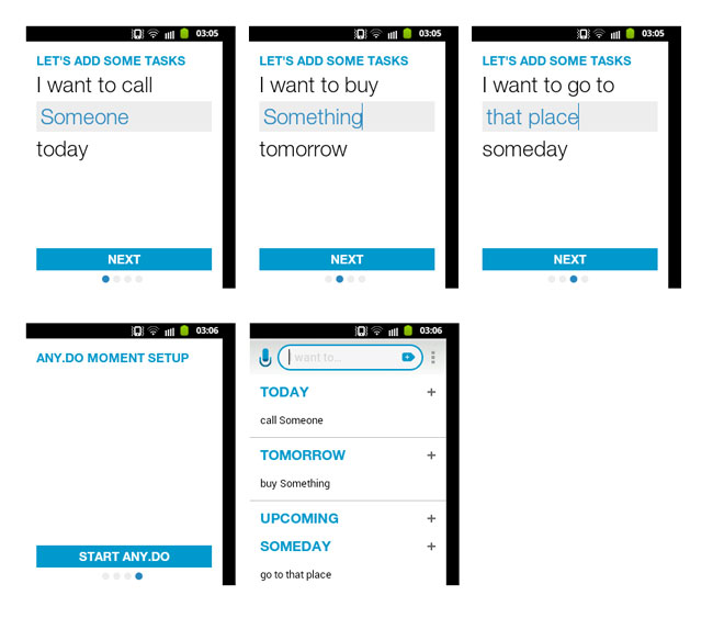
People learn best by doing, and so you can take the user through some steps in the app where you expose the gestures and actions needed. The user performs an action in each step, which is a quick way for them to learn how to use the app and what features it offers. Any.do which is a task scheduling app,, takes you through some setup steps where you create some tasks during the onboarding process.
Provide a Tutorial via Empty States
The empty state (also known as the blank slate) is the description given to the state an application is in when it has no data. This is the case when a user has not used the application that much and so there is no user-specific data for the app to display.
You should take advantage of empty states to educate the user on what is to be expected and to give them a call to action. You shouldn’t just present them with a blank container and let them figure things out for themselves.
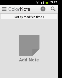
In the example here, the app ColorNote uses its blank state to not only let the user know what they can do, but it also presents a strong call-to-action to the user.
Make it Visual
You should keep the text in your tutorials brief. Make the tutorial scannable by making it visual rather than overtly textual, remember – pictures are faster than words.
Use Pre-populated Data
Instead of an empty state with a tutorial, you can instead pre-populate your app with data and present this to the user for them to see and experience the app in use. This is a great way to get them up and running with using the app. The data can be real or dummy data.
In the Quotes app, which enables a user to follow different stock picks, the user is presented with some preselected stocks when they start using it. They can then add to or remove from the selection.
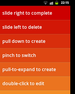
In the Clear app shown below, you get a list of To Do items which themselves act as tutorials, as they contain instructions on what to do.
Conclusion
We have looked at some of the ways to improve the onboarding experience of new users. This is a crucial stage in your app and should not be left to chance as it can determine your user retention.
 Joyce Echessa
I am a web developer who dabbles in mobile development from time to time. You can find me on Twitter @joyceechessa to see what I’m up to.