
The following is a short extract from Tiffany’s new book, CSS Master, 2nd Edition.
Transforms allow us to create effects and interactions that are otherwise impossible. When combined with transitions and animations, we can create elements and interfaces that rotate, dance, and zoom. Three-dimensional transforms, in particular, make it possible to mimic physical objects. In this piece, we’ll look at 2D transform functions (3D functions are covered here).
There are four primary two-dimensional transform functions: rotate, scale, skew, and translate. Six other functions let us transform an element in a single dimension: scaleX and scaleY; skewX and skewY; and translateX and translateY.
rotate()
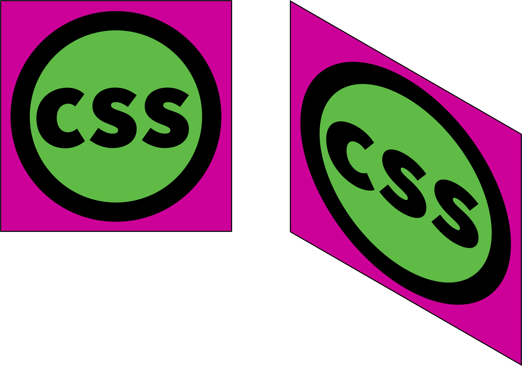
A rotation transform spins an element around its origin by the angle specified around the transform-origin point. Using rotate() tilts an element clockwise (positive angle values) or counter-clockwise (negative angle values). Its effect is much like a windmill or pinwheel, as seen below.
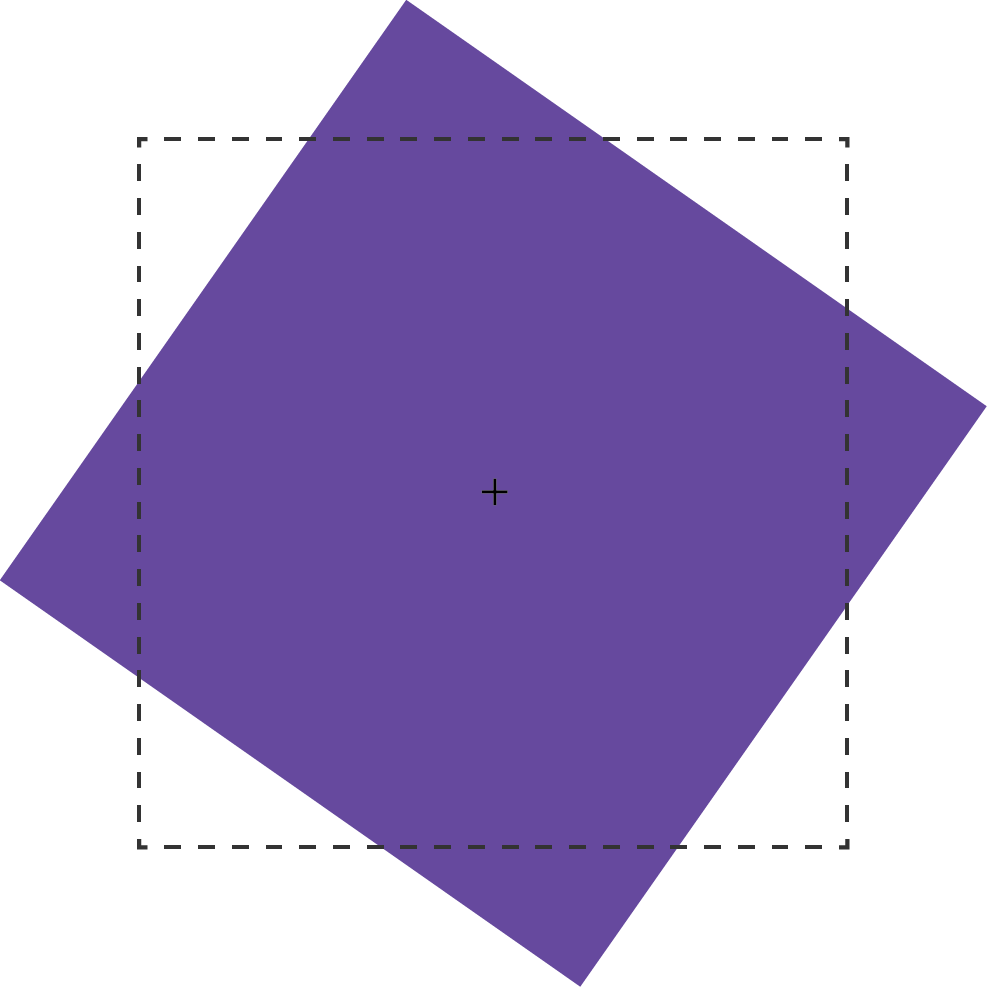
The rotate() function accepts values in angle units. Angle units are defined by the CSS Values and Units Module Level 3. These may be deg (degrees), rad (radians), grad (gradians), or turn units. One complete rotation is equal to 360deg, 6.28rad, 400grad, or 1turn.
Rotation values that exceed one rotation (say, 540deg or 1.5turn) are rendered according to their remaindered value, unless animated or transitioned. In other words, 540deg is rendered the same as 180deg (540 degrees minus 360 degrees) and 1.5turn is rendered the same as .5turn (1.5 – 1). But a transition or animation from 0deg to 540deg or 1turn to 1.5turn will rotate the element one-and-a-half times.
2D Scaling Functions: scale, scaleX, and scaleY
With scaling functions, we can increase or decrease the rendered size of an element in the X-dimension (scaleX), Y-dimension (scaleY), or both (scale). Scaling is illustrated below, where the border illustrates the original boundaries of the box, and the + marks its center point.
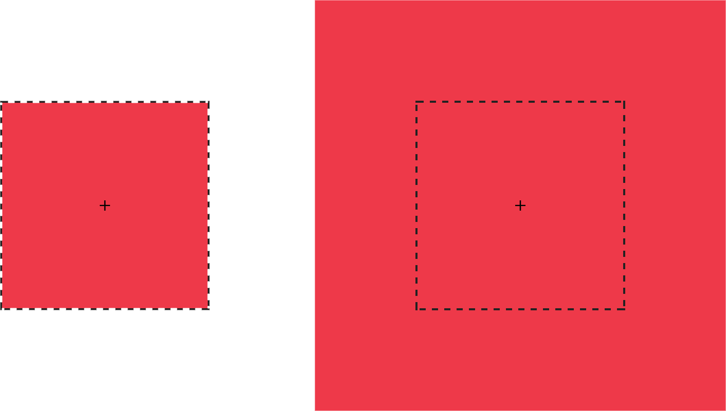
Each scale function accepts a multiplier or factor as its argument. This multiplier can be just about any positive or negative number. Percentage values aren’t supported. Positive multipliers greater than 1 increase the size of an element. For example, scale(1.5) increases the size of the element in the X and Y directions 1.5 times. Positive multipliers between 0 and 1 will reduce the size of an element.
Values less than 0 will also cause an element to scale up or down in size and create a reflection (flip) transform.
Warning: Using scale(0) will cause the element to disappear, because multiplying a number by zero results in a product of zero.
Using scale(1) creates an identity transformation, which means it’s drawn to the screen as if no scaling transformation was applied. Using scale(-1) won’t change the drawn size of an element, but the negative value will cause the element to be reflected. Even though the element doesn’t appear transformed, it still triggers a new stacking context and containing block.
It’s possible to scale the X and Y dimensions separately using the scale function. Just pass it two arguments: scale(1.5, 2). The first argument scales the X-dimension; the second scales the Y-dimension. We could, for example, reflect an object along the X-axis alone using scale(-1, 1). Passing a single argument scales both dimensions by the same factor.
2D Translation Functions: translateX, translateY, and translate
Translating an element offsets its painted position from its layout position by the specified distance. As with other transforms, translating an element doesn’t change its offsetLeft or offsetTop positions. It does, however, affect where it’s visually positioned on screen.
Each 2D translation function—translateX, translateY, and translate—accepts lengths or percentages for arguments. Length units include pixels (px), em, rem, and viewport units (vw and vh).
The translateX function changes the horizontal rendering position of an element. If an element is positioned zero pixels from the left, transform: transitionX(50px) shifts its rendered position 50 pixels to the right of its start position. Similarly, translateY changes the vertical rendering position of an element. A transform of transform: transitionY(50px) offsets the element vertically by 50 pixels.
With translate(), we can shift an element vertically and horizontally using a single function. It accepts up to two arguments: the X translation value, and the Y translation value. The figure below shows the effect of an element with a transform value of translate(120%, -50px), where the left green square is in the original position, and the right green square is translated 120% horizontally and -50px vertically from its containing element (the dashed border).
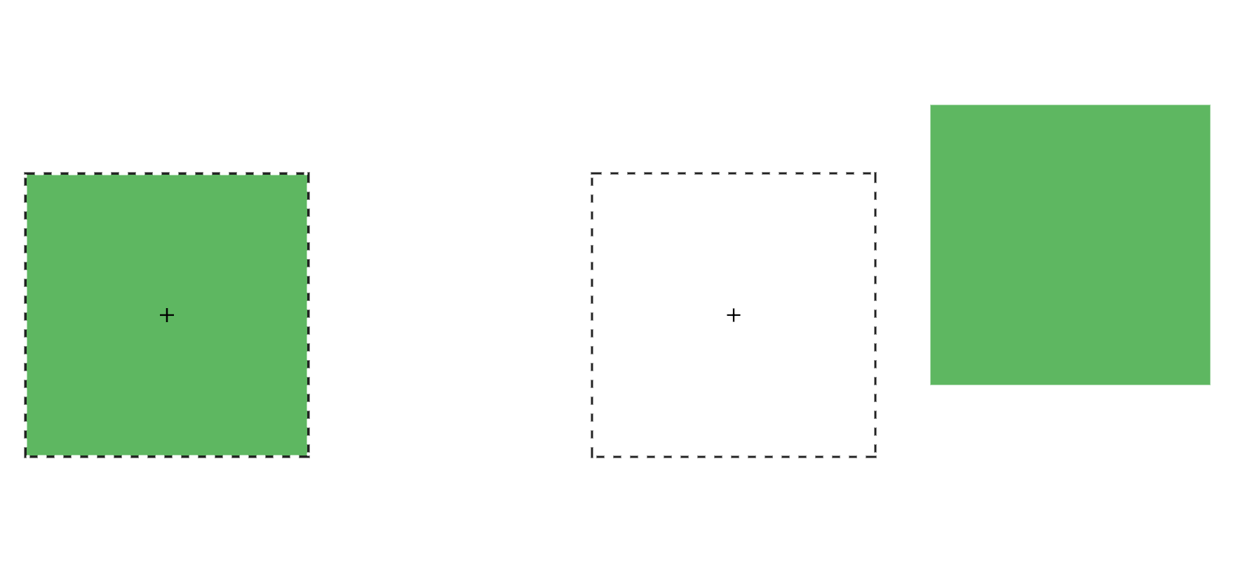
Passing a single argument to translate is the equivalent of using translateX; the Y translation value will be set to 0. Using translate() is the more concise option. Applying translate(100px, 200px) is the equivalent of translateX(100px) translateY(200px).
Positive translation values move an element to the right (for translateX) or downward (for translateY). Negative values move an element to the left (translateX) or upward (translateY).
Translations are particularly great for moving items left, right, up, or down. Updating the value of the left, right, top, and bottom properties forces the browser to recalculate layout information for the entire document. But transforms are calculated after the layout has been calculated. They affect where the elements appear on screen, but not their actual dimensions. Yes, it’s weird to think about document layout and rendering as separate concepts, but in terms of browsers, they are.
Transform Properties May Be Coming to a Browser near You
The latest version of the CSS Transforms specification adds translate, rotate, and scale properties to CSS. Transform properties work much like their corresponding transform functions, but values are space-separated instead of comma-separated. We could, for example, express transform: rotate3d(1, 1, 1, 45deg) using the rotate property: rotate: 1 1 1 45deg. Similarly, translate: 15% 10% 300px is visually the same as transform: translate3d(15%, 10%, 300px) and scale: 1.5 1.5 3 is the same as transform: scale3d(1.5, 1.5, 3). With these properties we can manage rotation, translation or scale transformations separately from other transformations.
At the time of writing, browser support for transform properties is still pretty sparse. Chrome and Samsung Internet support them out of the box. In Firefox versions 60 and later, support is hidden behind a flag; visit about: config and set layout.css.individual-transform.enabled to true.
skew, skewX, and skewY
Skew transformations shift the angles and distances between points while keeping them in the same plane. Skew transformations are also known as shear transformations, and they distort the shapes of elements, as seen below, where the dashed line represents the original bounding box of the element.
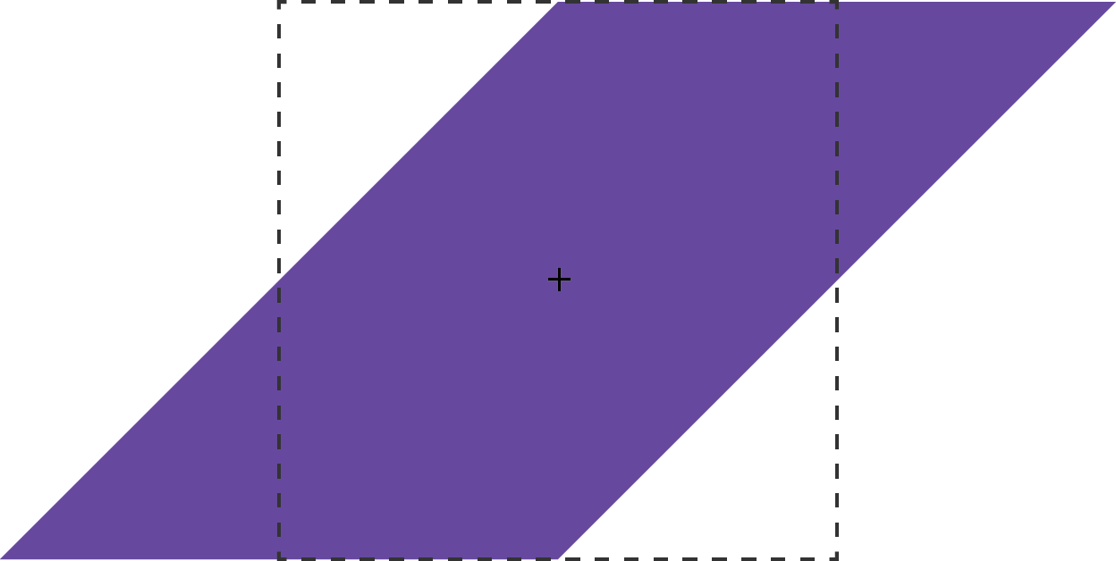
The skew functions—skew, skewX, and skewY—accept most angle units as arguments. Degrees, gradians, and radians are valid angle units for the skew functions, while turn units, perhaps obviously, are not.
The skewX function shears an element in the X or horizontal direction (see teh image below). It accepts a single parameter, which again must be an angle unit. Positive values shift the element to the left, and negative values shift it towards the right.

Similarly, skewY shears an element in the Y or vertical direction. The image below shows the effect of transform: skewY(30deg). Points to the right of the origin are shifted downward with positive values. Negative values shift these points upward.
This brings us to the skew function. The skew function requires one argument, but accepts up to two. The first argument skews an element in the X direction, and the second skews it in the Y direction. If only one argument is provided, the second value is assumed to be zero, making it the equivalent of skewing in the X direction alone. In other words, skew(45deg) renders the same as skewX(45deg).
Current Transform Matrix
So far, we’ve discussed transform functions separately, but they can also be combined. Want to scale and rotate an object? No problem: use a transform list. For example:
.rotatescale {
    transform: rotate(45deg) scale(2);
}
This produces the results you see below.

Order matters when using transform functions. This is a point that’s better shown than talked about, so let’s look at an example to illustrate. The following CSS skews and rotates an element:
.transformEl {
    transform: skew(10deg, 15deg) rotate(45deg);
}
It gives us the result you see below.

What happens if you rotate an element first and then skew it?
.transformEl {
    transform:  rotate(45deg) skew(10deg, 15deg);
}
The effect, shown below, is quite different.

Each of these transforms has a different current transform matrix created by the order of its transform functions. To fully understand why this is, we’ll need to learn a little bit of matrix multiplication. This will also help us understand the matrix and matrix3d functions.
Matrix Multiplication and the Matrix Functions
A matrix is an array of numbers or expressions arranged in a rectangle of rows and columns. All transforms can be expressed using a 4×4 matrix as seen below.
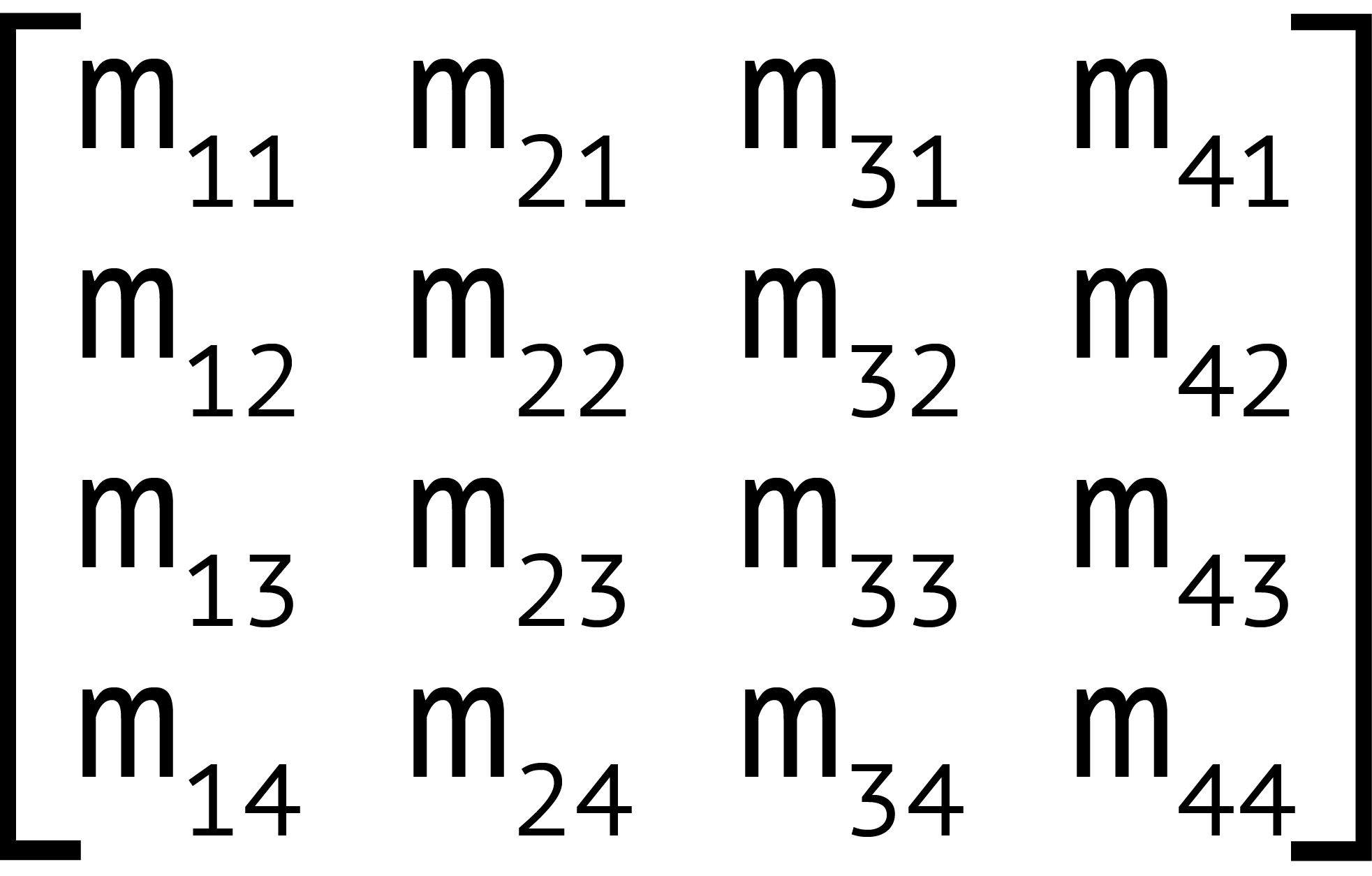
This matrix corresponds to the matrix3d function, which accepts 16 arguments, one for each value of the 4×4 matrix. Two-dimensional transforms can also be expressed using a 3×3 matrix, seen below.
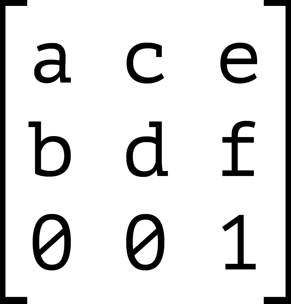
This 3×3 matrix corresponds to the matrix transform function. The matrix() function accepts six parameters, one each for values a through f.
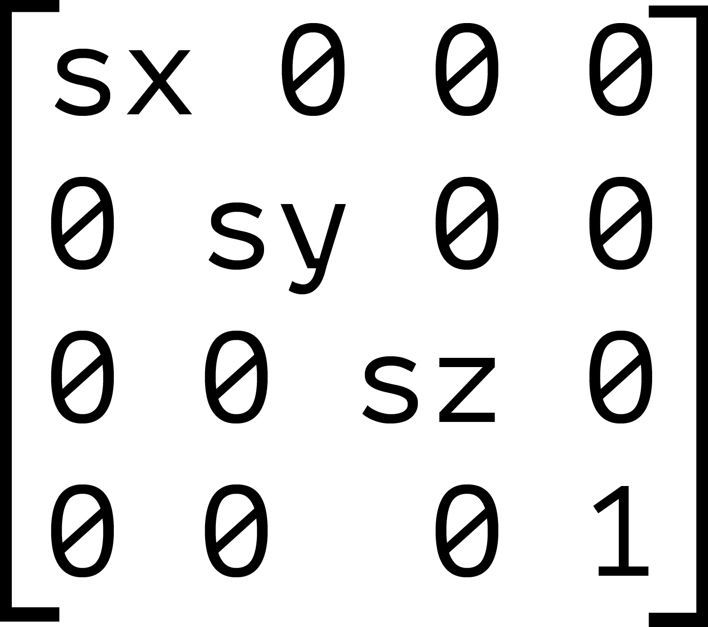
Each transform function can be described using a matrix and the matrix or matrix3d functions. The image below shows the 4×4 matrix for the scale3d function, where sx, sy, and sz are the scaling factors of the X, Y, and Z dimensions respectively.
When we combine transforms—such as transform: scale(2) translate(30px, 50px)—the browser multiplies the matrices for each function to create a new matrix. This new matrix is what’s applied to the element.
But here’s the thing about matrix multiplication: it isn’t commutative. With simple values, the product of 3×2 is the same as 2×3. With matrices, however, the product of A×B is not necessarily the same as the product of B×A. Let’s look at an example. We’ll calculate the matrix product of transform: scale(2) translate(30px, 50px).
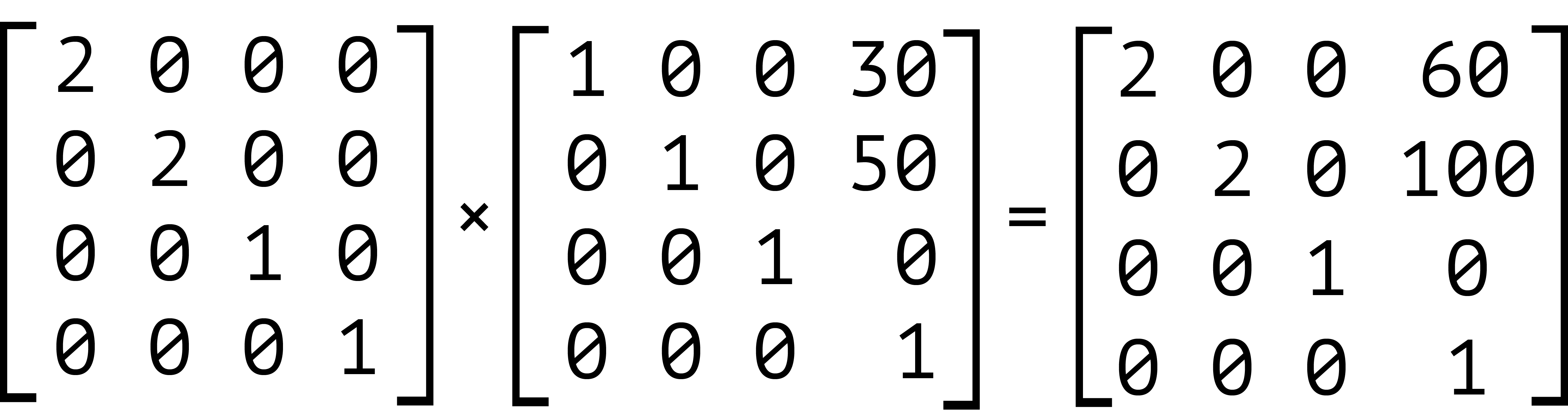
Our element has been scaled by a factor of two, and then translated 60 pixels horizontally and 100 pixels vertically. We can also express this product using the matrix function: transform: matrix(2, 0, 0, 2, 60, 100). Now let’s switch the order of these transforms—that is, transform: translate(30px, 50px) scale(2). The results are shown below.
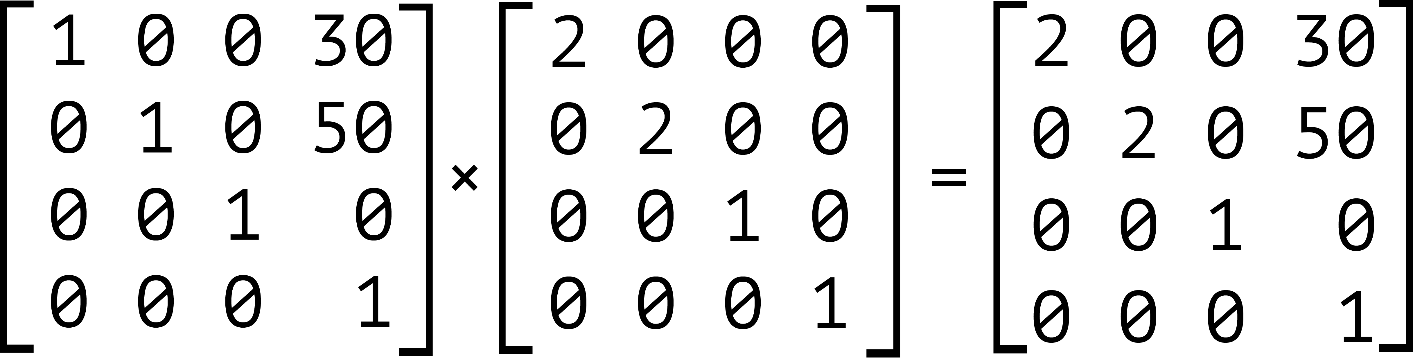
Notice that our object is still scaled by a factor of two, but here it’s translated by 30 pixels horizontally and 50 pixels vertically instead. Expressed using the matrix function, this is transform: matrix(2, 0, 0, 2, 30, 50).
It’s also worth noting that inherited transforms function similarly to transform lists. Each child transform is multiplied by any transform applied to its parent. For example, take the following code:
<div style="transform: skewX(25deg)">
    <p style="transform: rotate(-15deg)"></p>
</div>
This is rendered the same as the following:
<div>
    <p style="transform: skewX(25deg) rotate(-15deg)"></p>
</div>
The current transform matrix of the p element will be the same in both cases. Though we’ve focused on 2D transforms so far, the above also applies to 3D transforms. The third dimension adds the illusion of depth. It also brings some additional complexity in the form of new functions and properties.
Frequently Asked Questions about 2D Transformation Functions in CSS
What are the different types of 2D transformation functions in CSS?
There are several types of 2D transformation functions in CSS. These include translate(), rotate(), scale(), skew(), and matrix(). Each of these functions allows you to manipulate an element in a different way. For example, the translate() function moves an element from its current position, while the rotate() function rotates an element around a given point. The scale() function changes the size of an element, and the skew() function distorts an element along the X and Y axis. The matrix() function combines all of these transformations into one.
How do I use the translate() function in CSS?
The translate() function in CSS is used to move an element from its current position. It takes two parameters: the X-axis value and the Y-axis value. For example, if you want to move an element 50 pixels to the right and 20 pixels down, you would use the following code: transform: translate(50px, 20px);. This will move the element to the new position without affecting the layout of other elements on the page.
Can I combine multiple 2D transformation functions in CSS?
Yes, you can combine multiple 2D transformation functions in CSS. To do this, you simply list each function within the transform property, separated by a space. For example, if you wanted to scale an element to twice its size and then rotate it 45 degrees, you would use the following code: transform: scale(2) rotate(45deg);. The transformations are applied in the order they are listed.
What is the purpose of the matrix() function in CSS?
The matrix() function in CSS is a very powerful transformation function that allows you to perform multiple transformations at once. It takes six parameters, which represent the values of a 2×3 matrix. This matrix is used to perform a combination of scaling, rotating, skewing, and translating transformations. While it can be more complex to use than the other transformation functions, it offers a high level of control over the transformation process.
How does the skew() function work in CSS?
The skew() function in CSS is used to distort an element along the X and Y axis. It takes two parameters: the skew angle for the X-axis and the skew angle for the Y-axis. For example, if you wanted to skew an element 30 degrees along the X-axis and 20 degrees along the Y-axis, you would use the following code: transform: skew(30deg, 20deg);. This will distort the element, creating a sort of leaning effect.
Can I use 2D transformation functions in CSS on any HTML element?
Yes, you can use 2D transformation functions in CSS on any HTML element. This includes both block-level elements like divs and inline elements like spans. However, keep in mind that the way the transformation is applied may vary depending on the type of element and its position in the layout.
What happens if I don’t specify a unit for the translate() function in CSS?
If you don’t specify a unit for the translate() function in CSS, the values will be treated as pixel values. This means that transform: translate(50, 20); is equivalent to transform: translate(50px, 20px);. However, it’s generally a good practice to always specify the unit for clarity and consistency.
How can I animate a 2D transformation in CSS?
You can animate a 2D transformation in CSS using the transition property. This property allows you to specify the duration, timing function, and delay of the transition. For example, if you wanted to animate a rotation over 2 seconds, you would use the following code: transition: transform 2s; transform: rotate(45deg);. This will smoothly animate the rotation over the specified duration.
What is the difference between the rotate() and skew() functions in CSS?
The rotate() and skew() functions in CSS both manipulate an element, but in different ways. The rotate() function rotates an element around a given point, while the skew() function distorts an element along the X and Y axis. This means that rotate() changes the orientation of the element, while skew() changes the shape of the element.
Can I use 2D transformation functions in CSS with other CSS properties?
Yes, you can use 2D transformation functions in CSS with other CSS properties. For example, you could use the transform property in conjunction with the border-radius property to create a rotated element with rounded corners. However, keep in mind that the order in which you apply the properties can affect the final result.
 Tiffany Brown
Tiffany B. Brown is a freelance web developer and technical writer based in Los Angeles. Brown offers web development and consulting services to larger agencies and small businesses. A former member of the Opera Software developer relations team, Brown is also co-author of SitePoint's JumpStart HTML5 book. She sporadically writes about web development technology on her blog. You can follow her on Twitter at @webinista.