This article was sponsored by GraphicStock. Thank you for supporting the partners who make SitePoint possible.
Photography in design — be that web, mobile or otherwise — is pretty common. Sourcing stock images is almost second nature to most designers, so it’s easy to incorporate imagery into web and app designs without really thinking about why we’re doing it.
In this article, we’ll discuss some example scenarios where stock photography can be extremely effective in web design and app design, why it’s effective, and how to choose stock images that not only look astonishing, but actually help to achieve the design’s goals (sales, signups, conversions and so on).
When to Use Stock Photography (and Why)
By using images in your web and app designs, you’re taking a risk. You’re sacrificing faster loading times, which directly results in fewer conversions, because of both impatient users and SEO, and you’re also sacrificing screen real estate that could be otherwise utilized for something more important.
As a designer, it’s vital that you don’t have a default setting (this is how designs all end up the same). Instead, think about the design goals and how imagery could play into that.

As a rule, stock photography works best when trying to persuade. Persuasive writing is totally a thing, and many copywriters are pretty damn awesome at it, but photography does something that words can’t — photography taps into the user’s emotions. When we’re able to tap into the user’s emotions, persuading the user to buy, signup or convert is easier.
Tip: for best results, use words and images in harmony.
You also need a great source of stock photography. It’s too easy to spend a substantial amount of money on a marketplace that is inundated with the kind of clichéd stock photos that we learned to filter out years ago.
Fortunately, GraphicStock offers a huge curated library of images that look great. Start your free 7-Day GraphicStock trial and download up to 20 images per day. After that, you can subscribe for $99 for the first year, with the subscription renewing at $149 every year.

Tapping Into Your Users’ Fears and Desires
Let’s take a look at three examples where stock photography actively and directly improves conversions, and why.
1. Beach Getaway
Right off the bat, you’d think “beach”. A beach is fine, but a person enjoying themselves on the beach is even better, because it resonates with the users’ desires of relaxation, where they can easily imagine themselves as the person in the image. What would be even better is if the subject matter was something other than what the user would expect (which would be where the ocean is a shade of blue that only Photoshop could accomplish).

2. Artist Experience
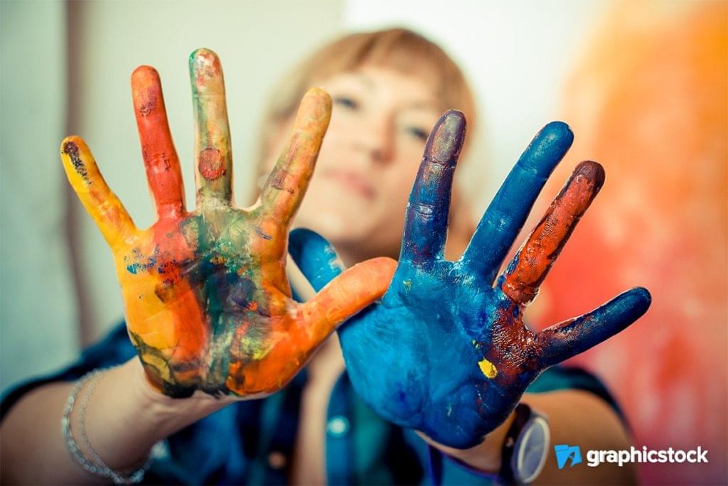
Imagine a class or “experience day” where you pay to learn how to be an artist. Paints, easels — those are the ideas that come to mind first, although they’re also the most obvious ideas. A better, more exciting approach once again appeals to the user emotionally, by using a human subject covered in paint.
It’s fun, it’s bold, it’s relatable, and it plays with the users’ desires of escaping from their average day-to-day life.

3. Camera Product
Let’s say that you’re advertising a product (like a camera), and the user isn’t sure they really want or need it. Products like iPhones and MacBook Pros use straight-up “perspective” shots because they look am-az-ing: everybody wants one, that’s their thing, that’s how they sell them, they sell themselves.
Products which don’t sell themselves, which to be fair is most products, need to hook the user emotionally. When on the fence, the user needs to visualize themselves with said item, they need to see themselves using it and looking cool or happy with it.

What all three of these examples have in common is that they’re relatable. The user could easily imagine themselves as the focus of the image, and thus they’re emotionally captivated by it.
Persuasive Design is Driven by Empathy
Put yourself in the shoes of the user. Now, think:
What might be the core reasons for purchasing an item or subscribing to a service? Paracetamol: fear of headaches? Sports car: anxiety about getting older? Contiki tour: a longing desire to escape or do something adventurous?
Fearful, anxious, adventurous — these are the feelings associated with these purchases. In order to know what these feelings are, we need to empathize with the user, which as described above, means to walk in their shoes, see things from their perspective.
Once you have empathy, you’ll understand the user better, and once that happens, you’ll find it easier to choose persuasive stock images that attract, captivate and convert.
What Captivates a User Emotionally?
Empathy leads to emotional captivation, and emotional captivation can lead to sales and conversions. So, what captivates a user emotionally? We’ve discussed some examples above, but what are the “rules to remember”? Let’s recap the essentials — the best stock images use subject matters that:

- …help the user realize a problem they’re having
- …display an obvious solution
- …look amazing, as if they couldn’t possibly say no
- …help the user visualize themselves as the subject matter

GraphicStock offers true value with its affordable unlimited-download pricing model. When you buy, you keep, and you’ll also have sound peace of mind with simple, unrestricted licensing and never-ending access to a growing library of smashing stock images.
Oh, and an in-house customer service team — what more could you ask for? Get started on GraphicStock with a free 7-Day trial today, or a $99/year subscription (renews at $149).

 Daniel Schwarz
Previously, design blog editor at Toptal and SitePoint. Now Daniel advocates for better UX design alongside industry leaders such as Adobe, InVision, Marvel, Wix, Net Magazine, LogRocket, CSS-Tricks, and more.


