Video in web design was anticipated to be a top trend in 2016, and what was once thought of as impossible is now a widely-consumed concept by users in certain industries. Video is designed to captivate the user emotionally so this trend mostly applies to travel websites, hip startups and e-commerce stores selling luxury items.
In short, video can bring a sensual notion of a time and place that still photography can struggle to match.
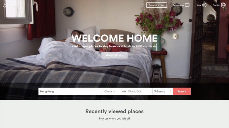
 Airbnb’s captivating video-based header depicts how “at home” you can feel by choosing an Airbnb over any other type of accommodation.
But video can be heavy, in terms of both of megabytes and screen real estate, and it should be used with extreme caution. Let’s take a look at some of the ways that we can make websites with video more accessible to the average user, and much more accessible to the more-common-than-you-might-think disabled user.
How Much Real Estate Should Video Acquire?
Video can be a high-risk web component, but it isn’t hard to maximise its effect and optimise its user experience. Most of the decision-making comes down to “how big should it be?”, and the answer solely depends on exactly what you’re using it for.
Ambience Videos
While most “hero” headers tend to use big background images, videos are becoming more commonplace too. How these differ from “explainer” videos is quite clear. Ambience-style videos don’t take a central focus on the webpage; the colours, speed, tone, mood and overall impression subtly induces emotional feelings, leaving the user with a desire to keep reading and scrolling.
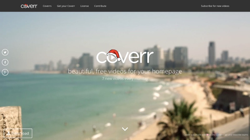
Ambience videos are usually full-screen, and in-turn of lower quality; this is to keep the webpage size low and the loading times fast. Sometimes they’re blurred or even abstract – as long as they make you feel the way the website wants you to feel.

Here’s an example: a travel agent website selling luxury island holidays may want you to feel adventurous, so their video might slowly transition between various scenic island destinations with soft lighting and relaxing hues, making you feel as if you were literally right there in the moment. It can make all the difference between “Ah! Yes! Please!” and “Ehhh, maybe someday.”
Explainer Videos
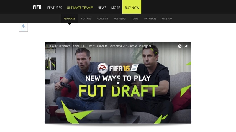
Explainer videos (which are smaller/not full-screen) have been around since as far back as I can remember. Historically, they’ve converted very well and they’re usually set in the middle of the hero header, but other emerging trends (like card-based design) have allowed us to use video in smaller, more modest ways.

Facebook videos are now set to autoplay but no sound will be appear unless you imply in some way that you’re watching the video, such as full-screening or interacting with the video.
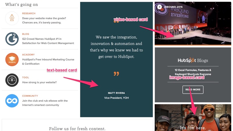
I adore this kind of non-invasive functionality and we’re now starting to see it in effect with card-based designs, meaning compact, user-friendly videos that can be combined with text alternatives to satisfy a wider crowd. And that’s a huge deal.
 HubSpot’s multimedia card-based approach.
Autoplay functionality helps those with motor disabilities to interact more easily with video media, but the overall reduced frame of the component means that we can sum up the video in text side-by-side, sort of like visual alt attribute. Video doesn’t have to be invasive anymore; it can heighten the experience without warding off users with simpler needs.
Multimedia websites allow catering for all types of users.
How to Handle Sound
Deaf users (like myself) are immediately turned off when they see video, much like the average user is when sound begins to blare through a quiet office (much to the dismay of irritated colleagues!). Sound control makes everybody happy, but auto-mute or text alternatives aren’t the only way to handle it…there’s subtitles too. But beware, you run the risk of users not knowing there’s subtitles and clicking the back button anyway.
Quality vs. Performance
Video is expensive. It costs a lot of megabytes, so only when the internet became faster over time did we begin to consider it as a viable type of media for the web. Sadly, internet speeds still have a lot of work to do (especially on low-bandwidth mobile devices), and this is where the inevitable question, “do we need to use video, or are we trying to be trendy”? needs to be asked.
If your website isn’t aimed at huge first-world markets, I wouldn’t consider using video components at all. A large statistic of the world still isn’t connected to the internet and many of those that only have access to slower connections.
Where to Find Great Footage
Stock video is actually quite easy to come by. Perhaps not as common as stock images, but that will change as we become more accepting of video. Pexels is the most well-known source of free stock videos, but I have to say that Adobe Stock trumps on quality.
Here’s some other alternatives:
- Videezy
- X Stock Video
- Coverr (my favourite!)
Conclusion
Because video is a type of media, it can only move forward as new web design trends appear on the scene. More trends equals more web components, which means new ways to implement the media. Video will surely advance further than this in 2016, but how? Leave your ideas in the comments below, I’m interested!
 Daniel Schwarz
Previously, design blog editor at Toptal and SitePoint. Now Daniel advocates for better UX design alongside industry leaders such as Adobe, InVision, Marvel, Wix, Net Magazine, LogRocket, CSS-Tricks, and more.


