
UX and analytics make a great team. Your website analytics can give you insights enabling you to learn about your users, track their journeys, and find potential problem areas. You can use the quantitative data to inform your qualitative UX approach. Remember, your analytics tell you what’s happening on your website, while UX techniques such as usability testing will help uncover why things are happening.
There are various ways that Google Analytics can be used to uncover how your users are navigating your website. Within the Pages report you can drill down to see how users are navigating to, and from, a selected page in your website. But the User Flow and Behavior Flow reports give more information on multi-step journeys from your most popular landing pages onwards.
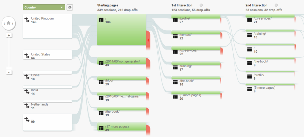
These reports can be hard to analyze, particularly for large websites, due to the fact that there are unlikely to be a series of clear pathways through your website. You’ll find that there are huge numbers of paths that different users can take, which makes finding insights from these reports quite challenging. However, they can be useful for getting a good top-level overview and showing the most dominant pathways through a site. While they suffer from grouping multiple pages, you can often get a good idea of the most common journeys taken by users.
One example of how I’ve used these reports in the past to inform my UX work has been looking out for pogo sticking.
Pogo Sticking
Pogo sticking describes where users bounce between two pages on a website instead of progressing their journey through the site. It can be a sign of confusion on the users’ part and is unlikely to help you convert those users.
The Nielson/Norman group wrote this guide to pogo sticking, which explains it in more detail. It covers some possible reasons behind pogo sticking behavior, and also gives some potential solutions to these problems.
A Pogo Sticking Case Study
A client of mine ran a travel website offering bespoke holidays based a variety of activities and locations. They believed there were opportunities to improve their conversion rate, and I started looking for those opportunities within their analytics.
The Problem
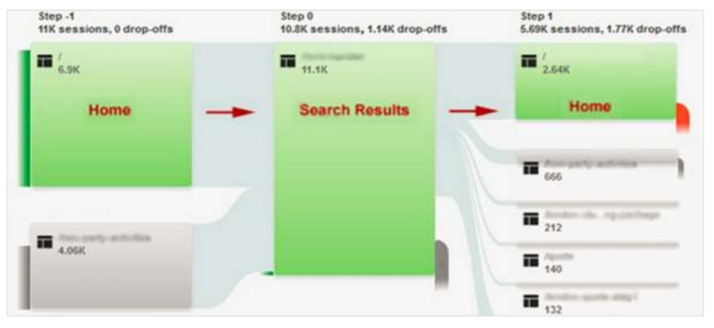
One big issue became apparent when I first looked at their behavior flow reports. As the simplified diagram below shows, there was a clear case of pogo sticking between the home page and the search results page.
As seen below, there are lots of users landing on the home page before going on to the search results page as their next step. The problem is that the next step for a lot of these users is to return to the home page rather than move on to other pages.
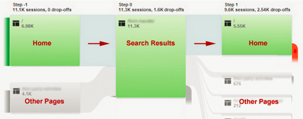
The home page placed search front and center, so it was no surprise that the search results pages were the most popular destination from the home page. However, it was a surprise to note the pogo sticking, as this suggested that users were not seeing the search results they expected. Looking in more detail at the home page, we noticed a potential issue. The search functionality allowed users to search by activity or location, but the way the boxes were laid out on the home page made it look like users were able to search by location and activity.
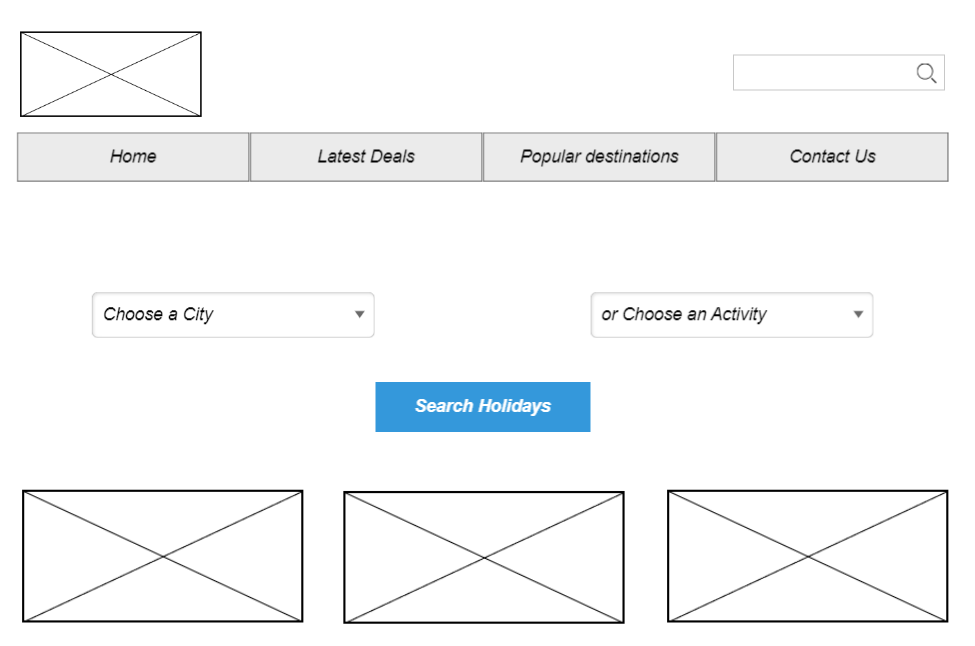
This meant that users thought they were searching for specific activities within a destination but were then presented with search results showing all activities at a destination.
We ran some usability testing sessions on the website and these showed, as expected, that there was confusion over the search functionality. During the testing sessions, users would attempt to search by location and activity without realizing that the option was not available. This led to unexpected search results and users returning to the home page to attempt their search again. Seeing individual users displaying the same pogo sticking behavior as that demonstrated in Google Analytics enabled us to dig deeper into why this issue was occurring.
The Solution
The client didn’t have the development resources available to make major changes to how the search functionality worked, so we couldn’t suggest large-scale changes. Instead, we set about finding a design to minimize the pogo sticking by simplifying the search functionality and making it clear to users that they could search by destination or activity.
After sketching out and discussing various solutions, it was decided that introducing tabs was the best approach — to ensure it was clear that there were two separate search options available. This meant that users were able to choose between “activity” or “location” searches. The following wireframe shows our initial design.
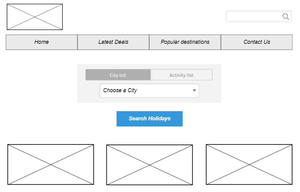
This design required minimal development and was aimed specifically at tackling the pogo sticking issue.
The Results
This design was implemented on the home page and saw an immediate reduction in pogo sticking between the home page and search pages. This, in turn, led to more users getting to view destination and activity pages and also led to an overall increase in conversions. The following screenshot shows that pogo sticking was still an issue, but that there was a notable reduction in this type of behavior.
The longer-term plan is to further improve the search functionality by adding in a level of faceted search — allowing users to filter their search results and find the right destinations and activities for their requirements. This will reduce the pogo sticking even further and lead to a much more efficient way to find the right holiday.
Other Ways to Use Analytics to Inform Your UX
We’ve looked at one example of how analytics data can be used to identify a particular issue with the user journey. There are lots of other ways analytics can be used to help inform your UX decisions.
Starting off your UX work by looking at your website analytics for potential issues is a great way to find problems you might not have even been aware of. Website analytics are often overlooked during the UX process, but your analytics can be used to:
- analyze key user journeys
- identify potential problem areas on your website
- find out more about your website users
- measure the impact of your design changes
- create reports to show the value of your UX work
Taking an analytics-first approach to your UX work is great, low-cost way to start your initial UX investigative forays. Website analytics tools like Google Analytics can be free to use and you can pick up some key insights very quickly from them.
To find out more about taking an analytics-first approach to your UX work, check out my book Researching UX: Analytics.
Frequently Asked Questions (FAQs) about UX Issues and Analytics
How can analytics help identify UX issues?
Analytics can be a powerful tool in identifying UX issues. By tracking user behavior, analytics can provide insights into where users are having difficulties or abandoning the site. For example, if a significant number of users are leaving from a specific page, it may indicate a UX issue on that page. Similarly, if users are not completing a desired action, such as making a purchase or filling out a form, analytics can help identify where in the process they are dropping off.
What are some common UX issues that can be identified through analytics?
Some common UX issues that can be identified through analytics include confusing navigation, poor page layout, slow loading times, and issues with form completion. By analyzing user behavior, you can identify where users are struggling and make necessary improvements to enhance the user experience.
How can I use analytics to improve my website’s UX?
You can use analytics to improve your website’s UX by tracking user behavior and identifying areas of difficulty or frustration. This can include tracking page views, bounce rates, exit rates, and conversion rates. By analyzing this data, you can identify where improvements are needed and make changes to enhance the user experience.
What is a problem statement in UX design?
A problem statement in UX design is a clear, concise description of the issue that needs to be addressed. It provides a focus for the design process and helps guide decision-making. A good problem statement should be user-focused, specific, and actionable.
How can I create an effective problem statement for a UX issue?
To create an effective problem statement for a UX issue, you should first identify the problem through user research and analytics. Once you have a clear understanding of the issue, you can write a problem statement that is user-focused, specific, and actionable. This statement should clearly articulate the problem, who it affects, and why it is important to solve.
How can I find and fix UX issues early?
Finding and fixing UX issues early can be achieved through a combination of user research, usability testing, and analytics. User research can help identify potential issues before they become problems, usability testing can validate your design decisions, and analytics can provide ongoing feedback about how users are interacting with your site.
What are some examples of UX problems?
Some examples of UX problems include confusing navigation, slow loading times, poor readability, and issues with form completion. These problems can lead to user frustration and abandonment, so it’s important to identify and address them as soon as possible.
How can I use analytics to track UX improvements?
You can use analytics to track UX improvements by comparing user behavior before and after making changes. For example, if you make changes to improve page load times, you can use analytics to track whether users are staying on the page longer or converting at a higher rate.
What is the role of a problem statement in solving UX issues?
A problem statement plays a crucial role in solving UX issues by providing a clear, focused description of the problem. This helps guide the design process and ensures that solutions are targeted towards addressing the specific issue at hand.
How can I use analytics to create a better user experience?
Analytics can be used to create a better user experience by providing insights into user behavior. This data can help you understand where users are struggling, what they find engaging, and where there are opportunities for improvement. By using this information to inform your design decisions, you can create a more user-friendly and effective website.
 Daniel Schwarz
Previously, design blog editor at Toptal and SitePoint. Now Daniel advocates for better UX design alongside industry leaders such as Adobe, InVision, Marvel, Wix, Net Magazine, LogRocket, CSS-Tricks, and more.