 There are a number of ways to add breathing space to your type. White space or negative space helps to focus attention on the words, while line spacing and letter spacing can help to make your text more readable. Let’s take a look at each of these.
White Space
White space is the space between graphics, text elements and between columns on a page. It’s one of the most important principles in layout and design. It’s essential not to think of the space around your type (or graphics) as just blank space. The space is actually a design element all of its own and is used to create a classic or elegant appearance, and as I mentioned previously, this is a decision that you as a designer needs to make. Don’t just let your page fall together. A web page with very little white space can appear too busy and may be difficult to read and focus on. However some simple ways to increase the amount of white space around your type, are to use- bulleted items
- headlines and sub headlines
- padding around images
- margins
Line Spacing (Leading)
By changing the amount of space between lines, you increase the readability of a passage of text. If the line spacing is too tight, it becomes difficult to separate the words and is tiring on the eye. In the example below, you can see a paragraph of 12 pt text. As the line spacing in increased, the text becomes easier to read, and a nice airy effect is achieved.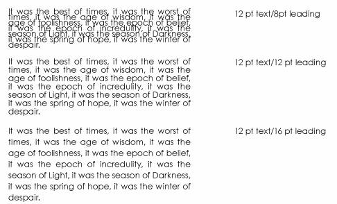 As a rule of thumb, you may need to increase line spacing:
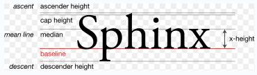
- If the typeface you choose has a large x-height, which many san-serif fonts do
- If you are reversing the type out, for example light blue font on a dark navy background.
- From the Wikimedia Commons
Letter Spacing (Tracking)
Some typefaces have connecting letters that are designed to sit very close together. You can set the space between letters (known traditionally as tracking) to make your text more readable. If you’re using the “web safe” fonts, Georgia, Verdana, Arial and so on, for your body text, you can usually leave the letter spacing as is. However you might like to change the spacing between letters for headings and sub-headings to achieve that airy feel and also stretch the length of your text without distortion.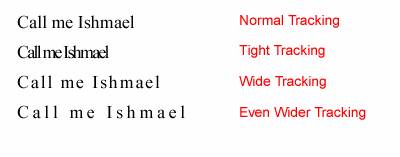 There are no hard and fast rules when it comes to letter spacing. You really need to trust your eyes and own judgment. If the letters look too close together, they most likely are.
Kerning
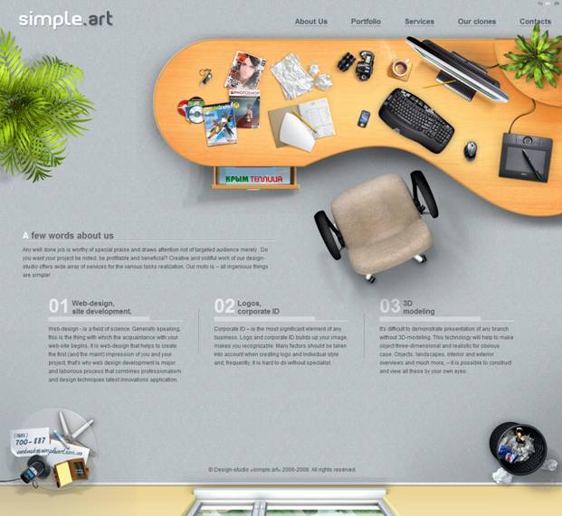
Kerning is sometimes confused with tracking. It refers to the adjustment of spacing of two particular characters to correct visually uneven spacing. This is used mainly in print design. Let’s take a look at some examples of web sites which make good use of space to create clean, legible designs. Matt Lawrence’s blog is mainly text based, yet still achieves a sense of airy-ness by using large heading and sub-headings and body text with large line spacing. The background image on the right hand side blends with the page and adds to the sense of spaciousness.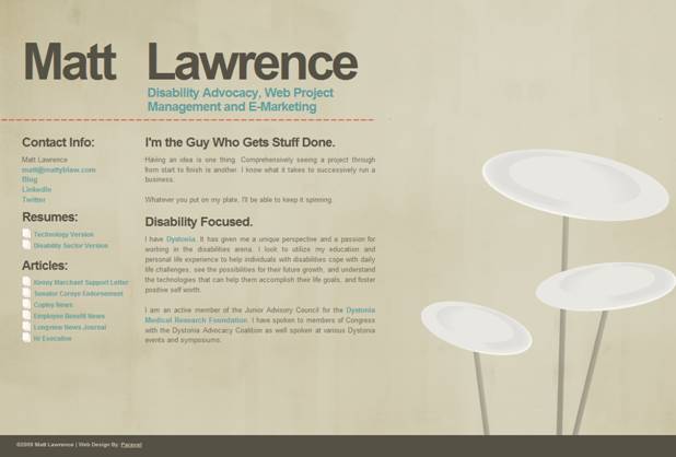 Simpleart leaves plenty of room around the main image on the page and separates three columns of text with gutters. A large margin underneath the three columns gives a nice impression (in this case) of floor space.
 Daily Bath & Body is simple, clean and elegant. There’s lots of space around the logo in the header and between the main image and the headline “Indulge daily”. The headline itself uses wide tracking, while the body text is easy to read with good line spacing.
 A simple measure is a slightly busier site than the others shown here, but it does a nice job putting a fair amount of information onto one page whilst keeping it legible and attractive. Each section of the page is allowed to breathe, either by using large margins or by using simple graphics such as the pencils in the navigation area.
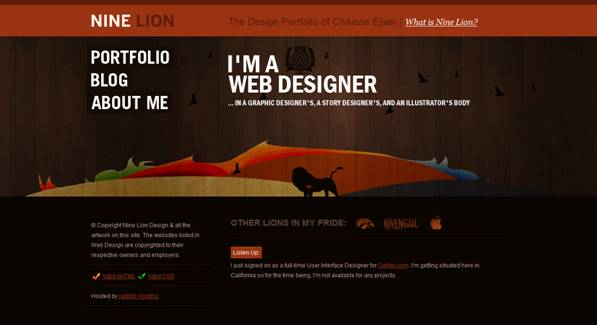
 Finally, just to show that white space does not have to be white, Nine Lion combines a colourful graphic with large headline type. The small body text is cleanly separated from the graphic using a margin.
 I’d love to see some of your links to pages you like using white space as a design element. Share them in the comments!
Frequently Asked Questions about Typography and Space
What is the importance of space in typography?
Space in typography is crucial as it affects readability and the overall aesthetic of the design. It helps to create a balance and harmony in the layout, making it easier for the reader to navigate and understand the content. Proper use of space can highlight important elements, create emphasis, and guide the reader’s eye through the text. It’s not just about the space between letters, but also the space between lines, paragraphs, and around the text block itself.
How does kerning affect the readability of a text?
Kerning refers to the adjustment of space between individual letters. Proper kerning ensures that the spacing between letters is visually consistent, which enhances readability. Poor kerning can lead to letters appearing too close together or too far apart, making the text difficult to read and visually unappealing.
What is the difference between kerning and tracking?
While both kerning and tracking deal with the adjustment of space in typography, they are applied in different contexts. Kerning is the adjustment of space between two individual letters, while tracking is the uniform adjustment of space across a group of letters or a whole block of text. Tracking affects the overall character density and can significantly impact the readability and appearance of the text.
How can I adjust the space in my text using Microsoft Office?
Microsoft Office provides several tools to adjust the space in your text. You can adjust the space between lines, between paragraphs, and even between individual letters. To adjust the space between lines or paragraphs, go to the ‘Paragraph’ settings. To adjust the space between letters, select the text and go to the ‘Font’ dialog box, then adjust the ‘Spacing’ option.
How does space affect the legibility of a font?
Space plays a significant role in the legibility of a font. Adequate space between letters, words, and lines makes a text easier to read. Conversely, too little space can make the text feel cramped and difficult to read, while too much space can make it seem disjointed. The optimal space depends on the specific font and the context in which it is used.
What is the role of white space in typography?
White space, also known as negative space, is the space around and between the elements of a design. In typography, white space helps to separate different elements, guide the reader’s eye, and create a balanced, harmonious layout. It can also be used to create emphasis and hierarchy in the design.
How can I use Google Fonts to improve the space in my typography?
Google Fonts offers a wide range of fonts with different characteristics, including spacing. You can experiment with different fonts to see how they affect the readability and appearance of your text. Google Fonts also provides information about each font, including its characteristics and recommended usage, which can help you make informed decisions about your typography.
What is micro typography and how does it relate to space?
Micro typography refers to the fine details in typography, including the adjustment of space. It involves elements such as kerning, tracking, and the use of white space. Micro typography can significantly impact the readability and aesthetic of a text, making it an important aspect of typography design.
How does space contribute to the overall design of a webpage?
Space is a fundamental element in webpage design. It helps to create a clean, organized layout, making it easier for users to navigate and interact with the page. Space can be used to separate different elements, create emphasis, and guide the user’s eye. It also contributes to the overall aesthetic of the page, creating a balanced, harmonious design.
What are some common mistakes to avoid when dealing with space in typography?
Some common mistakes include using too little or too much space, not considering the relationship between different elements, and not adjusting the space to suit the specific font and context. It’s important to remember that space is not just an empty area, but a crucial element that contributes to the readability and aesthetic of the text.
 Jennifer Farley
Jennifer Farley is a designer, illustrator and design instructor based in Ireland. She writes about design and illustration on her blog at Laughing Lion Design.