Last week, Google released a new invite-only product, Inbox. Inbox is an interface to Gmail — designed not as an alternative service, but as an alternative and augmented interface. As a super-heavy email user, I’ve been taking a look at it since day one and will be reporting my initial findings and impressions in this post. It is through this kind of public feedback — rather than in-app feedback functionality that is available across all Google products — that I believe most change can be brought forth.
If you’d like to know more about Inbox, look through the various online resources already published on the topic. In this post, I’ll express my initial opinion about the service, listing the pros and cons I noticed.
Overview
Google’s team says the best way to use Inbox is to go all in — and go all in I did. From the night of release, Inbox completely replaced both my mobile and my desktop Gmail application, just so I could see how much of an effect it would have. During that time, I was also at ForumPHP in Paris, so emails kept piling up, making for a perfect opportunity to properly test things.
Features
While the features that Inbox offers are listed on their website and in various promotional articles, I’ll focus on those that immediately made an impression on me and that I actually used. Inbox uses the same* interface on both mobile devices and desktop browsers, making for a seamless transition between the two at any time.
* See discrepancies section below.
Done!
The emails you mark as “done” in the service get archived in Gmail, so the workflow remains nearly identical there.
The sync with Gmail is near instant, and in case you have Gmail installed on your mobile devices alongside Inbox, Gmail notifications will disappear promptly as you deal with your Inbox messages. This is something Twitter and Facebook should learn from — Google has consistently shown them how to implement notification sync across devices from day one, and yet they’ve failed time and again to properly implement this simple feature many users would consider essential.
Preview
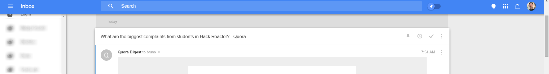
When an email matches a certain context, the interface will make a note of it and alert you by displaying a more in-depth snippet about it. This can be anything from travel itineraries and flight information to eBay purchases:
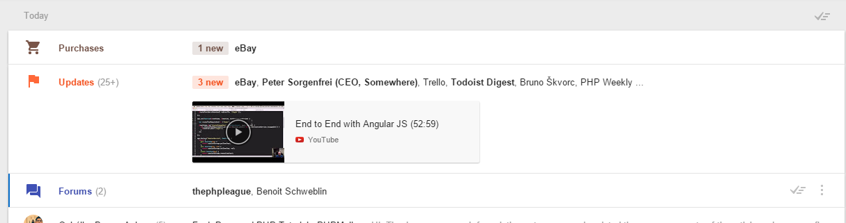
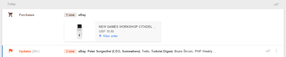
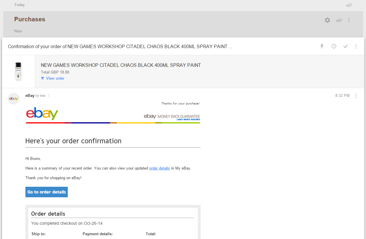
An item you bought will be displayed as a badge, and clicking on it will quickly render the entire order information screen.
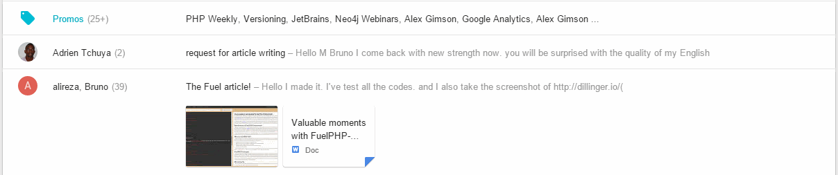
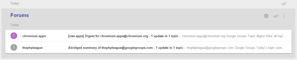
Grouping
All contextually similar items will be grouped under a single category. The entire set of bidding on an item on eBay, winning the auction, paying for it via PayPal, and then getting the order confirmation email will be grouped under “Purchases”, allowing you to easily skim through and “group-done” the entire set. You know what it’s about — you don’t need to check details — so why not save a minute and just get them all out of the way? Same thing with groups like “Forums”, “Updates”, and so on – as well as any other custom groups you define (think of them as contextually reactive labels).
The social networking content is almost identical to that of Gmail – there’s a social group which holds all Twitter, Facebook, etc notifications. What’s different from the original Gmail, however, is that G+ is no longer embedded – you can no longer comment on your posts directly from the interface and must instead go to G+ by clicking on the link in the email. Whether this was done in order to remove the G+ behemoth from the interface and make things faster, or to keep the desktop and mobile version in sync (or both!), I can’t tell, but I won’t miss the feature.
Compose Popover
One of the features I find myself using most is the compose popover.

By holding your mouse over the compose button, or tapping it in the mobile version, your most frequent recent contacts will show up, right above the “create reminder” and “invite to Inbox” option (if you have the latter available). This lets you immediately get back in touch with the people you converse with most. Tapping the compose button itself one more time once the popover is already open will open a familiar compose window as in Gmail, for quickly crafting an email.
Offline Ready
Inbox is Offline Ready by default – read your preloaded email, mark it as done, categorize it, delete it: All the changes will be synced as soon as you regain internet connection. You can even compose drafts and keep them around for as long as you want, or until you regain your connection and manage to send them.
Default Reply-all
Inbox has switched to a default ‘Reply-all’ sending mode when replying to emails. This is guaranteed to cause a fuss and a half with a lot of people, but personally, I like it – I end up setting Reply all on almost all of my replies anyway, and the switch must have been based off of some data, so I’m quite certain it’ll fit most power users’ use cases.
Reminders and Snoozing
One of the most important features of all is the Reminders feature. You can remind yourself to take a look at an email in three hours or even “when I reach home” — that’s right, you can even trigger them by location. Sure, you’d need location reporting activated on your mobile device for that to work, but that’s about it — Google will do its best to make sure everything is as accurate as possible. It’s like the minimal features of IFTTT, Tasker and Google Notes/Reminders all shoved into one whole. Something we’ve previously used Google/Google Now for: “OK Google, remind me to send an email to Mary in 4 hours” can now be done in the inbox directly.
Setting a reminder to bake a cake in five hours is as easy as clicking reminder, selecting the time, saving and then just relaxing and forgetting about it. The reminder won’t be visible until it’s almost time to trigger it. You can see a list of all your reminders in the Reminders group (left menu), which will also list all your previous reminders from Google Reminders and Google Notes – even before Inbox.
There’s a caveat, though: look at the section on discrepancies below.
Missing Features and Bugs
While Inbox, in its current state, does indeed provide functionality beyond a normal email client and makes life much easier, there are areas in which it could definitely improve before becoming the email client that’s about to doom its competition.
Layout and UX discrepancies between mobile and desktop
On mobile, it’s quite easy to force the app into fetching fresh content – just pull down and the refresh symbol appears. On desktop, not so much. There’s no refresh button, and using the browser’s reload button is madness in this age of ultra bloated front end apps – it would take ten times longer for the page to reopen than to just wait for the autofetch to kick in.
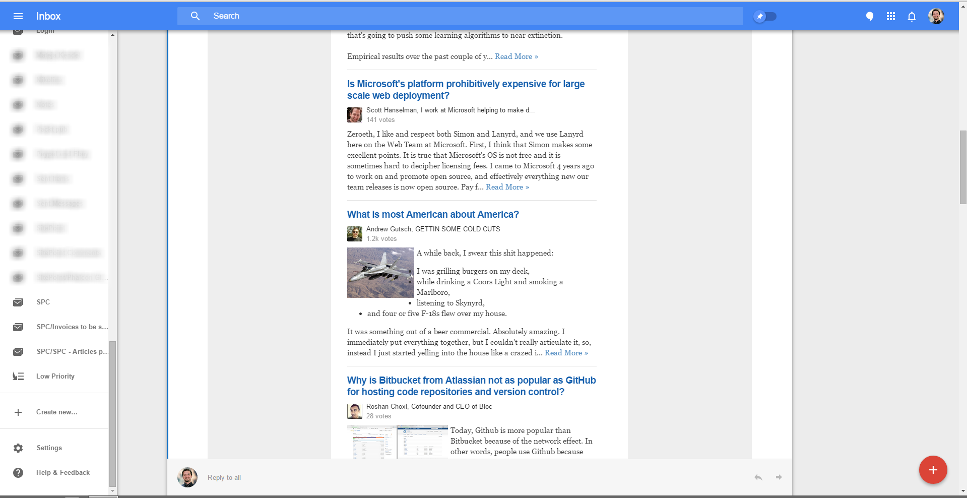
Furthermore, when looking at an email, there is a toolbar on top that holds the “done” button.
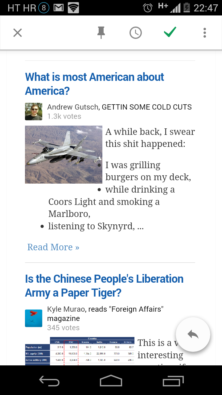
On desktop, in long emails, there’s a definite lack of it. The button (and the toolbar containing it) should become sticky after the scroll area moves past them into a long email, so that an email can be marked as “done” after it’s read, without having to scroll back to the top:
This doesn’t happen on mobile, and it’s a UX gaffe that should be fixed.
Another slip-up is the lack of location selection on desktop while setting reminders — you can easily set location-based reminders on mobile, but the laptop is lacking the option. This is a shame for two reasons: Firstly, laptops are mobile (or at least ‘moveable’) devices, and HTML5 has a location API. This feature missing makes no sense. Secondly, to set a reminder for a location, you’d have to use a mobile device, and that sometimes isn’t possible. Maybe you don’t have it with you, maybe you don’t have internet access on it (at a conference perhaps?), or who knows what else. Maybe I’m planning to lug my laptop around all day?
These minor discrepancies are not dealbreakers, but they are annoying and can (and should) be easily fixed.
No reply-from
The lack of a “reply from” feature means you always reply from the same email address to which you got the email. For users like me, who use a single Gmail account to aggregate emails from all other email accounts, business and personal, this is particularly troubling. Not only because I don’t use that Gmail address for sending emails, but also because that’s my one email address I’ve kept private in all the years to avoid spammers and various forced signups.
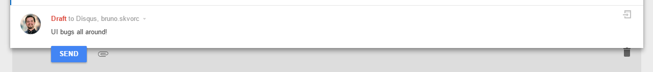
Popout reply buggy, reply layout falls apart
A flat-out UI bug, the Popout reply feature that worked so well in Gmail doesn’t work here, even though the option is there when composing a reply. The UI also sometimes falls apart for no apparent reason:
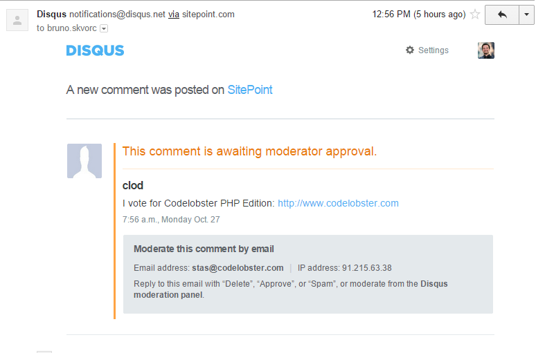
Failed rendering of certain emails
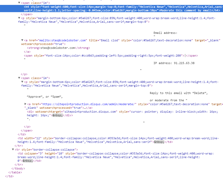
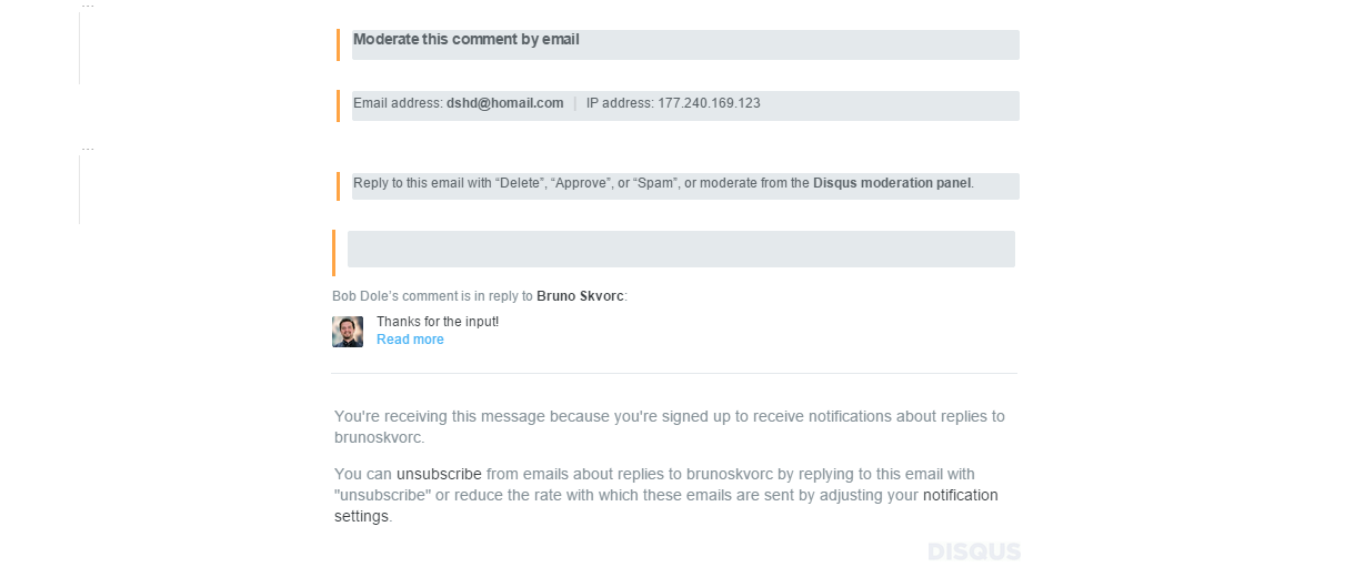
In Gmail, a Disqus moderator approval email looked like this:
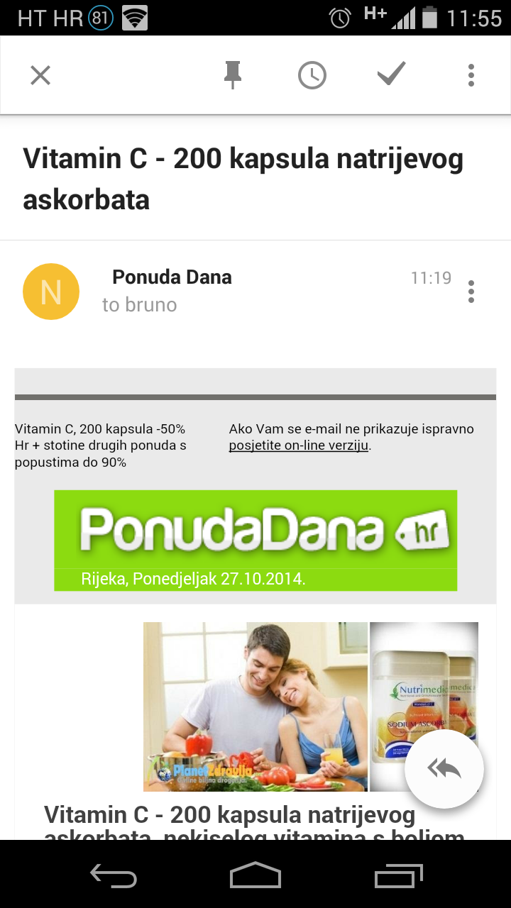
In Inbox, it looks like this:
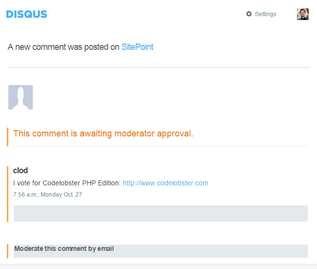
I have no doubt about this being Disqus’ fault, based on the HTML of their email, but it’s still important to note that the difference is there, and if it happens with Disqus, it might happen with other emails too. This is a pretty big issue – who’s breaking standards here? Is it really Disqus failing to properly HTMLify their emails? Or is it more serious, and Inbox doesn’t render as per standards?
This happens on mobile too:
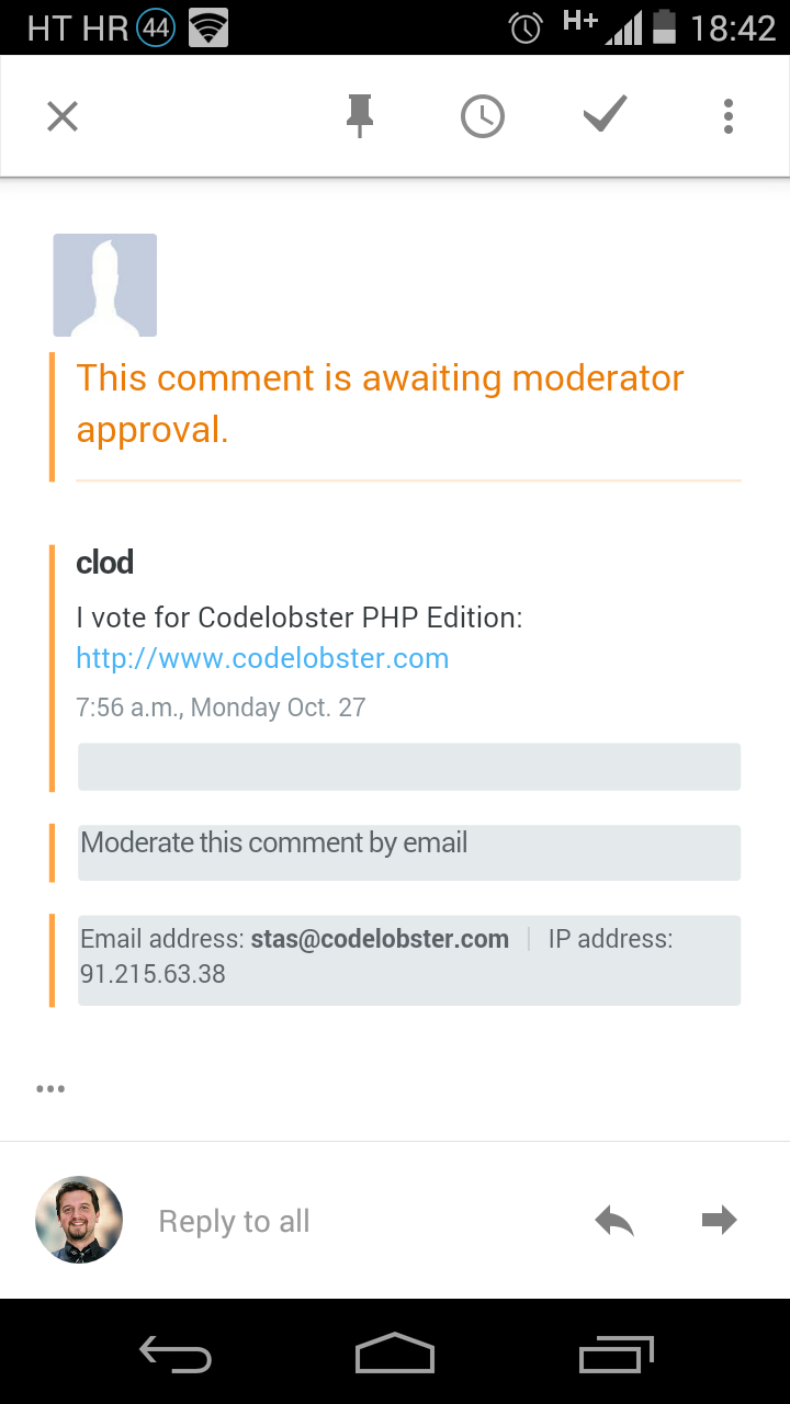
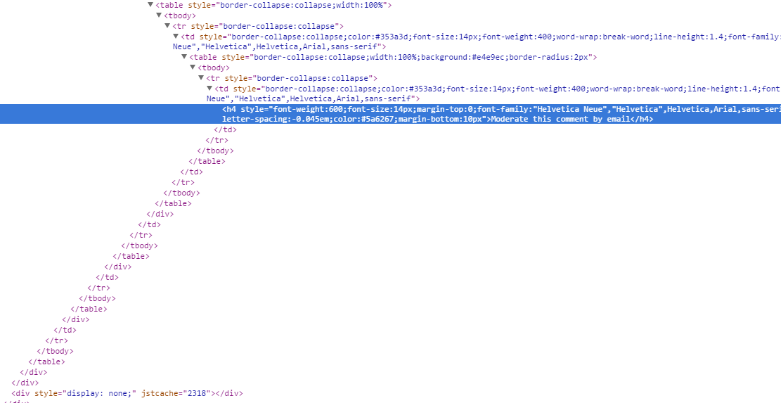
Inbox is missing a Show Original option, so you can’t really inspect the HTML of an email with the click of a button, but an inspection of the tag soup through the Chrome Dev Tools reveals that a large chunk of HTML is actually missing.
Gmail:
vs Inbox:
Needless dual menu
See the three vertical dots in the top right? “Which three dots, the upper or the lower?”, you might be asking. Exactly – there are two menus with the same icon, both pertaining to the context of one email. If you want to flag it as spam (as I do with this email) or move it to another label, you need to use the upper one.

If you want to reply or forward, you’ll need to use the lower one.

The UI being full of these little quirks tells me it was a rush job or a conflict between design teams, and that’s something we’re not used to with Google.
Custom Context Parsers and Extensions
While it’s nice that Inbox recognizes some context and prettifies it up somewhat, pointing it out to the user, it would be nice if we could define custom context filters and apply them to our interfaces. For example, I get dozens of Disqus notifications per day – comments needing approval and such. It would be nice if I could somehow teach Inbox to group the emails from Disqus that come from the SitePoint domain (but ONLY from the SitePoint domain) and alter their message preview to one containing the bulk of the comment with regular expressions.
I’ll dare to dream further and say that I should even be able to define custom intents on my emails which would execute a set of operations on a message that I would usually need to perform manually. For example, approving a comment is done by replying “approve”, spamming is done by replying “spam” and deleting.. you get the gist.
Why not let us be able to define these options in the context menu of a subject line, so that I can just click one of the three options (Approve, Spam, Trash) and execute this context operation? This would take minutes out of every hour, for sure.
This is something that could be easily built with a Chrome extension, but why not make it official, open an “Inbox extensions” API that people can install into their UI directly on the back end (thus getting it in the mobile app, too) and let the magic happen? Sure, we’d open ourselves to memory leak hell that we already currently have with Chrome’s Web Store and the extensions present there, but it would let us “email power users” shave off a significant number of hours per month.
Too little info in subject lines
Building on the previous complaint, the subject lines in Inbox are much shorter than in Gmail. This obscures some information and makes it difficult for power users to discern the value of an email through its subject alone. For example, Disqus will send you email notifications if you’re an admin whenever a comment needs approving.
If you’re an admin on several websites, or some websites you’re an admin on are only partially managed by you and other people approve comments on other posts, you’d be hard pressed to find out if a comment on a post from your or someone else’s jurisdiction needs approval. In Gmail, this was dead easy — longer subject lines led to more clarity as to the nature of the email, thus enhancing workflow.
Yes, this is nitpicking and Disqus does have a famously bad interface/API/architecture, but it’s a real world example nonetheless — longer subject lines are better than shorter subject lines.
Automatic Translation
Inbox should detect foreign language emails and automatically offer to translate them to my UI language of choice. I should not have to install a custom translate extension, and I shouldn’t have to paste the content into Google Translate to figure out its meaning.
Considering this is already done in Google+, there shouldn’t be many problems implementing it here, too.
Availability
Unfortunately, Inbox is not yet available for most people. It’s an invite-only app, so you can only be invited by someone who already has access. What’s more, not all those with access immediately get invites to send out – you need to be a very early adopter, an online personality with at least some kind of decent public exposure, or a Google employee. Needless to say, this upset a throng of people who took to the Play store and spammed the review section with one-star reviews solely on the basis of not being invited to the party, potentially skewing the results for newcomers down the line.
Another potential hurdle for many Google users and customers is the fact that Inbox is not available in the Google Apps suite (yet). Those who complain about this should, however, realize that Inbox is far from fine-tuned to perfection, and releasing a flawed product into a paid suite would be more harmful to a paying community than not releasing one at all. The memory expense alone is mindboggling, and running both a tab with Inbox and a tab with Gmail will often be so expensive you’ll need a high end computer to keep up.

Note: All the bugs discussed in this post have been reported to the Inbox team, but if you have access, please do the same in order to expedite the fixing process.
Conclusion
After having used the service for a couple of days, I can safely say that it’s on the way to replacing Gmail for me, but not quite there yet. I need structure and more detail. I don’t want my email too filtered and crippled, I want it empowered with context. Keep the monetization filters and algorithms, but let us customize the interface and email contexts as we see fit, and fix the discrepancies, and you have a Gmail killer. Until then, this won’t be much more than a fancy Gmail skin that works intermittently.
With all that said, if you’re really itching for an invite, let me know what you think the one feature you’ll be using most in Inbox is, and I’ll try and throw your name into a raffle, giving out the invites I still have after 48 hours.
Have you tried Inbox? What did you think? Will you continue using it?
 Bruno Skvorc
Bruno is a blockchain developer and technical educator at the Web3 Foundation, the foundation that's building the next generation of the free people's internet. He runs two newsletters you should subscribe to if you're interested in Web3.0: Dot Leap covers ecosystem and tech development of Web3, and NFT Review covers the evolution of the non-fungible token (digital collectibles) ecosystem inside this emerging new web. His current passion project is RMRK.app, the most advanced NFT system in the world, which allows NFTs to own other NFTs, NFTs to react to emotion, NFTs to be governed democratically, and NFTs to be multiple things at once.