Designers and marketers spend a lot of time, energy, and effort persuading website visitors to sign up for trials, newsletters, free downloads, and other incentives. Designing a creative and interesting registration form is a crucial final part of that process. You will need to maintain a certain balance between appealing design and simplicity. If you add too many design elements or form fields, the user may get distracted. Conversely, if you have a very simple form with only text and default styles, they might find it boring and ignore the offer.
So, today I’ll walk you through the careful balance of designing a clean and stylish registration form that is both simple and appealing. We’ll focus on keeping it clean, interesting, and at the same time effective. So, let’s get started!
Resources:
Fabric patterns
Wood Patterns
Final Result: (To download the completed, layered file, click here.)

Step 1
Open Photoshop and create a new file with a 575px width and a 600px height.
Step 2
Now, create a new layer and fill it with color #2d3335 using the paint bucket tool.
Step 3
To add a nice pattern to the background, click on the “Layer Style” > “Pattern Overlay” and add a pattern.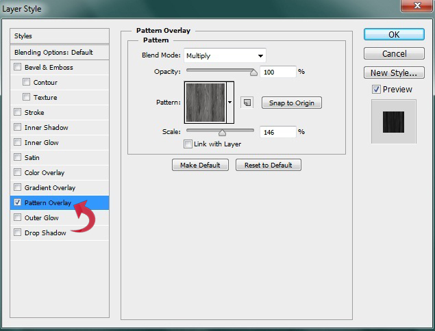
Step 4
For the form base or background, select the rectangle tool and create a rectangle using color #d7d7d7.
Step 5
Now, click on the layer styles and add a pattern, Satin, Inner Shadow, and Stroke.

 Add a 1px stroke using color #bfbfbf.

Step 6
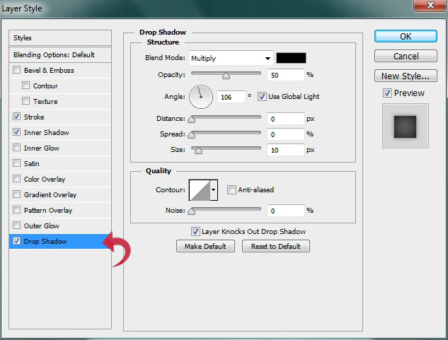
For the title, select the type tool and add your desired text. Then, click on “Layer Styles” > “Drop Shadow.”
Step 7
Now we will create two dividers. For the first one, select the line tool to draw a line with a 1px weight using color #bcbcbc. Now, click on “Layer Styles” > “Drop Shadow” to add a thin shadow to the line. Use the following settings.

Step 8
Right-click on the new line layer and select “Rasterize layer.” Then, select the eraser tool with a soft round brush and use it on the sides to achieve the effect shown below.
Step 9
Repeat the same process described above to create the second divider.
Step 10
Now, let’s start with our registration form fields. So select the rectangle tool and create a rectangular stripe with color #9e0039.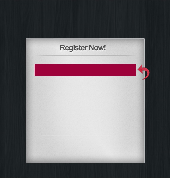
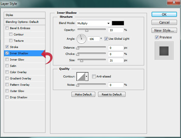
Step 11
Click on “Layer Styles” and add Stroke, Inner shadow, and Drop Shadow using the following settings.

Step 12
Select the type tool and add form field text using color #efefef. Then, click on “Layer Styles” > “Drop Shadow” and use the settings shown below.
Step 13
Repeat the same process to create additional form fields.
Step 14
Now for the button, select the rectangle tool again and create a rectangle using color #464646.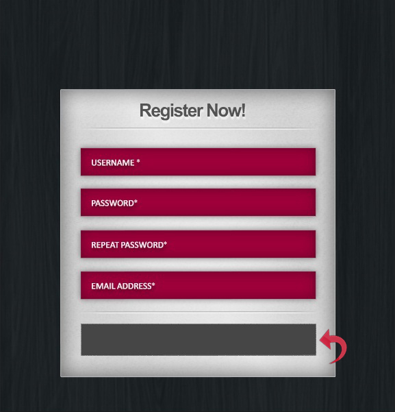
Step 15
Click on “Layer Styles” and add Stroke, Inner Shadow, and Drop shadow using the following values.

Step 16
Add the button text using the type tool with a very slight drop shadow.
Step 17
For the side options, select the rectangle tool and create a small rectangle using color #464646. Then, click on “Layer Styles” and add Stroke and Inner Shadow to the rectangle. Use the following settings.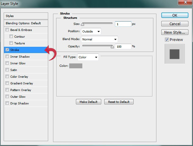

Step 18
Select the type tool and add text along the right side using a slight drop shadow.
Step 19
Repeat the same process to add more options; you can simply duplicate the above rectangle layer and add text.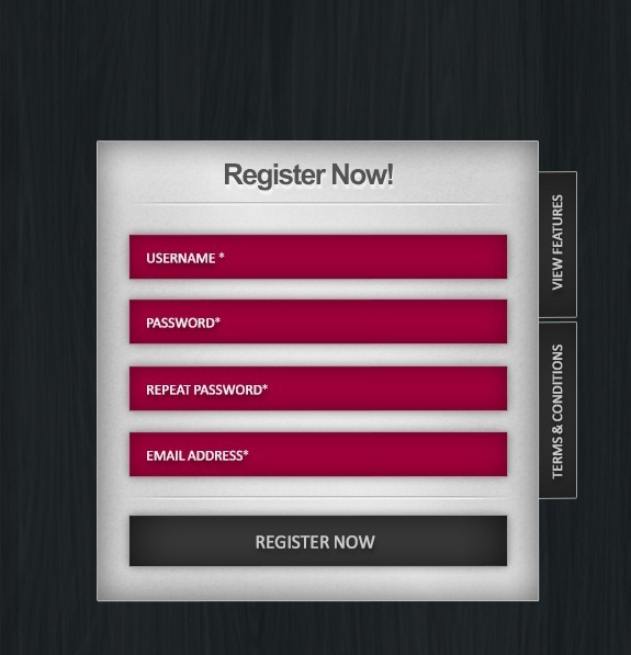
Step 20
Now, group up all the layers and click on “Edit” > “Free Transform” and make the entire form look slightly tilted. Don’t tilt it too much, or your form fields will look strange when they’re used.
Step 21
Now let’s start with the nail and ropes. For the holes, create a new layer, select the hard round brush, and use it on the sides with a 16px size and color #424242.
Step 22
Click on “Layer Styles” > “Inner Shadow” and apply the following settings.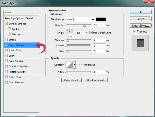
Step 23
Reduce the brush size to 10px and create a tilted line. Then, click on “Layer Styles” and add “Bevel & Emboss” and a fabric pattern. Use the settings below.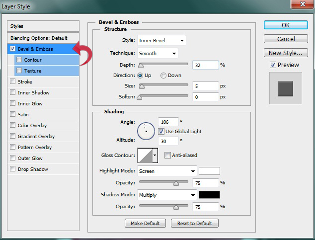
 Repeat the same process to create the other side.

Step 24
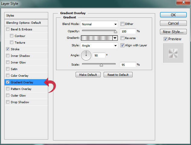
For the nail, select the ellipse tool and create a small round shape. Then, click on “Layer Styles” and add Stroke, Gradient, and Drop Shadow to the shape using the following values.
Step 25
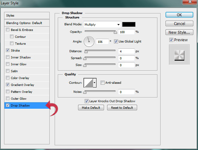
For the Drop Shadow, create a new layer, select the lasso polygonal tool, create a shape similar to our form, and fill it with color #000000.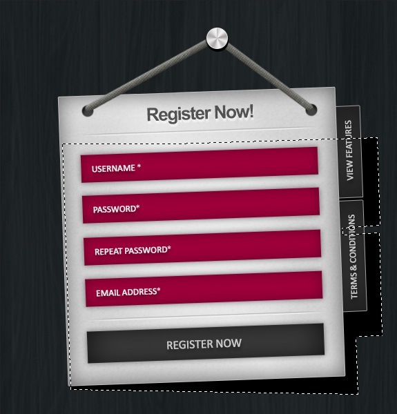 Now, click on “Filter” > “Blur” > “Gaussian Blur.” Use the settings shown below.
 We are done! Our sleek and clean registration form is ready.
Hope you guys enjoyed the tutorial. Take care!
We are done! Our sleek and clean registration form is ready.
Hope you guys enjoyed the tutorial. Take care!
Frequently Asked Questions about Designing a Clean, Stylish Registration Form
What are the key elements to consider when designing a registration form?
When designing a registration form, it’s crucial to consider the user experience. This includes ensuring the form is easy to understand and navigate, with clear instructions and labels for each field. The form should also be visually appealing, with a clean, stylish design that aligns with your brand’s aesthetic. Additionally, it’s important to only ask for necessary information to avoid overwhelming users. Lastly, consider the placement of the form on your website. It should be easy to find and access.
How can I make my registration form more user-friendly?
To make your registration form more user-friendly, ensure it’s simple and straightforward. Avoid using jargon or complex language. Use clear, concise labels for each field and provide helpful error messages if a user enters information incorrectly. Also, consider including tooltips or help text to guide users through the process. Lastly, make sure your form is responsive and works well on all devices.
How can I add a touch of style to my registration form without compromising its functionality?
Adding style to your registration form can be achieved through careful use of colors, fonts, and layout. Choose a color scheme that matches your brand and is pleasing to the eye. Use fonts that are easy to read and professional. The layout of the form should be logical and intuitive, with related fields grouped together. However, remember that functionality should always come first. A stylish form is useless if it’s not easy to use.
What are some common mistakes to avoid when designing a registration form?
Common mistakes when designing a registration form include asking for too much information, using unclear labels, and not providing error messages. Also, avoid using a design that’s too complex or cluttered. This can confuse users and make the form difficult to navigate. Lastly, ensure your form is accessible to all users, including those with disabilities.
How can I ensure my registration form is accessible to all users?
To ensure your registration form is accessible, use clear, legible fonts and high-contrast colors. Provide alternative text for any images or icons. Make sure the form can be navigated using a keyboard for users who can’t use a mouse. Also, ensure error messages are clear and helpful, and provide instructions or help text where necessary.
How can I test the effectiveness of my registration form?
You can test the effectiveness of your registration form by conducting user testing. This involves observing users as they interact with your form and gathering feedback. You can also use analytics tools to track how users interact with your form, such as how long they spend on each field and where they encounter errors.
Can I use templates for designing my registration form?
Yes, using templates can be a great starting point for designing your registration form. However, it’s important to customize the template to fit your brand and meet your specific needs. Also, ensure the template you choose is user-friendly and accessible.
How can I protect my registration form from spam and bots?
To protect your registration form from spam and bots, consider using CAPTCHA or other similar verification methods. This requires users to complete a simple task to prove they’re human before they can submit the form.
How important is the mobile experience for registration forms?
The mobile experience is extremely important for registration forms. More and more people are using their mobile devices to access the internet, so it’s crucial that your form is responsive and works well on all devices. This includes ensuring the form is easy to navigate on a smaller screen and that all text is legible.
How can I encourage users to complete my registration form?
To encourage users to complete your registration form, make the process as simple and straightforward as possible. Only ask for necessary information and provide clear instructions. Also, consider offering incentives for completing the form, such as access to exclusive content or a discount on their first purchase.
 Anum Khan
Anum is Web and Graphic designer. Addicted to Photoshop and crazy for pixel perfection. She is also an active blogger, sharing her passions, skills and creative details on her blog Websoulz. She loves to connect with the community, sharing the latest design gossips and rolling her eyes on boring trends.