There are two main standpoints from which most people determine whether a website design is “good” or “bad.” There’s a strict usability angle, which focuses on functionality, the effective presentation of information, and efficiency. Then there’s the purely aesthetic perspective, which is all about the artistic value and visual appeal of the design. Some people become caught up in the aesthetics and graphics, and forget about the user, while some usability gurus get lost in their user testing and forget about visual appeal. In order to reach people and retain their interest, it’s essential to maximize both.
The most important point to keep in mind is that design is about communication. If you create a website that works and presents information well, but looks ugly or fails to fit with the client’s brand, no one will want to use it. Similarly, if you make a beautiful website that is hard to use or inaccessible, people will leave. Indeed, the elements and functionality of a finished website design should work as a single cohesive unit, so that users are pleased by the design but drawn to the content.
One of the biggest concerns among usability professionals is the time it takes users to scan the page for the information they want, be it a piece of content, a link to another page, or a form field. The design should not be a hindrance; it should act as a conduit between the user and the information.
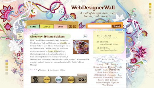
Nick La’s Web Designer Wall (see below) is a great example of a design that’s both beautiful and usable. Nick’s rich, colorful illustrations flow around the structure of the page, which is embellished with navigation and site elements that look as if they were cut from a sketchbook. The abundance of handcrafted, organic elements creates contrast and helps to draw your eyes to the content of the blog posts without interfering with the pages’ readability or how it’s organized.
Users can move about easily via intuitive navigation: we’ll talk more about the placement of navigation later, but the main navigation block itself should be clearly visible on the page, and each link should have a descriptive title. A navigation structure that not only changes appearance when hovered over with the cursor, but also indicates the active page or section (as in the example below, from a navigation menu from nclud.com), helps users to recognize where they are, and how to get where they want to go.

Secondary navigation, search fields, and outgoing links should not be dominant features of the page. If we make these items easy to find, and separate them visually from the content, we allow users to focus on the information — yet they’ll know where to look when they’re ready to move on to other content.
Users recognize each page as belonging to the site: even if there’s a dramatic difference between the layout of the home page and the rest of the site, a cohesive theme or style should exist across all site pages to help hold the design together.
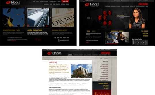
Take a look at the three screenshots from the Moore School of Business website. Although the content blocks on these pages are divided differently, there are several visual indicators that let users know that these are pages from the same site. Much of this unity is due to the repetition of the identity and navigation blocks. The consistent use of a very limited color palette (black, gray, yellow, and red) also helps to unify the pages.
The Principles of Beautiful Web Design
This article is from Jason Beaird’s The Principles of Beautiful Web Design book (the second edition of which is out now). This is the second part of the first chapter, which we’ll continue next by looking at the anatomy of web pages.
 Jason Beaird
Jason Beaird is a designer and front-end developer with over ten years of experience working on a wide range of award-winning web projects. With a background in graphic design and a passion for web standards, he’s always looking for accessible ways to make the Web a more beautiful place. When he’s not pushing pixels in Photoshop or tinkering with markup, Jason loves sharing his passion for the Web with others.


