Photoshop is great for taking your work from an idea to a finished product, which is why it is preferred by most industry professionals. You can set up a steady workflow for almost any scenario, whether you are a photographer, graphic designer, web designer, or a designer of mobile applications. In this tutorial, we will walk through the process of creating your own user interface in Photoshop.
Tips
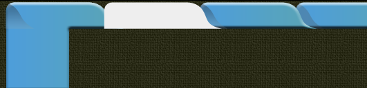
Setting Things Up How you set up the foundation for your app really depends on where it is going to live once it is created. If it is going to be a desktop application, then you will choose a different size and resolution than if it is going to be an iPad or an iPod app. In this example, I am going to create an app for the iPad. Know Thy Dimensions It won’t do anyone any good if you design your iPad app and it doesn’t display proportionally. Content will be clipped, or the user won’t be able to make a selection properly. When creating an app for any specific device, it is always good to know its dimensions. You can usually find tech specs on the maker’s website, or in some form of documentation. The iPad’s dimensions are portrait 768 x 1024 and landscape 1024 x 768. Consider Your Content Your app’s design also depends on its content. You can’t create a layout or a design that is an end-all solution for every situation, so it is a good idea to consider the easiest way to deliver your content, and set up your structure based on this idea. Keep it Simple I know we have heard this a million times, but in application design it is especially true. You need to keep the user experience as simple as possible. Make it intuitive, and make it so that any user — experienced or novice — will be able to work their way through your app. Look at the Competition This is not an opportunity to rip off other people’s work, but a chance to see what has been done, so that you might brainstorm about what you could add to make your app unique. You would look at key features of competing apps, as well as what elements are missing from them. You can learn a lot about what works well and what doesn’t from trying out competitor’s products. Consider the Natural Flow of Elements When creating a user interface here in the United States, we know what we are doing pretty well. We have an intuitive grasp of where certain elements should go. However, when we are designing for other countries, things may not be so intuitive. For example, Arabic countries read from right to left, which is opposite of the United States. When creating apps for English users, we normally read from left to right, so main elements, such as navigation should start on the left side. If your app’s experience flows in a sequential order, then you should start on the left side, and work in a flow from left to right. You should also flow from top to bottom, as this is the most intuitive flow to follow when reading content. Think of it as reading a book, because this is how we are trained in school to consume and scan content. Consider How the Platform Works Most mobile devices today are meant to work in both portrait and landscape modes. The iPad is no different. When you are designing the user interface for your app, you need to take this into account. Do you want to design your app solely for portrait mode? If your goal is to have your app respond to its orientation so that it fills the screen in both portrait and landscape, then you will need to consider both of these orientations.Step 1: Dividing your Canvas
Our example project is going to be an app that takes an umbrella site, and integrates all of its subdomains and articles into one place. The intention for this app is to be able to read several different site’s articles in one single app without having to jump from site to site. Our first step is to divide the canvas into the main areas for our content. We will need a vertical area for site navigation, and a horizontal for sub-navigation. We will also need an area for a preview of the actual article, and the last area will be for tweeting the article, or sharing it with Facebook or StumbleUpon.
Step 2: Add Texture For Visual Interest
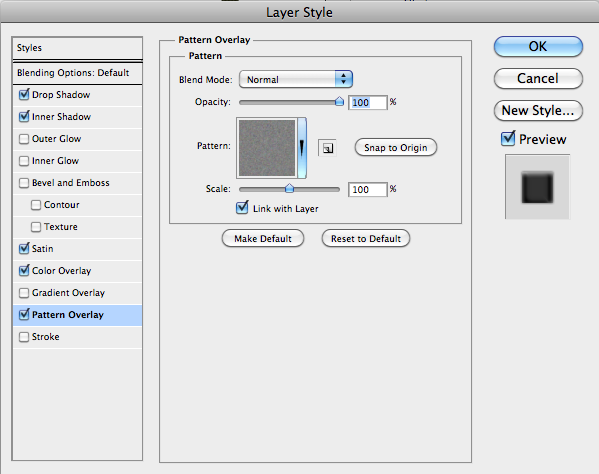
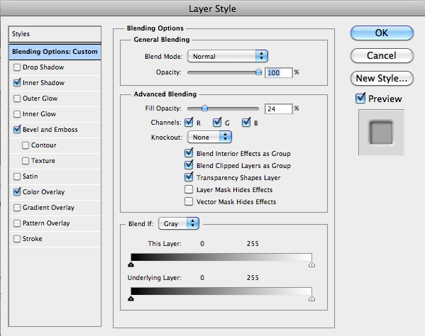
When designing any type of interface, it is good to have visual contrast. I know ahead of time that most of my app is going to be smooth, shiny, and possibly glossy. Adding a slight roughened texture to the background area can really add a nice visual impact to the background without distracting the viewer. I added a tan color overlay with a course weave textured pattern. The key is subtlety, so I dropped the opacity to 30% and the scale to 25%.
Step 3: Block in Your Main Areas, Adjust to Taste
A good idea — even if you have done preliminary sketches — is to block in main context areas with different colors. This way, you can get a visual preview of what the overall look will be. This is the step where you can play around with the width of each column, and make sure there is enough room for each logo in the left column, enough room for the content in the middle, and enough room for our icons in the right column.
Step 4: Make the Framework for Your Icons
I already had this set up for tutorial purposes, but I will show you how I set this up. Unfortunately, we are going to have to do some math in order to create our vertical menu on the left side. This may sound daunting, but I will help you to break it down. The SitePoint family has seven different icons, so we need to figure out how much space we need so that we can space them equally apart from each other, while leaving extra space at the top and the bottom. The reason that we want to leave around 50-75px of space at both the top and the bottom, is to leave room for sub-menus, buttons for other menus such as preferences, options, and settings, and anything else that we might integrate, such as social media integration, user account details, and more. In our example, the height is 768px tall, so we need to subtract at least 100px for our menu bar at the top and bottom. This leaves us with 668px of space, and we will divide that number by 7. The answer is roughly 95.42 pixels. If your want your right side nav buttons for each site to fill the space vertically, then each button will need to be roughly 95px tall. Keep in mind that you don’t have to fill the space vertically. You can always leave space for expansion later.Step 5: Draw Out Your Guides
I like to use rulers to set everything up, and I go by pixels instead of inches. To change your ruler measurements, right-click on the ruler itself and change inches to pixels. You can draw out your top guide to leave space for the menu we mentioned earlier.Step 6: Use a Template Rectangle to Save Time
We know from our calculations that we need to make each nav button on the left side 95px tall, so now we can use the marquee tool, and our top guide to create a template rectangle, and simply duplicate it and place it accordingly. To specify an exact size for our marquee tool, go to the top menu bar and change the normal setting to fixed size. Then, you will see the width and height options become active, so now you can dial your dimensions in. Fill the selection with the color that you want as the background. Make sure that you choose a color that will work with each icon, or decide to use normal text as the names for each menu.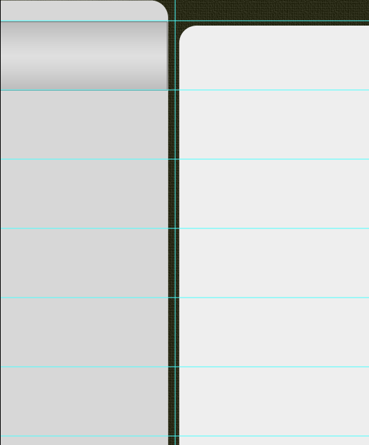
Step 7: Duplicate and Arrange
Duplicate your rectangle layer and stack them on top of each other until you have all 7 arranged vertically.
Step 8: Don’t Forget to Organize Your Layers
When you are creating your own user interfaces, your Photoshop files can end up getting very large, and they can become complicated to work with and difficult to navigate. Fortunately, Photoshop has integrated the ability to organize your layers by grouping them. You can take entire sections of your work, comprised by countless layers, and group them all in a folder. Simply select the layers that you wish to group together and go to “Layer” > “New” > “Group From Layers.” You can even name the group to make it easy to identify its contents. You’ll love this feature when you are working on something deeply detailed; one section of our mockup is made up of 75 layers.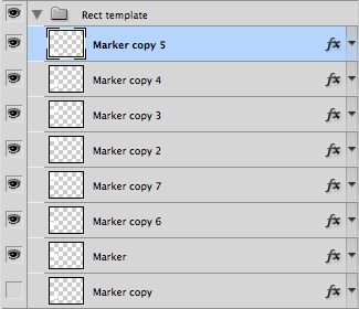
Step 9: Add Some Dimension
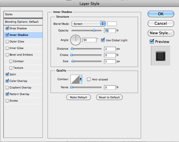
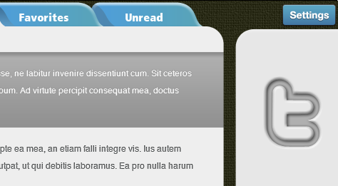
We need a method to visually note where the user is within the application. A user needs to know where they are at all times in relation to the rest of the application. Your indicators don’t have to be large and loud; they can be subtle, simple, and easy to notice. In our app, the normal state for our left menu is a slight gradient. To represent what the menu will look like when you mouse over or select an item, I created a shape that was opposite of our gradient. I added an inner shadow and highlighted the middle area to make it brighter.
Step 10: Import Logos or Create a Consistent Textual Menu
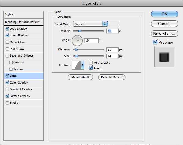
You can import several different types of files if you are importing logos. You can import Illustrator vector files, and you can import them as smart objects. Open the Illustrator file, select the logo, copy your selection, and switch back to Photoshop. When you go to “Edit” > “Paste,” you can paste as several options, but I usually choose “Paste as a smart object.” This leaves the files crisp, clean, and editable. Repeat this for your other logos. You can also use transparent PNG files. They are void of their background and are usually good quality in terms of resolution and color. Try to avoid low-resolution files such as GIF files or bitmaps, as they can be a hassle to work with. Center them within the left sidebar if you have room, but you can also shift them to the left slightly since you need to leave space for a navigation arrow that we will use to indicate which site’s article are selected.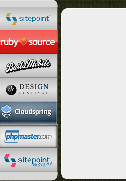 To create the arrow, select the custom shape tool and select a triangle. The size and shape aren’t important, because we can manipulate these via the anchor points. Make it fit the size and shape of the area where it belongs. Now, add a layer style to give it some dimension. I added a small drop shadow, a white inner shadow, and a satin layer style to give the arrow some shine.


 As you can see, with the inner shadow on the button area, and the arrow, it will be hard for the user not to know where they are within the application.

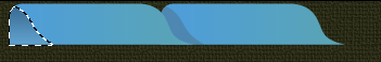
Step 11: Top Navigation
To break up the site visually, instead of using block-style buttons across the top, try creating a shapelier tabs menu. This adds some variation to your design, and it’s a great way to let users know where they are, because the tab is highlighted via dimension.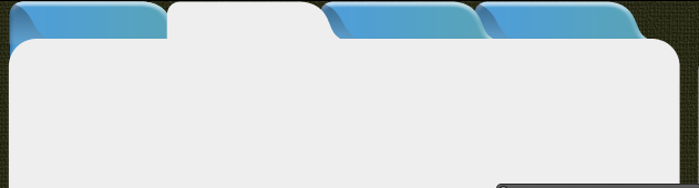 To create each tab, start by selecting the Rounded Rectangle Shape Tool. Use the Pen Tool and the Selection Tool to edit the shape until you have created the rounded shape shown below. Copy and paste the shapes until you have the four adjacent tabs that you need. One we will make white, because that will serve as our active tab. To create the shadow on the left side, hold down command/ctrl and click the layer icon to make a selection of the tab shape. Create a new layer and fill it with a darker blue color. Use the arrow keys and move the dark blue tab until it overlays the original tab. You can either clip the dark blue shadow tab to the tab layer below, or you can hit command/ctrl to load the regular tab as a selection. Then, select the dark blue tab layer, and hit command/ctrl + shift + “I” to invert the selection and select the excess, leaving only the shadow portion. Repeat this process for two other blue tabs.
 The tab on the far left will be exposed, so we will need to add to that portion of the blue tab so that it is seamless with the look of the content area. Use the Marquee Tool to draw a box large enough to fill the area that will span the area of the left portion of the white rounded corner. Merge this layer with the leftmost tab. Add some shape to each tab by adding a bevel and emboss layer style. Add a smooth inner bevel with a size of 5px to give each tab a soft, rounded feel. To save time, right-click on the layer style, select copy layer style, and then right-click on each of the other blue tab layers and select “Paste layer style.” This keeps you from having to redo each layer style individually.

Step 12: The Content Area
Each article excerpt will be a very light gray by default, but when you have it selected, it will turn a darker gray. Create a rounded rectangle that spans the empty area where your content will go. Be sure that it blends seamlessly with the white tab.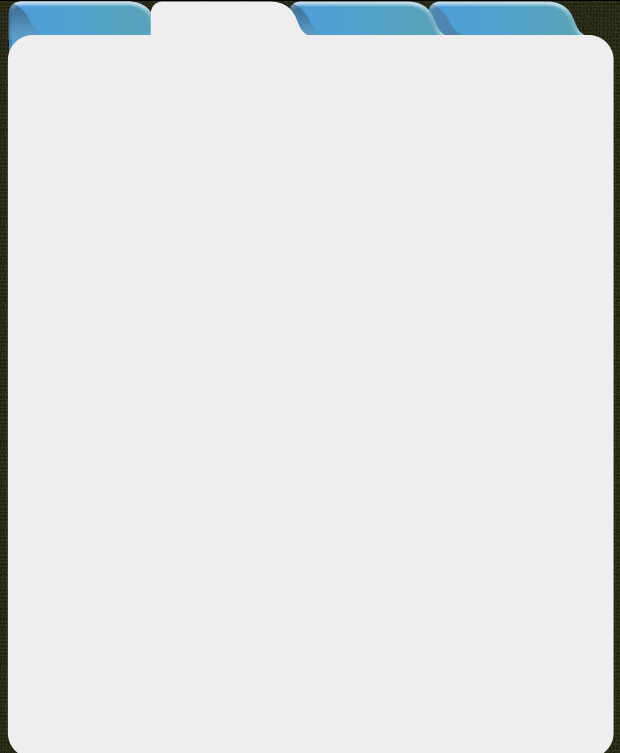
Step 13: Text For Your Tabs
Use your Text Tool and select a bold sans serif font to use for your text on your tabs. Sans-serif shows up the best, and it is usually a good idea to choose a bold typeface. Good choices are usually Verdana, Arial, or Helvetica. Arrange them visually in the center of each tab.
Step 14: Show the Excerpt
Draw out the text area using your Text Tool. You can simply click and drag to draw a box where you would like for the boundaries of the text to be. Here, I used representative text, since this is just a mockup. You can find this type of text on any lorem ipsum generation site. I knew that I wanted to show roughly three lines of text, and that the user would have to double-click on the excerpt to be able to read the article in its entirety. To show that the user has chosen an article, I created a bolder version. When an article is selected, I created a dark rectangle and white text, to remove any doubt as to which article is selected. I added an inner shadow layer style to add dimension to the selected version.

Step 15: Break up the Content
When there is a large amount of text, the user needs to be able to determine where one excerpt ends and another one begins. To make this as easy as possible, it is a good idea to use horizontal or vertical rules. To make the rule in the example, I used the Pen Tool and drew a horizontal line from left to right where the text begins and ends so that it aligns with each edge. I selected a 1px hard edge brush and in the Paths Panel, I click the second icon titled “Stroke path with brush.” It doesn’t matter what color you choose, because I went to the Layers Panel, set the fill to 0%, and added a slight drop shadow. be sure to set the distance to 0 to get an equal shadow all the way around. Hit Command/ctrl+ “J” to duplicate the layer as many times as needed to divide each excerpt.
Step 16: Make the User Aware of More Content
Select the custom shape tool and create an upside-down triangle. Fill it with your color of choice and add a slight bevel and emboss layer style to it. Place it at the bottom of the last excerpt to indicate that there is more content.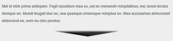
Step 17: Add Social Media
You can either make your own social media buttons, or you can download free ones from the Internet. There are literally hundreds of free Facebook and Twitter icons that you can download for free. The trick is to look for ones that are made with shapes or paths, or ones that are built in illustrator. You can import them as paths, giving you clean, crisp icons. For our app, I wanted a “pressed in” look, so I used shapes with proper negative space so that the inner edges would be embossed. Import your shape, and double-click the layer to bring up your layer styles. Select inner shadow, and set the distance to 1px and the size to 5px. Select Bevel and Emboss, and choose Outer Bevel. Set the direction to down and the size to 5px. Then, select Color Overlay and choose black as the color, and you should have a slightly inset Twitter icon.
 Import your other icons and copy the layer styles from the twitter icon and paste them onto the other social media icons. Space them equally from each other and align them to the center of the right column.

Step 18: Add a Button for Settings/Options
Let’s use the Rounded Rectangle Shape Tool to create a settings button in the upper right corner of your app. Sample the same blue that you used on the tabs earlier to create a sense of unity. Add a slight drop shadow with a distance and size of 1px each. Then, set the opacity to 40%. Add an inner shadow, but make it white and set the blend mode to “normal.” Set the distance to 1px and the size to 2px. Add a slight gradient overlay, with an opacity of 30% to add some dimension. Add a small 1px stroke, and set the type to gradient and make the gradient black to charcoal grey.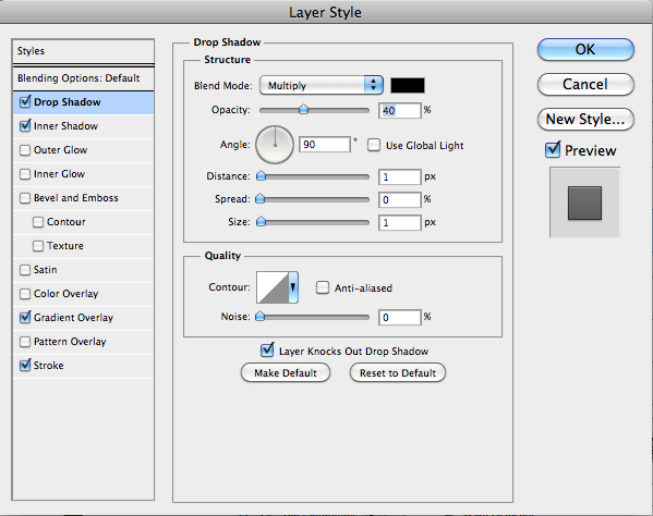


 Duplicate one of the text layers for the tab, and lower the size to fit the button that you made. Add a 1px drop shadow in your layer styles.
Step 19: Add a Button to Add Sites
We want to add a button to be able to add sites to our reading list. To do this, simply draw a thin rectangle, duplicate the layer, and hit command/ctrl + “T” to transform the second rectangle. Hold shift when rotating it to constrain it to 45° increments, and turn it until it is horizontal. Hit command/Ctrl + “E” to merge the two rectangles into a plus sign. Then copy the pressed layer style from one of the social media icons we used earlier. The effect is too strong at first, so we will want to lower the size on the bevel and emboss layer style to 2px. This will scale the effect to the smaller icon.
Conclusion
By implementing the techniques that we’ve covered in this tutorial, you can create a mock up of your app quickly and efficiently. Adding subtle textures, gradient overlays, and repeating elements will create an intuitive interface that promotes use, because it is visually interesting, and simple to navigate. Save time by copying and pasting layer styles on elements that are the same, and remember to give each section breathing room and space. The final result is show below: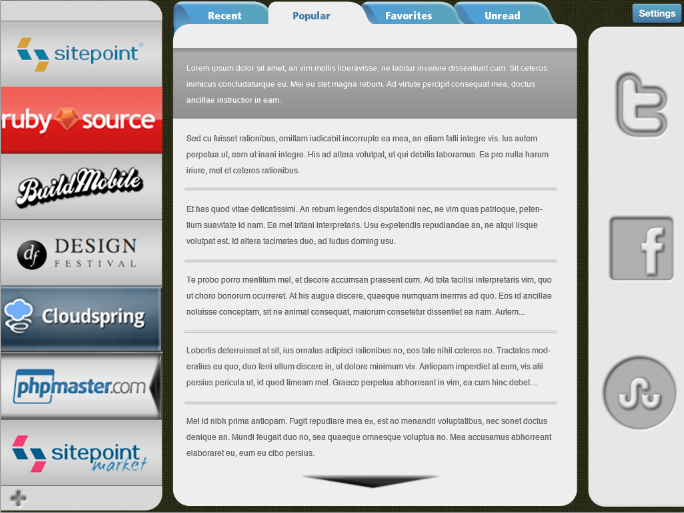
Frequently Asked Questions about Creating Your Own User Interface in Photoshop
How can I customize my workspace in Photoshop?
Customizing your workspace in Photoshop is a great way to improve your efficiency and workflow. You can do this by going to the ‘Window’ menu and selecting ‘Workspace’. From there, you can choose from a variety of preset workspaces or create your own by selecting and arranging panels in a way that best suits your needs. Remember to save your custom workspace by clicking on ‘New Workspace’ and giving it a name.
What are the key components of the Photoshop interface?
The Photoshop interface is made up of several key components. These include the Menu Bar at the top, which contains various commands and options; the Options Bar, which changes based on the tool you have selected; the Tools Panel, which contains all the tools you can use; and the Panels, which provide information and options for working with your images.
How can I use the Layers panel effectively?
The Layers panel is a crucial part of the Photoshop interface. It allows you to manage and organize your layers, which are like transparent sheets that you can stack and edit independently. You can create new layers, delete layers, group layers, and adjust layer opacity and blending modes. Understanding how to use the Layers panel effectively can greatly enhance your Photoshop skills.
What is the purpose of the Tools panel in Photoshop?
The Tools panel in Photoshop contains a variety of tools that you can use to create, edit, and manipulate your images. These tools include selection tools, painting and drawing tools, text tools, shape tools, and more. Each tool has its own set of options that you can adjust in the Options Bar.
How can I navigate my image using the Navigator panel?
The Navigator panel in Photoshop allows you to quickly move around your image, especially when you’re zoomed in. You can use the slider to zoom in and out, and you can click and drag the red box in the Navigator panel to move to different parts of your image.
What are the benefits of using the History panel in Photoshop?
The History panel in Photoshop allows you to undo and redo your actions, which can be a lifesaver when you make a mistake. It keeps track of each step you take in your editing process, and you can click on any step in the History panel to revert back to that point.
How can I use the Properties panel in Photoshop?
The Properties panel in Photoshop provides options and settings for the currently selected layer or tool. For example, if you have a text layer selected, the Properties panel will show options for text size, font, color, and more. Understanding how to use the Properties panel can help you fine-tune your edits and create more precise results.
What is the purpose of the Channels panel in Photoshop?
The Channels panel in Photoshop allows you to manage and edit the color channels in your image. Each image is made up of red, green, and blue channels, and you can edit each channel individually to adjust the colors in your image. You can also create alpha channels to make complex selections and masks.
How can I use the Brush panel in Photoshop?
The Brush panel in Photoshop provides options for customizing your brushes. You can adjust the size, hardness, spacing, shape dynamics, texture, and more. Customizing your brushes can help you achieve a variety of effects and styles in your artwork.
What is the role of the Adjustments panel in Photoshop?
The Adjustments panel in Photoshop allows you to apply non-destructive adjustments to your images. These adjustments include levels, curves, color balance, hue/saturation, and more. Because these adjustments are non-destructive, you can always revert back to your original image if needed.
 James George
James George is a professional web developer and graphic designer. James is an expert in design, and a professional web developer, with a special interest in WordPress. Founder of Design Crawl, James has been a professional designer since 2005.