Links have always been, well, links. A blue bit of text on a web page that takes you somewhere else. What’s perhaps most surprising about links is how little they’ve changed since their inception in 1965.
This is most likely because they haven’t needed to. They are just a way to navigate between two places.
However, in this age of fantastic new web technologies and platforms, links have changed too. In 2014 they can point to anything you want them to point out — external or internal pages, PDFs or SVGs, images or archives, even trigger events in JavaScript.
The problem is, looking at a (most commonly) blue piece of text gives absolutely no indication of what it’s likely to do! Sure, you can use helpful title attributes and informative link text, but at the end of the day, this might not be how your link needs to be visible.
So, how can we make links more informative?
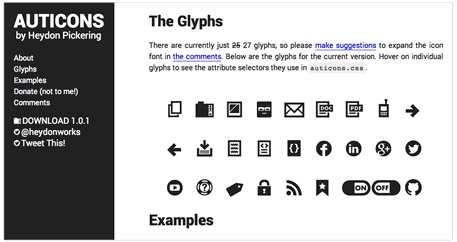
One great implementation I’ve seen recently (courtesy of Christian Heilmann) is Heydon Pickering’s Auticons.
Heydon uses CSS3 selectors to visually change the appearance of links without requiring any extra markup — and this works really well.
But, if you have a page full of links there is a problem: you end up with a cluttered page, crammed full of icons, as well as the blue link text!
The same applies to Mark Boulton’s Sparkicons — though that article is a very interesting read.
On To Some Code
My original idea involved using the rel attribute on the link to determine our styles as, in CSS3 you can use attribute selectors with ease.
Note that I’ve used *= for the selector, because the attribute might have more than one value (demo):
HTML
<a href="http://google.com" rel="external" title="An External Link">To Google</a>
CSS
a[rel*='external'] {
    position: relative;
}
a[rel*='external']:after {
    content: " \f08e";
    font-family: "FontAwesome";
    font-size: 12px;
    left: 50%;
    margin-left: -6px;
    opacity: 0;
    position: absolute;
    top: -22px;
    -webkit-transition: all .25s linear;
       -moz-transition: all .25s linear;
        -ms-transition: all .25s linear;
         -o-transition: all .25s linear;
            transition: all .25s linear;
}
a[rel*='external']:hover:after {
    opacity: 1;
    top: -18px;
}
My first example makes the icon fade in (using Font Awesome) above the link when you hover over it.
This is a really quick and dirty way to show that the link has some functionality beyond just taking you somewhere. You know it’s going to lead you off the website and can then act accordingly.
Bringing the Icons Inline
However, for links in the flow of text, you might not want the icon to appear from the top.
I’ve played around with a few ways of doing this.
So far, the best way I’ve found that doesn’t cause content to jump around when responding to the hover, involves setting aside some negative space for the icon.
Here’s the code:
a[href^='http'] {
    padding-right: 15px;
    position: relative;
}
a[href^='http']:after {
    content: "\f08e";
    font-family: "FontAwesome";
    font-size: 12px;
    right: -15px;
    opacity: 0;
    position: absolute;

    -webkit-transition: all .25s linear;
       -moz-transition: all .25s linear;
        -ms-transition: all .25s linear;
         -o-transition: all .25s linear;
            transition: all .25s linear;
}
a[href^='http']:hover:after {
    opacity: 1;
    right: 0;
}
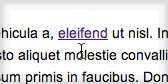
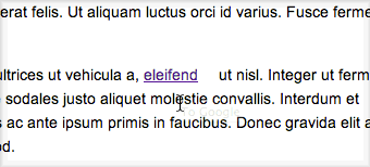
As you can see in the demo, we reserve some white space to the right of the link that is filled with the icon during the hover state. I don’t think this causes much of a display problem, especially once you realise that space does actually have some content in the hover state of the link.
But it’s not perfect.
Another alternative without the space reservation would be to have the icon appear on top of the text. For that you could give the icon a background color and change the opacity down a little, as in this example.
Personally, I do like this implementation but not the fact that you then can’t read the text in the link once hovered.
Text Out, Icon In
One final method was to hide the text completely and replace it with the icon. I think is a lot cleaner than having the icon appear on top of the text. Here is an example of this.
I’ve also added a bit of extra flair, and changed the icon as you lose the hover. Obviously, this is not helpful or informative, but just demonstrates some extra things you can do with this.
The only caveat for this example is that the link needs a fixed height for the line-height to work properly. I did manage to create a version that doesn’t, but this requires an extra piece of markup in the link to function correctly.
I do prefer this animation though, so if you don’t mind an extra span try it out (please note: on some versions of Chrome the transition property in CSS3 is buggy when the content property is changed. I’ve filed a bug report and this should be fixed in upcoming versions).
What About Mobile?
This is the big question mark: None of this will work correctly for mobile because there is no “hover” state. You see the link as it is, there’s no way to see the hover state until you actually touch the link to follow it.
This makes all of the above pretty redundant for mobile users, which is where it is almost certainly more relevant. You’re less likely to want to click on a PDF, for example, if you’re on a mobile device.
So, how can we get around this?
Well, what if we use media queries to always show the icons when the viewport is below a preset width?
@media only screen and (max-width: 800px) {

    a[href^='http']:after,
    a[href^='https']:after{
        opacity: 1;
        right: 0;
    }

}
(Resize your browser window in this demo to see the icon appear permanently below a certain threshold)
Another approach would be to use JavaScript to intercept the first touch on the link, and show the prescribed icon instead.
You already see this approach in some JavaScript tooltips implementations. On mobile they will show the tooltip on the first tap, and then follow the active link on the second tap.
However, I wouldn’t expect this to be a popular method, as having to click twice just to follow a link will irritate a lot of people.
Accessibility
There are some accessibility issues with this too. These are covered pretty well here by Karl Groves. The tl;dr is that content added by a CSS property is invisible to screen readers, so none of this information really helps those browsing the web with a screen reader.
However, you’d hope the title attribute of the link does enough to describe what its purpose (Plus, I believe the href attribute of links is read out on screen readers.)
Also, for people who like to browse with the keyboard, the examples above wouldn’t show a change when the link is active. To rectify this, you would just need to add a[href^='http://']:focus wherever you have the hover styles.
An easy fix.
And Finally…
As with Auticons, you can make deploy this approach widely throughout your project. If you have a lot of links to different content types, you can use the $= selector in CSS3 to target different links with certain files types.
For instance, if you want to just add an icon to PDF documents you might use the following as your selector:
a[href$='.pdf']
Add an icon for PDFs to your CSS and you’ve given people a handy little hint as to what they’re clicking on! Feel free to post your thoughts in the comments below.
And remember, you don’t have to use a font for your icons. You could create yourself custom images or use an icon-set with a background-image in the CSS.
 Alex Hall
Alex is a professional web designer and developer from the UK with over 10 years experience in the field. In his spare he's always tinkering with something new and web-based. He also loves most sports and rock climbing.


