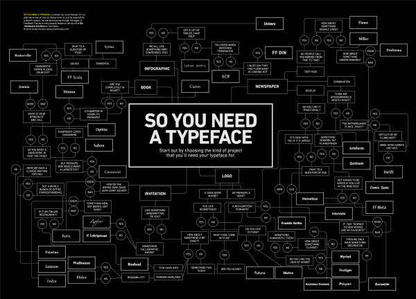
About five years ago Julian Hansen published a brilliant flowchart poster called ‘So You Need a Typeface‘. Answer a series of simple ‘yes/no’ questions and Julian will point you to the font you need.
While the poster is a little tongue-in-cheek, it gives you an idea of how complex font selection can be. Someone once said ‘Nobody ever got sacked for buying IBM’ and perhaps the same could be said for ‘choosing Helvetica’. As designers, we can easily be forgiven if we make safe typography decisions.
And, to be honest, that is generally sound advice – particularly with the denser, text-heavy webpages.
But it’s also a bit of a shame. The current website trend towards large image backgrounds and lower text provides a little more space for less conservative choices.
Logos & Movies
Movie titles and company logos are two areas with long histories of more inventive and daring typography. There’s simply more room to experiment with a logo than you might be afforded on a book, newspaper or magazine layouts.
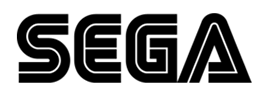
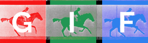
Back in 1975 Sega (formally ‘SErvice GAmes’) unveiled this epic sci-fi creation – all Star Trek, disco and circuit boards.
The logo has served Sega brilliantly and remains almost unchanged 40 years later. The CNN logo (1980) certainly paid homage to the Sega design, but I can’t remember seeing anything else like it since. Like glitter rock, it was kitsch and firmly rooted in its time.
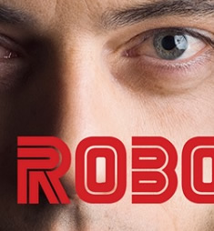
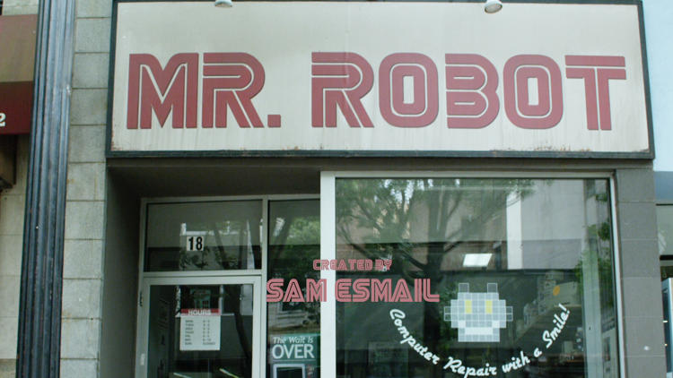
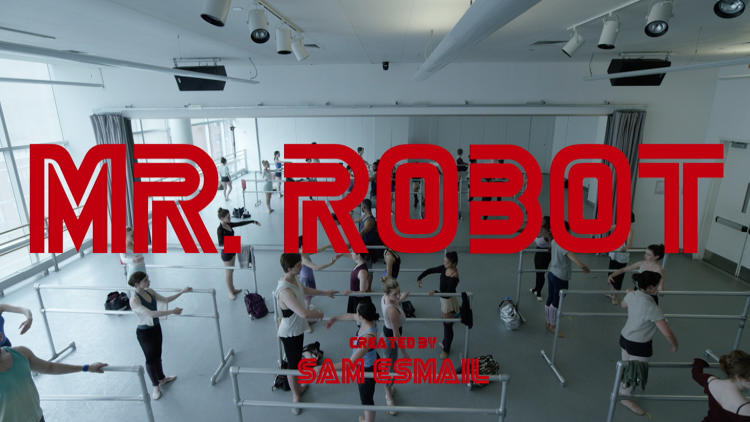
..Until ‘Mr. Robot’
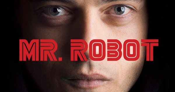
If you’ve missed it so far, Mr. Robot is a 2015 TV psychological thiller centered around a troubled, young computer security expert and a shady hacker group – think of it as ‘Edward Snowden in Breaking Bad’.
Everything from the scripting to the photography to the acting is amazing, but it’s the opening titles that really set the tone from the first seconds.
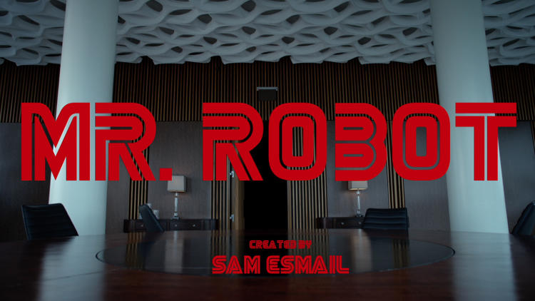
Each episode carefully crafts the ‘Mr. Robot’ title – in that super kitsch Sega-like font – into a new scene. The results are stunning. Touches of Kubrick framing mixed with 80’s video games blend to create a vaguely familiar yet disorienting tone. And that’s the intention – this is a dark, unsettling story.
Creator Sam Esmail said:
The typeface was the one ingredient about the opening titles that we kept as our flag of consistency… I must have looked at hundreds of fonts before settling on our current one.
Now as a designer, I’m fairly sure my natural instinct would have been to completely avoid a font like that. Futura would have been just fine. Univers would have worked. And nobody would have noticed – much less complained.
But I doubt either would have had the visual punch of that unloved and unlovable Sega-esque typeface.
There are plenty of other examples of oddball type choices working.
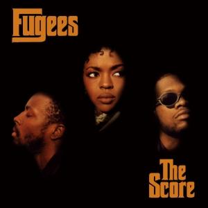
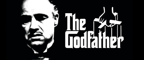
Back in the mid-90’s, The Fugees released this striking album cover for ‘The Score’, employing a very distinctive typeface. Though their R&B hip hop has little to do with italian-american mobsters, you might recognize that font from The Godfather trilogy.
It doesn’t have to only be about choosing obscure typefaces. Sometimes it’s about how a font is used.
Re-Inventing Clarendon
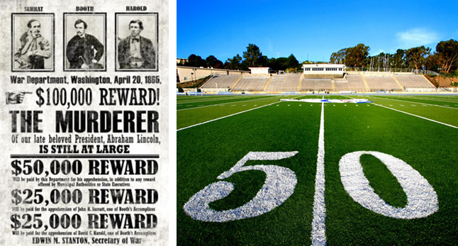
Londoner Robert Besley designed the Clarendon slab-serif way back in 1845 with newspapers in mind, but it might conjure up visions of all-capitals wanted posters to our eyes. You’ll even see it on NFL field markings. It looks heavy, solid and very official.
Yet in the 1960’s, Blue Note Records released a series of hip jazz masterworks with incredibly iconic covers dominated by fusty old Clarendon. Clarendon is very blocky and static when centered in all uppercase, but Reid Miles, the cover designer, found it had energy and shape when used in all lowercase. It has echoes of musical notation.
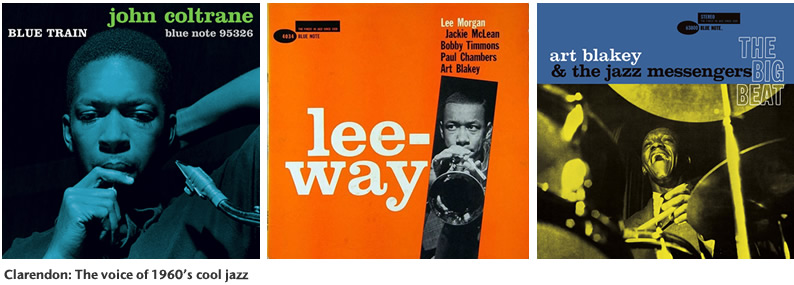
Miles also used a limited, flat color palette and loose asymmetric layouts to create a feeling of movement.
“Fifty Bucks an album…they loved it, thought it was modern, they thought it went with the music…one or two colors to work with at that time and some outrageous graphics!”.
To me, these are all glorious examples of the power of listening to what smart people might tell you – and doing the exact opposite.
Originally published in the SitePoint Design Newsletter.Frequently Asked Questions about Brave Typeface and Mr. Robot
What is the Brave Typeface used in Mr. Robot?
The Brave Typeface is a unique font style that was prominently used in the popular television series, Mr. Robot. This typeface is characterized by its bold, clean lines and modern aesthetic, which perfectly complements the show’s futuristic and tech-centric theme. It’s a sans-serif typeface, meaning it doesn’t have the small projecting features called “serifs” at the end of strokes. The Brave Typeface is versatile and can be used in various design projects, including web design, graphic design, and print media.
How can I download the Brave Typeface?
Unfortunately, the Brave Typeface is not available for public download as it is a proprietary font used specifically for the Mr. Robot series. However, there are similar fonts available online that you can use. Websites like FontSpace and DaFont offer a wide range of fonts that are similar in style to the Brave Typeface. Always ensure to check the licensing terms before using any font in your projects.
What are some similar fonts to the Brave Typeface?
If you’re looking for fonts similar to the Brave Typeface, you might want to consider fonts like Roboto, Montserrat, or Open Sans. These fonts share similar characteristics with the Brave Typeface, such as clean lines and a modern feel. They are also free to use, making them a great alternative for your design projects.
How can I use these fonts in my design projects?
Once you’ve downloaded a font, you can install it on your computer and use it in various design software like Adobe Photoshop, Illustrator, or even in word processing programs like Microsoft Word. Simply open the program, select the text tool, and choose the installed font from the dropdown menu.
Can I use the Brave Typeface for commercial purposes?
As the Brave Typeface is a proprietary font, it is not available for public use, including commercial purposes. However, the similar fonts mentioned earlier like Roboto, Montserrat, and Open Sans are free to use and can be used for both personal and commercial projects, subject to their respective licensing terms.
Why is the Brave Typeface so popular?
The popularity of the Brave Typeface can be attributed to its use in the Mr. Robot series. Its modern and clean aesthetic appeals to many designers and it fits perfectly with the show’s theme. Its versatility also makes it suitable for a wide range of design applications.
What is the history of the Brave Typeface?
The Brave Typeface was specifically designed for the Mr. Robot series. Its unique design and modern aesthetic were created to match the show’s futuristic and tech-centric theme. The exact details of its creation and the designer behind it are not publicly available.
Can I create my own version of the Brave Typeface?
Creating your own version of a proprietary font like the Brave Typeface can be a complex process and may involve legal issues. It’s always best to use available fonts or hire a professional font designer if you need a specific typeface for your project.
How can I identify a font used in a TV show or movie?
There are several online tools and websites that can help you identify fonts used in TV shows, movies, or any other media. Websites like Font Squirrel’s Matcherator, WhatTheFont, and Identifont can help you identify a font by uploading an image of the text.
What other TV shows or movies use unique fonts like the Brave Typeface?
Many TV shows and movies use unique fonts to help establish their brand and theme. For example, the Harry Potter series uses the ‘Harry P’ font, and the Star Wars series uses the ‘Star Jedi’ font. These fonts, like the Brave Typeface, become synonymous with the show or movie they represent.
 Alex Walker
Alex has been doing cruel and unusual things to CSS since 2001. He is the lead front-end design and dev for SitePoint and one-time SitePoint's Design and UX editor with over 150+ newsletter written. Co-author of The Principles of Beautiful Web Design. Now Alex is involved in the planning, development, production, and marketing of a huge range of printed and online products and references. He has designed over 60+ of SitePoint's book covers.


