While all designers would love it if the pursuit of design could be for purely artistic purposes, well, we all have to pay the rent somehow. So applying design to commercial pursuits – specifically branding – is an excellent place where artistic pursuits and commercial application come together.
One example of applying design principles to branding is with Avivo. Denis Olenik was the lead designer, and he has graciously provided us a snapshot of his process in developing a brand from scratch. As you read through this article, notice how Denis uses various tools, design definitions, and fundamental design concepts – like repetition – to build a beautiful brand portfolio for Avivo.
Also, be sure to check out the impressive corporate identity collections at the end of this post to gather inspiration for your own brand projects.
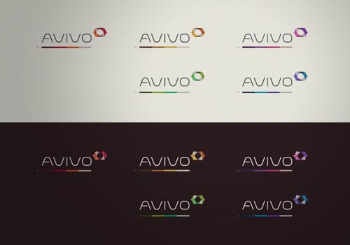
Designing the logo
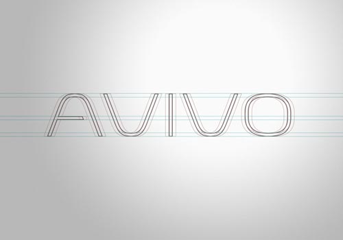
Of course, one of the keys to a successful brand will always be a logo. Notice how designing the company name and logo went hand in hand. Careful application of scale was applied and the result is a well-balanced look and feel.

Typography
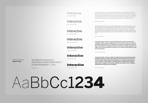
Another key to a successful brand is careful and consistent use of typography. If at all possible, the font selection should be used throughout all mediums, unless mixing it up is appropriate.
Note how the typographical selection by Denis ties so well into the company name. Of equal importance is the fact that the font face has been defined and documented. This level of due diligence is necessary for a complete brand portfolio.
Color selection and definition
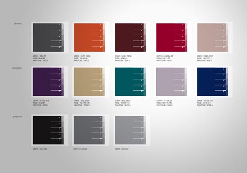
Denis then moves to color selection and definition. You can see the carefully selected palettes to be used in the first image below. Next, the colors are defined in CMYK, RGB, and Pantone colors. Finally, the colors are applied and defined, giving the company multiple but consistent options.

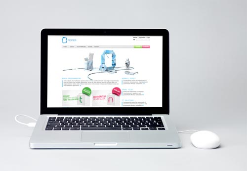
Application of the brand
Finally, we get to see the brand applied to some real world marketing collateral. Note how the brand works well in multiple media and formats, from business cards to smart phones.


More Corporate Identity Collections
The following are a collection of some corporate identity projects designed by some incredibly talented designers. Take a look, gather some inspiration, and use your newly refreshed creative juices to create some amazing designs!
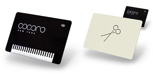
Cocoro New York by Mark Brooks
This hair salon certainly has a “New York” look and feel with the right style and colors of brand.
![]()
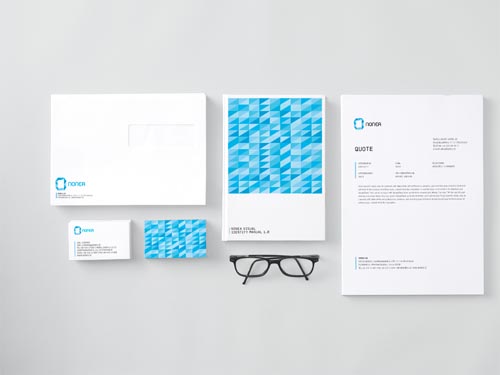
Nonea by ChevyChase
The typography matches the graphics for this brand perfectly.

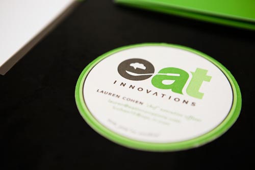
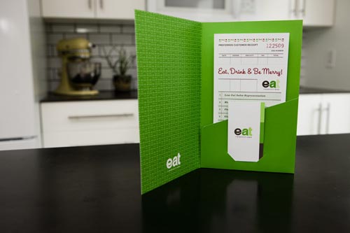
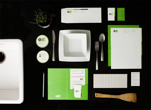
Eat by Ptarmak
The images within the negative space of this company’s logo is brilliant!

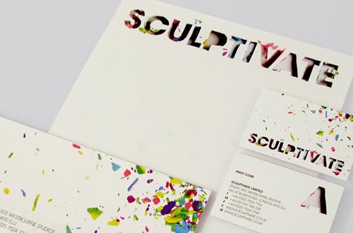
Cultivate by Thisisroot
Root developed the look for this design and build agency for environments by pushing Play-Doh through a stencil.
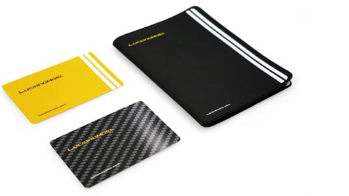
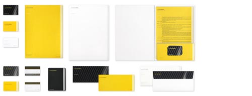
Luciano Moto by Undesign.it
The brand for this motorbike showroom in Europe beautifully portrays the feel of racing motorbikes with a bold font full of forward motion, yellow background, racing stripes, and tire marks.

Cow branding image by Steve Corey.
 Tara Hornor
Tara Hornor has a degree in English and has found her niche writing about marketing, advertising, branding, graphic design, and desktop publishing. She is a Senior Editor for Creative Content Experts, a company that specializes in guest blogging and building backlinks. In addition to her writing career, Tara also enjoys spending time with her husband and two children.