Is your site mobile-aware? Is it truly responsive? If it’s not, according to eMarketer, there are expected to be more than 1.75 billion smartphone users this year. By 2017 global mobile phone penetration will rise to 69.4% of the population.
I know: You’ve heard the chants before; the internet is everywhere; next year the internet will only be viewed on a mobile device; desktop computers are going the way of the dinosaurs…
But seriously, that’s what’s happening! Whether you like it or not, if you don’t get on the bandwagon, that site you’ve invested so heavily in may soon have a very limited audience.
But then it gets complicated, as there’s no one mobile landscape. With the release of the iPhone 6 and 6 Plus recently, there are nothing less than 46 competing devices, all with different resolutions and hardware capabilities. And in addition to that, there’s network speed to contend with.
Whereas on the desktop, you might think only in terms of Wifi or DSL speed, with mobile handsets there’s all the different network data speeds, namely: GPRS, EDGE, 3G and LTE (4G).
While you can make a mobile-aware site, can you make one which handles such a wide range of devices that also works well across different data speeds?
I now want to show you two simple tools; tools which can help you respond to the most common devices and speeds and stay on top of the development issues, until your site’s perfect. Let’s start with number one.
Mobile Emulation in Google Chrome
With the release of Chrome 32 a new developer tool was added — mobile emulation. This tool is an absolute godsend for debugging mobile and responsive designs.
If you don’t already have it open, open it with one of the following options:
- Press F12 (or Cmd+Alt+l on a Mac)
- Click Developer Tools under View -> Developer
- Right click anywhere on a website and click Inspect Element
At the top of the developer tools window you’ll see a new icon, which looks like a mobile phone. Click that and the mobile emulation mode will be enabled for the site you’re currently on, as you can see in the screenshot below.
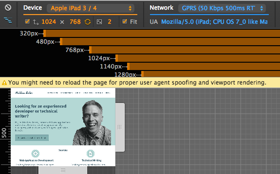
You can see the normal developer tools are available, but there are a number of additional options, and the site’s been rendered to simulate a mobile device, in this case an iPhone 6 Plus. Let’s look at it in some more detail now.
Device Configuration
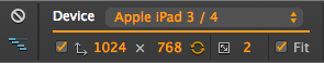
At the top left, there’s a device configuration, allowing you to pick from one of 46 mobile devices to emulate. Below the device list you can see options for:
- Screen resolution
- Display rotation between landscape and portrait
- Set the device pixel ratio
- Fit the display within the visible viewing area or display
it at the full size
Network Configuration
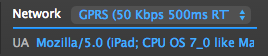
Next, in blue, is the network configuration. There you can set the network speed, all the way from offline to no throttling. This will help you see just how fast, or slow, your site will load depending on the speed of the network the user is on.
Under ‘network’, you can manually set the user agent. This will help you see how your site will respond.
Breakpoints
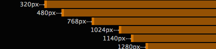
Now what about those breakpoints? The tool will automatically detect all the breakpoints you’ve set in CSS and provide a link to each one. You can see in the image below it has detected 6. By clicking on each of them, you can see how the page renders at each.
One point about User-Agent strings; if you don’t want to set them manually, you don’t have to. By clicking escape on your keyboard, you can open up further configuration options and pick from a list of pre-set user agents to spoof.
In addition to this, you can also emulate hardware device sensors, including touch input, geolocation and an accelerometer.
Usersnap Extension
With all the configurability this new edition provides, designing for mobile devices just became a whole lot easier. But that’s not the end of the story.
It’s one thing to see how the site renders under different conditions, but how do you share the results with your developers and designers?
The Usersnap Chrome extension integrates nicely with this new addition to the Chrome developer tools. You can take the screen annotation and reporting capability you’ll be familiar with if you’ve ever used the Usersnap Widget and apply it to your design sessions with the mobile emulation plugin.
If you don’t already have it, install it from the Chrome Web Store. Once installed, you’ll see a Usersnap icon appear in the Chrome toolbar. The first time you use it, a small prompt will appear indicating you have to configure it.
Click ‘ok’, and after logging in to Usersnap, you’ll be taken to the configuration page of the tool. At the bottom of the page, as below, you’ll see a list of your projects.
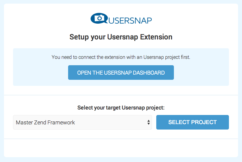
Pick a relevant one from the list and click Select Project. With that done, you’re now ready to use the extension. Going back to the mobile emulation plugin, I noticed that when the page hits the 768px breakpoint, it stops rendering correctly.
So I want to let my team know about it so I can get it fixed. Clicking on the Usersnap button opens up what I saw of the site in the Usersnap editor, where I have all the usual functionality available. I can add a comment, highlight, note, blackout, ruler, and draw onscreen.
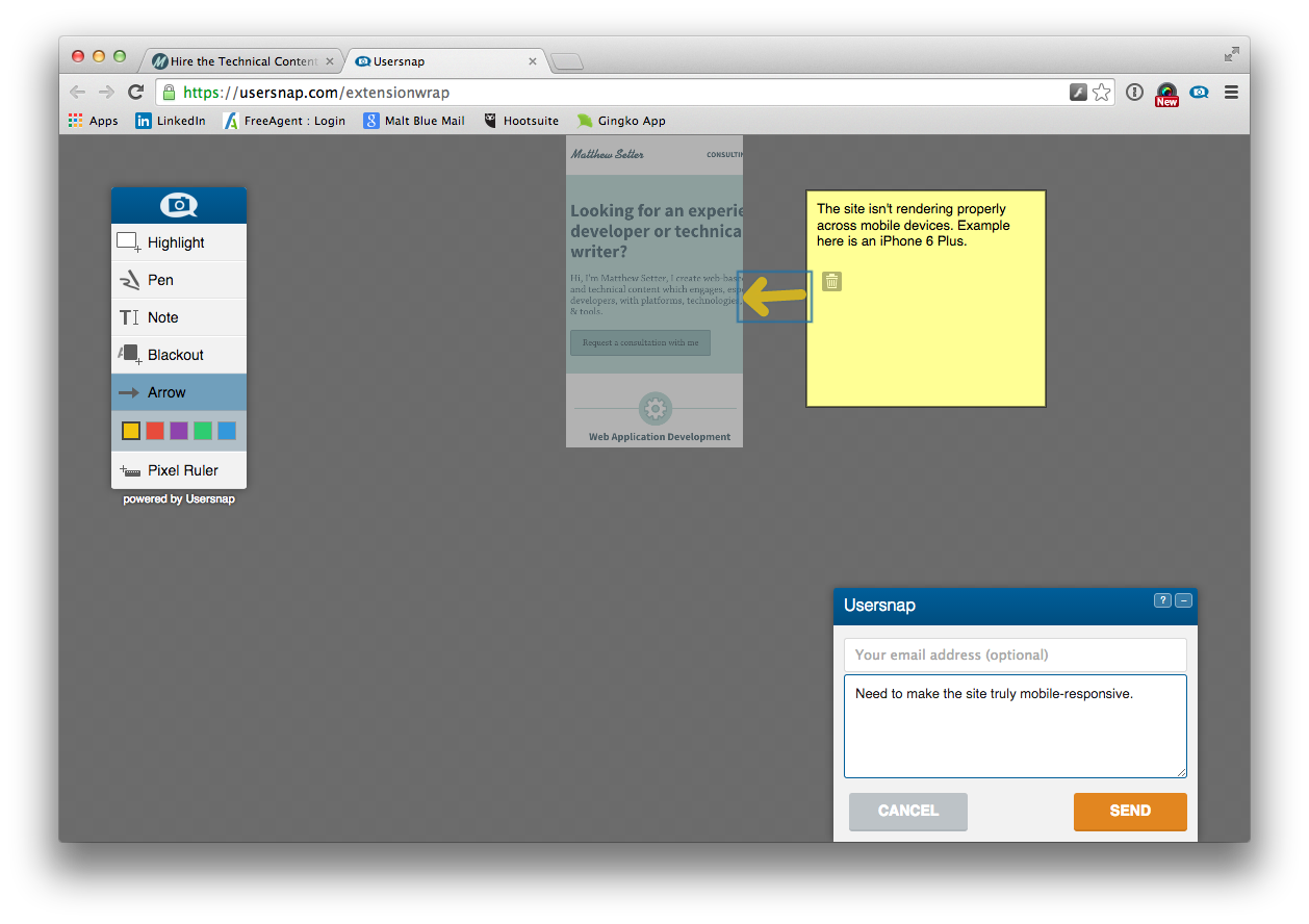
You can see in the screenshot above that I’ve made some annotations for my team to let them know what the site looks like and that it needs some changes to have the site render correctly on a mobile device. Now you have even more flexibility and control than ever before to design, develop, and debug great web sites and applications.
Wrapping Up
So there you have it, two great tools to help you simplify the effort required to ensure cross-device compatibility of your website or web app.
Have you tried them yet? What’s your experience been like?
Frequently Asked Questions (FAQs) about Responsive Website Testing
What is the importance of responsive website testing?
Responsive website testing is crucial in today’s digital age where users access websites from a variety of devices with different screen sizes. It ensures that your website provides an optimal viewing and interaction experience—easy reading and navigation with a minimum of resizing, panning, and scrolling—across a wide range of devices. Without responsive testing, you risk providing a poor user experience, which can lead to increased bounce rates, lower search engine rankings, and a decrease in conversions and sales.
How does Google Chrome aid in responsive website testing?
Google Chrome offers a built-in tool for responsive website testing. This tool, known as DevTools, allows developers to simulate a variety of devices and screen sizes. It also provides options to test the website’s performance under different network conditions. This makes it a comprehensive tool for ensuring your website performs optimally on all devices and under various conditions.
How does the Responsive Tester extension for Chrome work?
The Responsive Tester extension for Chrome allows you to test your website’s responsiveness on different screen resolutions. After installing the extension, you can select from a list of preset screen resolutions or input custom dimensions. The extension then resizes your browser window to simulate the selected screen size, allowing you to see how your website adapts.
What is Google’s Mobile-Friendly Test?
Google’s Mobile-Friendly Test is a free tool that allows you to check if your website is mobile-friendly. It analyzes your website and provides a report on any issues that might affect the user experience on mobile devices. This tool is essential for ensuring your website is not only responsive but also optimized for mobile users.
How does the Responsive Test Tool differ from other testing tools?
The Responsive Test Tool is a web-based tool that allows you to test your website’s responsiveness on various devices and screen sizes simultaneously. Unlike other tools that only simulate one device or screen size at a time, the Responsive Test Tool provides a side-by-side comparison, making it easier to spot any inconsistencies or issues.
What is BrowserStack and how does it aid in responsive testing?
BrowserStack is a cloud-based testing platform that allows you to test your website on real devices and browsers. It provides a more accurate representation of the user experience compared to simulators or emulators. With BrowserStack, you can test your website’s responsiveness on a wide range of devices and browsers without needing to own or maintain a device lab.
How does the Responsive Design Checker tool work?
The Responsive Design Checker is a web-based tool that allows you to test your website’s design on various screen sizes. You simply enter your website’s URL, and the tool displays how your website appears on different devices. It also provides a feature to rotate the screen, simulating both portrait and landscape orientations.
How often should I perform responsive website testing?
Responsive website testing should be an ongoing process. It’s recommended to test your website each time you make a significant change or update. Regular testing ensures that your website continues to provide an optimal user experience across all devices and screen sizes.
Can I perform responsive website testing without any tools?
While it’s possible to manually resize your browser window to simulate different screen sizes, this method is not as accurate or efficient as using a dedicated testing tool. Tools like Google’s DevTools, Responsive Tester, and BrowserStack provide more accurate simulations and offer additional features that can aid in identifying and resolving issues.
What are some common issues found during responsive website testing?
Common issues found during responsive website testing include elements not resizing properly, text being too small to read, links being too close together, and content not fitting the screen. These issues can negatively impact the user experience and should be addressed promptly to ensure your website is truly responsive.
 Matthew Setter
Matthew Setter is a software developer, specialising in reliable, tested, and secure PHP code. He’s also the author of Mezzio Essentials (https://mezzioessentials.com) a comprehensive introduction to developing applications with PHP's Mezzio Framework.