With responsive practically becoming the standard, it’s harder than ever to define the best size for a website. Before responsive became mainstream, we used to base our design width on which screen sizes were popular at the moment.
This way you knew that at least way a large portion of your sites’ visitors would see the site as you intended. But as screens became bigger, so did our websites. Only to be followed by smaller screen sizes, due to smaller laptops becoming popular.
Luckily responsive sites solve a lot of this bouncing up and down so you can make you website look good on most screens. But it still doesn’t answer the question of what is the best size for a website. Time to do some research.
A little bit of screen size history
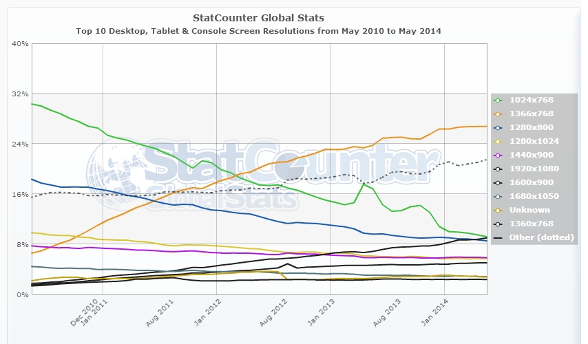
Let’s first look at some of the most popular screen sizes over the years. According to the data Statcounter (a popular free visitor counter) provides, 1024×768 was the most popular size up until March 2012. That month it was surpassed by 1366×768, which is still the most popular today.
The difference between these two sizes? 1366×768 is widescreen with a 16:9 ratio, where 1024×768 has the more traditional 4:3 ratio. This shift marks the change from regular desktop monitors to the still very popular widescreen laptops.
The 1366×768 size is just for display screens ranging from 10.1 to 16 inch, but you can imagine it won’t look that pretty on the latter.
So it’s safe to say that if you decide to use a static size, 1366×768 is your safest bet. That is if you cater a general audience.
1920×1080 (Full HD screens) is on the rise too, especially with a tech oriented audience. This means these people will see your 1366×768 site with large empty spaces left and right.
And did you see the large “Other” line in the StatCounter screenshot? There’s just a whole range of different screen sizes to design for which don’t fall in the listed size categories. That’s where responsive comes into play.
How about responsive?
Making a site responsive is more popular than ever. It allows for one design which is displayed full width on any screen size. Adapting a websites’ view size is regulated with CSS and is based on the viewport of the device a visitor is using. The viewport is the visible part of your website, without scroll bars.
Annarita wrote an excellent article about the concepts of responsive design here on SitePoint.com. You can read it here.
A general assumption is that you can use a responsive design to make a website look good on any type of device. That is not entirely true. A responsive design makes sure that the maximum view space of each device is used when viewing your site. It basically means no horizontal scroll bars. But that doesn’t mean it will actually look good.
To see a live example, please have a look at one of my sites which uses responsive design. It uses a full page background image which I believe looks great on a Full HD monitor (which I’m using myself). The sidebars are still on default settings.
The WordPress theme I use is optimized for responsive, which means, for example, even the call-to-action “Apply” boxes scale down.
Now re-size your browser, and see what happens. The sidebars are moved below the main content, therefore losing their use as sidebars. They become just a bunch of boxes for which no one will take the effort to scroll down to see them. Imagine if you HAD ads put in there: this will severely reduce your earnings. It looks even worse on mobile, toO crammed up which makes your small mobile screen feel even smaller.
While I don’t like the sidebars below the content, I wouldn’t want them placed in between content either. I may be a bit biased since I really don’t like responsive (I decide to buy a larger phone and use desktop sizes instead), but you have to be really creative if you want to make proper use of sidebars.
You basically have to accept the fact that you need to include your most important links and ads in-content or they probably won’t get seen. But you need to be very sure this design still looks good on desktop or tablets (for which you should disable responsive), since it’s bound to mess up your layout if you don’t keep an eye on it.
Responsive design works better for layouts which don’t include sidebars in the first place. But there’s only so much room on smaller screens, so even with an optimized mobile layout you need to decide which content you want to show the most.
So is responsive the best “size” for a website? Probably yes, but life was much easier when we were all just using the same screens.
Let me know in the comments what you think is the best size for a website, or what your thoughts are on responsive design in general.
Frequently Asked Questions about Website Size and Design
What is the ideal website size for mobile devices?
The ideal website size for mobile devices varies depending on the device’s screen size. However, most designers aim for a width of 320 to 480 pixels for mobile-friendly websites. This range accommodates the majority of smartphone screen sizes, ensuring that your website is accessible and user-friendly for mobile users. Remember, it’s crucial to optimize your website for mobile devices as more than half of global web traffic comes from mobile.
How does screen resolution impact website design?
Screen resolution refers to the number of pixels displayed on the screen and significantly impacts website design. A higher screen resolution means more pixels, leading to sharper and clearer images. However, if a website is designed for a high resolution and viewed on a lower resolution screen, it may appear small and hard to read. Therefore, it’s essential to design websites that can adapt to various screen resolutions for the best user experience.
What is the significance of responsive design in website size?
Responsive design is a web design approach that makes your website look good on all devices, regardless of their screen size. It automatically adjusts the layout, images, and functionalities of your website to fit the device on which it’s being viewed. This is crucial in today’s digital age, where people use multiple devices with different screen sizes to browse the internet. A responsive design ensures that your website provides a consistent user experience across all platforms.
How does website size affect loading speed?
The size of your website, particularly the size of your images and other media files, can significantly affect your site’s loading speed. Larger files take longer to load, which can frustrate users and lead them to leave your site. Therefore, it’s essential to optimize your images and other media files to ensure your website loads quickly.
What is the recommended website size for desktops?
The recommended website size for desktops is typically between 1024 and 1920 pixels in width. This range accommodates most desktop screen sizes, ensuring that your website looks good and functions well on all desktop devices. However, it’s also important to consider the height of your website and ensure that important information is visible without scrolling.
How can I test my website on different screen sizes?
There are several tools available online that allow you to test how your website looks on different screen sizes. These tools simulate various screen sizes and resolutions, helping you identify any issues with your website’s design. Some popular options include BrowserStack, Google’s Mobile-Friendly Test, and Screenfly.
How does website size affect SEO?
Website size can impact SEO in several ways. Larger websites with more content tend to rank higher in search engine results. However, if your website is too large and takes too long to load, it can negatively impact your SEO. Search engines like Google prioritize websites that provide a good user experience, which includes fast loading times.
What is the role of CSS in website size and design?
CSS, or Cascading Style Sheets, is a style sheet language used for describing the look and formatting of a document written in HTML. CSS plays a crucial role in website size and design as it allows you to control the layout of multiple web pages all at once. It also enables you to create responsive designs that adapt to different screen sizes.
How can I optimize my website for different screen sizes?
Optimizing your website for different screen sizes involves implementing a responsive design, optimizing your images and media files, and testing your website on various devices. You can use CSS to create a responsive design that automatically adjusts to fit the screen size. Additionally, you should compress your images and media files to ensure they load quickly on all devices.
What is the impact of website size on user experience?
The size of your website can significantly impact the user experience. If your website is too large and takes too long to load, users may become frustrated and leave. On the other hand, if your website is too small and doesn’t provide enough information, users may not find what they’re looking for. Therefore, it’s essential to strike a balance and create a website that provides valuable content without sacrificing speed and performance.
 Jacco Blankenspoor
Jacco Blankenspoor is a website developer from the Netherlands, and is currently just building lots of different websites. When he is not working on HIPAAHQ.com you might catch him grinding coffee.