In a figurative sense, the concept of visual balance is similar to that of physical balance illustrated by a seesaw. Just as physical objects have weight, so do the elements of a layout. If the elements on either side of a layout are of equal weight, they balance one another. There are two main forms of visual balance: symmetrical and asymmetrical.
Symmetrical Balance
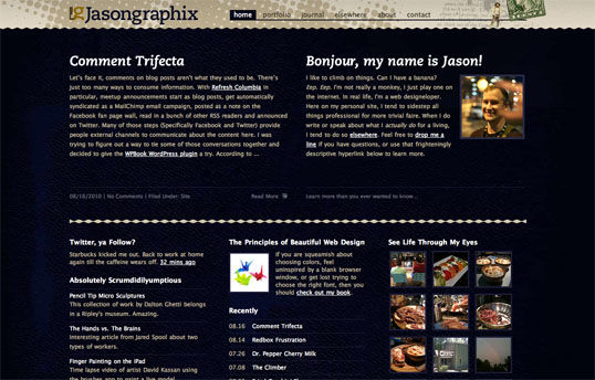
Symmetrical balance, or formal balance, occurs when the elements of a composition are the same on either side of an axis line. The digital painting Contemplation by David Lanham shown below, illustrates this concept well. Notice how the male and female figures are similar in position and proportion. Even the shaded background boxes are mirror images of one another.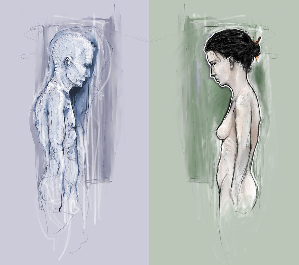 Although it may not be practical for all designs and clients, this type of symmetry—called horizontal symmetry—can be applied to website layouts by centering content or balancing it between columns. The home page layout of my personal site design is an example of such symmetry. Notice on the screenshot, below, that the content areas graduate from two columns at the top of the page to three columns at the bottom, yet the layout still maintains its symmetrical balance:
 The two other forms of symmetrical balance are less common in website design, due to the nature of the medium. They are, however, commonly exhibited in logo and print design:
- bilateral symmetry, which exists when a composition is balanced on more than one axis
- radial symmetry, which occurs when elements are equally spaced around a central point
Asymmetrical Balance
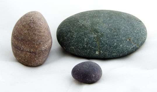
Asymmetrical balance, or informal balance, is a little more abstract (and more visually interesting in general) than symmetrical balance. Rather than mirror images on either side of the layout, asymmetrical balance involves objects of differing size, shape, tone, or placement. These objects are arranged so that, despite their differences, they equalize the weight of the page; for instance, if you have a large object on one side of a page, and partner it with several smaller items on the other side, the composition can still feel balanced. The concert poster by my friend Jeremy Darty seen below is a fine example of asymmetrical balance. The visual weight of the large pink flamingo on the left is balanced by the combined weight of the smaller flamingos and text blocks on the right-hand side of the layout. Notice, also, Jeremy’s use of the rule of thirds. The blue cloud behind the Pop Sucks title takes up one-third of the vertical space and spans two-thirds of the horizontal. Take a look at the photo below of the three stones. It may not be a particularly exciting picture, but as far as balance goes, it rocks! If you were to use a piece of paper to cover any one of the three stones below, the entire photograph would feel unbalanced and unfinished. This is generally the way balance works. It’s as if the entire composition is in a picture frame hanging by a single nail on the wall. It barely takes much weight on one side or the other to shift the entire picture off balance.
 Unlike symmetrical balance, asymmetrical balance is versatile and, as such, is used more often on the Web. If you take a look at most two-column website layouts, you’ll notice that the wider column is often lighter in color—a tactic that creates a good contrast for the text and main content. The diminutive navigational column is often darker, has some sort of border, or is made to stand out in another way, in order to create balance within the layout. The About Us page of the Steinway & Sons website, shown in the screenshow below, is an excellent example of asymmetrical balance. In this example, there’s no defined right column, just a large stoic image of the company’s founder. That epic moustache carries a lot of weight, but it’s balanced out by the sizeable italic headline atop the main content.
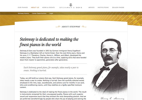 There are many other principles at work in Jesse Bennet Chamberlain’s design of the Steinway & Sons site, and it goes beyond asymmetrical balance. The site has great harmony (no pun intended), which comes from the repeated use of curves, textures, and consistent typefaces. Much of that harmony can be explained via the principles of unity.
The Principles of Beautiful Web Design This article is from Jason Beaird’s The Principles of Beautiful Web Design book (the second edition of which is out now). This is the fifth part of the first chapter.
Frequently Asked Questions about Balance in Design
What is the importance of balance in design?
Balance is a fundamental principle in design that contributes to how well a design is perceived. It provides stability and structure to a design. When elements are balanced, it creates a sense of harmony and cohesion, making the design more appealing and effective. Balance can be achieved through symmetry, asymmetry, or radial balance. Each type of balance can evoke different emotions and reactions from the viewer, making it a powerful tool in the hands of a designer.
How can I achieve balance in my design?
Achieving balance in design involves careful consideration of the visual weight and distribution of elements. This can be achieved through symmetry, where elements are mirrored on either side of a central axis, asymmetry, where different elements are balanced due to their visual weight, or radial balance, where elements radiate from a central point. The choice of balance depends on the message you want to convey with your design.
What is the difference between symmetrical and asymmetrical balance?
Symmetrical balance refers to the arrangement of elements in a design in a way that they are mirrored on either side of a central axis. This type of balance often conveys a sense of formality, stability, and dignity. On the other hand, asymmetrical balance involves different elements that have equal visual weight. This type of balance is more dynamic and can create a sense of movement and excitement in a design.
How does color affect balance in design?
Color plays a significant role in achieving balance in design. Different colors can have different visual weights. For instance, darker colors tend to appear heavier than lighter ones. Therefore, a smaller area of a darker color can balance a larger area of a lighter color. Understanding how to use color to balance your design can greatly enhance its effectiveness.
Can a design be unbalanced and still be effective?
Yes, a design can be intentionally unbalanced to create tension, draw attention, or convey a particular mood or message. However, this should be done carefully as an unbalanced design can also appear chaotic and confusing to the viewer.
What is radial balance in design?
Radial balance is a type of balance where elements radiate from a central point. It is often used in designs that depict nature, like flowers or snowflakes, but can also be used in other types of designs to create a sense of harmony and unity.
How does balance relate to other principles of design?
Balance is closely related to other design principles like contrast, emphasis, and unity. For instance, contrast can be used to create visual interest and balance in a design. Similarly, balance can help to emphasize certain elements in a design and create a sense of unity.
How can I use balance to improve my designs?
Understanding and applying the principle of balance can greatly improve your designs. It can help you create designs that are visually appealing, effective, and convey your message clearly. You can use balance to guide the viewer’s eye, create a certain mood, and enhance the overall impact of your design.
What is visual weight and how does it affect balance?
Visual weight refers to the perceived heaviness or lightness of an element in a design. It is determined by factors like size, color, texture, and shape. Visual weight can greatly affect balance as elements with greater visual weight tend to draw more attention and need to be balanced with other elements in a design.
Can balance be subjective in design?
While there are general rules and principles for achieving balance in design, it can also be somewhat subjective. Different viewers may perceive balance differently based on their personal experiences, cultural background, and other factors. Therefore, it’s important to consider your target audience when designing.
 Jason Beaird
Jason Beaird is a designer and front-end developer with over ten years of experience working on a wide range of award-winning web projects. With a background in graphic design and a passion for web standards, he’s always looking for accessible ways to make the Web a more beautiful place. When he’s not pushing pixels in Photoshop or tinkering with markup, Jason loves sharing his passion for the Web with others.