Ever feel overwhelmed by your advertising? That’s where ad servers come into play as they let you swap out ads quickly after only putting the HTML or JavaScript tags in your site once. After you’re all set up, you just need to head to your server whenever you need to change an ad. You can also monitor stats, geo-target ads and make numerous other little tweaks to make sure you are optimizing your returns.
What are you waiting for? Find the server solution that best suits your needs!
ADTECH: ADTECH’s ad serving solution trends towards larger sites, but if you fit in with them, it does offer some fairly impressive features such as live testing, real-time monitoring, user tracking, rich media support and a whole lot more.

Atlas Solutions: Atlas Solutions focuses heavily on allowing you to use the real-time data it collects to make more organized decisions about which ads you should be serving and to whom. You can also prioritize advertisements that are needed to keep your advertisers happy and make sure they get the impressions they want.

Bluestreak: A third-party ad server that allows you to upload your creatives and preview them before setting them live. Reports are updated every 20 minutes to allow you to adjust any campaigns you are running in near real-time. Bluestreak puts a heavy emphasis on rich media, so it’s very video ad friendly.

DoubleClick: DoubleClick is probably the best known of all the ad servers out there, but it is mostly for the controversy that once surrounded its tracking of users, and the lengthy time the purchase by Google took to be approved. DoubleClick still operates as a separate entity and focuses heavily on making widgets out of rich media ad campaigns. They also provide you with forecasting tools to help you predict future campaign needs.

Google Ad Manager: Leave it to Google to come up with one of the simplest solutions out on the market for ad servers. With Google Ad Manager you simply define which sections of your site you want to serve ads for and then generate code for each one individually. Once the code is entered, all creative uploads can be handled in the manager where you can also get reports on how each ad spot and individual ad is performing.

OpenX: OpenX, formerly known as phpAdsNew, gives you the option of using a hosted solution for your ad serving, or you can download it and run everything from your side. You can manage inventory easily with just a few check marks, geo-target ads by country so only the visitors you want to be served will be, view statistics for each ad placement and more.

Smart AdServer: Smart AdServer focuses on rich media campaigns for sites in Europe and features the ability to launch just about any style of advertisement you can think of in just three clicks. Using real-time monitoring, you can choose on the fly if you want to target the ads based on geography, ISP, browser, keywords and more.

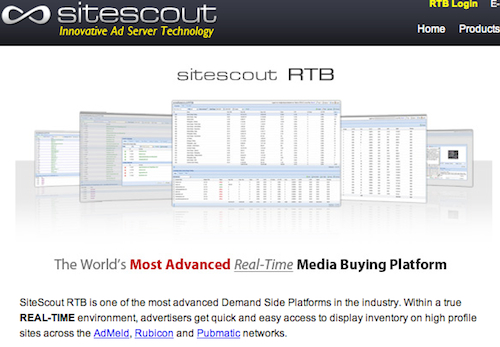
SiteScout: SiteScout is run by a small, Canadian team who, in 2010, launched their innovative Real Time Bidding platform for running ads with ability to target specific demographics.
Comments on this article are closed. Have a question about Ad server solutions? Why not ask it on our forums?
Frequently Asked Questions about Ad Server Solutions
What are the key features to look for in an ad server solution?
When choosing an ad server solution, there are several key features to consider. Firstly, the ad server should have a user-friendly interface that allows for easy management of ads. It should also offer robust targeting capabilities, enabling you to reach your desired audience effectively. Additionally, the ad server should provide comprehensive reporting and analytics tools to help you track the performance of your ads and make data-driven decisions. Other important features include support for multiple ad formats, integration with other marketing tools, and reliable customer support.
How does an ad server solution benefit publishers?
Ad server solutions offer numerous benefits to publishers. They streamline the process of managing and delivering ads, saving publishers time and effort. They also provide advanced targeting capabilities, helping publishers to reach their desired audience more effectively. Furthermore, ad server solutions offer detailed analytics and reporting tools, enabling publishers to track the performance of their ads and optimize their ad campaigns based on data-driven insights.
Can ad server solutions support multiple ad formats?
Yes, most ad server solutions support a wide range of ad formats, including display ads, video ads, mobile ads, and native ads. This allows publishers to deliver a diverse mix of ads and reach their audience through various channels.
How do ad server solutions handle data privacy and security?
Ad server solutions typically have robust data privacy and security measures in place. They comply with industry standards and regulations, such as the General Data Protection Regulation (GDPR), to ensure the privacy and security of user data. They also use encryption and other security technologies to protect data from unauthorized access.
What kind of reporting and analytics tools do ad server solutions offer?
Ad server solutions offer a variety of reporting and analytics tools. These tools provide detailed insights into the performance of your ads, including metrics like impressions, clicks, conversions, and revenue. They also offer features like real-time reporting and data visualization, making it easier to understand and interpret your ad performance data.
How do ad server solutions integrate with other marketing tools?
Most ad server solutions can integrate with a wide range of other marketing tools, including CRM systems, email marketing platforms, social media management tools, and more. This allows you to streamline your marketing workflows and manage all your marketing activities from a single platform.
Are ad server solutions suitable for businesses of all sizes?
Yes, ad server solutions are suitable for businesses of all sizes. They offer scalable solutions that can accommodate the needs of both small businesses and large enterprises. They also offer flexible pricing plans, making them accessible to businesses with different budgets.
How do ad server solutions handle ad blocking?
Ad server solutions typically have strategies in place to deal with ad blocking. They use techniques like ad reinsertion to bypass ad blockers and ensure that your ads are delivered to your audience. They also offer features like ad quality control and user consent management to ensure that your ads are not intrusive and respect user preferences.
Can ad server solutions help with ad optimization?
Yes, ad server solutions can help with ad optimization. They offer features like A/B testing and machine learning algorithms that can help you optimize your ad campaigns based on data-driven insights. They also provide recommendations on how to improve your ad performance.
What kind of customer support do ad server solutions offer?
Most ad server solutions offer comprehensive customer support, including live chat, email support, phone support, and a knowledge base with helpful resources. Some also offer dedicated account managers and professional services for additional support.