


Key Takeaways
- “The Elements of Typographic Style” by Robert Bringhurst, “Thinking with Type” by Ellen Lupton, and “The Anatomy of Type” by Stephen Coles are three highly recommended typography books for frontend designers. These books provide a deep understanding of typography, its history, and its role in communication and web design.
- Strong typography skills are essential in web design, as the majority of web-based communications still heavily rely on written language. Mastery of typography, like any other art, is a lifelong process that involves constant refinement of traditional and modern techniques.
- If one had to choose only one book, “The Anatomy of Type” by Stephen Coles would be the top pick due to its highly accessible structure and immediate practical value, helping designers choose the right font for a project and avoid common mistakes.
In 2006, Swiss-based Information Architect, Oliver Reichenstein, estimated 95% of all information on the web was text-based. He reasoned that therefore, web design was 95% typography.
Although photojournalists, Netflix and Youtube might argue otherwise, in 2014 the vast majority of web-based communications — the article headlines, online books, tweets, social updates, forum posts and blogs — is still written language on a page.
That means that whether you are a pro-designer or just a part-time doodler, rock-solid typography skills can take you a very long way in web design.
Like any of the great arts, — painting, sculpture, poetry, photography — mastering the subtleties of arranging type in space is a lifetime process, and you’ll probably never finish refining your command of all the traditional techniques, along with more modern methods.
That said, today, I’m going to suggest a selection of typography books that every designer — newbie or otherwise — could use on their shelves.
SIDENOTE:
Just before we get to the books, it seemed illogical to recommend these books, without linking to somewhere where you can get them. Rather than using any SitePoint affiliate code (we don’t have one), we’d prefer supporting the Electronic Frontier Foundation’s (EFF) vigilant defence of our collective free speech, privacy, innovation, and consumer rights.
As such, we’re using the EFF’s affiliate code in any book links below.
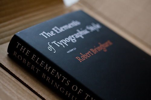
THE ELEMENTS OF TYPOGRAPHIC STYLE
‘The Elements of Typographic Style‘ was written by the Canadian typographer (and poet – the man loves words) Robert Bringhurst, and published by the Hartley & Marksin publishing house in 1992. This is the typography book I most often hear referred to as a ‘bible for typographers’.
In this book, Robert has created the perfect summary of all the most important techniques of arranging typefaces, giving the reader many hard-won tips regarding the particularities of fonts, glyphs, styles and design.
The book is not merely a discussion about methods and graphic principles; indeed, Bringhurst
also analyzes the idea of written type from a philosophical point of view, bringing the reader to consider the role of typography in history, in society and in communication.
The topics are deepened by the presence of many explaining images and schemes and by the author’s deep attention to detail. I strongly recommend this book because it will give you solid background in typography, while unearthing many fonts, terms and techniques you’ve probably never heard of.
- The Elements of Typographic Style
- By Robert Bringhurst
- Published: 1992
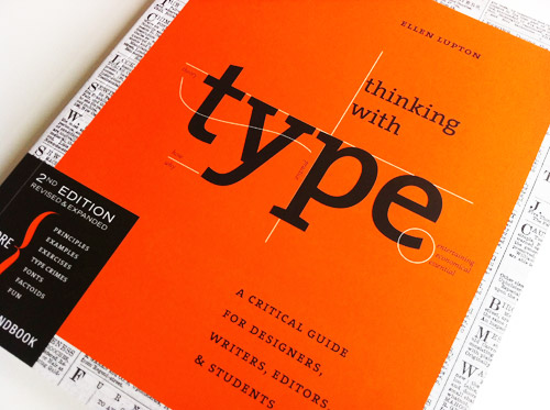
THINKING WITH TYPE
The next book I suggest you is ‘Thinking with Type‘, written by Ellen Lupton and published by the ‘Princeton Architectural Press’ in 2010.
The book is very broad, addressed to all designers, from school students to professionals. It is a kind of explanatory journey through the world of typography and has a nice balance of both on theory and practice.
Ellen speaks about the history of type, spacing, alignment, designing of typefaces and makes a detailed classification of all type.
You can also find many footnotes, charts, examples, images and even exercises, that give you plenty of opportunity to learn, with little efforts, new technical principles and to put them into practice immediately.
The book is divided in three major sections: ‘Letter’, ‘Grid’ and ‘Text’. Each section is a deep analysis of the topic it mainly concerns, but Lupton never looses focus on the big picture, preferring to show the links of each subject to typography in general.
I think this book is very worthy your attention because it will provide you of a great knowledge regarding both the oldest type practices and the more modern ones.
- Thinking with Type
- By Ellen Lupton
- Published: 2010
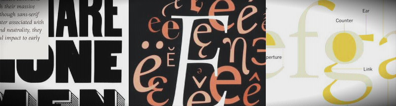
THE ANATOMY OF TYPE: A GRAPHIC GUIDE TO 100 TYPEFACES
The last book I’m going to show you is the mst recent of the bunch and a different approach to the others — ‘The Anatomy of Type‘ , written by Stephen Coles and published in 2012 by Harper Design. In this, the author analyses 100 different typefaces giving us precious information about every detail, about key features, font weights and more.
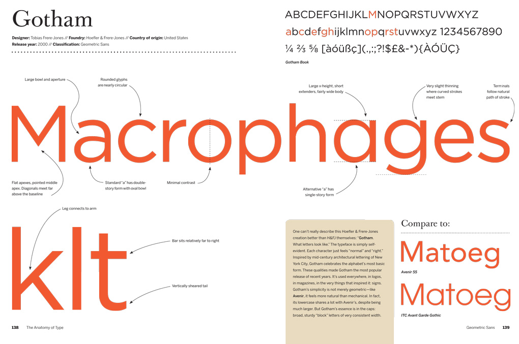
The fonts are divided in 15 groups and they are then examined through the help of large scale images that come together with crib notes and comments that put his own opinion into evidence.
Coles not only provide us with technical and graphical advice about typefaces, indeed, he also shares their history and some curiosities that, along with the use of different colors for each page, makes it a pleasure to leaf through. This one would make a fine coffee-table book.
- The Anatomy of Type
- By Stephen Coles
- Published: 2012
But If You Could Only Choose One?
Ah, the classic desert island question!
So, if I could take only one of these wonderful books, I think it would have to be (perhaps controversially) Stephen Coles’ ‘The Anatomy of Type‘. As great as the other books are, Anatomy of Type’s very skimmable structure makes it almost immediately valuable in helping you choose the right font for your project, without making common and easy-avoidable mistakes.
Frequently Asked Questions about Typography Books
What are some of the best typography books for beginners?
For beginners, it’s essential to start with books that provide a solid foundation in typography. “Thinking with Type” by Ellen Lupton is a great starting point. It’s a comprehensive guide that covers everything from letterforms and fonts to how type is used in different media. Another excellent book for beginners is “The Elements of Typographic Style” by Robert Bringhurst. This book is often referred to as the ‘bible’ of typography and provides a deep understanding of the principles of good typography.
How can typography books help improve my web design skills?
Typography plays a crucial role in web design. It can make or break the user experience on a website. By reading typography books, you can learn about the different typefaces, how to use them effectively, and how to create a visual hierarchy with type. This knowledge can significantly improve your web design skills and help you create more visually appealing and user-friendly websites.
Are there any typography books that focus on digital and web typography?
Yes, there are several books that focus specifically on digital and web typography. “On Web Typography” by Jason Santa Maria is one such book. It provides a comprehensive guide to using typography effectively in digital media. Another book is “Responsive Typography” by Jason Pamental, which focuses on how to use typography effectively in responsive web design.
What are some of the best books for learning about the history of typography?
If you’re interested in the history of typography, “The History of Graphic Design. Vol. 1, 1890–1959” by Jens Müller and Julius Wiedemann is a must-read. It provides a comprehensive overview of the evolution of graphic design and typography over the years. Another excellent book is “Type: A Visual History of Typefaces & Graphic Styles” by Cees W. de Jong. This book provides a visual history of typefaces and graphic styles from the 17th to the 20th century.
Can typography books help me choose the right fonts for my projects?
Absolutely! Typography books can provide you with a deep understanding of different typefaces and their characteristics. They can guide you on how to choose the right fonts based on the project’s requirements and the message you want to convey. Books like “The Anatomy of Type” by Stephen Coles and “The Complete Manual of Typography” by James Felici provide detailed insights into different typefaces and their appropriate usage.
Are there any books that provide practical exercises for improving typography skills?
Yes, there are several books that provide practical exercises for improving typography skills. “The Typography Workbook” by Timothy Samara is one such book. It provides numerous exercises that help you practice and improve your typography skills. Another book is “Type Team: Perfect Typeface Combinations” by Tony Seddon, which provides practical exercises on combining different typefaces effectively.
What are some of the best books for learning about typography best practices?
“The Elements of Typographic Style” by Robert Bringhurst is widely regarded as one of the best books for learning about typography best practices. Another excellent book is “Detail in Typography” by Jost Hochuli. This book provides a detailed guide to typography best practices, focusing on the minutiae that can make a significant difference in your designs.
Are there any typography books that focus on typography for print?
Yes, there are several books that focus on typography for print. “The Complete Manual of Typography” by James Felici is a comprehensive guide to creating professional-level type for print. Another book is “Mastering Type: The Essential Guide to Typography for Print and Web Design” by Denise Bosler, which provides a comprehensive guide to using typography effectively in both print and digital media.
Can typography books help me understand the psychology of type?
Absolutely! Books like “Stop Stealing Sheep & Find Out How Type Works” by Erik Spiekermann provide insights into the psychology of type and how it influences perception and communication. Understanding the psychology of type can help you make more informed decisions in your designs and communicate more effectively.
Are there any books that provide a global perspective on typography?
Yes, “Scripts: Elegant Lettering from Design’s Golden Age” by Steven Heller and Louise Fili provides a global perspective on typography, showcasing scripts from around the world. Another book is “Language Culture Type: International Type Design in the Age of Unicode” by John D. Berry, which explores type design in different cultures and languages.

