The Kickoff…
You’ll be pleased to hear that there aren’t actually that many things to learn about creating a professional-looking site!
You don’t need expensive html editors – just a text editor and a halfway decent image editor.
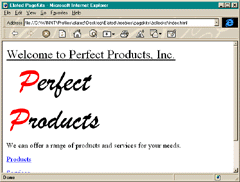
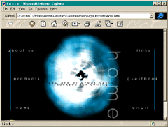
In this tutorial, we’ll take you through the basic things that make the difference between the nastiest personal pages and the professional look we all desire. We’ll take you from the image on the left, to the one on the right!
Space
This is really one of the most important things. Musicians often say "it’s not what you play, but what you leave out that’s important". What they’re saying is that the space that you leave in your playing gives the music room to breathe and allows it to groove. The same principle applies to web design (and design in general).
What you’re aiming for is to draw attention to the important bits – the message, the navigation system or whatever is the main thrust of the page.
People often make the mistake of making these things very big. They don’t have to be. The eye needs to be drawn to them, and this is best (and most professionally) achieved by the use of space. Don’t clutter your homepage with unnecessary text and images around the main areas, since they detract from the important bits.
Don’t make the mistake of thinking that if there’s a big white gap in your page that you should fill it with something. Just have the pieces that are necessary. The other stuff should probably have its own page if it’s that important!
As a rule, maybe only 75% of your page should be covered with images and text.
Consistency
You should aim to keep the look of a site consistent throughout.
This means a standard use of fonts, colours, image styles, layout styles, navigation style etc. Don’t just plonk an animated gif somewhere that you got off another site, since it’ll probably clash hideously with yours, for example.
- Your background colours should remain the same throughout, and you should pay attention to the little things like keeping the fonts in the text defined in html. Don’t mix fonts too much, fight the temptation!
- Header images for sections ought to have the same style as each other, which should in turn be related to the main look of the logo (colours, fonts etc).
- Colours. Don’t pick colours that clash appallingly – think about what your living room would look like in the colours you choose, then wonder if you’d like to spend a lot of time there! Define your link colours in the body tag to match your colour scheme as well.
Backgrounds
One of the main culprits for a bad-looking site are these multicoloured background image tiles. They also tend to have a definite pattern to them, which can make text really hard to read.
Try to go for a flat colour background, or for a large image (min 800×600 pixels) which is faded so that you can easily read the text on top of it. (Watch out for the file sizes on these though!) Big fadey text always looks cool, as do black and white photos that have been faded out. Another trick is to blur these backgrounds, since this makes the sharp text on top much easier to read – and it looks really cool too!
Scrolling Text
If you have a page of text that requires scrolling, try to split it up into sections on different pages, and add a navigation system for it. It’s just a bit nicer, and keeps the user from getting hideously lost on the page. Avoid those dead ends though!
Images
You so often see sites that have jagged images on them. There’s no need for this, and you don’t need really expensive software to get around it.
We use Adobe Photoshop, which is a bit of an industry standard, but there is now the excellent Paint Shop Pro 5 for PC, which is shareware. This program is great, and imports layered Photoshop files quite happily.
GIFs (.gif – the main web image format) are indexed colour, but you should always create the image in RGB mode (don’t worry about what these mean). This avoids the "jagging" that we all hate, and you end up with nice, non jagged GIFs on export. If you only have a GIF to start with, but need to resize and play with it generally, then change it to RGB mode first.
JPEG format (.jpg) is used most often for photos, since this is where it excels. This is an RGB format anyway, so no worries there. Watch the file size, but don’t make them look horrible on export, or there’s no point in them – find a happy compromise. You shouldn’t really have an image file bigger than 30k anywhere – and that’s for a REALLY big picture. Keep images to around 400 pixels across, max.
Layout
The trick with layout is to use tables to provide focus. They also resize to an extent with the browser size. Think about the layout of a magazine – it tends to have columns and areas with background colours to provide focus. The same applies here. You can pull quotes out of a body of text and make them the focal point for it. They also break up a big lump of text really well, which is always a good thing! "pull quotes from the text"
The Last Word
These are the basics of avoiding the pitfalls of website design. There are many more, but follow these guidelines and you’ll be most of the way there.
Look around the web, and you’ll find many examples of both bad and good sites. Bear in mind what you just read when you look at them, and try to see why the bad ones are so awful!
That’s the end of this tutorial. We hope you found it useful. If you would like to offer us feedback on this or any of the tutorials, please email us. Have fun!
 Boris Mordkovich
Boris is the CTO of EchoMedia Inc. Boris is an experienced Web developer and has over 30 different tutorials and articles.