Gone are the days of using Flash and GIF images for creating animated graphics. It is time to show off some of the best CSS3 capabilities. CSS3 transform has been there in the web for quite some time. Browsers like Mozilla, Google Chrome and Opera have full support for CSS3 2D and 3D transform techniques. In this article you will learn:
- CSS3 2D Transform Techniques
- CSS3 3D Transform Techniques
- What is a Perspective?
- And many different transform functions
- A 3D Card Flip
- A 3D Cube or a dice
Understanding CSS3 2D Transform
div elements. CSS3 2D transform contains some basic functions like below:
translate()rotate()scale()skew()matrix()
Translate
Using thetranslate() function, you can move the div and text from their original position to any x-y co-ordinate without affecting other HTML components. For example:
div{
    transform: translate(20px,20px);
}div element 20px in x-direction and 20px in the y-direction.
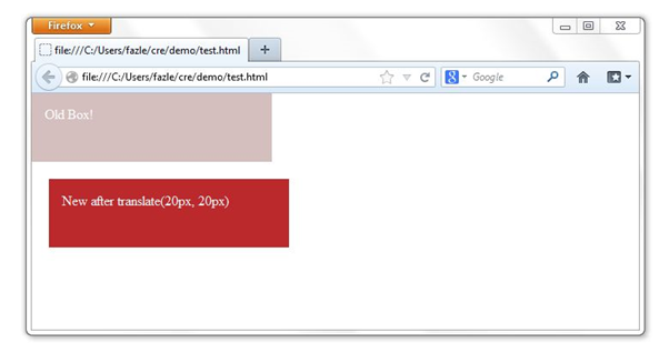 NOTE: x-y coordinates positioning in browsers is not same as used in geometry. A positive x value implies moving the object towards the right direction while a positive y value means moving it towards the bottom in y-direction.
 (0,0) co-ordinates refer to the top left corner of the browser.
For browsers like Opera, Chrome and older Firefox, you have to use –webkit-, -moz-, and –o- prefixes to the transform property. The CSS3 transform is not fully accepted by all browsers, but major browsers do support them with one of the above vendor provided prefixes.
Rotate
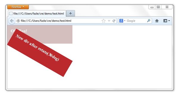
Therotate transform function rotates a specified HTML element to a given degree. The rotation is clockwise and starts from 0deg to 360deg. The rotation is done in the x-y plane.
div{
    transform: rotate(30deg);
}
Scale
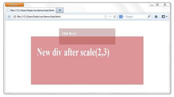
As the name suggests, it scales the old div to the new size as specified. This scaling takes place in both x and y direction. You can control the amount of scaling by specifying values, as parameters, toscale() function.
div{
    transform: scale(2,4);
}
Skew
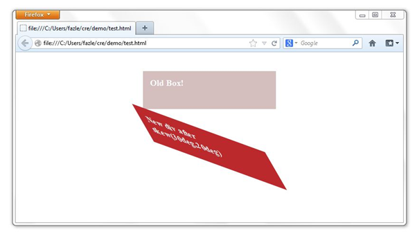
When askew transform function is applied to an element, the element bends to a specified amount as provided in the parameters list. You have to specify the angle value for x-direction as well as for the y-direction.
div{
    transform: skew(30deg,20deg);
}
Matrix
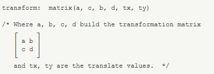
The work ofmatrix transform function is to combine all the above 2D transform function into one property. The values are in the form of linear transformation matrix.
div{
    transform: matrix(1.0, 2.0, 3.0, 4.0, 5.0, 6.0);
}
CSS3 3D Transform
Now that you have gone through the basic of 2D transformation, understanding 3D transformation won’t be a difficult task for you. 3D transform includes Z-axis transformation of the HTML elements. We will go through each of the new properties used in 3D transformation.translate3d(<translation-value>, <translation-value>, <length>): it defines a 3D translation. It takes three parameters x, y and z values. The z value specifies the translation in the Z-axis.translateZ(<length>): To define the translation only in the Z-direction, use this transform function. It works similar totranslateX()andtranslateY().scale3d(<number>, <number>, <number>): This function does the scaling in all the three dimensions. It takes three parameters as sx, sy and sz. Each value defines scaling in the respective direction.scaleZ(<number>): Just like thetranslate()function, we also havescaleZ()function which defines scaling only in one direction ie Z-direction. We also havescaleX()andscaleY()functions which also work similar toscaleZ()but in their respective directions.rotate3d(<number>, <number>, <number>, <angle>): It rotates a single HTML element by the specified angle provided in the last parameter in the [tx, ty, tz] vector specified by the first three numbers.rotateX(<angle>),rotateY(<angle>)androtateZ(<angle>)take only a single angle value to rotate in the respective axis.
rotate3d(1,0,0,30deg) is equal to rotateX(30deg), rotate3d(0,1,0,30deg) is equal to rotateY(30deg) and rotate3d(0,0,1,30deg) is equal to rotateZ(30deg).
Perspective
The main part of the 3D Transform using CSS is the perspective. To activate a 3D space to make 3D transformation, you need to active it. This activation can be done in two ways as follows:transform: perspective(500px);
or
perspective: 500px;
The functional notation is used to activate a single element whereas the second notation is used to apply perspective to multiple elements at a same time.
Transform Style
This is another important property in the 3D space. It takes two values:preserve-3d or flat. When the transform style value is preserve-3d then it tells the browser that the children element should also be positioned in the 3D space. On the other hand when the value of this property is flat, it indicates that children are present on the plane of the element itself.
Let’s start working
In this section, we will try to learn how to activate the 3D space and apply 3D transform different functions as stated above. In the below program we will create a blue square figure and then rotate it by 30 degrees in Y axis. HTML<section id="blue" class="container">
<div></div>
</section>/* styling a container of size 200px X 200px that will contain the object */
.container{
width:200px;
height:200px;
margin:40px auto;
position:relative;
}
/* activating the 3D space */
#blue{
perspective: 600px;
}
/* coloring the box and rotating it by 30 degrees in the 3D space */
#blue .box{
background:blue;
transform: rotateY(30deg);
-moz- transform: rotateY(30deg);
-webkit- transform: rotateY(30deg);
-o- transform: rotateY(30deg);
}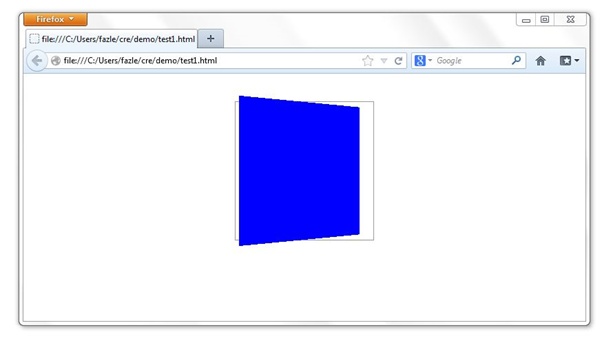 Similarly you can apply different
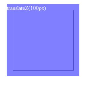
 translate(), scale() and rotate() functions to the above figure and see how the figure orientation changes. I have given a screenshot below that shows a translateZ() transformation.
CSS3 3D Transform Demos
1) Card Flip
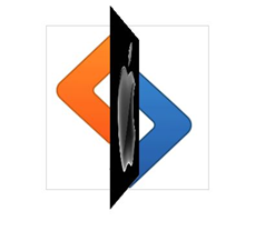
Now that we have understood the 2D and 3D transformation basics, we will make some practical demos and see how we can use them in day to day websites. I will show you how to make a card flip animation using CSS3 3D transform. The card has Apple’s logo on the front side and Samsung’s logo on the back, and when it flips it reveals SitePoint’s logo. Interesting isn’t? |
 |
 |
<section class="container">
    <div id="card">
    <figure></figure>
    <figure></figure>
</div> </section>
<a href="#">flip it!</a>/* Design container */
.container {
width: 250px;
height: 250px;
position: relative;
margin: 40px auto;
border: 1px solid #999999;
-webkit-perspective: 600px;
-moz-perspective: 600px;
-o-perspective: 600px;
perspective: 600px;
}/* styling card element */
#card {
width: 100%;
height: 100%;
position: absolute;
-webkit-transition: -webkit-transform 1s;
-moz-transition: -moz-transform 1s;
-o-transition: -o-transform 1s;
transition: transform 1s;
-webkit-transform-style: preserve-3d;
-moz-transform-style: preserve-3d;
-o-transform-style: preserve-3d;
transform-style: preserve-3d;
}height and width are set to 100%, the card div takes the dimensions of the parent container element. We have defined how long the transformation should take place with the transition property. It is set to 1s to animate the flipping for 1 second. The transform-style property makes sure that the children elements of this card div also have their 3D spaces activated. By default if the parent element’s 3D space is activated then only its direct children inherit the 3D activation. So in this example transform-style tells the children of the child div to inherit the 3D activation.
CSS
/* styling figure elements */
#card figure {
    display: block;
    height: 100%;
    width: 100%;
    position: absolute;
    margin:0px;
    -webkit-backface-visibility: hidden;
    -moz-backface-visibility: hidden;
    -o-backface-visibility: hidden;
    backface-visibility: hidden;
}backface-visibility property as hidden so the card is opaque and not transparent. You can also try setting it to transparent and see what effect you get.
CSS
#card .front {

    background: url('apple.jpg');

}

#card .back {

    background: url('samsung.jpg');

    -webkit-transform: rotateY( 180deg );

    -moz-transform: rotateY( 180deg );

    -o-transform: rotateY( 180deg );

    transform: rotateY( 180deg );

}
We have used two images, apple.jpg and samsung.jpg, as the background of the front figure and back figure.
Now that we have almost set everything, we need another class called “flipped” and set the transform property. This class will be set dynamically on the client side using any client-side scripting. I have used jQuery in this case. The “flipped” class styles are set as below:
CSS
#card.flipped {
    -webkit-transform: rotateY( 180deg );
    -moz-transform: rotateY( 180deg );
    -o-transform: rotateY( 180deg );
    transform: rotateY( 180deg );
}$(document).ready(function(){
$("a").click(function(){
$("#card").toggleClass("flipped");
});
});click property of the link and have set a callback function. The task of the function is to toggle the class of the card div to “flipped”.
Congrats! You’ve made the card flip animation. Go to the browser and see the animation. Wasn’t that easy? :)
Live Demo
2) A 3D Rotating Cube
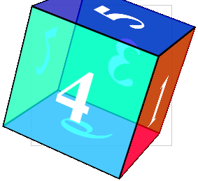
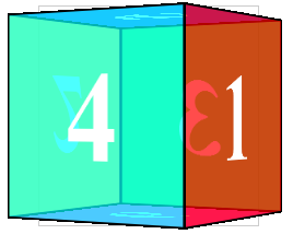
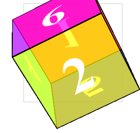
Let’s try something more complicated now. This time we will have six faces instead of only two. We will style each face, set them to proper orientation and finally animate. Each face of the cube will show the face number.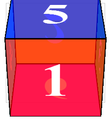 |
 |
 |
 |
 |
<section class="container">
    <div id="cube">
        <figure>1</figure>
        <figure>2</figure>
        <figure>3</figure>
        <figure>4</figure>
        <figure>5</figure>
        <figure>6</figure>
    </div>
</section>
<a href=”#”>Rotate it!</a>div, “cube” has six child “figure” elements for each side of the cube. Let’s start styling each of them.
CSS
/* First the container styles */
.container {
    width: 200px;
    height: 200px;
    position: relative;
    -webkit-perspective: 1000px;
    -moz-perspective: 1000px;
    -o-perspective: 1000px;
    perspective: 1000px;
    margin: 0 auto 40px;
    border: 1px solid #CCC;
}perspective property.
CSS
#cube {
    width: 100%;
    height: 100%;
    position: absolute;
    -webkit-transform-style: preserve-3d;
    -moz-transform-style: preserve-3d;
    -o-transform-style: preserve-3d;
    transform-style: preserve-3d;
    -webkit-transform: translateZ( -100px );
    -moz-transform: translateZ( -100px );
    -o-transform: translateZ( -100px );
    transform: translateZ( -100px );
    -webkit-transition: -webkit-transform 0.5s;
    -moz-transition: -moz-transform 0.5s;
    -o-transition: -o-transform 0.5s;
    transition: transform 0.5s;
}preserve-3d to transform property as we did in the card flip example. One more thing which we did in this example was translating the whole cube -100px in the z-direction. Later in this example we will see that, the front facing side of the cube 100px in the z-direction is always translated 100px to the front. So, in order to make the text appear hazy, we have moved the whole cube -100px back.
CSS
#cube figure {
    width: 196px;
    height: 196px;
    display: block;
    position: absolute;
    border: 2px solid black;
    line-height: 196px;
    font-size: 120px;
    font-weight: bold;
    color: white;
    text-align: center;
    margin:0px;
}/* Applying a unique color to each face */
#cube .front { background: hsla( 0, 100%, 50%, 0.7 ); }
#cube .back { background: hsla( 60, 100%, 50%, 0.7 ); }
#cube .right { background: hsla( 120, 100%, 50%, 0.7 ); }
#cube .left { background: hsla( 180, 100%, 50%, 0.7 ); }
#cube .top { background: hsla( 240, 100%, 50%, 0.7 ); }
#cube .bottom { background: hsla( 300, 100%, 50%, 0.7 ); }/* Giving the desired orientation to each side of the cube */
#cube .front {
-webkit-transform: rotateY( 0deg ) translateZ( 100px );
-moz-transform: rotateY( 0deg ) translateZ( 100px );
-o-transform: rotateY( 0deg ) translateZ( 100px );
transform: rotateY( 0deg ) translateZ( 100px );
}
#cube .back {
-webkit-transform: rotateX( 180deg ) translateZ( 100px );
-moz-transform: rotateX( 180deg ) translateZ( 100px );
-o-transform: rotateX( 180deg ) translateZ( 100px );
transform: rotateX( 180deg ) translateZ( 100px );
}
#cube .right {
-webkit-transform: rotateY( 90deg ) translateZ( 100px );
-moz-transform: rotateY( 90deg ) translateZ( 100px );
-o-transform: rotateY( 90deg ) translateZ( 100px );
transform: rotateY( 90deg ) translateZ( 100px );
}
#cube .left {
-webkit-transform: rotateY( -90deg ) translateZ( 100px );
-moz-transform: rotateY( -90deg ) translateZ( 100px );
-o-transform: rotateY( -90deg ) translateZ( 100px );
transform: rotateY( -90deg ) translateZ( 100px );
}
#cube .top {
-webkit-transform: rotateX( 90deg ) translateZ( 100px );
-moz-transform: rotateX( 90deg ) translateZ( 100px );
-o-transform: rotateX( 90deg ) translateZ( 100px );
transform: rotateX( 90deg ) translateZ( 100px );
}
#cube .bottom {
-webkit-transform: rotateX( -90deg ) translateZ( 100px );
-moz-transform: rotateX( -90deg ) translateZ( 100px );
-o-transform: rotateX( -90deg ) translateZ( 100px );
transform: rotateX( -90deg ) translateZ( 100px );
}#cube.show-front {
-webkit-transform: translateZ( -100px ) rotateY( 0deg );
-moz-transform: translateZ( -100px ) rotateY( 0deg );
-o-transform: translateZ( -100px ) rotateY( 0deg );
transform: translateZ( -100px ) rotateY( 0deg );
}
#cube.show-back {
-webkit-transform: translateZ( -100px ) rotateX( -180deg );
-moz-transform: translateZ( -100px ) rotateX( -180deg );
-o-transform: translateZ( -100px ) rotateX( -180deg );
transform: translateZ( -100px ) rotateX( -180deg );
}
#cube.show-right {
-webkit-transform: translateZ( -100px ) rotateY( -90deg );
-moz-transform: translateZ( -100px ) rotateY( -90deg );
-o-transform: translateZ( -100px ) rotateY( -90deg );
transform: translateZ( -100px ) rotateY( -90deg );
}
#cube.show-left {
-webkit-transform: translateZ( -100px ) rotateY( 90deg );
-moz-transform: translateZ( -100px ) rotateY( 90deg );
-o-transform: translateZ( -100px ) rotateY( 90deg );
transform: translateZ( -100px ) rotateY( 90deg );
}
#cube.show-top {
-webkit-transform: translateZ( -100px ) rotateX( -90deg );
-moz-transform: translateZ( -100px ) rotateX( -90deg );
-o-transform: translateZ( -100px ) rotateX( -90deg );
transform: translateZ( -100px ) rotateX( -90deg );
}
#cube.show-bottom {
-webkit-transform: translateZ( -100px ) rotateX( 90deg );
-moz-transform: translateZ( -100px ) rotateX( 90deg );
-o-transform: translateZ( -100px ) rotateX( 90deg );
transform: translateZ( -100px ) rotateX( 90deg );
}$(document).ready(function(){
var ctr=0;
var panel="";
$("a").click(function(){
ctr++;
if(ctr==1){
$("#cube").toggleClass("show-back");
$("#cube").removeClass(panel);
panel="show-back";
}
if(ctr==2){
$("#cube").toggleClass("show-right");
$("#cube").removeClass(panel);
panel="show-right";
}
if(ctr==3){
$("#cube").toggleClass("show-left");
$("#cube").removeClass(panel);
panel="show-left";
}
if(ctr==4){
$("#cube").toggleClass("show-top");
$("#cube").removeClass(panel); panel="show-top";
}
if(ctr==5){
$("#cube").toggleClass("show-bottom");
$("#cube").removeClass(panel);
panel="show-bottom";
}
if(ctr==6){
$("#cube").toggleClass("show-front");
$("#cube").removeClass(panel);
panel="show-front"; ctr=0;
}
});
});Frequently Asked Questions on Advanced CSS3 2D and 3D Transform Techniques
What are the basic differences between 2D and 3D transforms in CSS3?
The primary difference between 2D and 3D transforms lies in the dimension they operate in. 2D transforms allow you to manipulate elements in two dimensions – horizontal (X-axis) and vertical (Y-axis), while 3D transforms add an extra dimension, depth (Z-axis), allowing for more complex transformations like rotation in a 3D space.
How can I animate 3D transform properties in CSS3?
CSS3 allows you to animate 3D transform properties using keyframes and the animation property. You can define the changes in CSS properties over time using @keyframes rule, then apply these keyframes to elements using the animation property. This can create a variety of animations, including rotation, translation, and scaling in 3D space.
Can I use 2D and 3D transforms together?
Yes, you can combine 2D and 3D transforms together. However, once a 3D transform is applied, the element will behave as a 3D object, and all subsequent transforms will also be in 3D.
What is the use of the perspective property in 3D transforms?
The perspective property in CSS3 is used to determine how far an element is placed from the viewer in 3D space. It helps to create a sense of depth and perspective in 3D transformations. The lower the value, the more intense the 3D effect will be.
How can I create a 3D rotation effect using CSS3?
You can create a 3D rotation effect using the rotate3d() function in CSS3. This function takes four arguments, the first three are numbers defining the direction of the rotation axis and the fourth is the angle of rotation.
What are the browser compatibility issues with CSS3 2D and 3D transforms?
While most modern browsers support CSS3 2D and 3D transforms, there can be some compatibility issues with older versions of browsers. It’s always a good practice to check the compatibility and use vendor prefixes if necessary.
How can I scale an element in 3D space using CSS3?
You can scale an element in 3D space using the scale3d() function in CSS3. This function takes three arguments, which represent the scaling factor along the X, Y, and Z axes.
What is the difference between translate and translate3d?
The translate function moves an element in 2D space along the X and Y axes, while the translate3d function moves an element in 3D space along the X, Y, and Z axes.
Can I control the speed of a CSS3 animation?
Yes, you can control the speed of a CSS3 animation using the animation-duration property. This property defines the length of time that an animation takes to complete one cycle.
How can I make a 2D element appear in 3D space using CSS3?
You can make a 2D element appear in 3D space using the transform-style property in CSS3. By setting this property to “preserve-3d”, you can preserve the 3D position and orientation of the element.
 Syed Fazle Rahman
Web Designer with over 6 years of experience, including user experience and front end development. Currently, CEO and Co-Founder of Hashnode, a network of software developers. Has published two books: Jump Start Bootstrap and Jump Start Foundation for SitePoint Premium.

