There are several different ways in which you can lay out a form. The method you choose depends upon how long the form is, its purpose, how often it will be used by each person who has to fill it out, and, of course, the general aesthetics of the web page.
It’s generally considered most efficient to have one form element per line, with the lines stacked sequentially one on top of the other, as most Western-language web pages are designed to scroll vertically rather than horizontally. This allows users to follow the path to completion easily and focus their attention on entering one piece of data at a time.
For each form element in a left-to-right reading system, it’s logical to position the corresponding label in one of three ways:
- directly above the form element
- in a separate left column, left-aligned
- in a separate left column, right-aligned
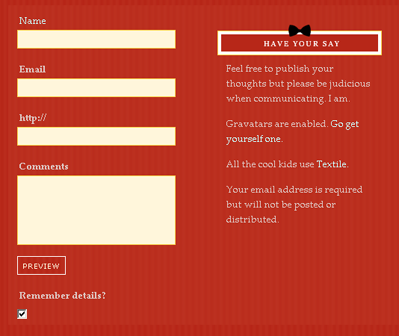 Labels that are positioned in a column to the left of the elements look much more organized and neat, but the way in which the text in those labels is aligned also affects the usability of the form.
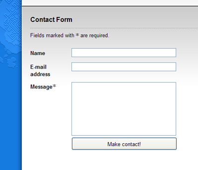
Right-aligning the text creates a much stronger grouping between the label and the element. However, the ragged left edge of the labels can make the form look messy and reduces the ability of users to scan the labels by themselves, as Luke Wroblewski argues in his article on the subject. In a left-aligned column, the labels instantly become easier to scan, but their grouping with the associated form elements becomes weaker. Users have to spend a little more time correlating the labels with their elements, resulting in slower form completion. An example of left-aligned labels can be seen below.
Labels that are positioned in a column to the left of the elements look much more organized and neat, but the way in which the text in those labels is aligned also affects the usability of the form.
Right-aligning the text creates a much stronger grouping between the label and the element. However, the ragged left edge of the labels can make the form look messy and reduces the ability of users to scan the labels by themselves, as Luke Wroblewski argues in his article on the subject. In a left-aligned column, the labels instantly become easier to scan, but their grouping with the associated form elements becomes weaker. Users have to spend a little more time correlating the labels with their elements, resulting in slower form completion. An example of left-aligned labels can be seen below.
 The right-aligned column layout shown below allows for quicker association between label and element, so again it’s more appropriate for forms that will be visited repeatedly by the user. Both layouts have the advantage of occupying a minimal amount of vertical space.
 What good examples of accessible forms have you seen recently? Add them in the comments.
Frequently Asked Questions on Accessible Form Layout Essentials
What are the key principles of creating accessible form layouts?
The key principles of creating accessible form layouts include ensuring that all form elements are clearly labeled, providing clear instructions for form completion, and ensuring that error messages are clear and easy to understand. Additionally, it’s important to ensure that forms are keyboard accessible and that they work well with assistive technologies such as screen readers. This involves using appropriate HTML elements and attributes, and testing the form with various assistive technologies.
How can I make my form labels accessible?
Form labels are crucial for accessibility as they provide context and instructions to users. To make your form labels accessible, ensure they are associated with their respective form controls using the ‘for’ attribute. Also, make sure the labels are descriptive and clear. Avoid using placeholder text as a substitute for labels as they disappear once the user starts typing, causing confusion for some users.
How can I make my forms keyboard accessible?
To make your forms keyboard accessible, ensure that all form controls can be accessed and manipulated using the keyboard alone. This can be achieved by using standard HTML form controls, which are inherently keyboard accessible. Also, ensure that the tab order of the form controls is logical and predictable, usually following the visual flow of the form.
How can I ensure my forms work well with screen readers?
To ensure your forms work well with screen readers, use appropriate HTML elements and attributes. For instance, use the ‘label’ element to associate labels with form controls, and use the ‘fieldset’ and ‘legend’ elements to group related form controls. Also, provide text alternatives for any non-text content in the form, such as images or CAPTCHAs.
How can I provide clear error messages in my forms?
To provide clear error messages, ensure they are concise, specific, and suggest a solution. Place the error messages close to the form controls they relate to, and use the ‘aria-describedby’ attribute to associate them with the form controls. Also, use live regions to announce the error messages to screen reader users without requiring them to navigate away from the form control.
What is the role of ARIA in form accessibility?
ARIA (Accessible Rich Internet Applications) is a set of attributes that define ways to make web content and web applications more accessible to people with disabilities. In form accessibility, ARIA can be used to provide additional information about form controls, indicate required form controls, and announce error messages to screen reader users.
How can I indicate required form controls?
To indicate required form controls, you can use the ‘required’ attribute in HTML5. Additionally, you can use the ‘aria-required’ attribute for older browsers that do not support HTML5. Also, visually indicate required form controls using asterisks or other visual cues, and provide a text explanation for these visual cues.
How can I make my form validation accessible?
To make your form validation accessible, provide clear and specific error messages, and ensure they are announced to screen reader users using live regions. Also, provide an error summary at the start of the form, especially for long forms. Additionally, avoid relying solely on color to indicate errors, and provide a way to bypass CAPTCHA for users who cannot complete it.
How can I make my forms accessible for people with cognitive disabilities?
To make your forms accessible for people with cognitive disabilities, keep your forms simple and clear. Avoid unnecessary complexity and provide clear instructions for form completion. Also, provide helpful error messages and allow users to correct errors easily. Additionally, allow users to save their progress and complete the form later if it’s long.
How can I test the accessibility of my forms?
To test the accessibility of your forms, you can use automated accessibility testing tools, manual testing, and user testing. Automated tools can catch many accessibility issues, but they cannot catch everything. Manual testing involves navigating the form using only the keyboard and testing it with various assistive technologies. User testing involves testing the form with real users who have disabilities.
 Cameron Adams
Cameron has been adding to the Internet for over seven years and now runs his own design and development business: www.themaninblue.com. He likes to combine the aesthetic with the technological on his Weblog, which contains equal parts of JavaScript, design and CSS.