The September edition of American fashion and lifestyle magazine W features a newly revamped W logo and a brand new tagline. The new branding comes as part of an overhaul of the entire magazine.
 |
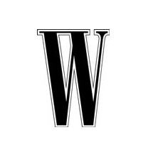 |
| The new italic W logo | The old W logo |
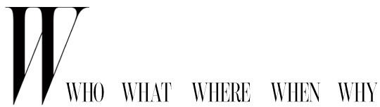
And then it is a new logo, as much as it looks like the old one, in a new typeface [called] Benton. It’s kind of skinny, it’s very vertical. It’s very elegant and it is italic, with a sense of movement, evolution. Then there is a tag line — that was never a part of W — which I think defines what W stands for. It’s not just women’s fashion, but the world of style and, more exactly, our five Ws: the who, the what, the where, the when and the why in the world of style.
 |
 |
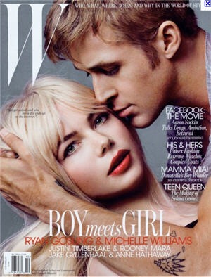
| Magazine cover with new logo and tagline | Old cover |
 Personally I love the new W. It is very elegant, almost a kind of an Audrey Hepburn of the font world. The touching serifs almost create another shape with a nice sense of movement. It’s only when I compare old and new that I realise I never really noticed the old one, but the new W has a beautiful, sophisticated look that’s easy on the eye.
What do you think of the new logo? An improvement or a step backwards?
Personally I love the new W. It is very elegant, almost a kind of an Audrey Hepburn of the font world. The touching serifs almost create another shape with a nice sense of movement. It’s only when I compare old and new that I realise I never really noticed the old one, but the new W has a beautiful, sophisticated look that’s easy on the eye.
What do you think of the new logo? An improvement or a step backwards?
Frequently Asked Questions about W Magazine’s New Logo
What is the inspiration behind W Magazine’s new logo?
The new logo of W Magazine is a modern interpretation of the magazine’s rich history and its commitment to the world of fashion, art, and culture. The design is inspired by the magazine’s bold and avant-garde approach to content, reflecting its status as a leading voice in the fashion industry. The logo’s sleek lines and minimalist design echo the magazine’s focus on modernity and innovation.
How does the new logo reflect the magazine’s brand identity?
The new logo perfectly encapsulates W Magazine’s brand identity. It is bold, innovative, and forward-thinking, much like the magazine itself. The design is a testament to the magazine’s commitment to pushing boundaries in the world of fashion and culture. It is a visual representation of the magazine’s mission to inspire, inform, and influence its readers.
What is the significance of the color scheme in the new logo?
The color scheme of the new logo is a nod to the magazine’s sophisticated and stylish aesthetic. The use of black and white creates a stark contrast, reflecting the magazine’s ability to stand out in a crowded market. The simplicity of the color scheme also allows the design to be versatile, ensuring that it can be used across various platforms and mediums.
How does the new logo compare to the old one?
The new logo is a significant departure from the old one. While the old logo was more traditional and ornate, the new logo is minimalist and modern. This shift in design reflects the magazine’s evolution and its commitment to staying relevant in a rapidly changing industry.
How has the reception been to the new logo?
The new logo has been well-received by readers and industry insiders alike. Many have praised its modern and innovative design, stating that it perfectly encapsulates the magazine’s brand identity. The logo has also been lauded for its versatility, with many noting its ability to stand out across various platforms and mediums.
How does the new logo align with current design trends?
The new logo aligns with current design trends in its simplicity and minimalism. These trends are popular in the design world as they allow for versatility and adaptability. The logo’s sleek lines and stark color contrast also align with trends towards bold and eye-catching designs.
What does the new logo say about the future direction of W Magazine?
The new logo suggests that W Magazine is committed to staying at the forefront of the fashion and culture industries. The modern and innovative design indicates that the magazine is not afraid to evolve and adapt, signaling a future direction that is forward-thinking and boundary-pushing.
How was the new logo designed?
The new logo was designed with a focus on simplicity and modernity. The design process involved a careful consideration of the magazine’s brand identity and its position in the market. The result is a logo that is bold, innovative, and perfectly representative of W Magazine.
What impact does the new logo have on the magazine’s overall aesthetic?
The new logo enhances the magazine’s overall aesthetic by adding a modern and innovative touch. It complements the magazine’s sophisticated and stylish content, creating a cohesive and visually appealing brand image.
How does the new logo differentiate W Magazine from its competitors?
The new logo differentiates W Magazine from its competitors through its bold and innovative design. It stands out in a crowded market, reflecting the magazine’s unique voice and perspective. The logo’s modern and minimalist design also sets it apart, signaling the magazine’s commitment to staying ahead of trends and pushing boundaries.
 Jennifer Farley
Jennifer Farley is a designer, illustrator and design instructor based in Ireland. She writes about design and illustration on her blog at Laughing Lion Design.