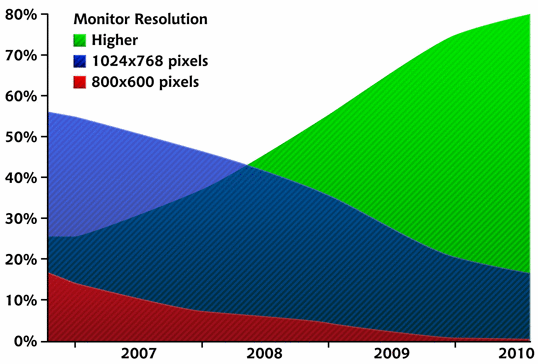
In comparison to the fixed-versus-fluid debate, the argument about designing for particular screen resolutions has been quite tame these past few years. When designers say that a site is designed, or optimized, for a particular screen resolution, they’re actually talking about the resolution of the viewer’s monitor. In the past, the screen resolution debate was focused on whether our designs should still accommodate monitor resolutions of 800×600 without displaying a horizontal scrollbar. According to W3Schools’ screen resolution statistics, in January 2010, 1% of web users had their screens set to 800×600 pixels (down from 4% in 2009), 20% had their resolutions set at 1024×768 pixels (down from 36%), and a whopping 76% of visitors had a resolution higher than 1024×768. The figure below illustrates these trends. These days, it’s a given assumption that desktop browsers display at least 1024×768. Even the majority of netbook computers have a 1024×600 or higher resolution. For that reason, 960px has become the de facto width for most web design projects. With W3Schools reporting the growth of users with resolutions greater than 1024, you’d think we’d be looking to push the standard width past 960, but there are a couple of reasons why this probably won’t happen. First, most users with larger monitors still keep their browser window set less than 1024 pixel-wide, so they can see other applications they have running. The other reason is line length. If a line of text is too long, it becomes less readable. Therefore, a wider default layout width would really only allow us to add more columns.

The Principles of Beautiful Web Design
This article is from Jason Beaird’s The Principles of Beautiful Web Design book (the second edition of which is out now). This is the twelfth part of the first chapter.Frequently Asked Questions about Screen Resolutions
What is the difference between screen resolution and display resolution?
Screen resolution and display resolution are often used interchangeably, but they refer to slightly different aspects of the display. Screen resolution refers to the number of pixels that can be shown on the screen, usually represented as the product of horizontal pixels and vertical pixels (for example, 1920×1080). On the other hand, display resolution refers to the physical number of pixels on a display device. If a device has a high display resolution, it can show more details and the image will be sharper.
How does screen resolution affect the quality of images and videos?
Screen resolution plays a significant role in determining the quality of images and videos. A higher resolution means more pixels are used to create the image, which results in a crisper, more detailed picture. Lower resolutions will not have as many pixels, which can lead to images and videos appearing blurry or pixelated.
What is the difference between 720p, 1080p, and 4K resolutions?
These terms refer to the number of pixels on the screen. 720p has a resolution of 1280×720 pixels, 1080p has a resolution of 1920×1080 pixels, and 4K has a resolution of 3840×2160 pixels. The ‘p’ stands for progressive scan, which means each line of pixels is displayed in sequence, resulting in a smoother image. The higher the number, the more pixels, and therefore, the better the image quality.
How does screen resolution impact gaming?
For gamers, screen resolution can significantly impact the gaming experience. Higher resolutions provide more detail and sharper images, which can enhance the realism and immersion of the game. However, higher resolutions also require more processing power. Therefore, if your hardware isn’t powerful enough, you may experience lag or stuttering at higher resolutions.
What is aspect ratio and how does it relate to screen resolution?
Aspect ratio is the ratio of the width of the screen to its height. It’s closely related to screen resolution because it determines the shape of the display. Common aspect ratios include 4:3, 16:9, and 21:9. When choosing a screen resolution, it’s important to consider the aspect ratio to ensure the display isn’t stretched or squashed.
How can I change my screen resolution?
You can change your screen resolution through your device’s display settings. However, it’s important to note that not all devices support all resolutions. Always ensure that the resolution you choose is supported by your monitor to avoid any display issues.
What is pixel density and how does it affect screen resolution?
Pixel density refers to the number of pixels per inch (PPI) on a display. It affects screen resolution because the higher the pixel density, the higher the potential resolution. Higher pixel densities can provide sharper and more detailed images.
What is the difference between SD, HD, Full HD, and Ultra HD?
These terms refer to different levels of screen resolution. SD stands for Standard Definition, which is typically 480p. HD stands for High Definition, which is 720p. Full HD is 1080p, and Ultra HD (or UHD) is 4K. The higher the definition, the better the video quality.
How does screen size affect resolution?
Screen size and resolution are closely related. Larger screens typically require higher resolutions to maintain image quality. If a large screen uses a low resolution, the pixels will be larger, and the image may appear pixelated or blurry.
What is the optimal screen resolution for my monitor?
The optimal screen resolution for your monitor depends on its size, aspect ratio, and pixel density. Generally, you should use the highest resolution that your monitor supports for the best image quality. However, you may need to adjust this based on your specific needs and preferences.
 Jason Beaird
Jason Beaird is a designer and front-end developer with over ten years of experience working on a wide range of award-winning web projects. With a background in graphic design and a passion for web standards, he’s always looking for accessible ways to make the Web a more beautiful place. When he’s not pushing pixels in Photoshop or tinkering with markup, Jason loves sharing his passion for the Web with others.