Bruce Springsteen — The River
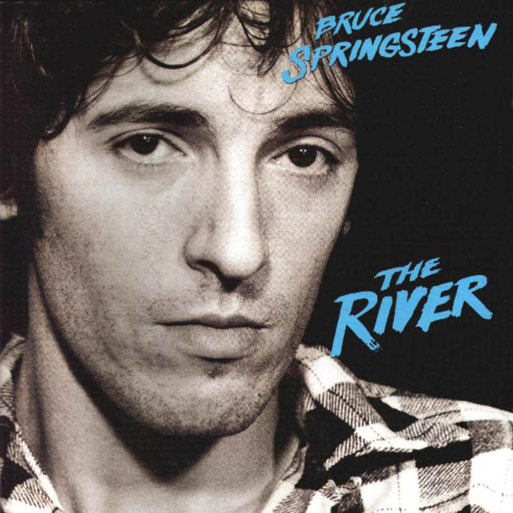 The type on Springsteen’s ‘The River’ is obviously custom type, likely created from a thick brush. The biggest hint? You’ll notice that all of the E’s are slightly different.
On close inspection, you can see that all of the horizontal strokes of each E vary to some degree. Some are really thick and some are medium in thickness while trailing off to be much thinner at the end.
A few months ago, I would have said that handmade brush fonts looked dated, but if you receive frequent email blasts from design bundle websites, you’ll quickly realize they are making a comeback in a big way. While many designers are hooked on precise, elegant fonts, there’s no doubt that handmade ‘artisanal’ fonts can bring a breath of fresh air.
It would be fine to use a handmade brush font like the one used on The River because the trend is currently in. As always, it’s good to keep in mind that you should use design trends sparingly. Avoid using them on projects that require more longevity, such as logos and signage.
The type on Springsteen’s ‘The River’ is obviously custom type, likely created from a thick brush. The biggest hint? You’ll notice that all of the E’s are slightly different.
On close inspection, you can see that all of the horizontal strokes of each E vary to some degree. Some are really thick and some are medium in thickness while trailing off to be much thinner at the end.
A few months ago, I would have said that handmade brush fonts looked dated, but if you receive frequent email blasts from design bundle websites, you’ll quickly realize they are making a comeback in a big way. While many designers are hooked on precise, elegant fonts, there’s no doubt that handmade ‘artisanal’ fonts can bring a breath of fresh air.
It would be fine to use a handmade brush font like the one used on The River because the trend is currently in. As always, it’s good to keep in mind that you should use design trends sparingly. Avoid using them on projects that require more longevity, such as logos and signage.
Indiana Jones and The Temple of Doom
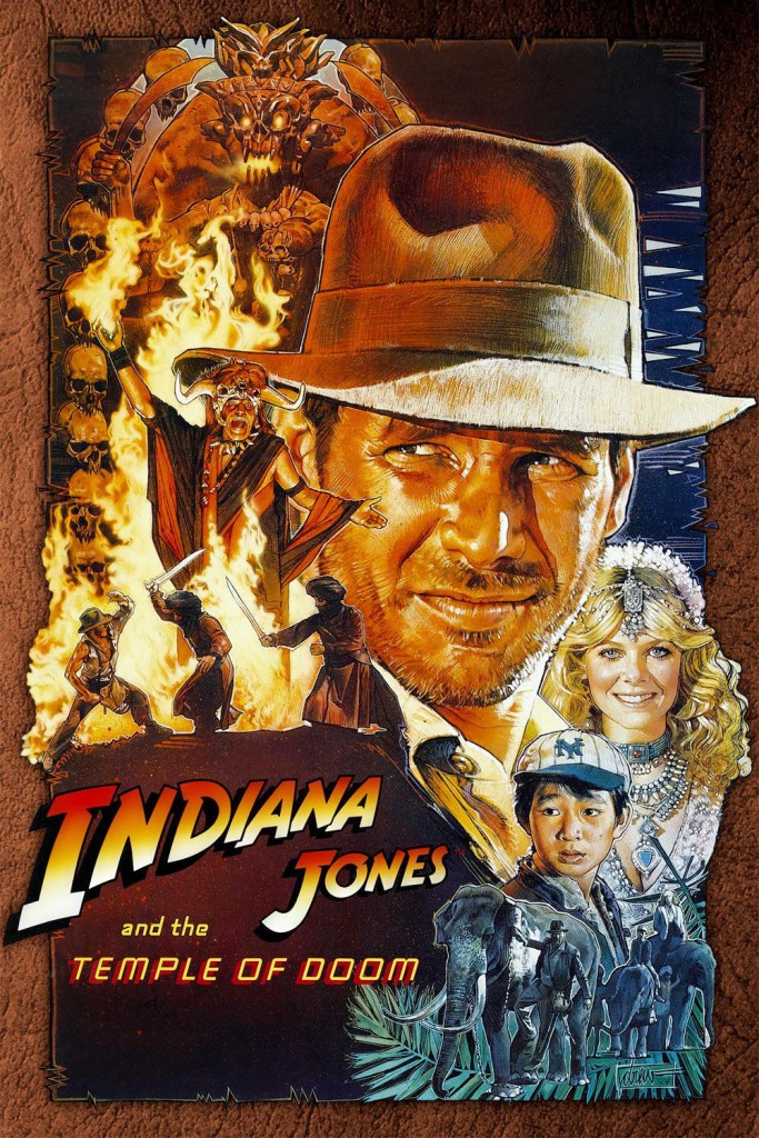 Indiana Jones and The Temple of Doom is a classic movie filled with adventure. The title font has a distinct look, and you can find a similar digital version called (appropriately) Adventure. There’s also Fedora, which works, too. Similar fonts have been used for years as they instantly give you the impression of an adventure or a safari. You immediately think of an exploration or a jungle trek.
This font is commonly used in promotions today. You might not consider using this font, not because it isn’t effective, but because of the fact it has been overused in nearly every scenario imaginable.
The Temple of Doom font is a completely different font. It initially seems a little out of place because it has more of a futuristic look to it. It looks like a variation of something simple to Eurostile, which fits well. The only real difference is that the lowercase ‘m’ is more rounded.
Indiana Jones and The Temple of Doom is a classic movie filled with adventure. The title font has a distinct look, and you can find a similar digital version called (appropriately) Adventure. There’s also Fedora, which works, too. Similar fonts have been used for years as they instantly give you the impression of an adventure or a safari. You immediately think of an exploration or a jungle trek.
This font is commonly used in promotions today. You might not consider using this font, not because it isn’t effective, but because of the fact it has been overused in nearly every scenario imaginable.
The Temple of Doom font is a completely different font. It initially seems a little out of place because it has more of a futuristic look to it. It looks like a variation of something simple to Eurostile, which fits well. The only real difference is that the lowercase ‘m’ is more rounded.
Def Leppard — Pyromania
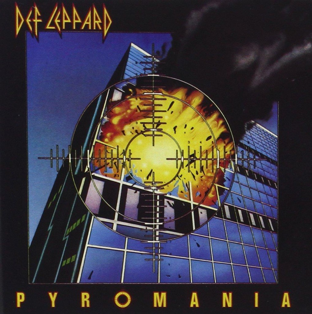 The band Def Leppard and an album name like Pyromania go hand in hand. Def Leppard’s band logo screams the 80s look, with sharp angles and an exaggerated height. Unless it’s used for display purposes today, it would be tough to use such an exaggerated font. You wouldn’t want to use it for body copy. Anything you use it on would immediately have an 80s Rock feel.
The font used for the word “Pyromania” needed to be a geometric font, simply because the “O” needed to be circular enough to be adapted into a crosshair symbol.
The band Def Leppard and an album name like Pyromania go hand in hand. Def Leppard’s band logo screams the 80s look, with sharp angles and an exaggerated height. Unless it’s used for display purposes today, it would be tough to use such an exaggerated font. You wouldn’t want to use it for body copy. Anything you use it on would immediately have an 80s Rock feel.
The font used for the word “Pyromania” needed to be a geometric font, simply because the “O” needed to be circular enough to be adapted into a crosshair symbol.
Tina Turner — Private Dancer
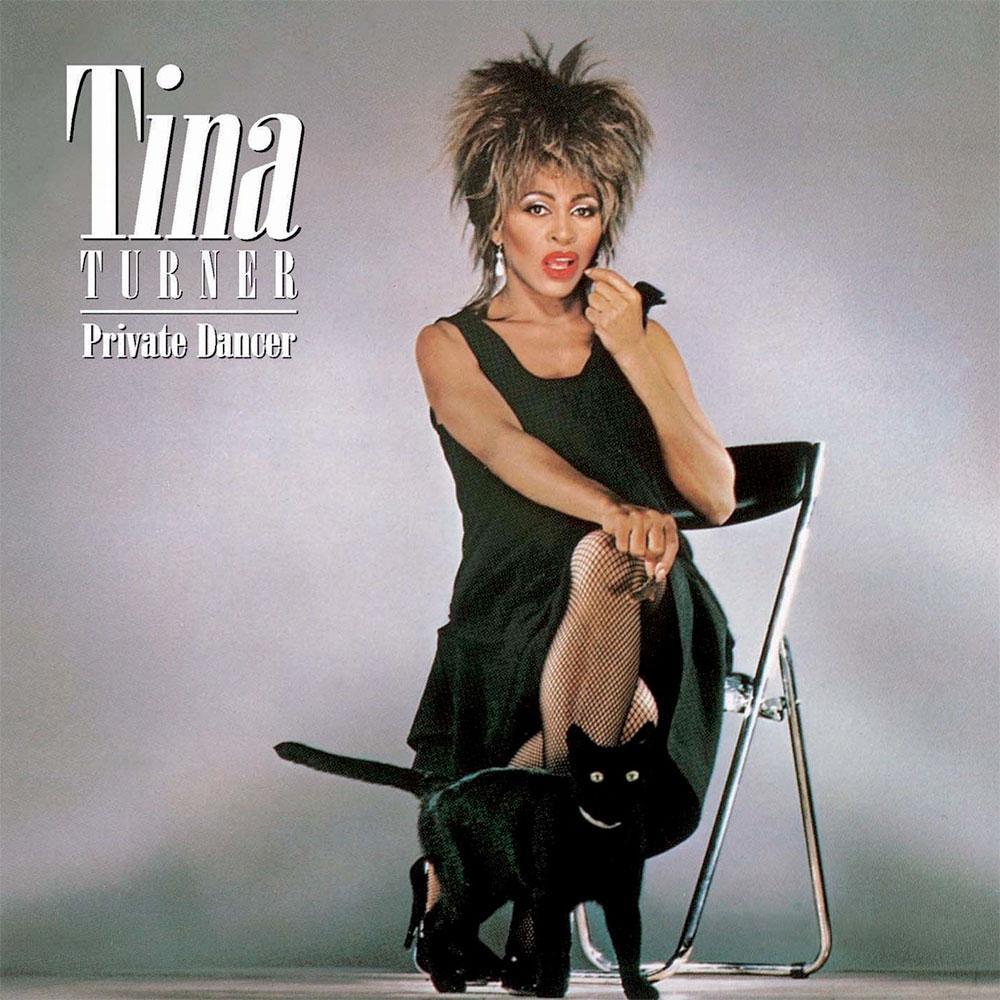 This Tina Turner album was an anthem for a lot of people during the 80s. When I saw the title text for this album, I immediately recognized that it was a variation of Bodoni.
After searching through my own font collection, I discovered the font used was in fact Bodoni Std Poster Compressed. It has such an exaggerated height with elongated, tall serifs for the capital T.
Tina Turner was an icon, so it’s no surprise that the title font for her name would be something tall and dominant while still being elegant and sophisticated.
Bodoni is a go-to font for a lot of designers, for its distinct look and elegance. However, this version of Bodoni is distinct. Those elongated serifs should be used sparingly. When using this font, you should stick to titles, posters, and book covers. I wouldn’t use it anywhere that it could break down, such as in smaller print.
This Tina Turner album was an anthem for a lot of people during the 80s. When I saw the title text for this album, I immediately recognized that it was a variation of Bodoni.
After searching through my own font collection, I discovered the font used was in fact Bodoni Std Poster Compressed. It has such an exaggerated height with elongated, tall serifs for the capital T.
Tina Turner was an icon, so it’s no surprise that the title font for her name would be something tall and dominant while still being elegant and sophisticated.
Bodoni is a go-to font for a lot of designers, for its distinct look and elegance. However, this version of Bodoni is distinct. Those elongated serifs should be used sparingly. When using this font, you should stick to titles, posters, and book covers. I wouldn’t use it anywhere that it could break down, such as in smaller print.
Maximum Overdrive
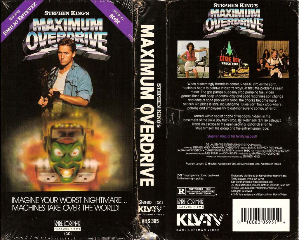 Maximum Overdrive is a movie about a world where vehicles control themselves, written and directed by legendary author Stephen King. It demanded a title that was bold, edgy, and futuristic.
A lot of films of this era were about the future and sci-fi. You’ll find a lot of metallic text and metallic sheens on type treatments. That look is dated by itself. Add to it the fake 3D aspect to the bold text and you have the makings of a typical 80s movie or album title.
I found a modern font that is similar to the one used here called Passion One Bold, and you can find it here. You could definitely use the font in designs of today, but you may want to stay away from adding a metallic, 3D treatment to it. Otherwise, you’ll end up with a look similar to Maximum Overdrive’s title, and other titles from the 80s.
Maximum Overdrive is a movie about a world where vehicles control themselves, written and directed by legendary author Stephen King. It demanded a title that was bold, edgy, and futuristic.
A lot of films of this era were about the future and sci-fi. You’ll find a lot of metallic text and metallic sheens on type treatments. That look is dated by itself. Add to it the fake 3D aspect to the bold text and you have the makings of a typical 80s movie or album title.
I found a modern font that is similar to the one used here called Passion One Bold, and you can find it here. You could definitely use the font in designs of today, but you may want to stay away from adding a metallic, 3D treatment to it. Otherwise, you’ll end up with a look similar to Maximum Overdrive’s title, and other titles from the 80s.
Conclusion
Typography is an art form all by itself. Just as you can look at a painting and tell what time period it is from, we can look at a lot of music albums and movie posters and tell what time period they are from. If you combine those fonts with specific type treatments, it can further enhance the look of being from a specific time period. On the other hand, that doesn’t mean that those fonts no longer have their place. A talented designer can repurpose nearly any font and use it in a new, interesting way. Font fads, just like clothing and hairstyles, come in cycles. Every now and then a fad will re-emerge and artists will breathe new life into it. Knowing where a font originated will help you to understand how you can use it in new ways. Sign up for the GraphicStock Ultimate ‘80s Movie Poster Contest and get ready for your chance to win the $5000 first prize. The Ultimate 80s Movie Poster Contest runs through November 16, 2015. Submit as many times as you like. Submitted posters must be original works, make use of at least 1 item from the GraphicStock library, and must not contain or make use of any copyrighted materials.Frequently Asked Questions About 80s Fonts
What Makes a Font an ’80s Font?
An ’80s font is characterized by its unique style that was popular during the 1980s. This includes bold, geometric shapes, neon colors, and digital-inspired designs. These fonts often have a futuristic feel, reflecting the technological advancements of the time. They are often used in retro designs to evoke nostalgia and capture the spirit of the 80s.
How Can I Use ’80s Fonts in My Designs?
80s fonts can be used in a variety of ways in your designs. They are perfect for creating retro-themed posters, album covers, logos, and more. You can also use them in digital designs to give a vintage feel. Remember, the key is to balance the boldness of the font with other design elements to create a cohesive look.
Are ’80s Fonts Still Relevant Today?
Absolutely! ’80s fonts are still very much relevant today. They are often used in designs to evoke a sense of nostalgia or to create a retro feel. They are also popular in the fashion and music industries, where they are used to create a vintage or retro aesthetic.
Where Can I Find ’80s Fonts?
There are many online resources where you can find ’80s fonts. Websites like 1001fonts, Fontmeme, and Fontspace have a wide selection of ’80s fonts that you can download and use in your designs.
Can I Use ’80s Fonts for Commercial Use?
It depends on the specific font and its licensing agreement. Some ’80s fonts are free for personal use but require a license for commercial use. Always check the licensing agreement before using a font in a commercial project.
How Do I Install ’80s Fonts on My Computer?
Installing ’80s fonts on your computer is a straightforward process. After downloading the font file, simply open it and click on the “Install” button. The font will then be available in all your design software.
What Are Some Popular ’80s Fonts?
Some popular ’80s fonts include the Tina font and the Def Leppard font. These fonts are characterized by their bold, geometric shapes and are often used in retro designs.
How Can I Create My Own ’80s Font?
Creating your own ’80s font requires knowledge of typography and design software. You can start by sketching out your design on paper, then digitize it using software like Adobe Illustrator or FontLab.
Can I Use ’80s Fonts in My Logo Design?
Yes, you can use ’80s fonts in your logo design. They can give your logo a unique and distinctive look. However, make sure the font aligns with your brand identity and target audience.
How Do I Choose the Right ’80s Font for My Design?
Choosing the right ’80s font for your design depends on the message you want to convey. Consider the mood and tone of your design, as well as the audience you are targeting. Experiment with different fonts until you find one that fits your design perfectly.
 James George
James George is a professional web developer and graphic designer. James is an expert in design, and a professional web developer, with a special interest in WordPress. Founder of Design Crawl, James has been a professional designer since 2005.